
4.5. Maps And Profiles#
The web app has three spatial views over the active survey: Map View for station geometry and map-style attributes, Profile View for per-station responses and along-line pseudosections, and the 3D Map for an interactive resistivity scene. Together they are the fastest way to confirm that a loaded survey is spatially coherent and physically plausible before you run QC, correction, or inversion.
All three read the same active survey and the same station selection, so a station picked on the map is the station shown in the profile view.
4.5.1. Recommended Inspection Order#
Use the views in a fixed order when opening a survey. It keeps interpretation from running ahead of basic data checks:
Map View — station overview — confirm station positions, line grouping, and coordinate sanity.
Map View — colour by elevation / resistivity — look for missing elevations and broad lateral contrasts.
Profile View — ρₐ / φ — inspect response curves for a few representative stations.
Profile View — pseudosections — check along-line continuity and frequency coverage.
Profile View — Phase Tensor / Tipper — check dimensionality and directionality before strike or 2-D assumptions.
3D Map — only after station geometry and responses look credible.
4.5.2. Map View#
Map View opens the interactive station map. It starts with station geometry, which is the first thing to inspect after loading — it shows whether station order, line grouping, and coordinates make sense before any interpolation or colouring.
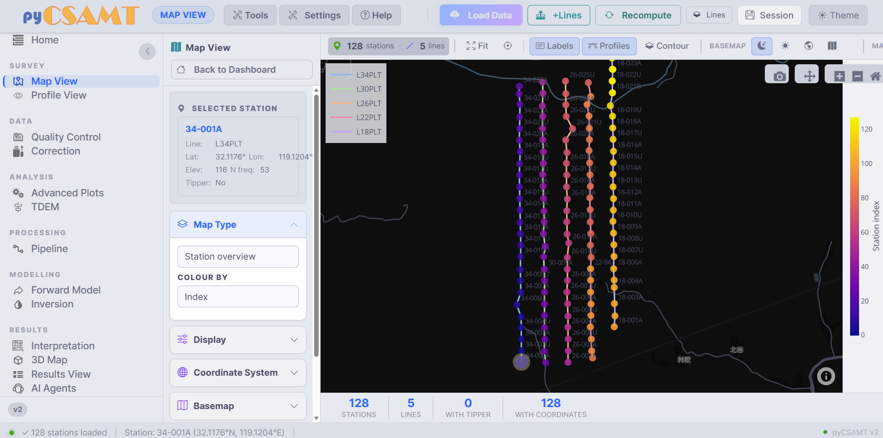
Map View. Left: the selected-station card and the Map Type, Display, Coordinate System, and Basemap panels. Centre: the interactive Plotly map with one colour per line. Footer: station, line, tipper, and coordinate counts.#
Left-hand controls
Selected Station card — the station currently in focus, with its line, latitude, longitude, elevation, frequency count, and tipper availability.
Map Type — what the map draws. Station overview shows locations and labels; other types colour stations by a scalar overlay or draw a density layer.
Colour by — the quantity used as the scalar overlay (for example station index, elevation, or apparent resistivity).
Display — marker style, labels, and overlays.
Coordinate System — the coordinate reference system used to interpret station coordinates (geographic latitude/longitude, a UTM zone, or a custom EPSG code). Set this before enabling basemap tiles.
Basemap — optional map tiles for external context.
Top toolbar
Fit re-frames the map to the survey extent.
Labels toggles station labels.
Profiles toggles the survey-line connectors.
Contour draws interpolated contours over the stations.
Basemap selects a tile style.
Plotly interactions
The map is a Plotly figure. Use the modebar (top-right of the figure) to pan, zoom, and take a PNG snapshot with the camera button; double-click to reset the view. Clicking a station selects it — the selection syncs to the station list and to Profile View.
Tip
Check the Coordinate System before trusting any geophysical pattern. If the station cloud looks stretched, mirrored, or far from its expected area, the input CRS is usually wrong — fix it before enabling basemap tiles or reading contours.
Each contour overlay is an interpolation over the finite station values, not a measured continuous field. Read it with the station layout in mind: do not treat closed patches outside station coverage as mapped geology, and switch back to the station overview if a contour shape is dominated by edge effects.
4.5.3. Profile View#
Profile View is the per-station response workbench. It starts with apparent resistivity and phase for the selected station and exposes tabs for pseudosections, tipper, phase tensor, a 2-D section, and a publication view.
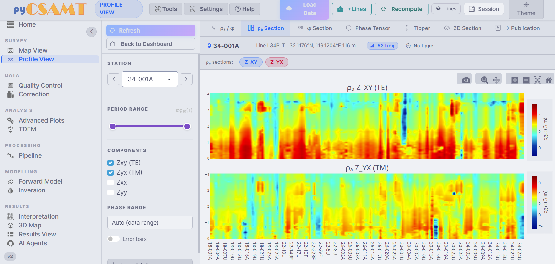
Profile View on the ρₐ Section tab. Left: station selector, period range, component toggles, phase range, and error bars. Centre: the Z_XY (TE) and Z_YX (TM) apparent-resistivity pseudosections along the line.#
The ρₐ and φ section tabs grid station (or along-line distance) against period, so a pseudosection is a useful continuity check across a line — but, like any interpolated display, it is a visual aid rather than a true depth section, and gaps between widely spaced stations should be read as missing information rather than as smooth structure.
Tabs
Tab |
Use it for |
|---|---|
ρₐ / φ |
Per-station apparent resistivity and phase response curves. |
ρₐ Section |
Along-line apparent-resistivity structure by period. |
φ Section |
Along-line phase structure by period. |
Phase Tensor |
Phase-tensor pseudosection for dimensionality and strike context. |
Tipper |
Tipper magnitude and direction where tipper data exist. |
2D Section |
Section-style view for profile- or inversion-oriented interpretation. |
Publication |
A cleaner, figure-oriented view for reports. |
Left-hand controls
Station selector — step through stations with the arrows or pick one from the dropdown. The header shows the line, coordinates, elevation, frequency count, and tipper status.
Period range — limit the visible period (
log10(T)) interval.Components — toggle the impedance tensor elements
Zxy (TE),Zyx (TM),Zxx, andZyy.Phase range — automatic (data range) or a fixed interval.
Error bars — show uncertainty where available.
The default component set emphasises the off-diagonal components
Zxy and Zyx, which usually carry the primary TE/TM information.
Enable Zxx and Zyy when diagnosing diagonal leakage, galvanic
distortion, or 3-D behaviour — if the diagonal components dominate, be
cautious before assuming a simple 2-D interpretation.
4.5.4. Phase Tensor Pseudosection#
The Phase Tensor tab draws a station-by-period ellipse pseudosection, coloured by skew β. Unlike the raw impedance tensor, the phase tensor is built to stay immune to static shift, so its ellipse shape and skew colouring are read as evidence of true earth structure rather than a near-surface artefact. Use it before strike and dimensionality decisions.
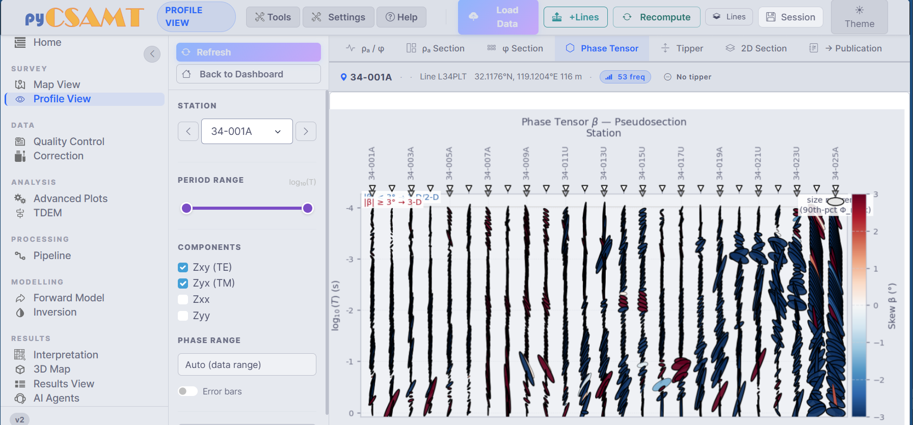
The phase-tensor β pseudosection. Small skew β (a few degrees or less) suggests 1-D/2-D behaviour; strong or abrupt skew changes flag possible 3-D effects or local data problems.#
The same phase-tensor and strike diagnostics are also available on the Advanced Plots page for whole-survey, multi-line views.
4.5.5. 3D Map#
The 3D Map page builds an interactive 3-D quick-look map from the survey. It is a Results-group page, best used after the maps and profiles look credible, because everything it draws is a projection of the same station-level ρₐ and period values you have just been reading in Profile View — there is no constrained inversion model behind it yet.
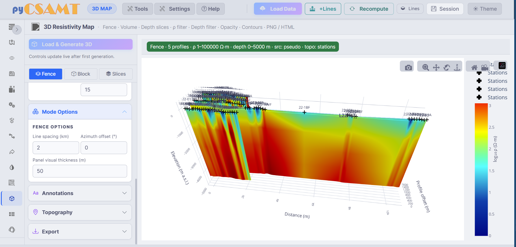
The 3-D Resistivity Map in Fence mode: resistivity panels along each line, station markers on the terrain, and a resistivity colour bar.#
Depth in this scene is a pseudo-depth, estimated from each sample’s apparent resistivity and period through the same skin depth relation used elsewhere in pyCSAMT, \(z \approx 503\sqrt{\rho_a T}\) (metres, with \(\rho_a\) in ohm·m and \(T\) in seconds) — a sampling-scale coordinate, not a recovered interface depth.
Modes
Fence — a fence view: vertical resistivity panels along each survey line, positioned in 3-D by station offset and line spacing, with controls for line spacing, azimuth offset, and panel thickness.
Block — a block volume built from the finite pseudo-depth samples across every line.
Slices — horizontal depth slices through the same interpolated point cloud.
Additional panels control Annotations, Topography (a topography overlay draping the scene on station elevations), and Export. Load & Generate 3D builds the scene; after the first build, the controls update the view live. The scene is a Plotly 3-D figure — drag to rotate, scroll to zoom, and use the modebar camera for a PNG, or export an interactive HTML file from the Export panel.
4.5.6. Figure Export And Code Parity#
Every interactive figure on these pages is a Plotly figure with a modebar: use the camera button for a quick PNG, and the Export panels (on 3-D and the results pages) for a figure export to PNG or standalone HTML. See Exports And Reproducibility for the full export story.
Because the web app shares controllers with the Python package, the same maps
and 3-D scenes can be reproduced in code with the pycsamt.map façade, so a
view you build interactively can be regenerated in a script for a report.
4.5.7. Common Issues#
- No stations appear
Confirm that data loaded successfully and that the station list is populated. If it is empty, return to Loading Data And Sessions.
- Stations plot in the wrong place
Check the Coordinate System panel in Map View — the wrong CRS is the usual cause. Standard EDI files are usually geographic latitude/longitude, but some project files use UTM or another EPSG code.
- Profile tabs are empty
Select a station with valid impedance data and enough frequency samples. Some tabs — the tipper view in particular — require the corresponding data to exist in the loaded files.
- Basemap tiles do not appear
Basemap tiles need optional geospatial dependencies and network access. The station and contour maps still work without tiles.
4.5.8. Next Steps#
Processing Pages – QC, correction, modelling, results, and agents.
Exports And Reproducibility – save maps, sections, and 3-D scenes.