
16.13. Forward Plotting#
Forward plots are quality control tools. They help you see whether a model, grid, forward response, or synthetic dataset looks physically plausible before it is used for inversion, AI training, reports, or tutorials.
In pyCSAMT, plotting functions are deliberately lightweight wrappers around Matplotlib. They do not run the solver. They inspect objects that already exist:
Most plotting functions return Matplotlib Axes objects, while composite
figures return a Matplotlib figure or an array of axes. This makes it
easy to customize labels, save files, or place plots inside your own dashboards
and notebooks. The helpers deliberately keep plotting separate from modelling:
the solver produces the arrays, and the plotting layer only makes those arrays
auditable.
16.13.1. Plot Selection Guide#
Use this table to choose the right function.
Function |
Input |
Use |
|---|---|---|
|
|
Apparent resistivity and phase curves for MT/CSAMT responses. |
|
|
Layered resistivity-depth profiles. |
|
|
One-page validation view for a 1-D forward run. |
|
|
2-D resistivity model with optional station markers. |
|
|
Period-by-station pseudo-section for TE or TM response quantities. |
|
|
Lateral profiles at selected frequencies. |
|
|
Orthogonal XZ, YZ, and XY slices through a 3-D volume. |
|
|
Map view of one tensor component at one frequency. |
|
|
Pseudo-section through one y-row of a 3-D station layout. |
|
|
Four-panel tensor component map. |
The plotting helpers use project style controls from pycsamt.api.style and
axis controls from pycsamt.api.control. For example, apparent resistivity is
displayed in a log-style geophysical convention, and station markers use the
shared station rendering presets.
16.13.2. Saving Figures#
Because the plotting functions return Matplotlib objects, save figures using standard Matplotlib methods. Any response works for this pattern; a quick halfspace keeps the point focused on saving, not on the model:
 1>>> import numpy as np
 2>>> import matplotlib.pyplot as plt
 3
 4>>> from pycsamt.forward import LayeredModel, MT1DForward, plot_response_1d
 5
 6>>> model = LayeredModel([100.0], [])
 7>>> response = MT1DForward(np.logspace(-3, 4, 10)).run(model)
 8
 9>>> axes = plot_response_1d(response)
10>>> fig = axes[0].get_figure()
11>>> fig.savefig("response_1d.png", dpi=200, bbox_inches="tight")
12
13>>> plt.close(fig)
For composite functions that return a figure directly:
1>>> from pycsamt.forward import plot_response_and_model_1d
2
3>>> fig = plot_response_and_model_1d(response, model=model)
4>>> fig.savefig("model_and_response.png", dpi=200, bbox_inches="tight")
5>>> plt.close(fig)
16.13.3. 1-D Response Plots#
Use plot_response_1d for MT and CSAMT apparent resistivity and phase curves.
It returns two axes: [ax_rho, ax_phase].
 1>>> import numpy as np
 2
 3>>> from pycsamt.forward import LayeredModel, MT1DForward, plot_response_1d
 4
 5>>> model = LayeredModel(
 6...     resistivity=[100.0, 10.0, 500.0],
 7...     thickness=[300.0, 800.0],
 8...     name="conductive_middle_layer",
 9... )
10
11>>> response = MT1DForward(freqs=np.logspace(-3, 4, 40)).run(model)
12
13>>> axes = plot_response_1d(
14...     response,
15...     modes="both",
16...     title="MT1D response",
17... )
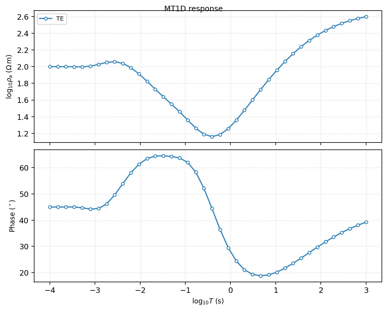
The two returned axes show apparent resistivity and phase against period. For the conductive middle layer, the resistivity curve drops over the period band that is most sensitive to the layer.#
The example produces two axes and a 40-sample response:
>>> len(axes), response.rho_a.shape, response.phase.shape
(2, (40,), (40,))
Read this plot as a quick physical sanity check:
a simple halfspace should produce a smooth response;
a conductive layer should lower apparent resistivity over its sensitivity band;
phase should remain finite and plausible;
sharp noise or oscillation in a clean synthetic response usually signals an input or solver setup problem.
plot_response_1d expects frequency-domain responses. TDEM responses can be
quickly inspected with the response object’s own plot method:
 1>>> import numpy as np
 2
 3>>> from pycsamt.forward import LayeredModel, TEM1DForward
 4
 5>>> model = LayeredModel([60.0, 250.0, 900.0], [120.0, 700.0])
 6>>> response = TEM1DForward(np.logspace(-6, -3, 25)).run(model)
 7
 8>>> ax = response.plot()
 9>>> print(response.times.shape, response.dBz_dt.shape)
10(25,) (25,)
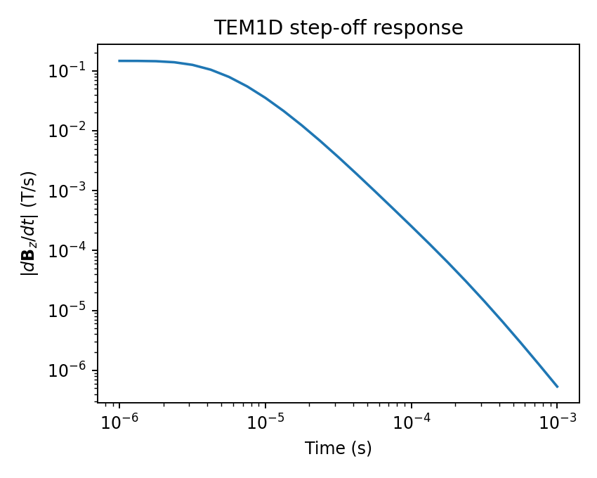
response.plot() is a quick diagnostic, not a publication figure – it
picks its axes and labels from response.method automatically, which is
why no mode or quantity argument is needed the way the 2-D and 3-D
plotting functions require one.#
A TEM response uses time gates instead of frequency samples, and
response.plot() reads them off the same object rather than needing a
separate axis argument.
16.13.4. 1-D Model Plots#
Use plot_model_1d to inspect one or more layered models. It returns one
axis.
 1>>> from pycsamt.forward import LayeredModel, plot_model_1d
 2
 3>>> truth = LayeredModel([80.0, 25.0, 600.0], [250.0, 900.0], name="truth")
 4>>> start = LayeredModel([100.0, 50.0, 500.0], [300.0, 1000.0], name="start")
 5
 6>>> ax = plot_model_1d(
 7...     [truth, start],
 8...     labels=["truth", "starting model"],
 9...     depth_max=2000.0,
10...     title="Layered models",
11... )
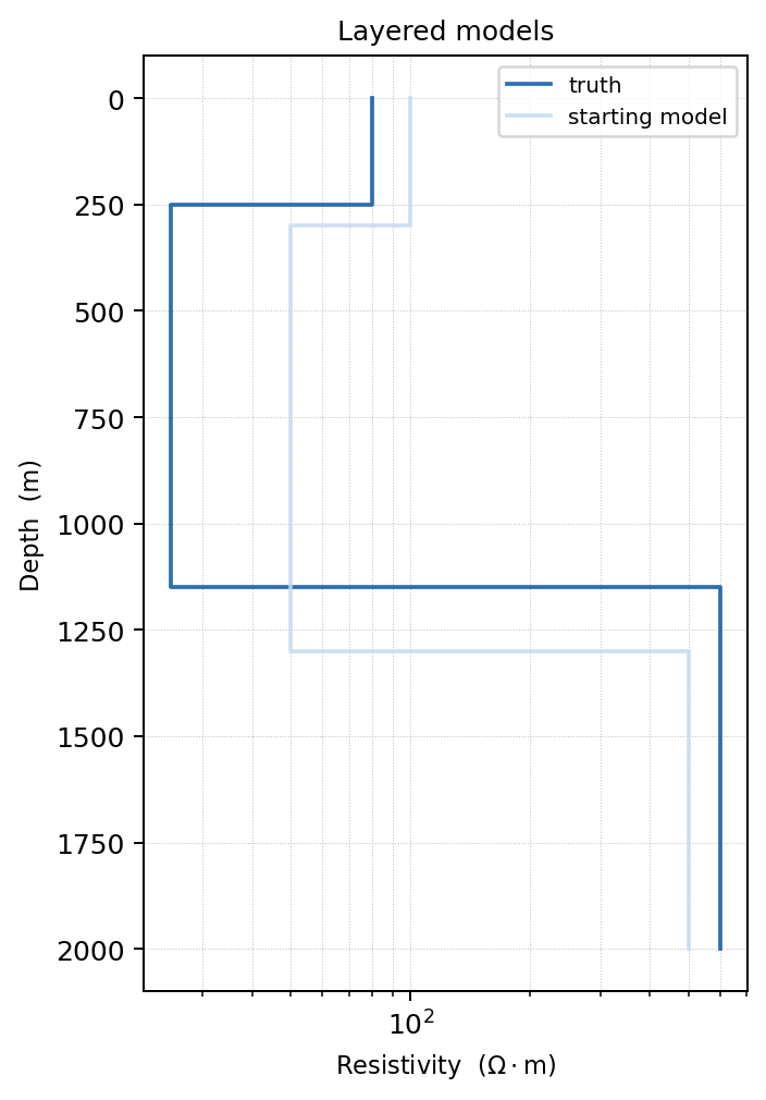
Overlaying the truth and starting model makes the prior information visible before running a synthetic recovery test.#
This is especially useful when preparing a synthetic recovery test. Plot the truth model and the starting model together so it is clear how much prior information the inversion receives.
16.13.5. 1-D Composite View#
plot_response_and_model_1d creates the canonical validation figure for a
single 1-D forward run. It returns a Matplotlib Figure.
 1>>> import numpy as np
 2
 3>>> from pycsamt.forward import (
 4...     LayeredModel,
 5...     MT1DForward,
 6...     plot_response_and_model_1d,
 7... )
 8
 9>>> model = LayeredModel([100.0, 20.0, 800.0], [300.0, 1000.0])
10>>> response = MT1DForward(np.logspace(-3, 4, 40)).run(model)
11
12>>> fig = plot_response_and_model_1d(
13...     response,
14...     model=model,
15...     title="Forward validation",
16... )
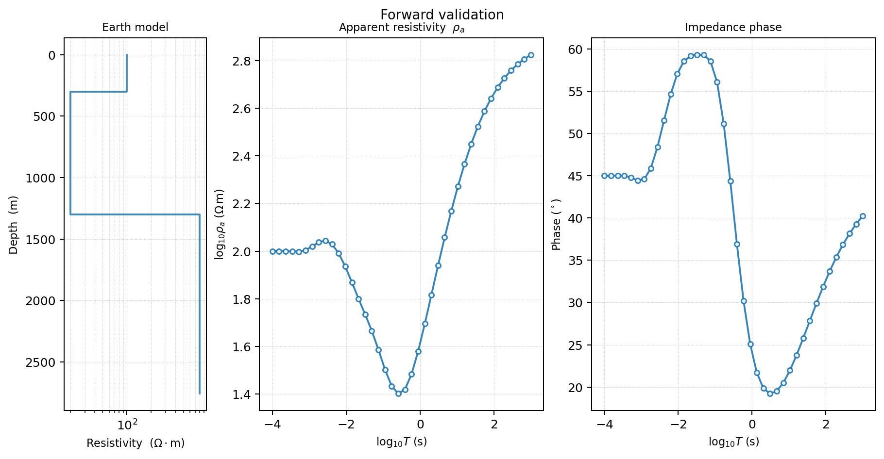
The composite view keeps the model and response together, which is useful when reviewing whether a curve feature is consistent with a layer boundary.#
If model is omitted, the function returns a two-panel response-only figure.
16.13.6. 2-D Grid Model Plots#
Use plot_model_2d to display a pycsamt.forward.Grid2D. By default,
it clips padding cells and displays the core model region.
 1>>> from pycsamt.forward import Grid2D, plot_model_2d
 2
 3>>> grid = Grid2D.with_anomaly(
 4...     bg_rho=500.0,
 5...     anomaly_rho=5.0,
 6...     anomaly_bounds=(2000.0, 6000.0, 300.0, 1500.0),
 7...     nx=50,
 8...     nz=35,
 9...     x_max=10000.0,
10...     z_max=6000.0,
11...     n_pad=8,
12...     n_stations=16,
13... )
14
15>>> ax = plot_model_2d(
16...     grid,
17...     clip_core=True,
18...     show_stations=True,
19...     station_preset="inversion",
20...     title="2-D anomaly model",
21... )
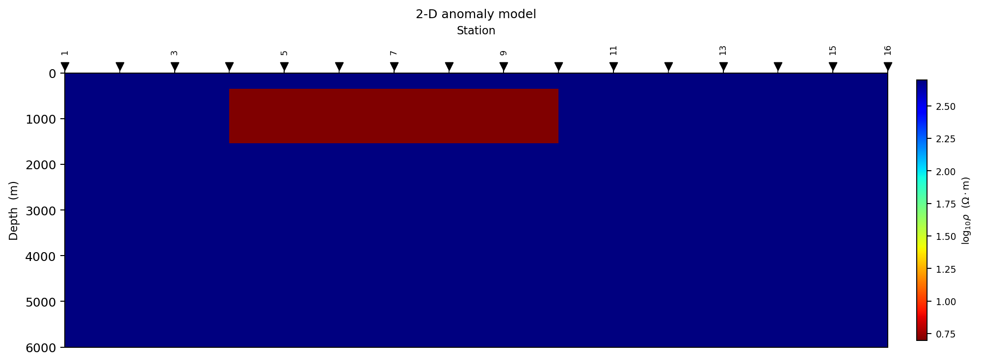
The core model is shown without padding cells. Station markers provide a quick check that the station layout samples the anomaly.#
Important options:
log_scaleWhen
True, the colour scale is \(\log_{10}\rho\). This is usually best for resistivity models.clip_coreWhen
True, padding cells are hidden. Useclip_core=Falsewhen debugging whether padding is large enough.show_stationsWhen
True, stations are drawn along the surface. If stations appear outside the core model, revisit grid construction.
16.13.7. 2-D Pseudo-Sections#
Use plot_pseudosection_2d to show a period-by-station view of a 2-D MT
response. It works on pycsamt.forward.ForwardResponse2D.
 1>>> from pycsamt.forward import MT2DForward, plot_pseudosection_2d
 2
 3>>> response = MT2DForward(
 4...     freqs=[1.0, 10.0, 100.0],
 5...     grid=grid,
 6...     verbose=False,
 7... ).run()
 8
 9>>> ax = plot_pseudosection_2d(
10...     response,
11...     mode="te",
12...     quantity="rho_a",
13...     n_contours=6,
14...     title="TE apparent resistivity",
15... )
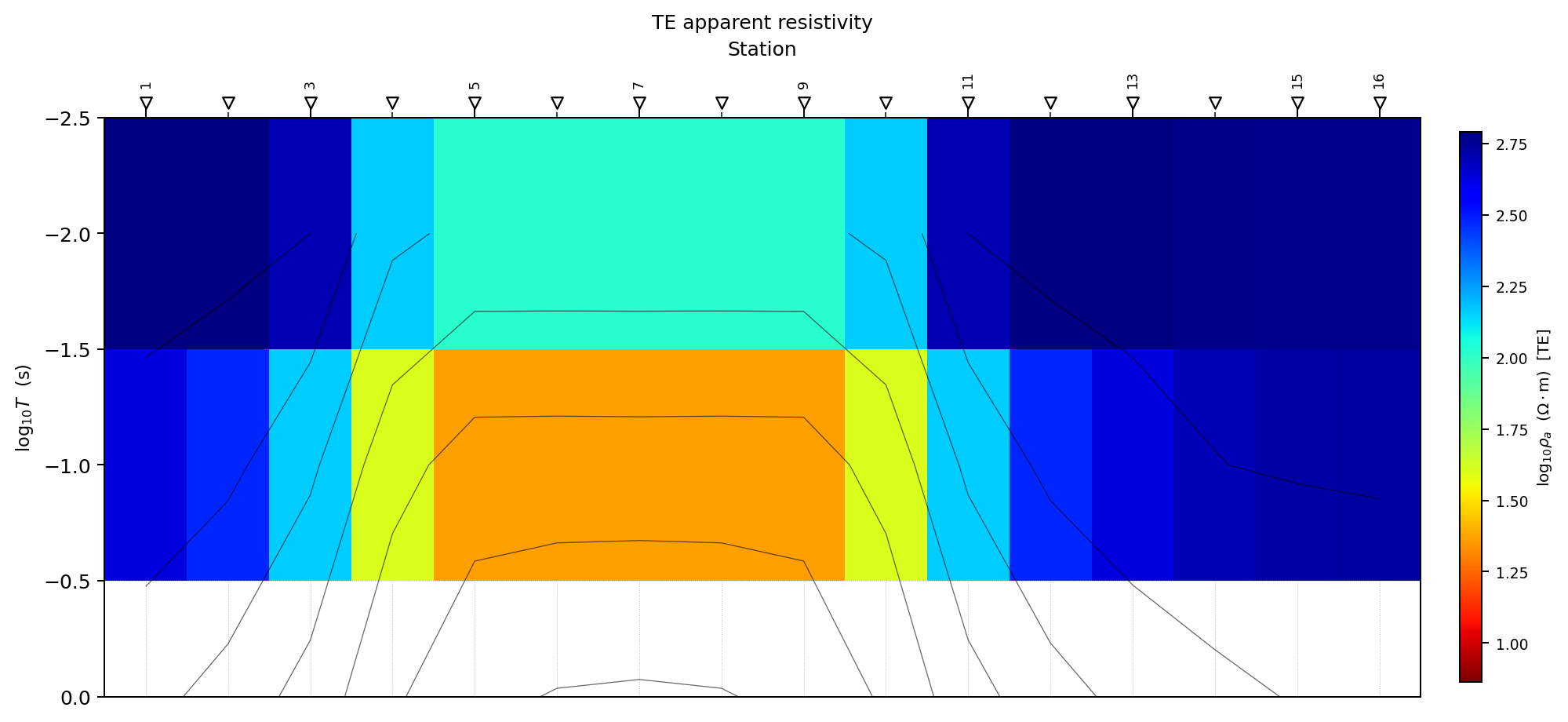
The pseudo-section arranges response values by station and period. It is a display of the forward response, not a recovered depth model.#
Valid mode values are "te" and "tm". Valid quantity values are
"rho_a" and "phase". Apparent resistivity uses a jet_r style colour
map by default, while phase uses RdBu_r.
Pseudo-sections are not subsurface images. They display response variations as a function of period and station distance. Use them to see whether a target creates a coherent response pattern, not to interpret target geometry directly.
16.13.8. 2-D Lateral Response Profiles#
Use plot_response_profiles to inspect how the response varies along the
profile at selected frequencies.
1>>> from pycsamt.forward import plot_response_profiles
2
3>>> ax = plot_response_profiles(
4...     response,
5...     mode="te",
6...     quantity="rho_a",
7...     freq_indices=[0, 1, 2],
8...     title="Lateral response profiles",
9... )
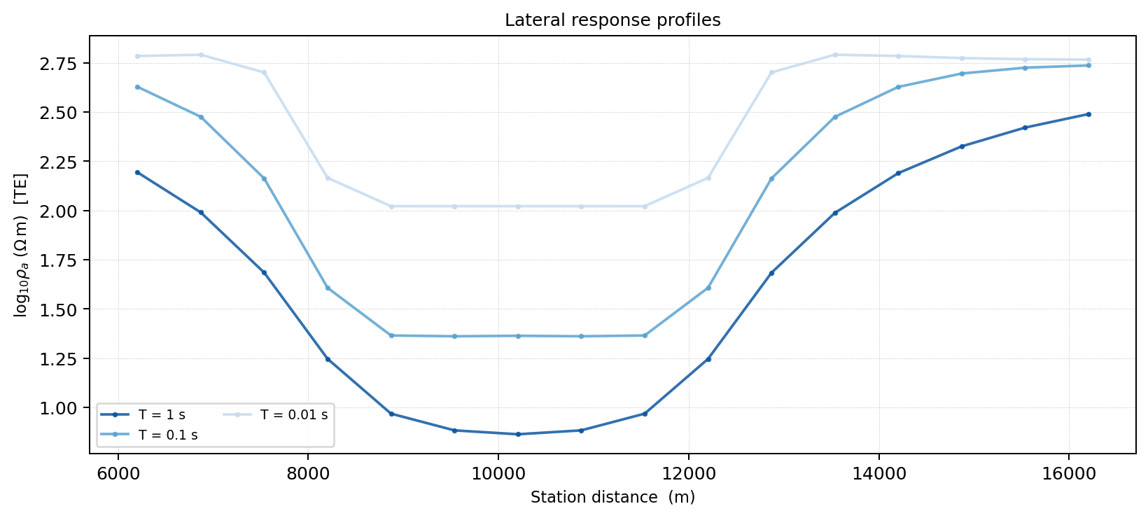
Frequency slices make lateral shifts and broadening easier to see than in a filled pseudo-section alone.#
If freq_indices is omitted, the function chooses a small number of
approximately evenly spaced frequencies. This plot is useful for detecting
whether an anomaly response is localized, broad, shifted, or absent.
16.13.9. 3-D Model Slice Plots#
Use plot_model_3d to inspect a pycsamt.forward.Grid3D. It returns
three axes: [ax_xz, ax_yz, ax_xy].
 1>>> from pycsamt.forward import Grid3D, plot_model_3d
 2
 3>>> grid3d = Grid3D.block_anomaly(
 4...     bg_rho=500.0,
 5...     anomaly_rho=20.0,
 6...     bounds=(2000.0, 6000.0, 2000.0, 6000.0, 300.0, 1500.0),
 7...     nx=20,
 8...     ny=20,
 9...     nz=15,
10...     x_max=8000.0,
11...     y_max=8000.0,
12...     z_max=4000.0,
13...     n_pad=6,
14...     nx_stations=5,
15...     ny_stations=5,
16... )
17
18>>> axes = plot_model_3d(
19...     grid3d,
20...     clip_core=True,
21...     show_stations=True,
22...     title="3-D block anomaly",
23... )
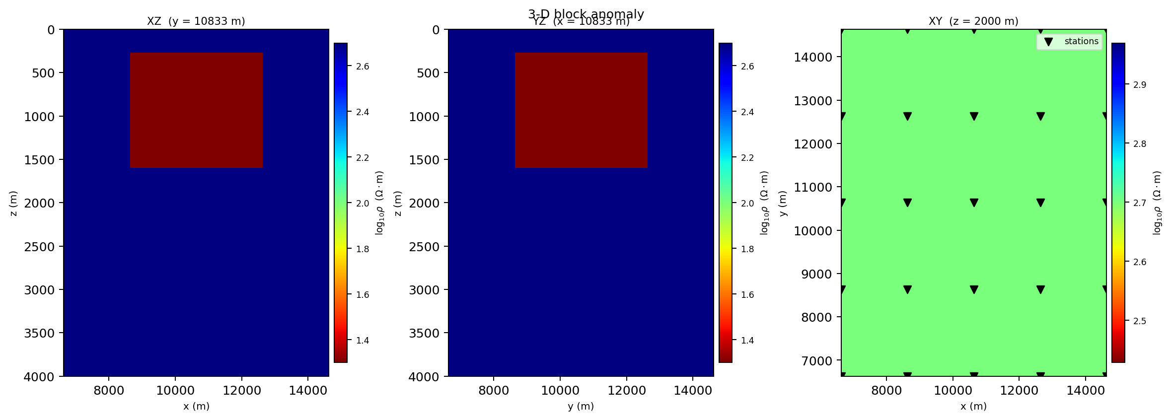
Orthogonal slices expose the same resistivity volume from three directions, so misplaced bounds are usually visible before a solver run.#
The three panels show:
XZ slice through the middle y position;
YZ slice through the middle x position;
XY slice through the middle z position.
Station positions are overlaid on the XY panel.
16.13.10. 3-D Response Maps#
Use plot_response_map_3d to display one response component at one frequency
as a map-view station scatter plot.
 1>>> from pycsamt.forward import MT3DForward, plot_response_map_3d
 2
 3>>> response3d = MT3DForward(
 4...     freqs=[1.0, 10.0, 100.0],
 5...     grid=grid3d,
 6...     verbose=False,
 7... ).run()
 8
 9>>> ax = plot_response_map_3d(
10...     response3d,
11...     freq_idx=0,
12...     component="xy",
13...     quantity="rho_a",
14...     show_labels=True,
15...     title="Zxy apparent resistivity map",
16... )
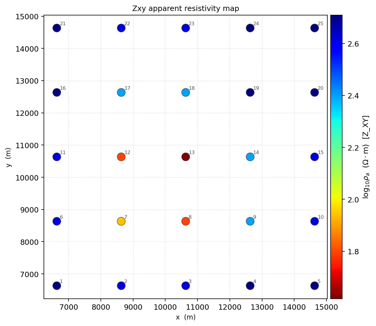
A response map shows one tensor component at one frequency across the station grid.#
Valid components are "xy", "yx", "xx", and "yy". Valid
quantities are "rho_a" and "phase".
16.13.11. 3-D Response Sections#
Use plot_response_section_3d for a period-by-station pseudo-section through
one y-row of the station layout.
1>>> from pycsamt.forward import plot_response_section_3d
2
3>>> ax = plot_response_section_3d(
4...     response3d,
5...     component="xy",
6...     quantity="rho_a",
7...     y_row=None,
8...     n_contours=5,
9... )
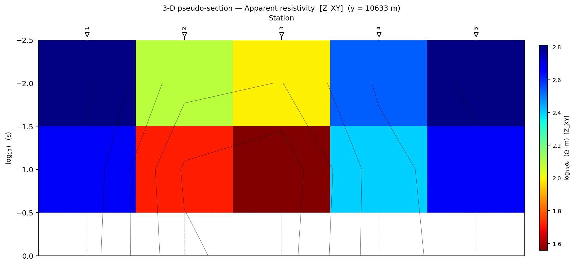
With y_row=None, the section is extracted through the middle row of the
station grid.#
When y_row=None, the middle y-row is selected. Use an explicit row index to
inspect different profile lines through the station grid.
16.13.12. 3-D Tensor Component Panels#
Use plot_tensor_components_3d to compare all four tensor components at one
frequency.
1>>> from pycsamt.forward import plot_tensor_components_3d
2
3>>> axes = plot_tensor_components_3d(
4...     response3d,
5...     freq_idx=0,
6...     quantity="rho_a",
7...     title="Tensor component comparison",
8... )
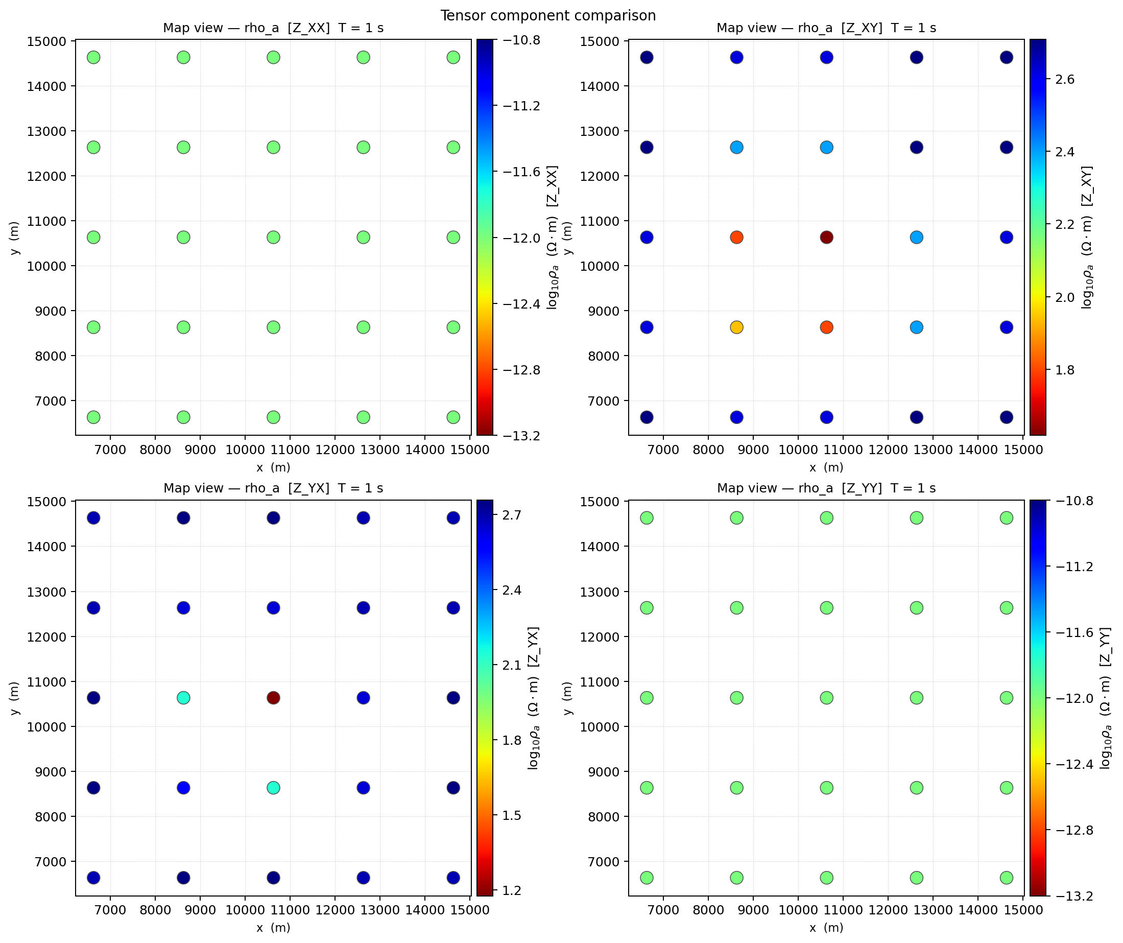
The four-panel layout keeps diagonal and off-diagonal components comparable at the same frequency and colour scale.#
The panels are arranged as:
1Zxx  Zxy
2Zyx  Zyy
For quasi-3-D responses, interpret diagonal components with care. The quasi-3-D solver is useful for survey design and synthetic AI examples, but it is not a substitute for a production full-3-D modelling engine.
16.13.13. Plotting Noisy Responses#
Always plot a few clean and noisy responses before training an AI model. This prevents accidental use of unrealistic noise levels or corrupted axes.
 1>>> import numpy as np
 2
 3>>> from pycsamt.forward import (
 4...     FieldRealisticNoise,
 5...     LayeredModel,
 6...     MT1DForward,
 7...     plot_response_1d,
 8... )
 9
10>>> model = LayeredModel([100.0, 20.0, 800.0], [300.0, 1000.0])
11>>> clean = MT1DForward(np.logspace(-3, 4, 40)).run(model)
12>>> noisy = FieldRealisticNoise(base_level=0.05).apply(clean, seed=10)
13
14>>> axes = plot_response_1d(clean, label_te="clean", color_te="0.2")
15>>> _ = plot_response_1d(
16...     noisy,
17...     label_te="noisy",
18...     color_te="firebrick",
19...     axes=axes,
20... )
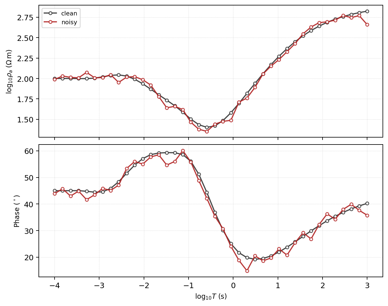
A noisy sample should perturb the clean curve without destroying the physically meaningful trend.#
When overlaying multiple responses, keep labels explicit. A noisy synthetic curve should still look like a possible field response. If the curve is dominated by spikes or negative-looking artefacts, reduce the noise level or review the noise model.
16.13.14. Plotting Dataset Samples#
ForwardDataset stores feature vectors, not full response objects. For
dataset QA, plot feature vectors directly or regenerate selected examples from
the original configuration. A small real dataset makes this concrete:
 1>>> import numpy as np
 2>>> import matplotlib.pyplot as plt
 3
 4>>> from pycsamt.forward import generate_dataset
 5
 6>>> dataset = generate_dataset(
 7...     solver="mt1d",
 8...     n_samples=6,
 9...     freqs=np.logspace(-3, 4, 40),
10...     n_layers=(3, 7),
11...     rho_range=(1.0, 10000.0),
12...     depth_max=3000.0,
13...     noise_level=0.05,
14...     noise_type="field",
15...     include_phase=True,
16...     seed=42,
17...     verbose=False,
18... )
19>>> print(dataset)
20ForwardDataset(n=6, n_features=80, n_params=13, solver='mt1d')
A simple feature plot can still catch many issues:
 1>>> def plot_dataset_sample(dataset, index=0):
 2...     fig, ax = plt.subplots(figsize=(7, 3), constrained_layout=True)
 3...     ax.plot(np.asarray(dataset.X[index]).ravel(), lw=1.2)
 4...     ax.set_xlabel("Feature index")
 5...     ax.set_ylabel("Feature value")
 6...     ax.set_title(f"{dataset.solver} sample {index}")
 7...     return ax
 8...
 9
10>>> ax = plot_dataset_sample(dataset, index=0)
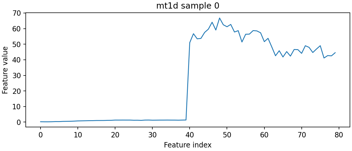
A raw feature-vector plot is not geophysical interpretation, but it quickly exposes NaNs, clipping, scale jumps, or unexpected feature ordering.#
For MT/CSAMT datasets with phase included, the first half of the feature vector is log apparent resistivity and the second half is phase. Splitting the feature vector before plotting often makes the QA clearer.
 1>>> def plot_mt_feature_sample(dataset, index=0):
 2...     n_freqs = len(dataset.freqs)
 3...     x = dataset.X[index]
 4...     log_rho = x[:n_freqs]
 5...     phase = x[n_freqs:2 * n_freqs]
 6...
 7...     fig, axes = plt.subplots(2, 1, figsize=(7, 5), sharex=True)
 8...     period = 1.0 / dataset.freqs
 9...     axes[0].semilogx(period, log_rho)
10...     axes[0].set_ylabel("log10 rho_a")
11...     axes[1].semilogx(period, phase)
12...     axes[1].set_ylabel("phase")
13...     axes[1].set_xlabel("period (s)")
14...     return axes
15...
16
17>>> axes = plot_mt_feature_sample(dataset, index=0)
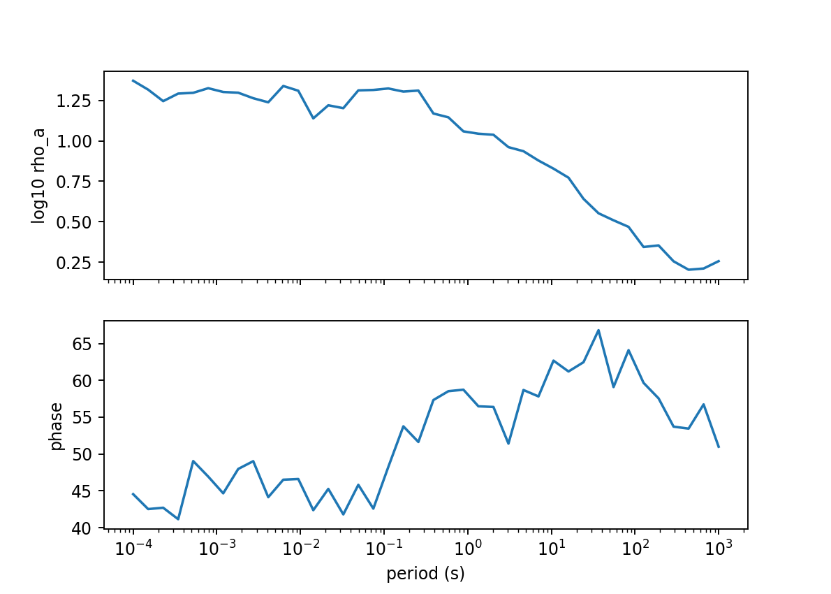
Splitting the feature vector restores the physical axes and makes dataset QA easier to compare with ordinary MT response plots.#
16.13.15. Plotting Checklist#
Use plots to check:
simple halfspace responses are smooth;
apparent resistivity and phase use the expected axes and units;
conductive anomalies produce plausible low-resistivity response zones;
station positions align with the model;
padding cells are not dominating the displayed interpretation region;
noisy synthetic samples still look like possible field data;
TE/TM and tensor component labels are consistent;
pseudo-section patterns move sensibly with frequency or period;
dataset feature vectors match the model architecture expected by AI code.
16.13.16. Common Mistakes#
Interpreting pseudo-sections as geologyPseudo-sections display response patterns. They are not inversion models.
Forgetting that 2-D and 3-D response arrays are frequency-firstPlotting functions use physical response arrays with shape
(n_freqs, n_stations). Some machine-learning and inversion handoff arrays are station-first.Plotting padded cells as interpretationPadding is numerical buffer. Use
clip_core=Truefor interpretation andclip_core=Falseonly for grid debugging.Comparing figures with different colour limitsUse common
vminandvmaxwhen comparing models or responses.Skipping noisy-sample plotsNoise settings that look reasonable numerically can still produce unrealistic synthetic data.
16.13.17. Next Pages#
Solvers And Grids explains the model and response containers used by the plotting functions.
Synthetic Datasets And Noise explains how generated datasets store features.
From Forward Modelling To Inversion explains how to use plots during synthetic recovery tests.