
11.13. Transfer Functions And Tipper Diagnostics#
The transfer-function tools in pycsamt.emtools focus on the
vertical-field response, usually called the tipper. The tipper
relates the vertical magnetic field to the horizontal magnetic field:
Here \(H_x\), \(H_y\), and \(H_z\) are magnetic-field Fourier coefficients at frequency \(f\), while \(T_x\) and \(T_y\) are complex, frequency-dependent transfer functions. In a laterally uniform 1-D earth, the horizontal magnetic field has no preferred lateral induction contrast to couple into \(H_z\), so the tipper is weak. When current is channelled by conductors or sharp resistivity contrasts, the vertical field grows and induction vector arrows become one of the fastest qualitative diagnostics for conductor position, strike, and period-dependent structure.
It is useful to treat the tipper as a two-component complex vector,
The real part is the in-phase induction response, the imaginary part is the quadrature response, and their relative size often changes with period.
This page covers two related workflows:
Workflow |
Main tools |
Purpose |
|---|---|---|
EDI or |
|
Work from assembled transfer functions, usually EDI files. |
Spectra-direct tipper diagnostics |
|
Work from spectral estimates before a final EDI has been written. |
All public functions used below are exported from pycsamt.emtools,
so the examples use the two-level import style.
11.13.1. Use A Dataset With Tipper#
Many AMT/CSAMT data sets contain only horizontal electric and magnetic
channels. Those files can have valid impedance but no vertical magnetic
transfer function. The tipper functions will then return graceful
"no tipper" messages.
For induction-vector work, first verify that the selected survey really
has tipper data. The bundled KAP03 long-period MT profile is useful for
examples because it includes vertical-field measurements and real
station coordinates – recovered from REFLAT/REFLONG in
>=DEFINEMEAS when the older, BIRRP-processed >HEAD block leaves
LAT=/LONG= empty, which is the case for every file in this
survey. Every map on this page uses those real coordinates, not an
index-on-a-line fallback.
>>> from pathlib import Path
>>> import numpy as np
>>> from pycsamt.emtools import ensure_sites
>>> edi_dir = Path("data/MT/kap03lmt_edis")
>>> sites = ensure_sites(
...     edi_dir,
...     recursive=True,
...     on_dup="replace",
...     strict=False,
...     verbose=0,
... )
>>> print(len(sites), "stations")
26 stations
>>> n_valid = sum(
...     1 for s in sites
...     if s.coords and np.isfinite(s.coords[0]) and np.isfinite(s.coords[1])
... )
>>> print("with usable coordinates:", n_valid, "/", len(sites))
with usable coordinates: 26 / 26
If a plot says "no tipper", check the data before changing plotting
options. Missing tipper is a data-content issue, not necessarily a
failed plot. If a map plots stations along a flat, evenly spaced line
with no vertical spread, that is the coordinate fallback – check
site.coords before assuming the survey has no real geometry; it may
simply live in a less common EDI location like >=DEFINEMEAS instead
of the ordinary >HEAD fields.
11.13.2. What The Tipper Stores#
For each station and frequency, pyCSAMT expects a two-component complex tipper:
Quantity |
Meaning |
|---|---|
|
Complex coefficient relating |
|
Complex coefficient relating |
|
In-phase part. Commonly used for Parkinson induction arrows. |
|
Quadrature part. Useful for checking frequency-dependent or inductive behavior that is out of phase with the horizontal field. |
|
Magnitude, often summarized as
|
You usually do not need to extract these arrays manually. The plotting functions read them from the site objects. Still, understanding the components helps interpret the figures.
For a selected component \(c\), pyCSAMT summarizes vector strength as
where \(c\) can be the real part, imaginary part, or complex
magnitude. For component="real",
\(T_{x,c}=\Re(T_x)\) and \(T_{y,c}=\Re(T_y)\). For
component="imag", the imaginary parts are used. For
component="abs", the norm is built from \(|T_x|\) and
\(|T_y|\). This is the quantity behind color scales in maps and
sections, and behind the polar radius in single-station views.
11.13.3. Choose Periods And Bands#
Tipper diagnostics are strongly period-dependent. A station may be weak at short period, strong at mid-period, and weak again at long period. Choose periods and period bands deliberately.
The period is
When a requested period \(T_0\) does not exist exactly in every EDI, the plotting functions use the nearest available sampled period in log-period space,
This keeps maps and roses reproducible across stations with slightly
different frequency grids, and it holds even when a station’s own
frequency array is not stored in strictly ascending or descending order
– true for two real stations in this survey, kap109 and kap145,
whose files concatenate runs recorded at different sample rates. A
narrow band should still be chosen only when the original sampling
supports it.
>>> periods = [25.0, 650.0, 2000.0, 17000.0]
>>> short_band = (25.0, 200.0)
>>> long_band = (2000.0, 17000.0)
>>> print("periods:", periods)
periods: [25.0, 650.0, 2000.0, 17000.0]
>>> print("short band:", short_band)
short band: (25.0, 200.0)
>>> print("long band:", long_band)
long band: (2000.0, 17000.0)
Use the same period choices across maps, roses, and sections when you want the figures to support one interpretation.
11.13.4. Single-Station Hodograms#
Start with plot_tipper_hodograms when inspecting one station. It
plots Tx and Ty in the complex plane, with colors split by period
band – a hodogram.
For each component, the hodogram point is simply the complex coefficient written as Cartesian coordinates:
Smooth curves through these points indicate that the station response evolves coherently with period. A scattered cloud means the azimuth and amplitude plots should be interpreted with more caution.
>>> import matplotlib.pyplot as plt
>>> from pycsamt.emtools import plot_tipper_hodograms
>>> fig = plot_tipper_hodograms(
...     sites,
...     station="kap151",
...     bands=[
...         (25.0, 200.0),
...         (200.0, 2000.0),
...         (2000.0, 17000.0),
...     ],
...     unit_circle=True,
...     normalize=False,
... )
>>> fig.savefig("tf_tipper_hodograms.png", dpi=200, bbox_inches="tight")
>>> plt.close(fig)
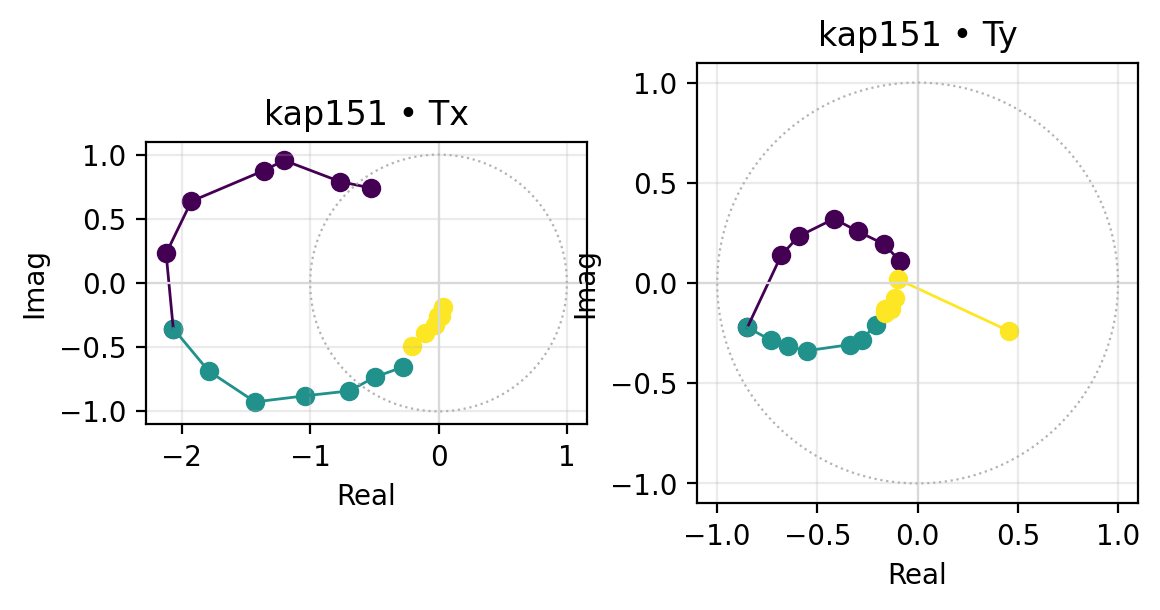
Read a hodogram before reading arrows. Station kap151’s Tx
traces a large, coherent loop that reaches well outside the unit circle
in the short- and mid-period bands (dark purple and teal) – real for
strong 3-D/lateral induction, and not automatically an error, but a
clear signal that this station warrants closer inspection before its
arrows are trusted at face value. Ty’s loop is smaller and stays
closer to the unit circle, so the two components are not equally
reliable here.
Set normalize=True only when comparing shape rather than amplitude.
For conductor-strength interpretation, keep the raw amplitude.
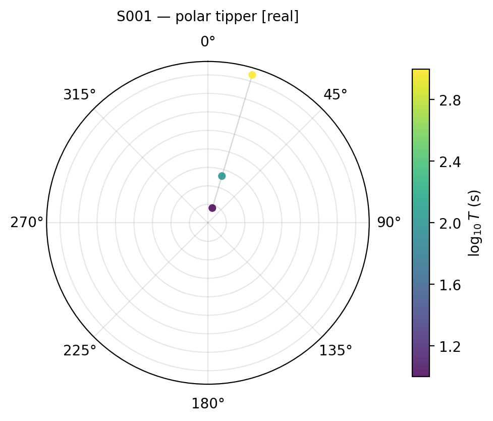
11.13.5. Single-Station Polar View#
plot_tipper_polar converts one station’s tipper into azimuth and
magnitude versus period. The polar angle is the tipper direction, radius
is magnitude, and color is log-period.
For the real component, the displayed azimuth and radius are
The same formula is used for component="imag" after replacing the
real parts by imaginary parts. With component="abs", the radius is
the complex-vector norm and the displayed direction follows the
component convention used by the plotting helper.
>>> from pycsamt.emtools import plot_tipper_polar
>>> ax = plot_tipper_polar(
...     sites,
...     station="kap151",
...     component="real",
... )
>>> ax.figure.savefig("tf_tipper_polar.png", dpi=200, bbox_inches="tight")
>>> plt.close(ax.figure)
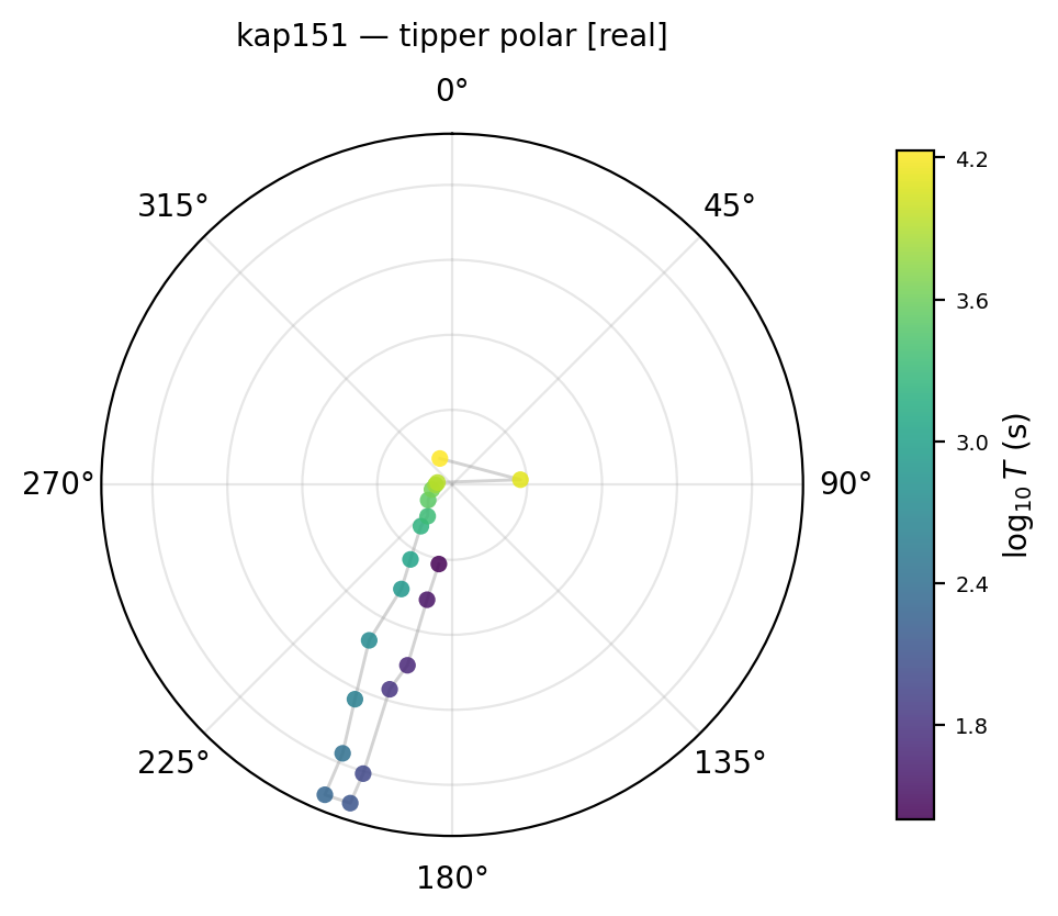
Valid components are "real", "imag", and "abs". Use
"real" for a Parkinson convention-style conductor-direction
reading, use "imag" to inspect the quadrature response, and use
"abs" when you mainly care about magnitude.
11.13.6. Induction Map At One Period#
plot_induction_map draws real and imaginary induction vector
arrows at a single target period. The function picks the nearest
available period for each station.
At station \(s\), the in-phase arrow is formed from \(\Re(T_x)\) and \(\Re(T_y)\) at the selected period. The quadrature arrow is formed from \(\Im(T_x)\) and \(\Im(T_y)\). The plotted length is scaled for readability,
where \(q\) is the display scale. Changing scale changes only
the drawing length; it does not change the transfer function.
>>> from pycsamt.emtools import plot_induction_map
>>> ax = plot_induction_map(
...     sites,
...     period=2000.0,
...     convention="park",
...     show_real=True,
...     show_imag=True,
...     scale=4.0,
...     station_labels=True,
...     reference_arrow=0.1,
... )
>>> ax.figure.savefig("tf_induction_map.png", dpi=200, bbox_inches="tight")
>>> plt.close(ax.figure)
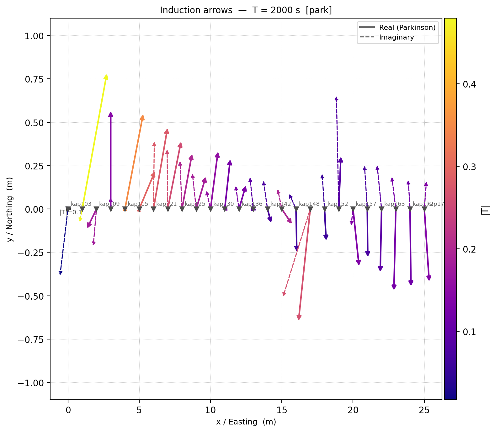
The station coordinates come from easting/northing, x/y, or lon/lat when
available, in that priority order; here they are the real (lon, lat)
positions recovered from >=DEFINEMEAS, which is why the axes read
“Longitude” and “Latitude” rather than a distance unit. If none of
those sources are usable, pyCSAMT falls back to an index along a flat
line – a real map should never look like an exactly horizontal row of
stations; if one does, check site.coords before trusting the layout.
scale controls arrow length in plot coordinates. If arrows are too
small or overlap badly, adjust scale rather than changing the tipper
data. The strongest, most coherent arrows here cluster around
kap121-kap130, in the same part of the profile that the
period section below flags as anomalous across most of the band.
11.13.7. Compare Several Periods On One Axis#
plot_induction_arrows overlays arrows from several requested periods
on one profile axis.
>>> from pycsamt.emtools import plot_induction_arrows
>>> ax = plot_induction_arrows(
...     sites,
...     periods=[25.0, 650.0, 2000.0, 17000.0],
...     convention="park",
...     scale=1.0,
...     normalize=True,
...     strike_ticks=False,
... )
>>> ax.figure.savefig("tf_induction_arrows.png", dpi=200, bbox_inches="tight")
>>> plt.close(ax.figure)
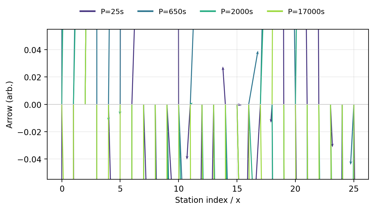
Use this for a fast period comparison, not as the final publication figure. Many periods on one axis can become visually crowded. If the period behavior matters, follow with a period section or a multi-period map.
11.13.8. Sign Conventions#
Induction-vector interpretation depends on convention. The two common views are Parkinson convention and Wiese convention. They are rotated relative to each other, so a figure can be misread if the convention is not stated.
With the real induction vector written as \(\mathbf{p}=(\Re(T_x),\Re(T_y))\), the Wiese vector can be read as a quarter-turn rotation,
The sign convention controls whether an arrow is interpreted as pointing toward a conductor, away from it, or along the related strike-normal direction. State the convention in captions whenever induction vectors are used for interpretation.
plot_induction_convention puts Parkinson/Wiese and real/imaginary
components in one 2-by-2 figure.
>>> from pycsamt.emtools import plot_induction_convention
>>> _ = plot_induction_convention(
...     sites,
...     period=650.0,
...     station_labels=False,
... )
>>> plt.gcf().savefig("tf_induction_convention.png", dpi=200, bbox_inches="tight")
>>> plt.close()
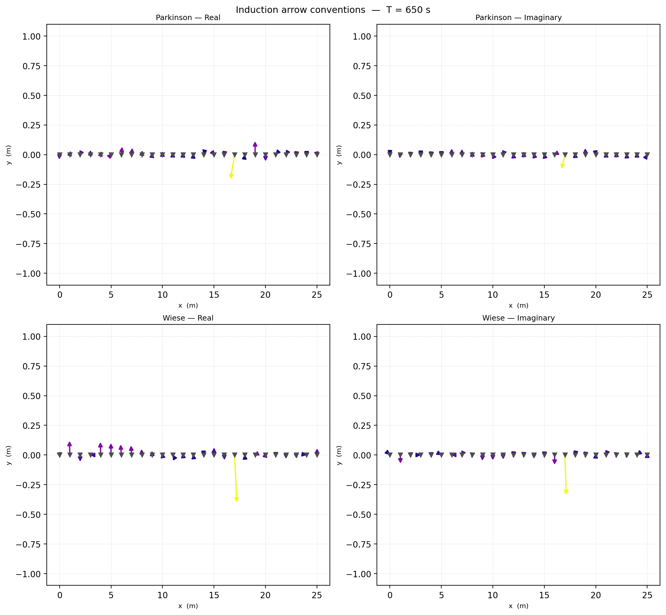
Use this plot when communicating with collaborators or comparing to a paper. It makes sign and component choices visible instead of leaving them implicit – the Wiese panels here are visibly rotated relative to the Parkinson panels at the same period, exactly as the quarter-turn formula predicts.
11.13.9. Period Pseudosection#
plot_induction_section shows tipper magnitude or component strength
over stations and period.
For station \(s\) and period \(T_j\), the section cell is
This is why component="abs" is useful for anomaly strength, while
"real" and "imag" separate in-phase and quadrature behavior.
>>> from pycsamt.emtools import plot_induction_section
>>> ax = plot_induction_section(
...     sites,
...     component="abs",
...     n_periods=30,
...     cmap="RdBu_r",
...     section="pseudosection",
... )
>>> ax.figure.savefig("tf_induction_section.png", dpi=200, bbox_inches="tight")
>>> plt.close(ax.figure)
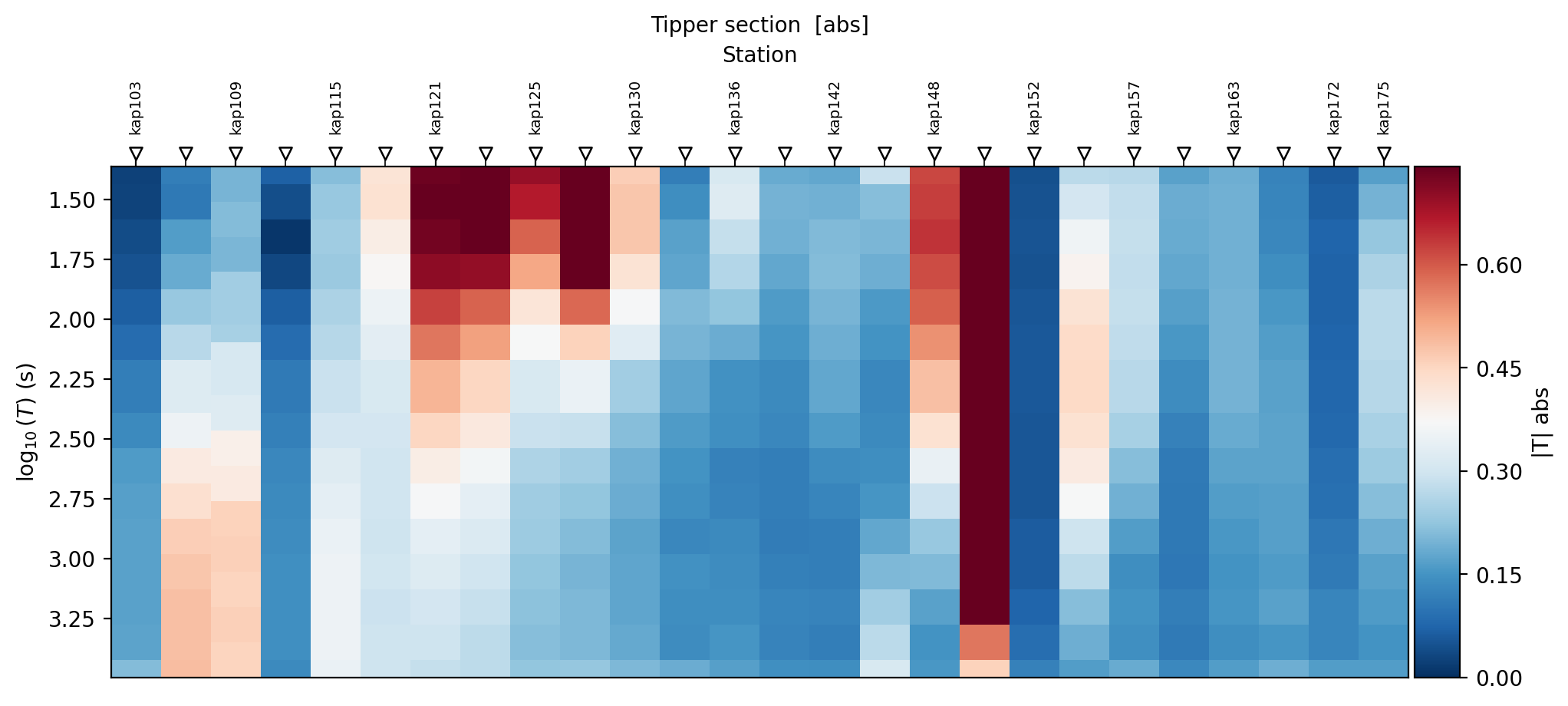
Use component="abs" for anomaly strength, "real" for in-phase
strength, and "imag" for quadrature strength. A section is the best
single view for answering: where along the line is the tipper strong,
and at what periods? Two stations dominate this section: kap121
through kap130 are strong across the short-period half of the band,
while kap148 stands out even more sharply – saturated dark red
across almost the entire period range, not just one band. A station
that stays anomalous from the shortest to the longest period sampled is
a different kind of feature than one that is only strong in a narrow
window, and deserves separate follow-up.
11.13.10. Induction Rose#
plot_induction_rose summarizes arrow azimuths over all stations and
selected periods.
For each selected sample, the rose angle is
where \(\mathbf{a}=(a_x,a_y)\) is the chosen real, imaginary, or magnitude-based induction vector. Unlike geoelectric strike, induction arrows are directional vectors, so the full \(0^\circ\) to \(360^\circ\) circle is meaningful unless you deliberately fold the result for a separate structural-axis comparison.
>>> from pycsamt.emtools import plot_induction_rose
>>> ax = plot_induction_rose(
...     sites,
...     component="real",
...     pband=(25.0, 200.0),
...     nbins=36,
...     title="Short-period induction azimuths",
... )
>>> ax.figure.savefig("tf_induction_rose_short.png", dpi=200, bbox_inches="tight")
>>> plt.close(ax.figure)
>>> ax = plot_induction_rose(
...     sites,
...     component="real",
...     pband=(2000.0, 17000.0),
...     nbins=36,
...     title="Long-period induction azimuths",
... )
>>> ax.figure.savefig("tf_induction_rose_long.png", dpi=200, bbox_inches="tight")
>>> plt.close(ax.figure)
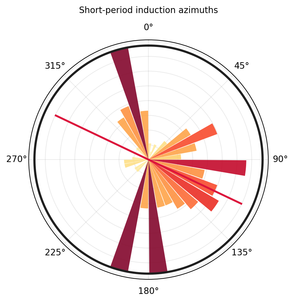
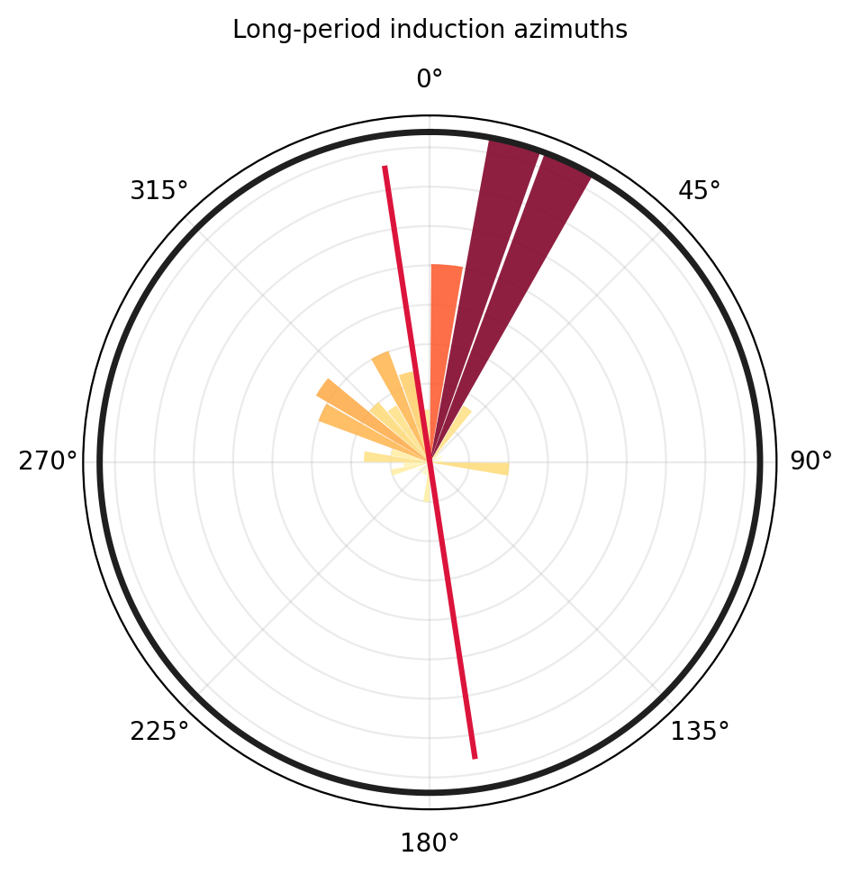
Compare short and long period roses before claiming a regional conductor.
The short-period rose here is genuinely scattered: strong petals near
0, 90, and 180 degrees with no single dominant sector –
consistent with shallow, heterogeneous structure pointing in several
directions at once. The long-period rose tells a different story: it
tightens sharply toward roughly 0-30 degrees, with most of the
short-period sectors barely present. That contrast, not either rose
alone, is the evidence for a deeper, more coherent conductive structure
along a preferred azimuth.
11.13.11. Multi-Period Map#
plot_induction_multiperiod_map stacks one map panel per period and
is the most report-ready induction-vector figure. It can use real EDI
tipper, or an explicit tipper_data override.
>>> from pycsamt.emtools import plot_induction_multiperiod_map
>>> fig, axes = plot_induction_multiperiod_map(
...     sites,
...     periods=[25.0, 650.0, 2000.0, 17000.0],
...     convention="park",
...     arrow_scale=6.0,
...     reference_arrow=0.1,
...     show_background_cbar=False,
...     station_labels=False,
...     xlabel="Longitude",
...     ylabel="Latitude",
...     title="Induction vectors across period",
... )
>>> fig.savefig("tf_induction_multiperiod_map.png", dpi=200, bbox_inches="tight")
>>> plt.close(fig)
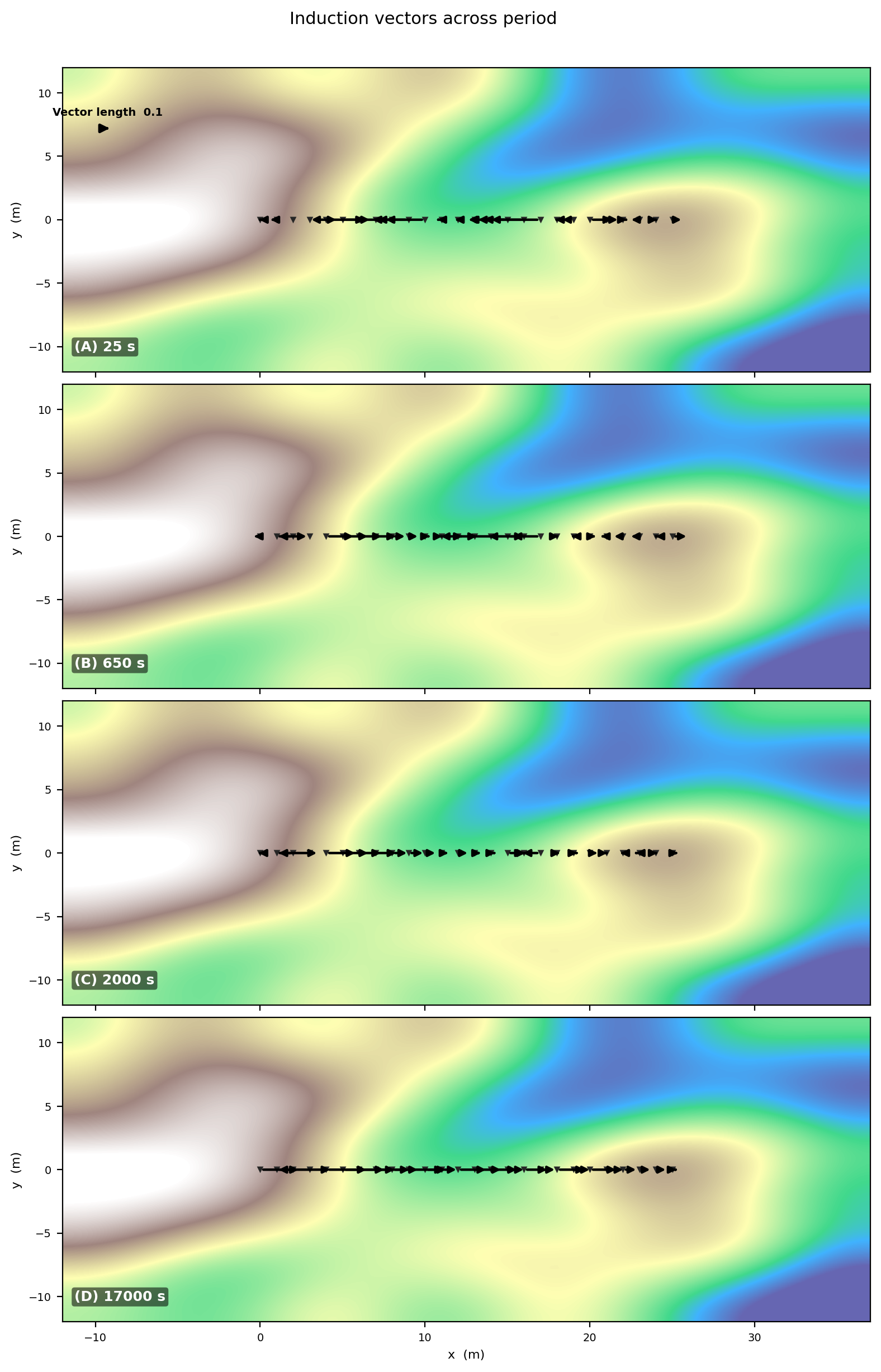
xlabel/ylabel default to "x (m)"/"y (m)" because this
function – unlike plot_induction_map – does not inspect the
coordinate source to relabel itself; pass real axis labels explicitly
whenever the underlying coordinates are geographic, as they are here.
When background is not supplied, the function draws a synthetic
terrain-like background. That background is a visual placeholder, not a
real DEM. For a report, pass your own background and
background_extent.
The fallback EDI read path in this function can only use a single tipper
component in some situations. When you need full two-component vectors,
pass tipper_data explicitly as a dictionary keyed by period. The
example below builds that dictionary from KAP03’s own real tipper –
useful both as a template for wiring in your own externally processed
transfer functions, and as a check that the override path reproduces the
EDI-driven map above exactly when fed the same underlying data:
>>> from pycsamt.emtools._core import _iter_items, _name
>>> from pycsamt.emtools.tf import _get_t_block, _nearest_idx
>>> override_periods = [25.0, 650.0, 2000.0, 17000.0]
>>> tipper_data = {}
>>> for p in override_periods:
...     rows = []
...     for i, ed in enumerate(_iter_items(sites)):
...         _, t, fr = _get_t_block(ed)
...         per = 1.0 / fr
...         j = _nearest_idx(per, np.array([p]))[0]
...         rows.append([t[j, 0], t[j, 1]])
...     tipper_data[p] = np.array(rows, dtype=complex)
>>> print({p: arr.shape for p, arr in tipper_data.items()})
{25.0: (26, 2), 650.0: (26, 2), 2000.0: (26, 2), 17000.0: (26, 2)}
>>> print("|T| mean at 25 s:", np.abs(tipper_data[25.0]).mean())
|T| mean at 25 s: 0.22174234813909238
>>> fig, axes = plot_induction_multiperiod_map(
...     sites,
...     periods=list(tipper_data),
...     tipper_data=tipper_data,
...     arrow_scale=6.0,
...     show_background_cbar=False,
... )
>>> fig.savefig(
...     "tf_induction_multiperiod_map_synthetic.png",
...     dpi=200,
...     bbox_inches="tight",
... )
>>> plt.close(fig)
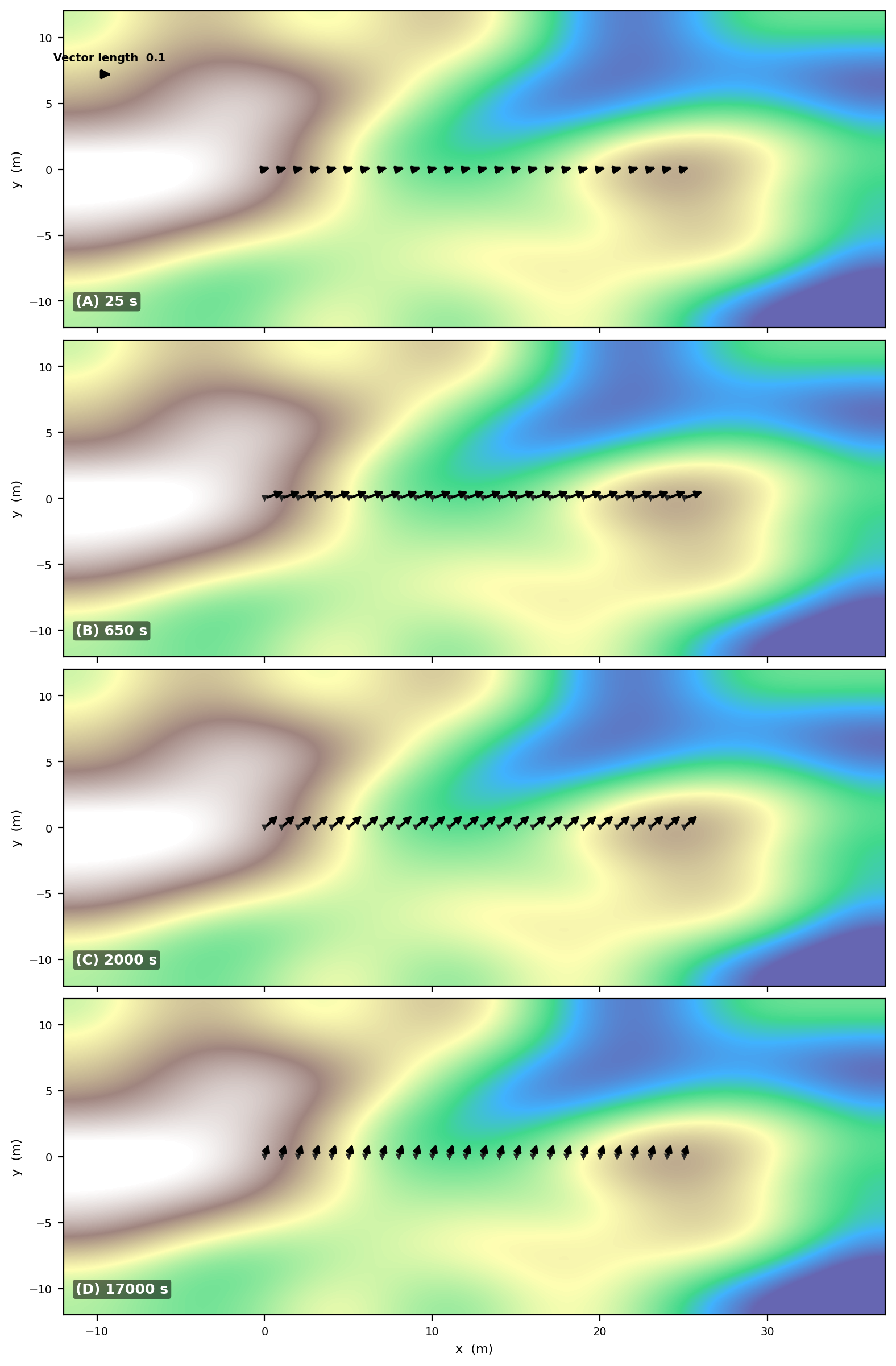
Each tipper_data value has shape (n_stations, 2) – column 0 is
Tx, column 1 is Ty – and the station order in each array must
match the station order returned by ensure_sites for the input
survey, which is exactly what iterating sites itself guarantees
above. Compare the two figures: they agree, because both are reading
the same real transfer functions, just through two different code paths.
Swap the extraction loop for your own inversion or remote-reference
output to reuse this pattern with genuinely external data.
11.13.12. Spectra-Direct Workflows#
The spectra-direct helpers work before final EDI assembly. They expect
Spectra objects or dictionaries of spectra objects and recover the
tipper from spectral estimates.
At the spectra stage, the same transfer function can be estimated from cross-spectral relationships. In compact least-squares form, each frequency solves
Here the rows represent time windows or spectral estimates at the same
frequency. The plotting API does not require you to perform this solve
manually; it asks each spectra object for its tipper (via Spectra.to_Z,
covered on Cross-Spectra Analysis) and then applies the same map, polar,
and rose formulas used for EDI-based data – any real
pycsamt.seg.spectra.Spectra object works directly, with no adapter
needed.
Use these functions when your workflow is still at the spectra stage:
Function |
Use |
|---|---|
|
Draw real and imaginary induction arrows from one or more spectra objects. |
|
Inspect one spectra object’s tipper azimuth and magnitude. |
|
Summarize spectra-derived induction azimuths over a period band. |
The bundled data/MT/SPECTRA files carry real cross-power spectra and
a real HZ channel, so their tipper is genuine – but they are
de-identified (REFLAT/REFLONG are zeroed), so a real map still
needs an explicit coords mapping. Use a placeholder local grid for
that, and be honest in the caption that the positions are placeholders
even though the tipper values are not.
>>> from pycsamt.seg.spectra import Spectra
>>> from pycsamt.emtools import (
...     plot_induction_map_from_spectra,
...     plot_induction_rose_from_spectra,
...     plot_tipper_polar_from_spectra,
... )
>>> spectra_dir = Path("data/MT/SPECTRA")
>>> sp1 = Spectra.from_file(spectra_dir / "spectra01.edi")
>>> sp2 = Spectra.from_file(spectra_dir / "spectra02.edi")
>>> print(sp1.name, "period range:", (1 / sp1.freq).min(), (1 / sp1.freq).max())
SPECTRA01 period range: 9.615384615384615e-05 0.5813953488372093
>>> print(sp2.name, "period range:", (1 / sp2.freq).min(), (1 / sp2.freq).max())
SPECTRA02 period range: 0.003125 2380.9523809523807
>>> spectra_by_station = {"spectra01": sp1, "spectra02": sp2}
>>> coords = {
...     "spectra01": (0.0, 0.0),
...     "spectra02": (500.0, 0.0),
... }
>>> _ = plot_induction_map_from_spectra(
...     spectra_by_station,
...     coords=coords,
...     period=0.1,
... )
>>> plt.gcf().savefig("tf_spectra_induction_map.png", dpi=200, bbox_inches="tight")
>>> plt.close()
>>> _ = plot_tipper_polar_from_spectra(
...     {"spectra01": sp1},
...     component="real",
... )
>>> plt.gcf().savefig("tf_spectra_tipper_polar.png", dpi=200, bbox_inches="tight")
>>> plt.close()
>>> _ = plot_induction_rose_from_spectra(
...     spectra_by_station,
...     component="real",
...     pband=(0.003, 0.6),
... )
>>> plt.gcf().savefig("tf_spectra_induction_rose.png", dpi=200, bbox_inches="tight")
>>> plt.close()
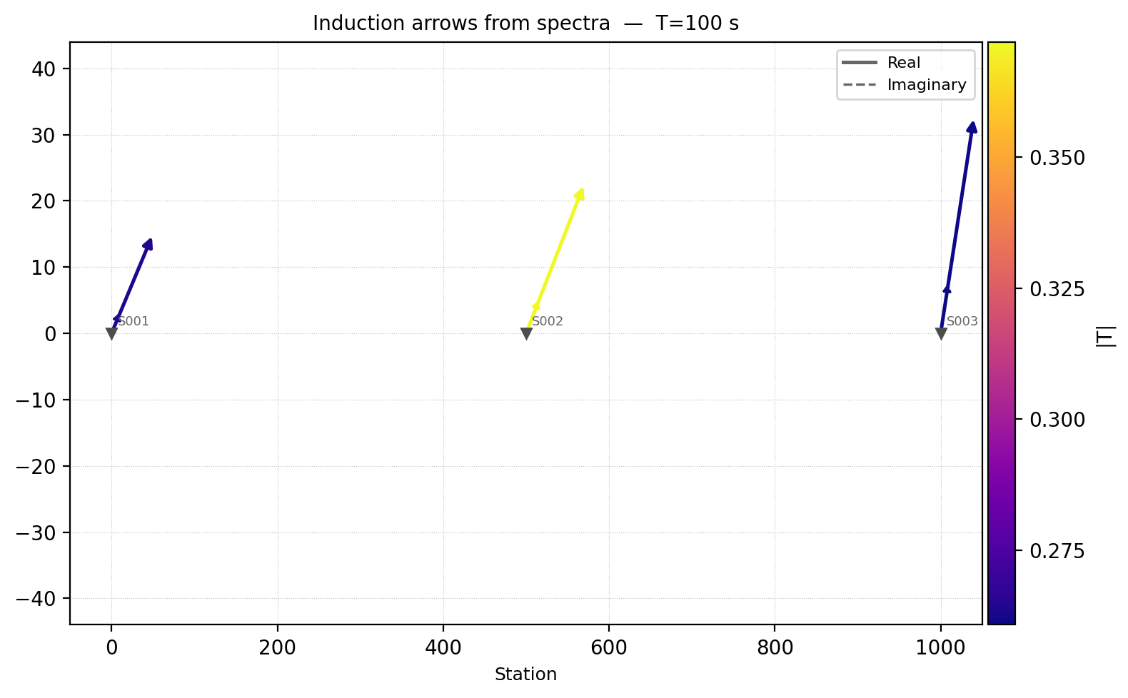
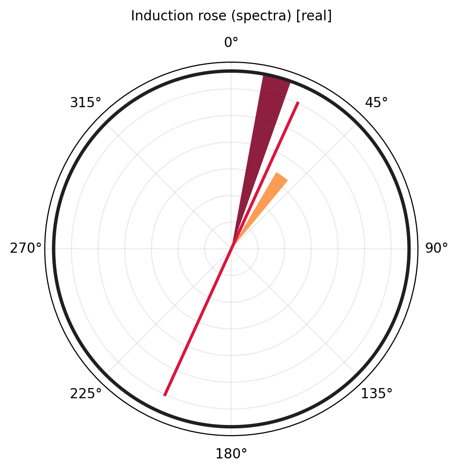
sp1 and sp2 barely overlap in period (0.003-0.58 s), so
0.1 s and the (0.003, 0.6) s rose band were chosen to land inside
both. For spectra maps, coords are plot coordinates (x, y). A
bare Spectra object does not carry reliable map geometry, which is
why this is the one map on this page that still needs an explicit
override.
11.13.13. Recommended Workflow#
A robust tipper interpretation keeps the raw station behavior, the period behavior, and the sign convention visible – each already shown individually above. The dropdown below is that same sequence as one self-contained script, reproducing every figure on this page end to end on KAP03:
View the executed workflow source codeClick to inspect and copy the complete code
 1def run_tf_workflow() -> None:
 2    """Run station, period, and convention diagnostics for KAP03 in the
 3    order recommended on the tf.rst page: hodogram, polar view, map,
 4    convention comparison, short/long-period roses, period section, and
 5    a multi-period map. Each step reproduces one of the figures already
 6    shown individually above; this function is documented here as a
 7    single, self-contained script rather than as a separate set of
 8    figures.
 9    """
10    sites = ensure_sites(KAP03, recursive=True)
11
12    strongest_station = "kap151"
13    periods = [25.0, 650.0, 2000.0, 17000.0]
14
15    plot_tipper_hodograms(
16        sites,
17        station=strongest_station,
18        bands=[(25.0, 200.0), (200.0, 2000.0), (2000.0, 17000.0)],
19    )
20    plt.close()
21
22    plot_tipper_polar(
23        sites,
24        station=strongest_station,
25        component="real",
26    )
27    plt.close()
28
29    plot_induction_map(
30        sites,
31        period=2000.0,
32        convention="park",
33        show_real=True,
34        show_imag=True,
35        scale=4.0,
36    )
37    plt.close()
38
39    plot_induction_convention(
40        sites,
41        period=650.0,
42        station_labels=False,
43    )
44    plt.close()
45
46    plot_induction_rose(
47        sites,
48        component="real",
49        pband=(25.0, 200.0),
50        title="Short-period induction azimuths",
51    )
52    plt.close()
53
54    plot_induction_rose(
55        sites,
56        component="real",
57        pband=(2000.0, 17000.0),
58        title="Long-period induction azimuths",
59    )
60    plt.close()
61
62    plot_induction_section(
63        sites,
64        component="abs",
65        n_periods=30,
66    )
67    plt.close()
68
69    plot_induction_multiperiod_map(
70        sites,
71        periods=periods,
72        convention="park",
73        arrow_scale=6.0,
74        show_background_cbar=False,
75        station_labels=False,
76        xlabel="Longitude",
77        ylabel="Latitude",
78    )
79    plt.close()
This sequence answers the practical questions in order: which station is
strong, whether its response is coherent, where the profile responds,
which convention is being used, whether azimuths tighten with period,
and how the anomaly migrates across period. On this survey it converges
on the same two features found piecemeal above: kap151 is the
station whose hodogram most rewards a closer look, and kap121
through kap148 are the segment of the profile that stays anomalous
across the widest part of the period band.
11.13.14. Common Pitfalls#
Do not use tipper tools on surveys without vertical-field data and then
interpret "no tipper" as a geological result.
Always state the sign convention. Parkinson and Wiese views are rotated relative to each other.
Do not interpret index-based map axes as geographic distance. If EDI
coordinates are missing from both >HEAD and >=DEFINEMEAS, the
plots fall back to station index – and unlike a missing map, this
failure mode still draws something, so check for an exactly flat,
evenly spaced line before trusting a map’s layout.
Do not collapse all periods too early. A strong whole-band station may
be strong only over a narrow period window – or, as with kap148
here, genuinely strong across nearly the entire band, which is itself
worth flagging rather than averaging away.
Do not treat synthetic or placeholder backgrounds as real topography in multi-period maps. Pass a real background raster for publication.
11.13.15. Worked Example#
The gallery example uses the KAP03 MT profile with real tipper data. It moves from station-level hodograms and polar plots to maps, convention comparisons, roses, period sections, and a multi-period publication-style map.
Open the rendered gallery page here: Induction arrows and tipper diagnostics (pycsamt.emtools.tf).