
4.3. Profile Maps And Pseudosections#
Profile maps show apparent resistivity or phase as a
function of station position and period. They are quick-look data
pseudosections, not inversion sections: every panel below is
built from responses derived from the measured impedance tensor,
pivoted onto station–period cells for display, with no forward model or
regularization involved. The renderer does not spatially interpolate
the heatmap cells, so a smooth-looking color transition must not be
mistaken for an inverted resistivity boundary.
pycsamt.map.profile is also what MapView Session’s
MapView.pseudosection and MapView.profile call underneath, and
what pycsamt.map.plot_profile_map() and
pycsamt.map.plot_pseudosection() share: today the two entry
points build the exact same figure, since build_profile_map simply
forwards to build_pseudosection. They are kept as separate named
functions so that a future profile-view (station-versus-quantity,
without the period axis) can diverge without breaking either name.
4.3.1. Function API#
Use pycsamt.map.plot_pseudosection() for one-shot scripts and
notebooks. Rendering options are passed with
pycsamt.map.ProfileMapOptions.
>>> from pycsamt.map import ProfileMapOptions, plot_pseudosection

>>> fig = plot_pseudosection(
...     "data/AMT/WILLY_DATA/L18PLT",
...     options=ProfileMapOptions(
...         quantity="rho",
...         components=("xy", "yx"),
...         period_range=(0.001, 10.0),
...         x_axis="distance",
...     ),
... )
>>> print("panels:", len(fig.data))
panels: 2
>>> print(
...     "x range (km):",
...     round(float(min(fig.data[0].x)), 2),
...     "-",
...     round(float(max(fig.data[0].x)), 2),
... )
x range (km): 0.0 - 2.41
>>> print("period rows:", len(fig.data[0].y))
period rows: 39
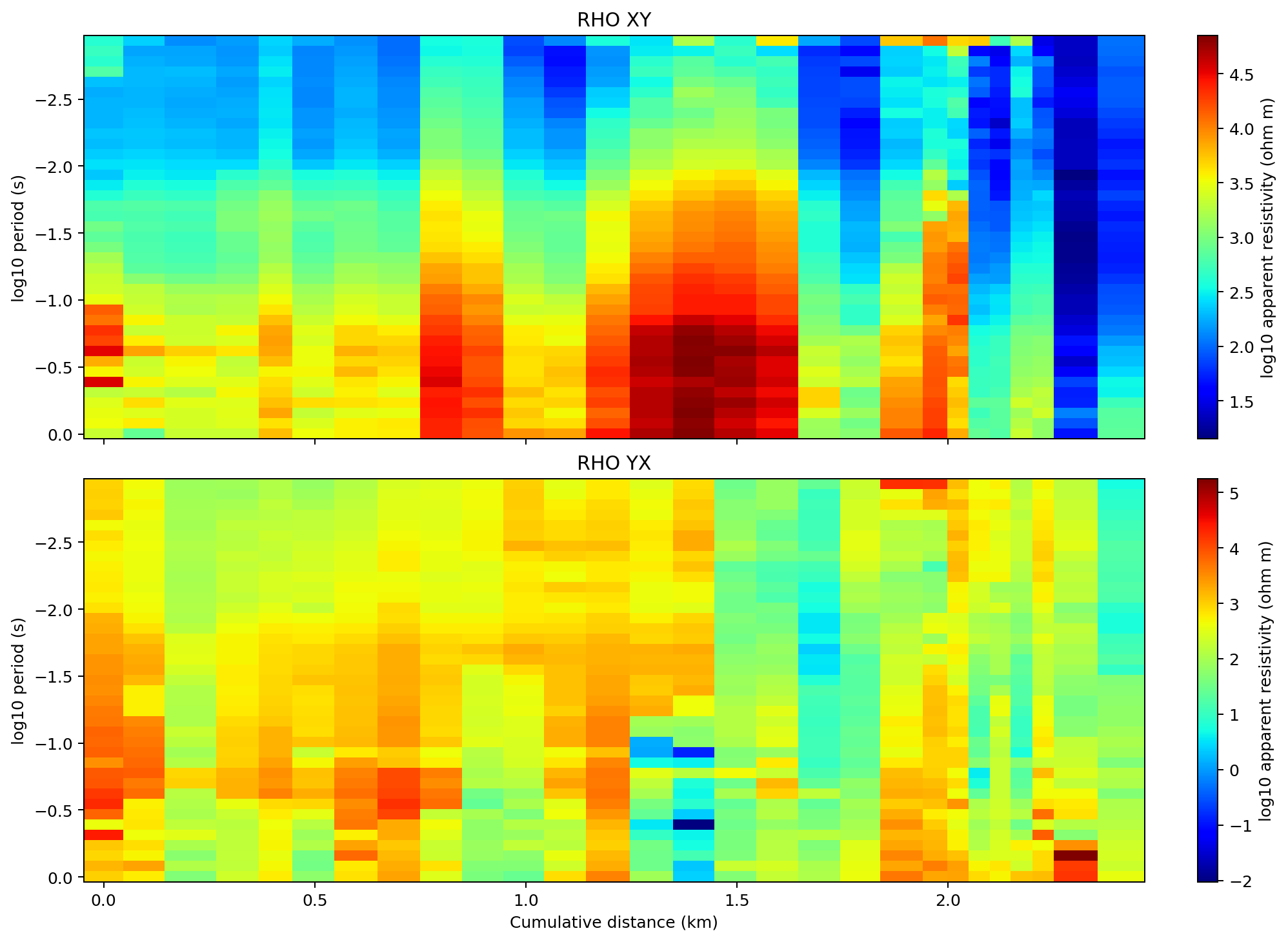
The two off-diagonal apparent-resistivity pseudosections use the same v2.1 chainage order and period window. Coherent colors that persist across adjacent stations identify lateral response trends; isolated cells or abrupt component disagreement should first be checked against data quality and strike orientation rather than interpreted immediately as geology.#
Passing components=("xy", "yx") builds two stacked heatmap panels
– one per component – through the same multi-component path used
whenever more than one component is requested. Because
period_range=(0.001, 10.0) keeps only periods inside that window,
the pseudosection has 39 period rows here instead of every period
present in the raw EDI files. The plotted vertical coordinate is not
depth; for frequency \(f_j\) it is
The axis is reversed so short periods appear at the top. Equation (1) orders the response by scale, but it supplies no one-to-one conversion from period to geological depth.
4.3.2. Builder API#
Use pycsamt.map.ProfileMap when you want an immutable builder
style. with_quantity, with_component, and with_components
return new builders that reuse the same normalized data.
>>> from pycsamt.map import ProfileMap

>>> fig = (
...     ProfileMap("data/AMT/WILLY_DATA/L18PLT")
...     .with_quantity("phase")
...     .with_component("xy")
...     .pseudosection()
... )
>>> print("panels:", len(fig.data))
panels: 1
>>> print("stations:", len(fig.data[0].x))
stations: 28
>>> print("period rows:", len(fig.data[0].y))
period rows: 53
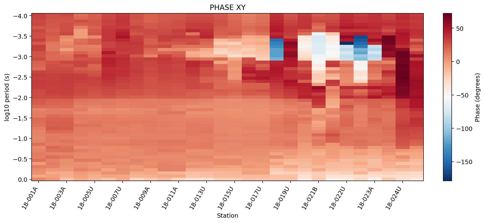
The phase panel retains all 53 recorded period rows. Broad, laterally persistent bands are more defensible than single-station extremes, although even coherent phase structure remains a measured response pattern rather than a depth-calibrated interface.#
with_component("xy") sets both component and components to
a single-element tuple, so this always renders one panel – unlike
passing components= directly to pycsamt.map.ProfileMapOptions,
where the plural field is what decides single- versus multi-panel
rendering (see Options Reference below). .figure()
is available on the same builder for a profile-view figure, which
today renders identically to .pseudosection().
4.3.3. Quantities And Components#
quantity accepts "rho" / "resistivity" and "phase" /
"phi". Components use the shared component parser: xx, xy,
yx, yy read one impedance tensor element directly, and
two derived modes combine the off-diagonal (geoelectric-strike-facing)
elements \(Z_{xy}\) and \(Z_{yx}\):
avgThe arithmetic mean of the two off-diagonal values, for both quantities: \(\bar\rho=(\rho_{xy}+\rho_{yx})/2\) and \(\bar\varphi=(\varphi_{xy}+\varphi_{yx})/2\).
detA determinant response-style summary. For phase it is identical to
avg. For resistivity it is the geometric mean, which is closer in spirit to a rotation-robust determinant response than a plain average, without evaluating the full complex \(\det(\mathbf{Z})\).
For a station–period cell, the implemented summaries are
The name det in (2) therefore
describes this package-specific derived summary. It should not be
reported as the complex tensor determinant
\(Z_{xx}Z_{yy}-Z_{xy}Z_{yx}\).
The difference is visible directly on L18PLT, comparing the median
value each mode produces over the same stations and periods:
>>> import numpy as np

>>> from pycsamt.map import ProfileMapOptions, plot_pseudosection

>>> for comp in ("xy", "yx", "det", "avg"):
...     fig = plot_pseudosection(
...         "data/AMT/WILLY_DATA/L18PLT",
...         options=ProfileMapOptions(
...             component=comp, components=(comp,), log_rho=False
...         ),
...     )
...     z = np.asarray(fig.data[0].z, dtype=float)
...     print(f"{comp}: median rho = {np.nanmedian(z):.1f} ohm.m")
xy: median rho = 435.8 ohm.m
yx: median rho = 225.6 ohm.m
det: median rho = 317.9 ohm.m
avg: median rho = 440.2 ohm.m
det (317.9) sits close to \(\sqrt{435.8\times225.6}\approx313.6\)
– the small gap is expected, since the code takes the median of the
per-period geometric means rather than the geometric mean of the two
medians. avg (440.2) is pulled toward the larger xy value
instead, as an arithmetic mean would. Repeating the loop for phase
shows the det and avg equivalence directly:
>>> for comp in ("xy", "yx", "det", "avg"):
...     fig = plot_pseudosection(
...         "data/AMT/WILLY_DATA/L18PLT",
...         options=ProfileMapOptions(
...             quantity="phase", component=comp, components=(comp,)
...         ),
...     )
...     z = np.asarray(fig.data[0].z, dtype=float)
...     print(f"{comp}: median phase = {np.nanmedian(z):.1f} deg")
xy: median phase = 13.6 deg
yx: median phase = -153.4 deg
det: median phase = -64.5 deg
avg: median phase = -64.5 deg
4.3.4. Axes#
x_axis="station"Use station IDs, in loaded order, along the horizontal axis.
x_axis="distance"Use cumulative station distance in kilometres instead, so unevenly spaced stations are positioned proportionally rather than at equal ticks.
>>> from pycsamt.map import ProfileMapOptions, plot_pseudosection

>>> fig_station = plot_pseudosection(
...     "data/AMT/WILLY_DATA/L18PLT",
...     options=ProfileMapOptions(
...         component="xy", components=("xy",), x_axis="station"
...     ),
... )
>>> fig_distance = plot_pseudosection(
...     "data/AMT/WILLY_DATA/L18PLT",
...     options=ProfileMapOptions(
...         component="xy", components=("xy",), x_axis="distance"
...     ),
... )
>>> print("station x (first 5):", list(fig_station.data[0].x[:5]))
station x (first 5): ['18-001A', '18-002U', '18-003A', '18-004A', '18-005U']
>>> print(
...     "distance x km (first 5):",
...     [round(v, 3) for v in fig_distance.data[0].x[:5]],
... )
distance x km (first 5): [0.0, 0.092, 0.198, 0.336, 0.398]
The uneven gaps between 0.0, 0.092, 0.198, … already show
that 18-003A and 18-004A are farther apart than
18-001A/18-002U, information a plain station-index axis
discards. If any station in the survey is missing a finite coordinate,
station distance falls back to station order instead of
raising, so a distance axis degrades gracefully rather than silently
lying about spacing.
With v2.1, ensure_sites first applies its validated automatic
ordering. The L18 coordinates pass the straight-profile checks, so
chainage order is used before cumulative distance is evaluated. For
successive finite longitude/latitude pairs, the map helper uses the
local kilometre approximation
where angles are expressed in degrees and \(d_i\) is in kilometres. This approximation is appropriate for a compact survey line; it is not a replacement for geodesic distance across regional or global extents.
4.3.5. By-Line Grids#
A survey normalized from several profile lines – for
example every WILLY_DATA folder together, loaded with
pycsamt.map.load_lines() as in Loading Map Data – has stations
from every line. By default they are concatenated onto one x-axis,
which reads as a single continuous section even though the lines are
unrelated traverses. Set by_line=True to render one panel per line
instead, arranged in a grid with line_cols columns (3 by default)
and one shared color scale so panels stay comparable to each other:
>>> from pycsamt.map import ProfileMapOptions, load_lines, plot_pseudosection

>>> data = load_lines("data/AMT/WILLY_DATA", detect="folder")
>>> print("lines:", data.lines)
lines: ('L18PLT', 'L22PLT', 'L26PLT', 'L30PLT', 'L34PLT')

>>> fig = plot_pseudosection(
...     data,
...     options=ProfileMapOptions(
...         component="xy", by_line=True, line_cols=3
...     ),
... )
>>> print("panels:", len(fig.data))
panels: 5
>>> print("titles:", [a.text for a in fig.layout.annotations])
titles: ['L18PLT', 'L22PLT', 'L26PLT', 'L30PLT', 'L34PLT']
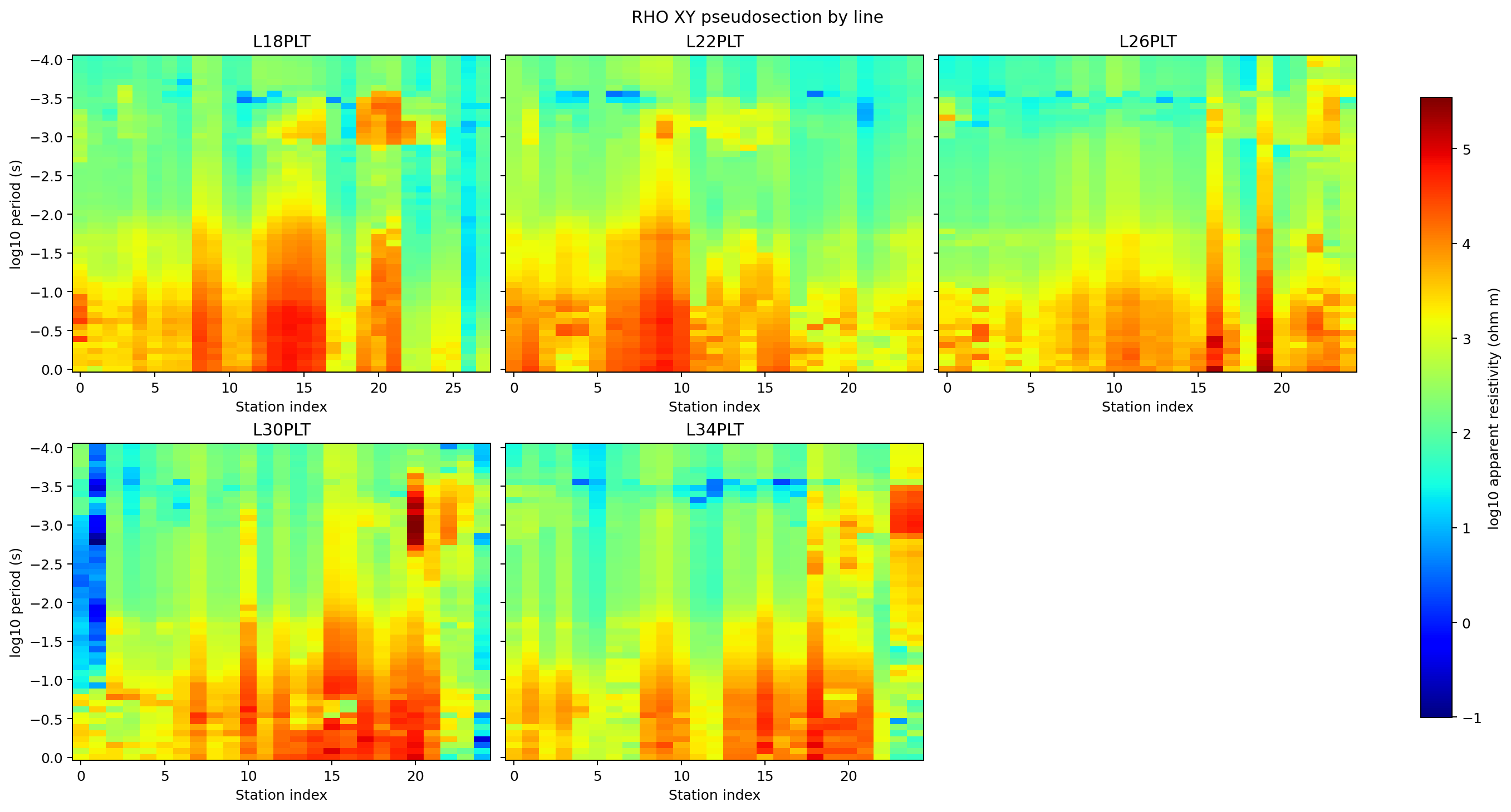
Each line retains its own station axis while all five panels share one resistivity scale. A color that recurs at similar periods on several lines can motivate a cross-line comparison, but differing station spacing and orientation still prevent these panels from constituting a 3-D volume.#
by_line only has line names to split on when the input MapData
actually carries them. Passing a bare parent folder such as
"data/AMT/WILLY_DATA" straight to pycsamt.map.plot_pseudosection()
does not rediscover per-folder lines the way
pycsamt.map.load_lines() does – every station collapses onto one
generic line named "line", and by_line quietly falls back to a
single panel. Load with detect="folder" (or supply a line_map)
first, then pass the resulting pycsamt.map.MapData through, as
above. The same option works with backend="matplotlib" for static
report figures:
>>> mpl_fig = plot_pseudosection(
...     data,
...     options=ProfileMapOptions(
...         component="xy",
...         by_line=True,
...         line_cols=3,
...         backend="matplotlib",
...     ),
... )
>>> type(mpl_fig).__name__
'Figure'
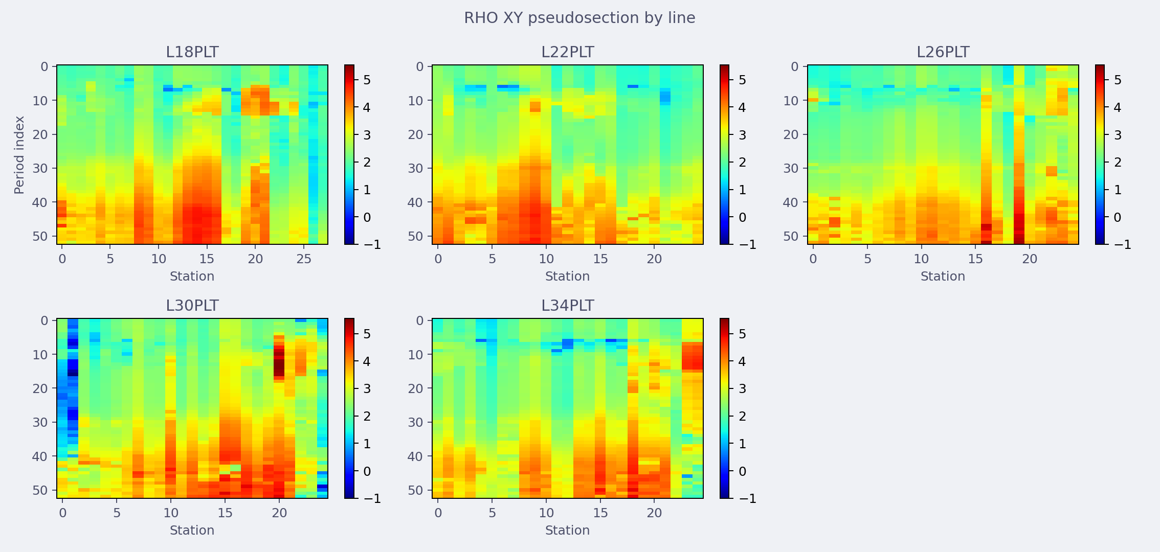
The Matplotlib backend renders the same v2.1-normalized five-line comparison for static reports. Blank grid space is layout padding, not missing survey data.#
4.3.6. Filtering And Value Ranges#
period_range, phase_range, and value_range filter the
long-form table before it is pivoted into a grid, so they change how
much data reaches the figure rather than just how it is colored.
period_range keeps rows whose period falls inside the window;
phase_range additionally restricts phase rows by value when
quantity="phase"; value_range restricts rows by value for any
quantity and also becomes the heatmap’s zmin/zmax (converted to
\(\log_{10}\) first when log_rho=True).
>>> from pycsamt.map import ProfileMapOptions, plot_pseudosection

>>> one_component = ProfileMapOptions(component="xy", components=("xy",))
>>> fig_all = plot_pseudosection(
...     "data/AMT/WILLY_DATA/L18PLT", options=one_component
... )
>>> fig_period = plot_pseudosection(
...     "data/AMT/WILLY_DATA/L18PLT",
...     options=ProfileMapOptions(
...         component="xy",
...         components=("xy",),
...         period_range=(0.001, 1.0),
...     ),
... )
>>> fig_value = plot_pseudosection(
...     "data/AMT/WILLY_DATA/L18PLT",
...     options=ProfileMapOptions(
...         component="xy",
...         components=("xy",),
...         value_range=(10.0, 5000.0),
...         log_rho=False,
...     ),
... )
>>> print("unfiltered period rows:", len(fig_all.data[0].y))
unfiltered period rows: 53
>>> print("period_range=(0.001, 1.0) rows:", len(fig_period.data[0].y))
period_range=(0.001, 1.0) rows: 39
>>> print(
...     "value_range colorbar zmin/zmax:",
...     fig_value.data[0].zmin,
...     fig_value.data[0].zmax,
... )
value_range colorbar zmin/zmax: 10.0 5000.0
With log_rho=True (the default), passing value_range=(10.0,
5000.0) would instead report zmin/zmax as
\(\log_{10}10=1.0\) and \(\log_{10}5000\approx3.7\), since the
range is converted to match the log-scaled color data.
4.3.7. Backends#
plotly is the interactive default and produces the heatmaps shown
above. matplotlib produces static figures for reports and batch
processing, using imshow per panel with a shared color range in
both the multi-component and by-line grid layouts. Unknown backends
raise ValueError rather than silently falling back (see
Troubleshooting). Both backends honor theme ("light",
"dark", "publication") through the same color palette used
across pycsamt.map.
4.3.8. Options Reference#
pycsamt.map.ProfileMapOptions stores every profile/pseudosection
control:
quantity"rho"/"resistivity"or"phase"/"phi". Defaults to"rho".componentThe single component used by
by_line=Trueand by the builder’swith_component. Defaults to"xy".componentsThe tuple of components rendered when
by_lineis not set. This is the field that decides single- versus multi-panel rendering –len(options.components) > 1triggers the stacked multi-component layout regardless of whatcomponent(singular) is set to. Defaults to("xy", "yx"), so a bareProfileMapOptions(component="xy")still renders bothxyandyxpanels unlesscomponents=("xy",)is set too – exactly whatwith_componentdoes for you on the builder API.theme"light","dark", or"publication".backend"plotly"or"matplotlib".period_range,phase_range,value_rangeOptional
(min, max)filters; see Filtering And Value Ranges.x_axis"station"or"distance"; see Axes.log_rhoWhether resistivity is color-scaled in \(\log_{10}\). Defaults to
True.height_per_panelPixel height budget per row for the Plotly multi-component and by-line grid layouts. Defaults to
260.cmapOptional color map override. Defaults to Jet for resistivity and RdBu_r for phase.
by_line,line_colsSee By-Line Grids.
show_errbarAccepted for forward compatibility but not yet wired into any renderer – setting it currently has no visible effect. Pseudosection panels are heatmaps, not point/line plots, so a per-station error bar does not have an obvious meaning on this view yet; treat it as reserved.
4.3.9. Troubleshooting#
- Two
xy/yxpanels appear even though I only wanted one component components(plural), notcomponent, controls panel count. Passcomponents=("xy",)explicitly, or use the builder’swith_component/with_components.- Empty figure with “No profile data available”
Every row was filtered out, usually by
period_range,phase_range, orvalue_rangeexcluding all the data, or the source has no readable impedance tensor for the requested component.by_line=Truestill renders one merged panelThe input has no real per-station line assignment. Load with
pycsamt.map.load_lines()(detect="folder"or an explicit mapping) before callingplot_pseudosection, as shown in By-Line Grids, instead of pointing straight at a multi-line parent folder.ValueError: Unknown profile backend: ...backendmust be"plotly"or"matplotlib".- Distance axis looks identical to station order
Some station is missing a finite latitude/longitude, so station distance fell back to plain station index. Check
data.has_geo(see Loading Map Data) before relying onx_axis="distance".- Colors have gaps or look washed out
With
log_rho=True, non-positive resistivity values becomeNaNbefore coloring, which shows as a gap rather than an error. Setlog_rho=Falseif the source can contain non-positive values you still want visible.