
11.24. Multi-Station Diagnostic Panels#
pycsamt.emtools.plot is the multi-station plotting layer for
impedance tensor and tipper response diagnostics. It is
the place to go when one station at a time is too narrow, but a map or
pseudo-section is too compressed. Its sibling module,
pycsamt.emtools.overview, covers the opposite case – one station,
every diagnostic at once – and is documented on this page too, since
both re-export through the same top-level pycsamt.emtools namespace
and cover the same site-level visualisation job.
The page covers six common plotting jobs:
compact apparent resistivity and phase panels for many stations;
raw full-tensor station groups;
response plus tipper quality control panels;
before/after comparison figures;
measured-versus-predicted fit grids with per-component RMS misfit labels;
a single-station “full response” overview combining impedance, induction arrows, and phase tensor ellipses in one figure.
Full callable signatures live in the API reference. This page explains when to use each figure, which arguments matter, and how to build reproducible plotting scripts.
11.24.1. Where This Module Fits#
Use pycsamt.emtools.plot after loading and inspecting data. It does
not replace the first-look inventory tools in inspect or the
specialized tensor/impedance diagnostics. Instead, it gives dense
station-group figures for QC, comparison, and reporting.
Function |
Best Use |
Figure Shape |
|---|---|---|
|
Quick rho/phase panels for selected stations. |
One station per small two-row group. |
|
Full-tensor raw-data review. |
One station group, one column per component. |
|
Joint impedance and tipper QC. |
Rho/phase rows plus Tx/Ty rows. |
|
Raw vs processed or before vs after. |
Paired columns per station. |
|
Observed vs predicted inversion-response review. |
Component columns with RMS labels. |
|
One station, every diagnostic at once. |
Rho/phase columns plus induction-arrow and phase-tensor-ellipse rows. |
All functions accept a path, Sites object, collection, or compatible
iterable. Internally they normalize inputs with ensure_sites unless
a function has a special duplicate-preservation mode.
11.24.2. Load Once, Plot Many#
Normalize a survey once and pass the resulting object into every plot
that follows; this keeps scripts fast and puts loading failures in one
obvious place rather than scattered across each figure call.
sites_summary is a cheap way to confirm what actually loaded before
spending time on figures – here it doubles as evidence for a claim made
throughout this page: L18PLT (an AMT line) carries no
tipper, while KAP03 (an MT line, loaded alongside
it) does.
>>> from pathlib import Path
>>> from pycsamt.emtools import ensure_sites, sites_summary
>>> survey = ensure_sites(
...     Path("data/AMT/WILLY_DATA/L18PLT"),
...     recursive=True,
...     on_dup="replace",
...     strict=True,
...     verbose=1,
... )
>>> kap = ensure_sites("data/MT/kap03lmt_edis", strict=True)
>>> stations = ["18-001A", "18-007U", "18-016A", "18-018A"]
>>> summary = sites_summary(survey)
>>> print(len(summary), "stations,", "tipper present:", bool(summary["has_tipper"].any()))
28 stations, tipper present: False
>>> summary.head(3)
   station  n_freq  has_tipper  period_min  period_max        lat         lon
0  18-001A      53       False    0.000096    0.992063  32.120300  119.128833
1  18-002U      53       False    0.000096    0.992063  32.121133  119.128900
2  18-003A      53       False    0.000096    0.992063  32.122083  119.128850
Use a short station list for most figures. The functions can plot many stations, but readability falls quickly once every panel carries multiple components and legends.
11.24.3. Quick Station Panels#
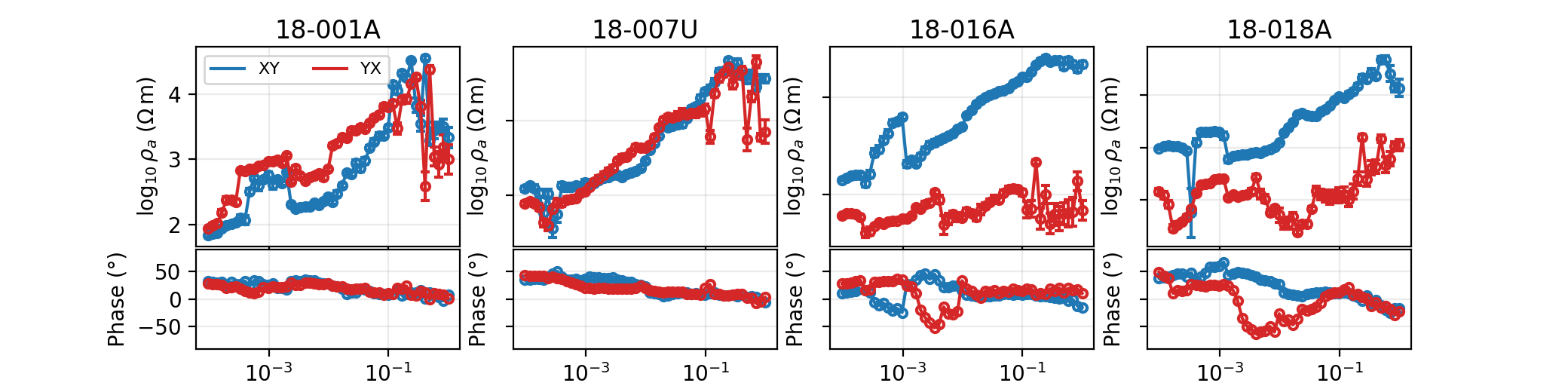
plot_sites_panels is the simplest overview. Each station gets two
stacked panels: apparent resistivity or impedance magnitude on
top, phase below. The default components are "xy" and
"yx" – the off-diagonal component pair that normally
carries the primary TE mode/TM mode information for a
1-D or 2-D earth. Apparent resistivity itself is the standard
half-space-equivalent quantity,
with \(Z\) in field units and \(f\) in hertz; every rho panel on this page plots \(\log_{10}\rho_a\) against period or frequency.
>>> import matplotlib.pyplot as plt
>>> from pycsamt.emtools import plot_sites_panels
>>> fig = plot_sites_panels(
...     survey,
...     stations=["18-001A", "18-007U", "18-016A", "18-018A"],
...     components=("xy", "yx"),
...     quantity="rhoa",
...     x_axis="period",
...     ncols=4,
...     show_error_bars=True,
...     show_legend=True,
... )
>>> [fig.axes[i].get_title() for i in range(0, 8, 2)]
['18-001A', '18-007U', '18-016A', '18-018A']
>>> fig.savefig("l18plt_station_panels.png", dpi=200)
>>> plt.close(fig)
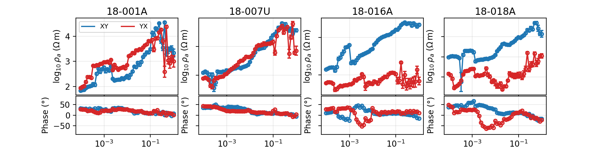
Four stations fill the requested four-column grid exactly, one rho/phase
pair of axes each, and fig.axes[0::2] (the top, rho, axis of each
pair) carries the station name as its title – confirmed above rather
than assumed. Use this figure when you want a quick visual sweep of
several stations, not a full tensor or tipper review; for those, reach
for plot_raw_sites_1d or plot_response_tipper instead.
11.24.4. Choose Rho Or Impedance Magnitude#
Most field reports use apparent resistivity, but sometimes you need to
inspect the impedance tensor directly. Set
quantity="impedance" to plot \(\log_{10}|Z|\) instead of
\(\log_{10}\rho_a\) – useful for tensor debugging, instrument
checks, or comparison with diagnostics that work in \(Z\)-space
rather than resistivity-space.
>>> fig = plot_sites_panels(
...     "data/AMT/WILLY_DATA/L18PLT",
...     stations=["18-001A", "18-016A"],
...     components=("xx", "xy", "yx", "yy"),
...     quantity="impedance",
...     phase_range=(-180.0, 180.0),
...     ncols=2,
...     show_legend=True,
... )
>>> fig.axes[0].get_ylabel()
'$\\log_{10}|Z|$'
>>> fig.savefig("impedance_magnitude_panels.png", dpi=200)
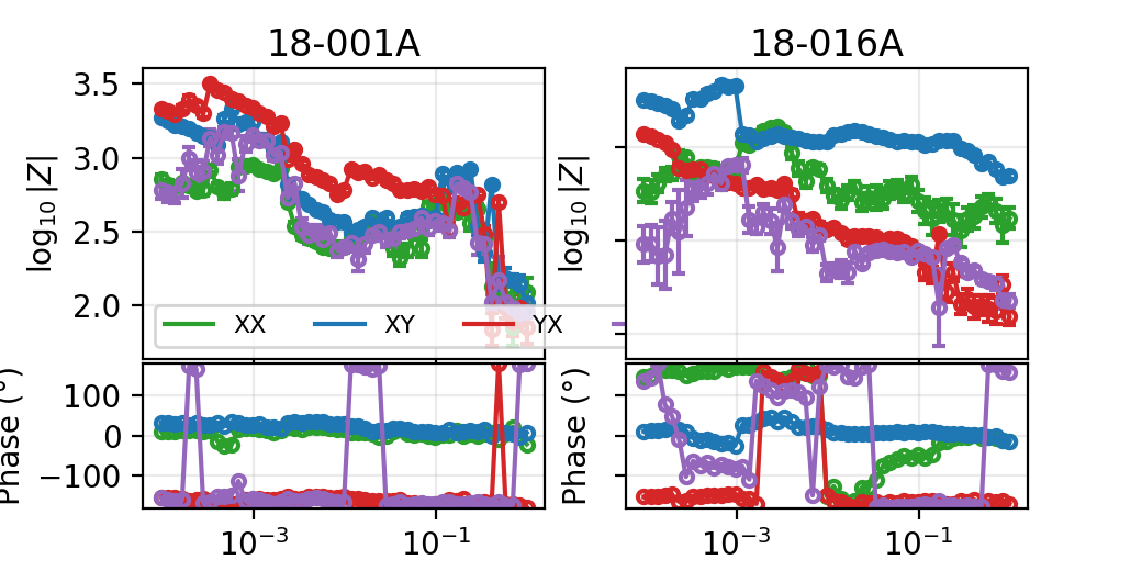
The y-axis label switches automatically with quantity, so a reader
can tell which space a saved figure used without checking the call that
produced it. Keep quantity="rhoa" for ordinary geophysical response
plots and switch to "impedance" only when the tensor itself, not its
resistivity-equivalent, is the object under review.
11.24.5. Phase Range And X Axis#
The high-level panel function exposes x_axis and phase_range
directly rather than requiring you to unwrap phase or convert period to
frequency by hand.
>>> fig = plot_sites_panels(
...     "data/AMT/WILLY_DATA/L18PLT",
...     stations=["18-001A", "18-007U"],
...     components=("xy", "yx"),
...     x_axis="frequency",
...     phase_range=(0.0, 360.0),
...     ylim_phase=(0.0, 360.0),
...     ncols=2,
... )
>>> fig.axes[1].get_ylim()
(0.0, 360.0)
>>> fig.savefig("frequency_axis_phase_0_360.png", dpi=200)
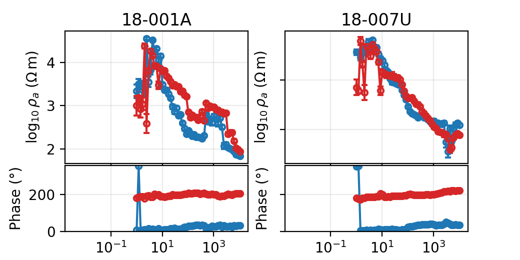
The phase axis limits read back exactly as requested, confirming
ylim_phase overrides the wrapping range rather than merely
suggesting it. Use phase_range=None to show raw, unwrapped phase.
Use an explicit range whenever several stations must share one display
convention for comparison.
11.24.6. Raw Full-Tensor Panels#
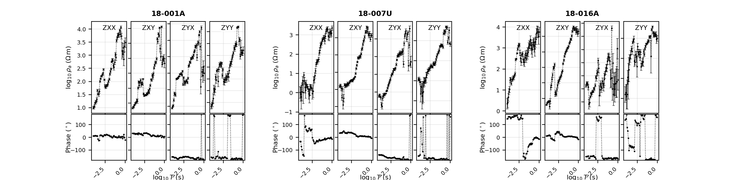
plot_raw_sites_1d is built for raw or nearly raw response review.
Each station is a group, each selected component is a column, and each
component column stacks apparent resistivity above phase.
>>> from pycsamt.emtools import plot_raw_sites_1d
>>> fig = plot_raw_sites_1d(
...     survey,
...     stations=["18-001A", "18-007U", "18-016A"],
...     components=("xx", "xy", "yx", "yy"),
...     raw=True,
...     force_style=False,
...     ncols_groups=3,
...     show_error_bars=True,
...     show_component_legend=True,
... )
>>> len(fig.axes)
24
>>> fig.savefig("raw_full_tensor_panels.png", dpi=200)
>>> plt.close(fig)
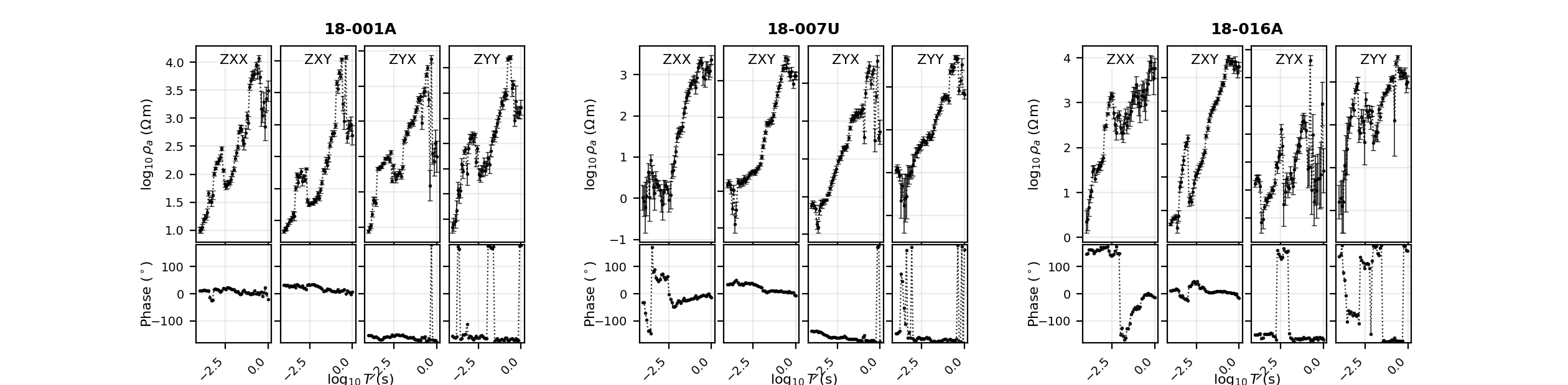
Three stations times four components times two rows (rho, phase) is the
24 axes reported above. With raw=True the function uses the
package’s plain diagnostic style – black by default – so nothing about
the display implies interpretation before you have even looked at it.
11.24.7. Force Component Colours#
After the raw diagnostic pass, set force_style=True (with
raw=True left on) to restore the usual per-component colours while
keeping the identical layout.
>>> fig = plot_raw_sites_1d(
...     "data/AMT/WILLY_DATA/L18PLT",
...     stations=["18-001A", "18-007U", "18-016A"],
...     components=("xy", "yx"),
...     raw=True,
...     force_style=True,
...     ncols_groups=3,
... )
>>> fig.savefig("raw_panels_component_colours.png", dpi=200)
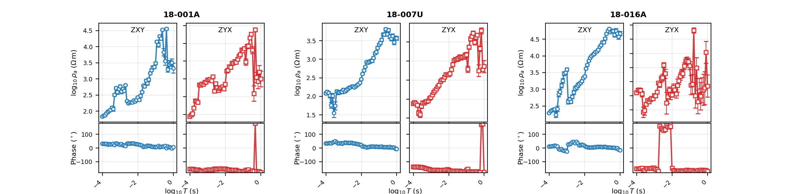
This makes a good second view: look for obvious raw-data problems in plain black first, then re-render with component colours once you want to compare TE mode/TM mode behaviour at a glance.
11.24.8. Shared Labels Or Axis Labels#
plot_raw_sites_1d can lay out its station and axis labels two ways.
label_mode="shared" draws the station name and axis labels once per
group, as fig.text calls that float above and beside the whole
group; label_mode="axis" instead sets each panel’s own
Axes.set_ylabel and leaves no group-level figure text at all. The
difference is visible directly in the object graph, not just the
rendered figure:
>>> fig_shared = plot_raw_sites_1d(
...     "data/AMT/WILLY_DATA/L18PLT",
...     stations=["18-001A"],
...     components=("xx", "xy", "yx", "yy"),
...     label_mode="shared",
...     show_component_legend=False,
...     ncols_groups=1,
...     figsize_scale=(8.0, 4.0),
... )
>>> fig_shared.subplots_adjust(left=0.20)
>>> sorted(t.get_text() for t in fig_shared.texts)
['$\\log_{10}T$ (s)', '$\\log_{10}\\rho_a$ ($\\Omega\\,\\mathrm{m}$)', '18-001A', 'Phase ($^\\circ$)']
>>> fig_shared.savefig("raw_shared_labels.png", dpi=200)

>>> fig_axis = plot_raw_sites_1d(
...     "data/AMT/WILLY_DATA/L18PLT",
...     stations=["18-001A"],
...     components=("xx", "xy"),
...     label_mode="axis",
...     show_component_legend=False,
...     ncols_groups=1,
...     figsize_scale=(6.0, 4.0),
... )
>>> [t.get_text() for t in fig_axis.texts]
[]
>>> [ax.get_ylabel() for ax in fig_axis.axes if ax.get_ylabel()]
['$\\log_{10}\\rho_a$ ($\\Omega\\,\\mathrm{m}$)', 'Phase ($^\\circ$)']
>>> fig_axis.savefig("raw_axis_labels.png", dpi=200)
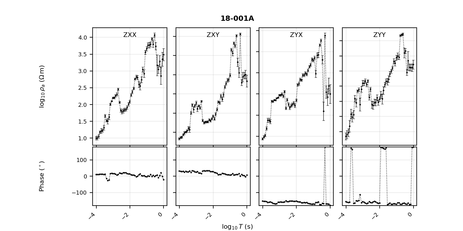
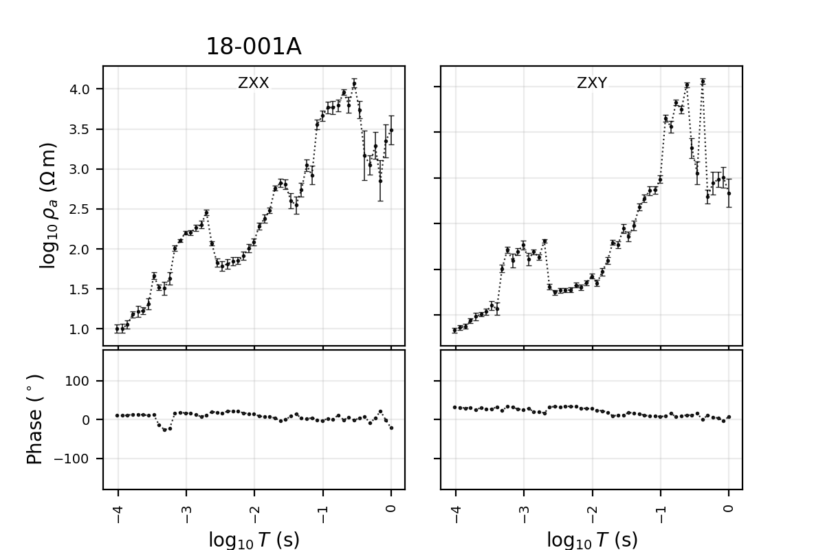
fig_shared.texts carries four entries – the station name plus rho,
phase, and period-axis labels – while fig_axis.texts is empty
because the same information lives on the axes themselves instead.
label_mode="shared" is the more compact choice for dense reports;
label_mode="axis" is sometimes easier while debugging a single
group, since every label belongs to a concrete Axes you can query or
move independently.
11.24.9. Use Display Control#
plot_raw_sites_1d and plot_response_tipper read display policy
from PYCSAMT_CONTROL unless you pass a specific control object. This
is how one script changes x-axis convention, phase wrapping, and rho
display consistently across every figure it produces.
>>> from pycsamt.api.control import PYCSAMT_CONTROL
>>> with PYCSAMT_CONTROL.context(
...     x__view="frequency",
...     rho__view="linear",
...     phase__range=(0.0, 360.0),
... ):
...     fig = plot_raw_sites_1d(
...         "data/AMT/WILLY_DATA/L18PLT",
...         stations=["18-001A"],
...         components=("xy", "yx"),
...         label_mode="axis",
...         force_style=True,
...         show_component_legend=False,
...         ncols_groups=1,
...         figsize_scale=(6.0, 4.0),
...     )
...
>>> fig.axes[0].get_ylabel()
'$\\rho_a$ ($\\Omega\\,\\mathrm{m}$)'
>>> fig.axes[2].get_ylim()
(0.0, 360.0)
>>> fig.savefig("raw_panels_frequency_linear_rho.png", dpi=200)
>>> plt.close(fig)
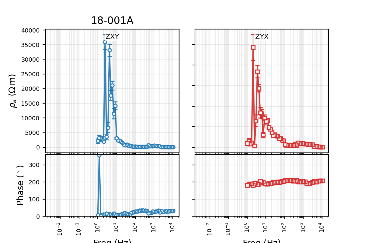
The rho label switches from $\log_{10}\rho_a$ to a plain linear
$\rho_a$, and the phase axis limits read back exactly (0.0,
360.0) – both driven entirely by the active control, with no other
argument touched. Use this pattern whenever one report needs a
consistent, non-default display style; it is more reliable than editing
labels or axis limits after the fact on each figure separately.
11.24.10. Response Plus Tipper#
plot_response_tipper adds tipper rows to the impedance
response layout. It needs a survey that actually carries vertical-field
data, so this and the next example switch to KAP03
(data/MT/kap03lmt_edis) – confirmed below to carry tipper on every
station, unlike L18PLT.
>>> from pycsamt.emtools import plot_response_tipper
>>> kap_summary = sites_summary(kap)
>>> bool(kap_summary["has_tipper"].all())
True
>>> fig = plot_response_tipper(
...     kap,
...     stations=["kap103", "kap142", "kap151"],
...     components=("xy", "yx"),
...     tipper_components=("tx", "ty"),
...     tipper_span_group=True,
...     ylim_tipper=(-2.5, 2.5),
...     ncols_groups=3,
... )
>>> fig.savefig("kap03_response_tipper.png", dpi=200)
>>> plt.close(fig)
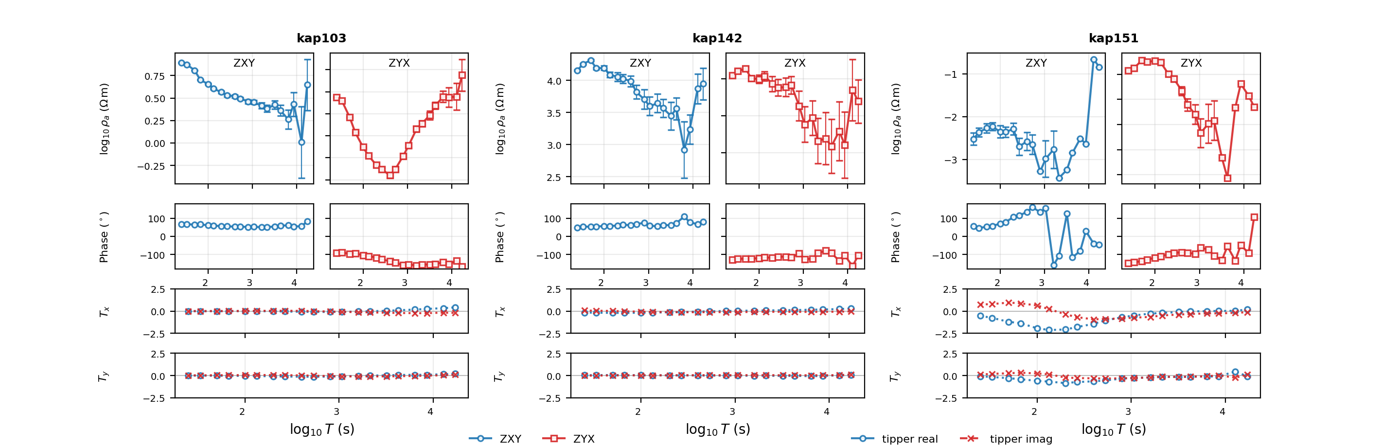
With tipper_span_group=True each tipper row spans the whole station
group, which usually reads best when there are only two impedance
components and tipper should register as a station-level property
rather than a per-component one. Running this same function against an
AMT/CSAMT line with no tipper would still render – it would just have
nothing meaningful to draw in the \(T_x\)/\(T_y\) rows, which is
why the has_tipper check above matters before you invest in the
figure.
11.24.11. Compact Tipper Rows#
Set tipper_span_group=False for a compact, repeated layout where the
tipper rows sit directly under each component column instead of
spanning the group.
>>> fig = plot_response_tipper(
...     "data/MT/kap03lmt_edis",
...     stations=["kap151"],
...     components=("xx", "xy", "yx", "yy"),
...     tipper_components=("tx", "ty"),
...     tipper_span_group=False,
...     show_tipper_error_bars=False,
...     show_component_legend=False,
...     ncols_groups=1,
...     figsize_scale=(7.2, 5.6),
...     shared_x_label_pad=0.11,
... )
>>> fig.savefig("kap151_response_tipper_compact.png", dpi=200, bbox_inches="tight")

Use the compact layout for one or two stations where every tensor component matters. Use the spanning layout from the previous section when comparing several stations and fewer, larger axes read better than many small ones.
11.24.12. Before And After Comparison#
plot_sites_compare pairs stations from two datasets column by
column. The usual use is raw versus processed, before versus after a
static shift correction, or original versus smoothed. There is
no real post-processing run bundled with these docs, so a light
frequency-domain moving average stands in honestly for “after”: real
numbers from a real, if simple, transform rather than anything
fabricated.
>>> from pycsamt.emtools import plot_sites_compare, smooth_mavg
>>> raw = survey
>>> smoothed = smooth_mavg(raw, k=5)
>>> fig = plot_sites_compare(
...     raw,
...     smoothed,
...     stations=["18-001A", "18-007U", "18-016A"],
...     components=("xy", "yx"),
...     labels=("raw", "smoothed k=5"),
...     quantity="rhoa",
...     x_axis="period",
...     ncols_groups=3,
...     show_legend=True,
... )
>>> [ax.get_title() for ax in fig.axes if ax.get_title()]
['18-001A', '18-007U', '18-016A']
>>> fig.savefig("raw_vs_smoothed_compare.png", dpi=200)
>>> plt.close(fig)

The title lives once per station group, spanning the raw/after column pair, which is exactly the three stations requested above. The function pairs stations by name; if the second dataset were missing a station, the corresponding after-column would simply come back blank rather than raising an error.
11.24.13. Compare Impedance Instead Of Rho#
The comparison view also accepts quantity="impedance". This matters
whenever a processing step changes the complex impedance tensor
directly and you want to see that change without it being partly hidden
behind the apparent-resistivity conversion.
>>> processed = smooth_mavg(raw, k=3)
>>> fig = plot_sites_compare(
...     raw,
...     processed,
...     stations=["18-001A", "18-016A"],
...     components=("xx", "xy", "yx", "yy"),
...     quantity="impedance",
...     phase_range=(-180.0, 180.0),
...     labels=("raw", "processed"),
...     ncols_groups=2,
... )
>>> fig.savefig("impedance_before_after.png", dpi=200)
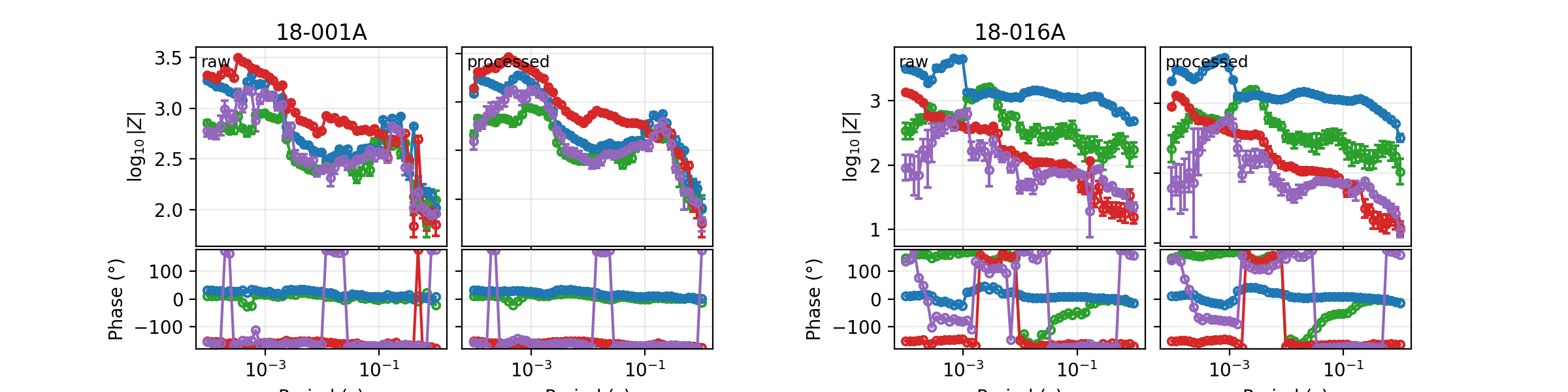
Use fixed ylim_rhoa/ylim_phase whenever a before/after
comparison needs the same visual scale across several separately saved
figures – otherwise auto-scaling can make two genuinely similar curves
look artificially different, or vice versa.
11.24.14. Measured Versus Predicted Fit Grid#
plot_sites_fit_grid is built for inversion QC: it pairs measured and
predicted stations by name, aligns predicted values onto the measured
frequency grid, plots both curves, and annotates each component panel
with its own RMS misfit. Writing the per-datum log-space
residual as \(r_i = \log_{10}\rho_a^{\mathrm{meas}} -
\log_{10}\rho_a^{\mathrm{pred}}\) (or the equivalent in
\(\log_{10}|Z|\) when quantity="impedance") and its display-space
error as \(\sigma_i\), the annotated value is
when errors are available, falling back to the unweighted root-mean square of \(r_i\) when they are not. This is the same error-normalized misfit used throughout pyCSAMT’s inversion tooling: a value near 1 means the fit is consistent with the assigned uncertainty, while a much larger value means the “prediction” departs from the data by more than its own error bars would allow.
>>> from pycsamt.emtools import plot_sites_fit_grid
>>> measured = survey
>>> predicted = smooth_mavg(measured, k=5)
>>> fig = plot_sites_fit_grid(
...     measured,
...     predicted,
...     stations=["18-001A", "18-016A"],
...     components=("xy", "yx"),
...     quantity="rhoa",
...     phase_range=(-180.0, 180.0),
...     ncols_groups=2,
...     show_mode_legend=True,
... )
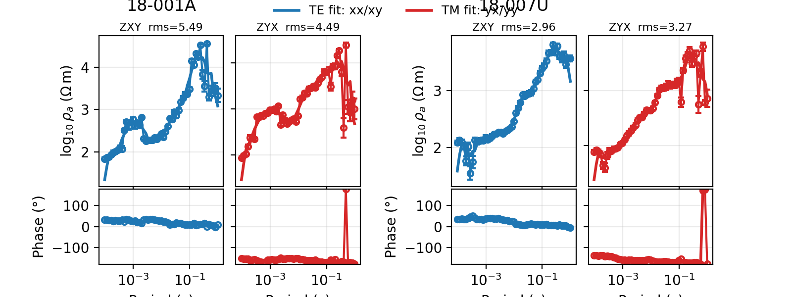
>>> sorted(t.get_text() for ax in fig.axes for t in ax.texts if "rms" in t.get_text())
['ZXY  rms=3.65', 'ZXY  rms=5.49', 'ZYX  rms=3.48', 'ZYX  rms=4.49']
>>> fig.savefig("measured_vs_predicted_fit_grid.png", dpi=200)
>>> plt.close(fig)
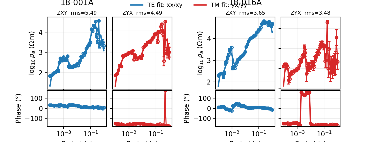
Every panel comes back with an RMS well above 1, from 3.48 to 5.49 across the two stations and two components requested. That is expected, not a bug in the demonstration: a five-point moving average was never fit to this survey’s error bars in the first place, so it lands several times outside them even though the raw curve shapes agree closely by eye. A real inversion response, fit to those same uncertainties, would be expected to land close to \(\mathrm{RMS} \approx 1\) instead. Treat this section’s numbers as a demonstration of the metric, not a QC result to reproduce.
11.24.15. Understand TE And TM Fit Colours#
The fit grid uses separate fit colours for TE mode-like and TM mode-like components:
xxandxyuse the TE fit colour;yxandyyuse the TM fit colour.
>>> fig = plot_sites_fit_grid(
...     measured,
...     predicted,
...     stations=["18-001A"],
...     components=("xx", "xy", "yx", "yy"),
...     color_fit_te="#2ca02c",
...     color_fit_tm="#d62728",
...     lw_fit=2.2,
...     ls_fit="-",
...     ncols_groups=1,
...     figsize_scale=(8.0, 4.0),
...     show_mode_legend=False,
... )
>>> fig.savefig("fit_grid_custom_fit_colours.png", dpi=200, bbox_inches="tight")
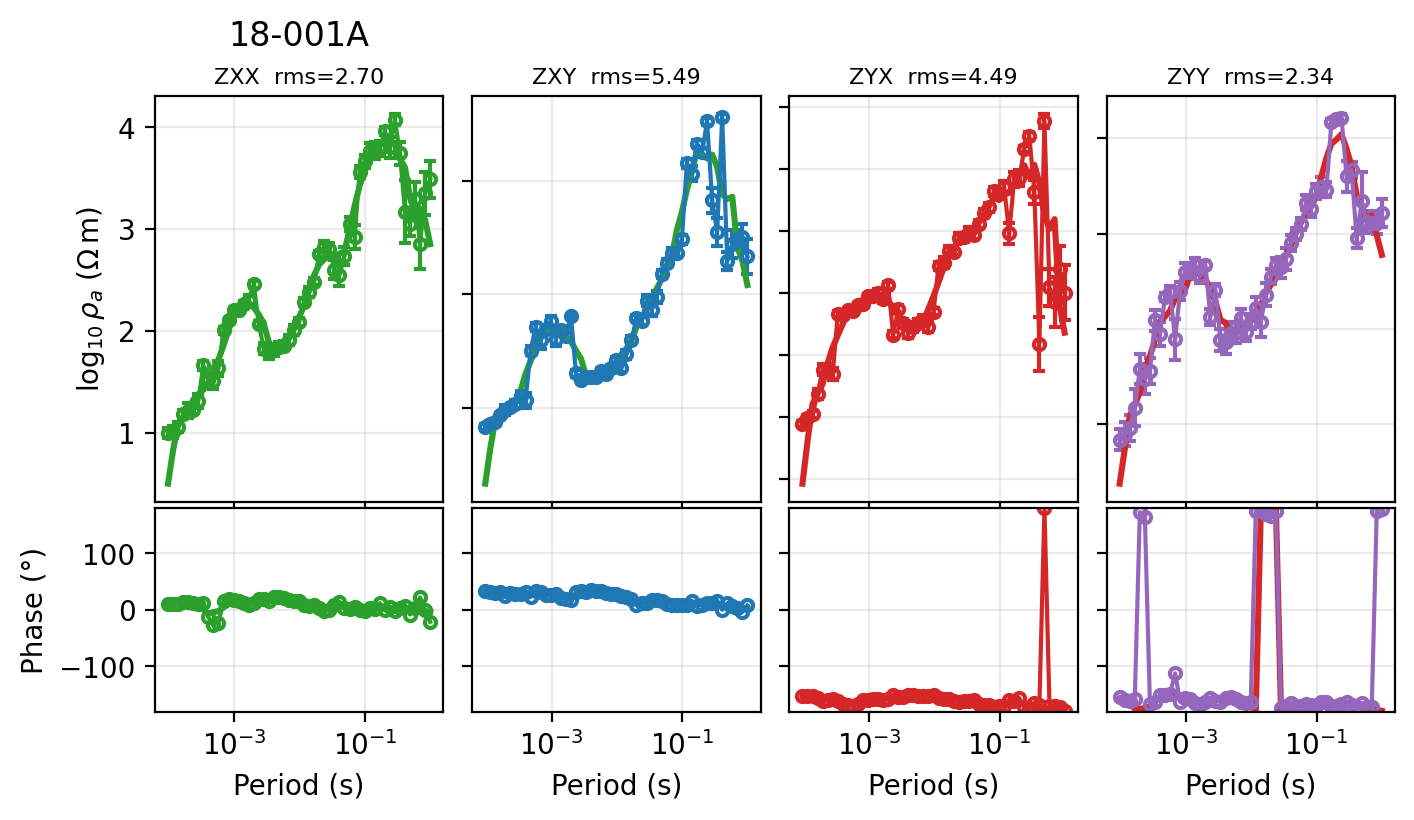
Use custom fit colours when assembling figures for publication or when the package defaults conflict with another report’s existing colour convention.
11.24.16. Full-Response Station Overview#
Every figure so far puts several stations side by side. Sometimes the
opposite view is what a report needs: one station, but the complete
picture – apparent resistivity and phase for all four impedance
components, induction arrows, and phase tensor ellipses, all
sharing one period axis. plot_response_overview (in the sibling
pycsamt.emtools.overview module, re-exported from
pycsamt.emtools) builds exactly that: the classic MT “full response”
quicklook, reworked to read display convention from
PYCSAMT_CONTROL/PYCSAMT_STYLE like every other function on this
page rather than hard-coding colours or axis choices.
The example switches datasets one more time, to the Gabbs Valley USGS MT
survey bundled at data/gv_data – three real stations (gv100,
gv130, gv163) that, unlike L18PLT, carry a full \(2\times 2\)
impedance tensor (\(Z_{xx}\) and \(Z_{yy}\) included, not
just the off-diagonal pair) as well as tipper, which this figure needs
to fill every row.
>>> from pycsamt.emtools import ensure_sites, sites_summary, plot_response_overview
>>> gv = ensure_sites("data/gv_data/gv_final_edi", strict=True)
>>> gv_summary = sites_summary(gv)
>>> print(len(gv_summary), "stations,", "tipper present:", bool(gv_summary["has_tipper"].all()))
3 stations, tipper present: True
>>> fig = plot_response_overview(gv, station="gv100")
>>> len(fig.axes)
7
>>> fig.axes[0].get_yscale(), fig.axes[0].get_xscale()
('log', 'log')
>>> fig.axes[2].get_yscale()
'linear'
>>> fig.savefig("gv100_response_overview.png", dpi=200, bbox_inches="tight")
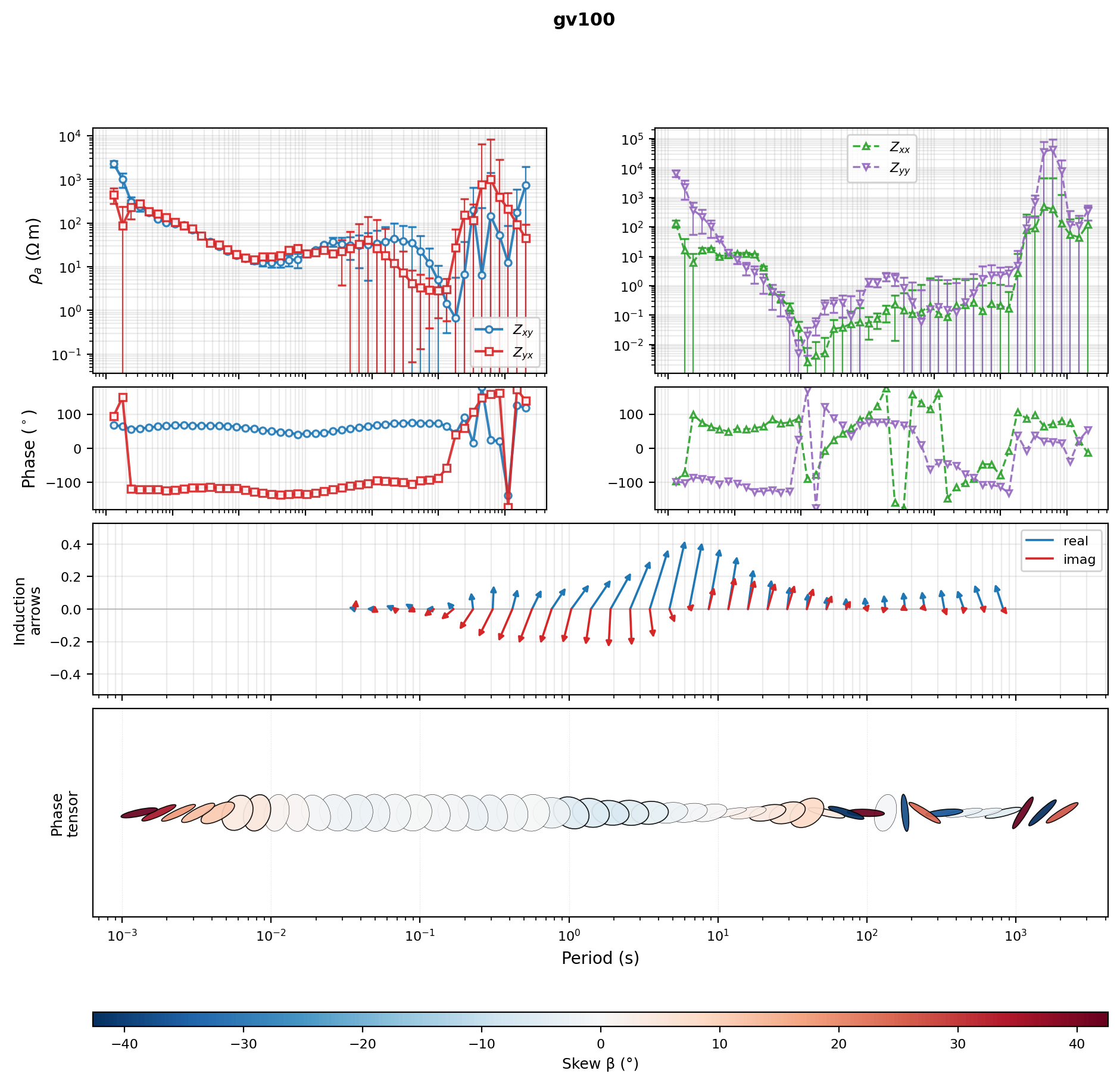
Seven axes come back for the default two-column layout: apparent
resistivity and phase for the off-diagonal (\(Z_{xy}\),
\(Z_{yx}\)) pair on the left, the diagonal (\(Z_{xx}\),
\(Z_{yy}\)) pair on the right, one induction-arrow row, one
phase-tensor-ellipse row, and the ellipse row’s own colourbar axis. The
apparent-resistivity row confirms as genuinely log-log
(get_yscale() == "log" over a log x-axis, not \(\log_{10}\rho_a\)
values plotted on a linear axis) and the phase row as linear-over-log,
i.e. semilog – both draw Matplotlib’s own per-decade grid rather than
sparse gridlines over pre-logged numbers, matching the reference
quicklook convention this figure reproduces.
Reading the panels from top to bottom: the resistivity and phase curves
behave exactly as in the earlier sections, just with all four components
present at once – \(Z_{xx}\) and \(Z_{yy}\) stay small relative
to the off-diagonal pair through the middle of the period range, as
expected for a survey without strong 3-D distortion there, then grow
noticeably at the longest periods where the error bars also widen – a
data-quality effect documented in the survey’s own USGS data release,
Peacock et al. (2021), not a
plotting artefact. The induction-arrow row draws one arrow per period
for the real and imaginary tipper parts, in the same real/imag colour
pairing used by plot_response_tipper’s \(T_x\)/\(T_y\) rows
earlier on this page; each arrow’s vertical extent is the physically
meaningful part, while its slight horizontal fan is a schematic
separation between neighbouring periods, not a period shift. The bottom
row draws one phase-tensor ellipse per period, coloured by Skew
by default: the pale, near-white ellipses through the middle of the
period range indicate low skew (consistent with the comparatively
regular, near-1-D-looking sounding curves above them), while the more
saturated red/blue ellipses at the shortest and longest periods flag the
same noisier bands already visible in the resistivity row.
11.24.17. A Full-Range Ellipse Colouring#
The default skew colouring is the more diagnostic choice – it flags
departures from 1-D/2-D structure directly – but some reports expect
the other common convention: colouring by \(\phi_{\min}\) (the
phase tensor’s minor-axis angle) over its natural
\(0^\circ\)-\(90^\circ\) range. Pass c_by="phimin_deg" with
an explicit clim to get it; note this is deliberately not the same
as c_by="phi_min", which colours by the raw phase-tensor singular
value (tan units) instead of its arctan in degrees and saturates near
one end of a 0-90 scale instead of using it fully.
>>> fig = plot_response_overview(
...     gv,
...     station="gv130",
...     c_by="phimin_deg",
...     clim=(0.0, 90.0),
...     cmap="turbo",
... )
>>> cbar_ax = fig.axes[-1]
>>> cbar_ax.get_xlabel()
'$\\phi_{min}$ (°)'
>>> cbar_ax.get_xlim()
(0.0, 90.0)
>>> fig.savefig("gv130_response_overview_phimin.png", dpi=200, bbox_inches="tight")
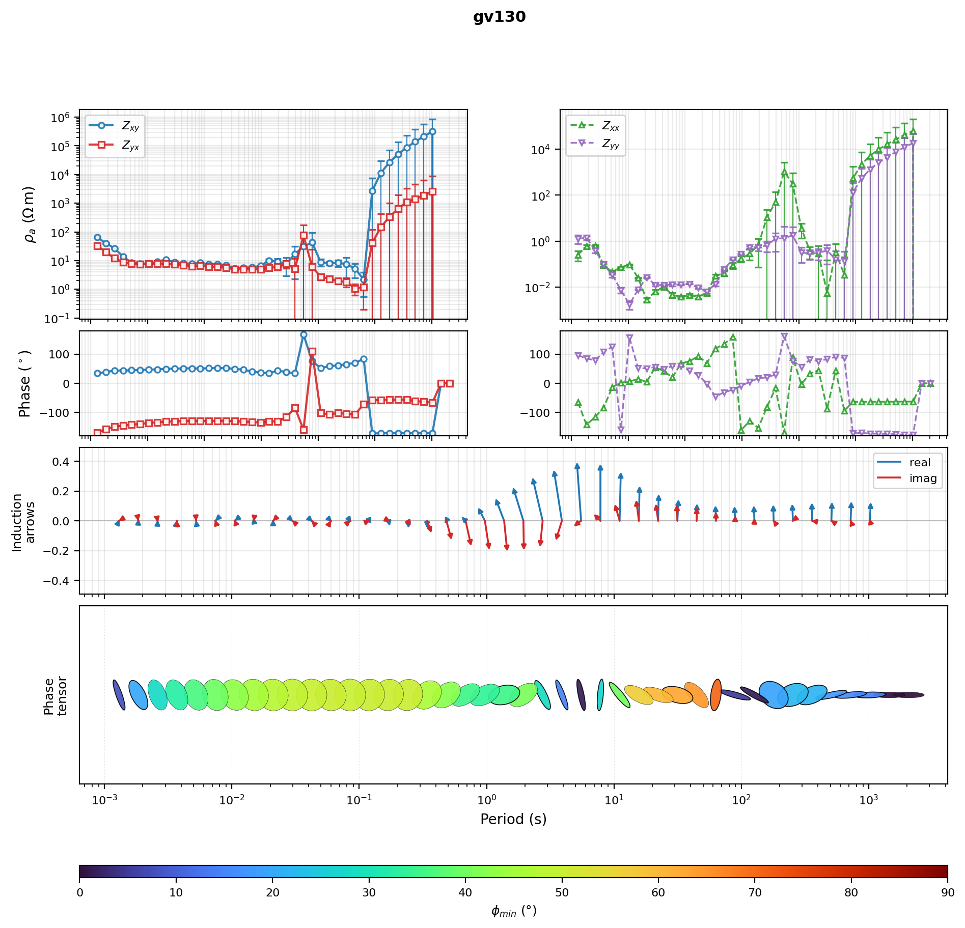
The colourbar now spans the full requested \(0^\circ\)-\(90^\circ\)
range and every ellipse gets a distinct hue rather than clustering near
one end – exactly the “very saturated, easy to scan” look a
\(\phi_{\min}\)-coloured strip is expected to have, and the reason
this convention, not skew, is the one to reach for when the ellipse row
needs to be readable at a glance rather than used as a 3-D-structure
flag. The colourbar itself lives in its own reserved row below the
ellipse strip by default (cbar_orientation="horizontal"); pass
cbar_orientation="vertical" to restore a right-hand gutter column
instead. Either way the space is reserved in the layout up front, so the
arrow row above and the ellipse row stay pixel-aligned on the shared
period axis – a colourbar attached the ordinary
Figure.colorbar-via-divider way would otherwise narrow just the
ellipse row after the fact, leaving a given period at a different pixel
column in each row.
Two more knobs are worth knowing about before reaching for this
function on a new survey. show_diag=False drops the
\(Z_{xx}\)/\(Z_{yy}\) column entirely, narrowing the figure to a
single column when a survey’s diagonal terms are not of interest or are
too noisy to be useful; the arrow and ellipse rows then span that one
column instead of two. And x_view and log_log_rho control the
axis conventions independently of PYCSAMT_CONTROL’s shared global
state – x_view="log10_period" switches to the
\(\log_{10}T\,(\mathrm{s})\) linear-axis convention used by
plot_raw_sites_1d earlier on this page, and log_log_rho=False
does the same for apparent resistivity, without needing a
PYCSAMT_CONTROL.context(...) block for either.
11.24.18. Choosing The Right Figure#
Here is a practical decision path:
I only need a quick rho/phase overviewUse
plot_sites_panelswithcomponents=("xy", "yx")and a short station list.I want a raw tensor QC viewUse
plot_raw_sites_1dwith all four components andraw=True.The survey has tipper and I need to inspect it with response curvesUse
plot_response_tipper. Confirm tipper exists withsites_summaryorlist_missing_sectionsfirst, as done above.I processed the data and need before/after panelsUse
plot_sites_comparewith the original and processedSitesobjects.I have model predictions or inversion responsesUse
plot_sites_fit_gridand read the RMS labels component by component.I need the complete picture for one station -- full tensor, arrows, and ellipsesUse
plot_response_overview. Confirm the station carries a full \(2\times 2\) tensor and tipper first, the same waysites_summaryconfirmed it for gv100 above.
11.24.19. Common Pitfalls#
- Too many stations in one figure
Start with four to six stations. If you need every station, create multiple figures by station group.
- Comparing figures with auto-scaled axes
Use fixed
ylim_rhoaandylim_phasewhen the visual comparison matters.- Using tipper plots on AMT lines with no tipper
The figure can still render, but it will not add useful interpretation. Check
sites_summaryfirst, as this page does.- Treating a smoothed dataset as a real prediction
A smoothed copy is useful for demonstrating the plotting API, but it is not a forward-model response – the inflated RMS values above are the direct consequence of that gap.
- Ignoring display control
If a report switches between period and frequency axes, or between linear and log rho displays, use
PYCSAMT_CONTROL.contextso all plots share the same convention, rather than editing axes after the fact.
11.24.20. Save A Multi-Figure Plot Bundle#
The following script writes the core report figures for one line in a single pass: a station-panel grid, raw full-tensor panels, a raw-vs-smoothed comparison, and a measured-vs-predicted fit grid, all from the same survey and station subset used throughout this page.
View the executed report-bundle source codeClick to inspect and copy the complete code
 1def make_plot_report_bundle() -> None:
 2    """Write the four report figures used by the "Save A Multi-Figure
 3    Plot Bundle" section: a station-panel grid, raw full-tensor panels,
 4    a raw-vs-smoothed comparison, and a measured-vs-predicted fit grid,
 5    all built from the same L18PLT survey and station subset.
 6    """
 7    survey = ensure_sites(L18PLT, strict=True)
 8    stations = ["18-001A", "18-007U", "18-016A", "18-018A"]
 9    processed = smooth_mavg(survey, k=5)
10
11    fig = plot_sites_panels(
12        survey,
13        stations=stations,
14        components=("xy", "yx"),
15        ncols=4,
16        show_legend=True,
17    )
18    fig.savefig(IMAGES / "user-guide-emtools-plot-15-01.png", dpi=200)
19    plt.close(fig)
20
21    fig = plot_raw_sites_1d(
22        survey,
23        stations=stations[:3],
24        components=("xx", "xy", "yx", "yy"),
25        ncols_groups=3,
26    )
27    fig.savefig(IMAGES / "user-guide-emtools-plot-15-02.png", dpi=200)
28    plt.close(fig)
29
30    fig = plot_sites_compare(
31        survey,
32        processed,
33        stations=stations[:3],
34        components=("xy", "yx"),
35        labels=("raw", "smoothed"),
36        ncols_groups=3,
37    )
38    fig.savefig(IMAGES / "user-guide-emtools-plot-15-03.png", dpi=200)
39    plt.close(fig)
40
41    fig = plot_sites_fit_grid(
42        survey,
43        processed,
44        stations=stations[:2],
45        components=("xy", "yx"),
46        ncols_groups=2,
47    )
48    fig.savefig(IMAGES / "user-guide-emtools-plot-15-04.png", dpi=200)
49    plt.close(fig)

Each of the four panels above comes from one of the functions covered earlier on this page, run back to back against the same four-station subset – a convenient single script to keep on hand once a survey has a settled station list and you just want the standard report figures regenerated.
11.24.21. Worked Example#
The gallery example demonstrates the same plotting layer on bundled AMT and MT surveys, including a tipper-capable MT line and display-control overrides.
Open the rendered gallery page here: Multi-station diagnostic panels (pycsamt.emtools.plot).