
11.11. Anisotropy Diagnostics#
pycsamt.emtools.anisotropy is the user-facing workflow for checking
whether a CSAMT/AMT impedance tensor behaves like an isotropic
1-D/2-D earth, or whether the two off-diagonal modes and the tensor
diagonal terms suggest axial anisotropy or 3-D structure.
In this page, anisotropy means directional electrical behavior: the apparent resistivity or phase inferred in one horizontal direction is not the same as the response inferred in the perpendicular direction. That does not automatically prove a unique geology. It is a diagnostic sign that the data may contain directional structure, local distortion, or 3-D effects that should be checked before a simple 1-D or 2-D interpretation is trusted.
The module follows the axial-anisotropy diagnostic idea described by Wang and Tan (2017) [Wang2017] for CSAMT data. In a practical field workflow, the method answers three concrete questions:
do \(Z_{xy}\) and \(Z_{yx}\) imply similar apparent resistivities?
do the tensor diagonal terms create a large Swift skew?
are the suspicious responses isolated single-frequency spikes, or coherent station-period patterns?
This page explains how to use the three workflow functions in the user guide context. Full callable signatures are intentionally left to the API reference.
11.11.1. Why This Matters#
In ideal 1-D MT/CSAMT, the off-diagonal impedance modes carry the useful response and the diagonal terms are close to zero. Real survey data are messier. Galvanic distortion, 3-D bodies, local conductors, acquisition noise, and genuine electrical anisotropy can all make the tensor depart from that ideal form.
The anisotropy module does not prove a geological model by itself. It is a diagnostic layer. Use it after loading and quality control, before trusting a 1-D inversion, and alongside phase-tensor, strike, static shift, and map views.
11.11.2. The Core Quantities#
For each station and frequency, the implementation reads the full impedance tensor:
The two Cagniard apparent resistivity values are computed from the off-diagonal modes using the practical-unit convention used by EDI impedance values in pyCSAMT:
where f is frequency in hertz. This practical-unit formula is the
one used by the code. It is different from the SI expression
\(|Z|^2 / (\omega\mu_0)\), which applies when impedance is stored in
SI ohms.
The main ratio metric is:
Interpret it as a signed mode contrast:
ratio_log10 = 0means both modes have the same apparent resistivity.ratio_log10 = 0.1means \(\rho_{xy}\) is about 1.26 times \(\rho_{yx}\).ratio_log10 = 0.3means a factor of about 2.negative values mean \(\rho_{yx}\) is larger than \(\rho_{xy}\).
The module also computes Swift skew:
The skew is useful because it uses the diagonal tensor terms, while the ratio uses the off-diagonal modes. Those two indicators are related, but they are not redundant.
Swift skew is therefore a dimensionality clue, not an anisotropy proof. A high value says that the full tensor does not look like a clean 1-D/2-D response in the selected coordinate system. The ratio \(\Lambda\) asks a different question: whether the two off-diagonal apparent-resistivity modes disagree strongly.
Alongside skew, the module reports a per-frequency Swift strike angle \(\theta\), found by rotating \(Z\) to the angle that minimizes its diagonal terms:
solved as \(\theta = \tfrac12\operatorname{atan2}\) of the numerator
and denominator above so the correct quadrant is kept. Because it comes
from the same diagonal/off-diagonal split as swift_skew, a strike
estimate is only as trustworthy as the skew that produced it: a large
swift_skew with an unstable strike_deg from one frequency to the
next means the “minimizing” rotation itself is poorly constrained, not
merely that the earth is 3-D.
The remaining detail columns are plain phase differences of the two off-diagonal modes, in degrees:
11.11.3. Data Contract#
The functions accept the same flexible sites input as the rest of
emtools:
a directory containing EDI files,
one EDI-like object,
a
Sitescontainer,an iterable of site-like objects.
Internally, the module calls ensure_sites. That means duplicate-file,
recursive-loading, strict-mode, and verbosity behavior is consistent
with the rest of the pyCSAMT user guide.
Use dense CSAMT/AMT frequency coverage when possible. Sparse long-period natural-source MT can still be passed to the functions, but the station-period patterns are usually less stable and less diagnostic.
11.11.4. Workflow Overview#
The usual workflow is:
Load a survey line.
Compute the per-frequency detail table.
Collapse it to a per-station summary.
Plot one or more station x period pseudo-sections.
Interpret broad patterns before isolated extreme pixels.
>>> from pathlib import Path
>>> from pycsamt.emtools.anisotropy import (
...     analyze_anisotropy,
...     anisotropy_table,
...     plot_anisotropy,
... )
>>> edi_dir = Path("data/AMT/WILLY_DATA/L18PLT")
>>> detail = analyze_anisotropy(edi_dir)
>>> summary = anisotropy_table(edi_dir)
>>> len(detail), len(summary)
(1484, 28)
>>> ax = plot_anisotropy(edi_dir, metric="ratio_log10")
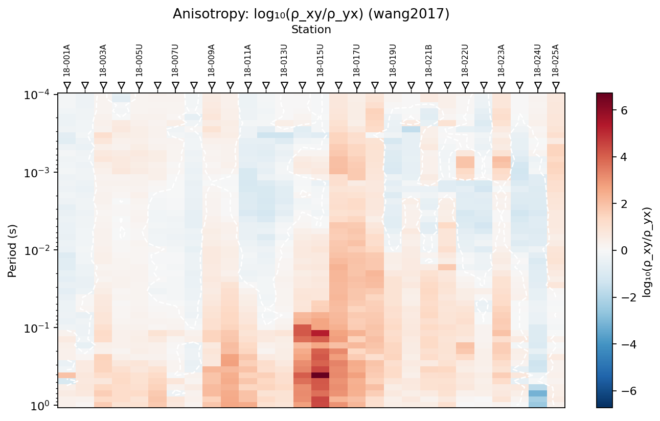
The same edi_dir is accepted by all three functions – one loaded
directory becomes a 1484-row per-frequency table, a 28-row per-station
table, and one pseudo-section – because each function delegates
loading to the shared site loader rather than re-parsing the survey on
its own.
11.11.5. Per-Frequency Detail#
Use analyze_anisotropy when you need the raw station-frequency
diagnostics. It returns one row for each station and frequency.
>>> from pycsamt.emtools.anisotropy import analyze_anisotropy
>>> detail = analyze_anisotropy(
...     edi_dir,
...     ratio_threshold=0.1,
...     skew_threshold=0.2,
...     recursive=True,
...     on_dup="replace",
...     strict=False,
...     verbose=0,
... )
>>> cols = [
...     "station", "freq_hz", "period_s", "rho_xy_ohmm", "rho_yx_ohmm",
...     "ratio_log10", "swift_skew", "strike_deg",
... ]
>>> detail[cols].head()
   station  freq_hz  period_s  ...  ratio_log10  swift_skew  strike_deg
0  18-001A  10400.0  0.000096  ...    -0.107418    4.293444  -77.840209
1  18-001A   8707.0  0.000115  ...    -0.124451    4.021890  -76.385301
2  18-001A   7289.0  0.000137  ...    -0.145718    3.846208  -75.453650
3  18-001A   6102.0  0.000164  ...    -0.247039    2.369018  -67.350131
4  18-001A   5108.0  0.000196  ...    -0.397532    1.729795  -60.108794
[5 rows x 8 columns]
>>> detail.to_csv("l18plt_anisotropy_detail.csv", index=False)
The important output columns are:
station: station name resolved from the loaded site.freq_hzandperiod_s: frequency and inverse frequency.rho_xy_ohmmandrho_yx_ohmm: practical-unit apparent resistivities from the two off-diagonal modes.phi_xy_degandphi_yx_deg: phase of the two off-diagonal modes.ratio_log10: \(\log_{10}(\rho_{xy}/\rho_{yx})\).phase_diff_deg:phi_xy_deg - phi_yx_deg.swift_skew: Swift skew from the full tensor.strike_deg: Swift strike angle in degrees.
The threshold arguments are accepted here for workflow consistency, but
the detail table itself does not add a Boolean flag. The thresholds are
used when the detail table is collapsed by anisotropy_table.
11.11.6. Single-Station Inspection#
Before interpreting a pseudo-section, inspect one or two stations as curves. This makes it easier to distinguish coherent frequency trends from isolated spikes.
>>> import matplotlib.pyplot as plt
>>> from pycsamt.emtools.anisotropy import (
...     ANISO_RATIO_THRESH,
...     SWIFT_SKEW_THRESH,
... )
>>> station = "18-009A"
>>> one = detail.loc[detail["station"] == station].sort_values("period_s")
>>> fig, (ax_ratio, ax_skew) = plt.subplots(2, 1, figsize=(7, 6), sharex=True)
>>> _ = ax_ratio.semilogx(one["period_s"], one["ratio_log10"], "o-")
>>> _ = ax_ratio.axhline(ANISO_RATIO_THRESH, color="0.4", linestyle="--")
>>> _ = ax_ratio.axhline(-ANISO_RATIO_THRESH, color="0.4", linestyle="--")
>>> _ = ax_ratio.set_ylabel("log10(rho_xy / rho_yx)")
>>> _ = ax_skew.semilogx(one["period_s"], one["swift_skew"], "o-", color="C3")
>>> _ = ax_skew.axhline(SWIFT_SKEW_THRESH, color="0.4", linestyle="--")
>>> _ = ax_skew.set_xlabel("Period (s)")
>>> _ = ax_skew.set_ylabel("Swift skew")
>>> _ = fig.suptitle(f"{station} anisotropy diagnostics")
>>> fig.tight_layout()
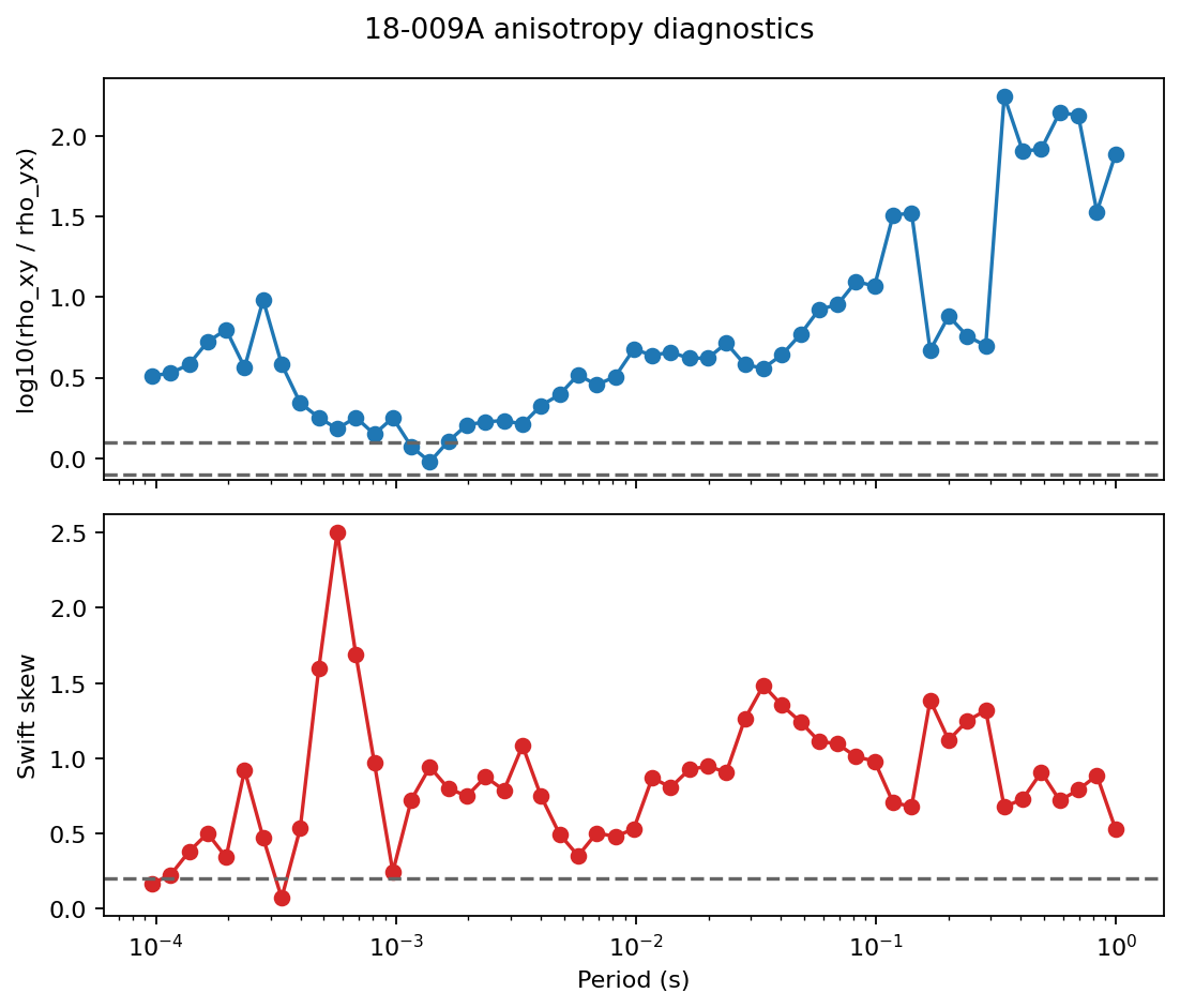
ANISO_RATIO_THRESH and SWIFT_SKEW_THRESH are the same default
constants analyze_anisotropy uses internally, drawn here as dashed
reference lines so the curve and the screening threshold stay visibly
tied together. If both curves stay above their thresholds over many
neighboring periods, the station deserves more attention than a station
with one isolated outlier.
11.11.7. Per-Station Summary#
Use anisotropy_table when you want one row per station. It calls
analyze_anisotropy internally, then groups by station.
>>> from pycsamt.emtools.anisotropy import anisotropy_table
>>> table = anisotropy_table(
...     "data/AMT/WILLY_DATA/L18PLT",
...     ratio_threshold=0.1,
...     skew_threshold=0.2,
... )
>>> ranked = (
...     table.assign(abs_mean_ratio=table["mean_ratio_log10"].abs())
...     .sort_values(
...         ["anisotropy_flag", "abs_mean_ratio", "mean_swift_skew"],
...         ascending=[False, False, False],
...     )
... )
>>> ranked[[
...     "station", "n_freq", "mean_ratio_log10", "max_abs_ratio_log10",
...     "mean_swift_skew", "median_strike_deg", "anisotropy_flag",
... ]].head(10)
    station  n_freq  ...  median_strike_deg  anisotropy_flag
15  18-016A      53  ...          -7.682709             True
16  18-017U      53  ...          -3.811541             True
14  18-015U      53  ...           8.230015             True
17  18-018A      53  ...          13.908826             True
13  18-014A      53  ...          27.482707             True
9   18-010U      53  ...          24.372200             True
24  18-023A      53  ...          21.460012             True
8   18-009A      53  ...          24.360106             True
26  18-024U      53  ...         -29.242651             True
27  18-025A      53  ...         -20.822334             True
[10 rows x 7 columns]
The summary columns are:
n_freq: number of frequencies contributing to the station.mean_ratio_log10: signed average ratio over frequency.max_abs_ratio_log10: largest absolute ratio over frequency.mean_phase_diff_deg: average phase difference between modes.mean_swift_skew: average Swift skew.median_strike_deg: median Swift strike estimate.anisotropy_flag:Truewhen the station exceeds either default criterion.
Using the same \(\Lambda\) and \(S\) notation introduced above, the default per-station flag is
where the overline denotes the station’s mean over frequency. That flag is useful for screening, but it should not be your final interpretation. In real field lines, many stations can be flagged. The relative ranking and the station-period shape are usually more informative than the binary column alone.
11.11.8. Pseudo-Section Plotting#
Use plot_anisotropy to map one metric onto station x period space.
This is the main visual diagnostic because it shows whether a response
is spatially and spectrally coherent.
>>> fig, axes = plt.subplots(2, 2, figsize=(12, 8), sharex=True)
>>> _ = plot_anisotropy(edi_dir, metric="ratio_log10", ax=axes[0, 0])
>>> _ = plot_anisotropy(edi_dir, metric="swift_skew", ax=axes[0, 1])
>>> _ = plot_anisotropy(edi_dir, metric="phase_diff_deg", ax=axes[1, 0])
>>> _ = plot_anisotropy(edi_dir, metric="strike_deg", ax=axes[1, 1])
>>> fig.tight_layout()
>>> fig.savefig("l18plt_anisotropy_metrics.png", dpi=200)
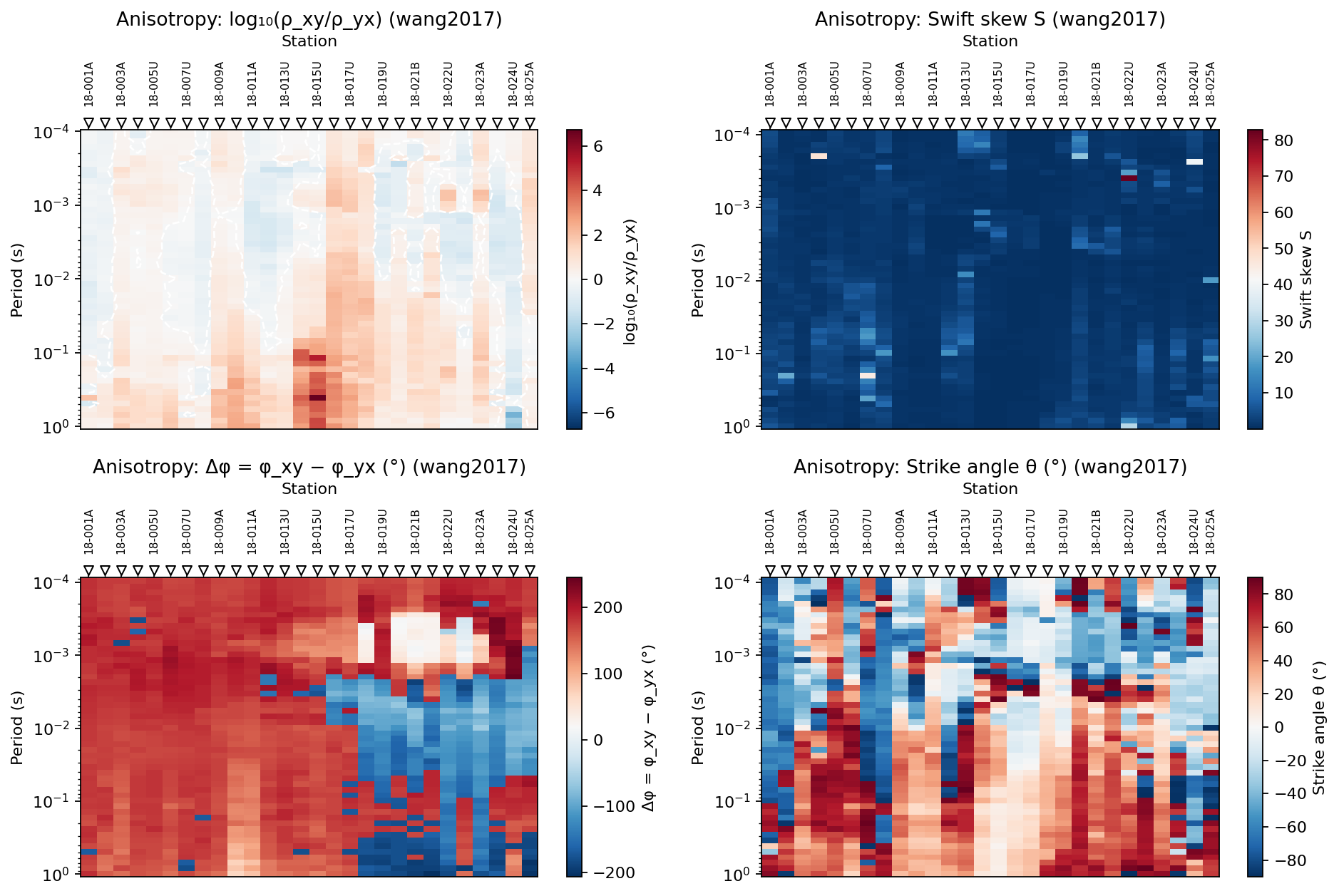
Available plot metrics are:
Metric |
Meaning |
|---|---|
|
Signed \(\log_{10}(\rho_{xy}/\rho_{yx})\); the default and usually the first plot to inspect. |
|
Full-tensor skew; useful for 3-D behavior and diagonal-term effects. |
|
Difference between the two off-diagonal phases. |
|
Swift strike angle estimate in degrees. |
For ratio_log10, the plotting function uses a diverging color range
centered around zero and can draw a white zero contour. For other
metrics, the color range follows the finite values in the grid.
11.11.9. Comparing Neighboring Lines#
The plotting function accepts an existing Matplotlib axis. That makes it easy to compare neighboring survey lines with the same metric.
>>> from pycsamt.emtools.anisotropy import anisotropy_table, plot_anisotropy
>>> l18 = "data/AMT/WILLY_DATA/L18PLT"
>>> l22 = "data/AMT/WILLY_DATA/L22PLT"
>>> fig, (ax18, ax22) = plt.subplots(1, 2, figsize=(12, 5), sharey=True)
>>> _ = plot_anisotropy(l18, metric="ratio_log10", ax=ax18)
>>> _ = ax18.set_title("L18PLT ratio")
>>> _ = plot_anisotropy(l22, metric="ratio_log10", ax=ax22)
>>> _ = ax22.set_title("L22PLT ratio")
>>> fig.tight_layout()
>>> t18 = anisotropy_table(l18)
>>> t22 = anisotropy_table(l22)
>>> t18["mean_ratio_log10"].abs().mean()
0.5836353106929171
>>> t22["mean_ratio_log10"].abs().mean()
0.5153467627986273
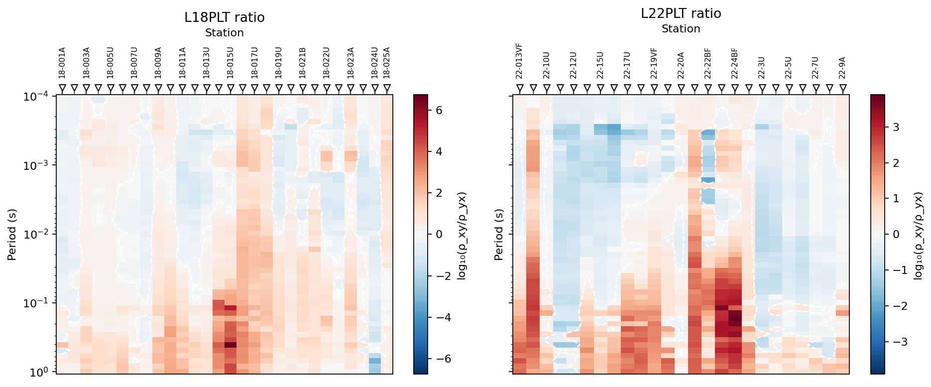
This comparison is useful for sanity checking. Neighboring lines do not need to match exactly, but a line with a completely different pattern should be checked for loading, station ordering, coordinate, or tensor quality issues before the difference is interpreted geologically.
11.11.10. Ratio And Skew Are Complementary#
Because the ratio and skew emphasize different tensor information, they can disagree. The following example quantifies the relationship across two lines.
>>> import pandas as pd
>>> both = pd.concat(
...     [t18.assign(line="L18PLT"), t22.assign(line="L22PLT")],
...     ignore_index=True,
... )
>>> both["abs_ratio"] = both["mean_ratio_log10"].abs()
>>> corr = both["abs_ratio"].corr(both["mean_swift_skew"])
>>> round(corr, 2)
-0.5
>>> fig, ax = plt.subplots(figsize=(6, 5))
>>> for line, group in both.groupby("line"):
...     _ = ax.scatter(
...         group["mean_swift_skew"], group["abs_ratio"],
...         label=line, alpha=0.8,
...     )
...
>>> _ = ax.set_xlabel("Mean Swift skew")
>>> _ = ax.set_ylabel("Mean absolute ratio")
>>> _ = ax.set_title(f"Ratio vs. skew, Pearson r = {corr:.2f}")
>>> _ = ax.legend()
>>> fig.tight_layout()
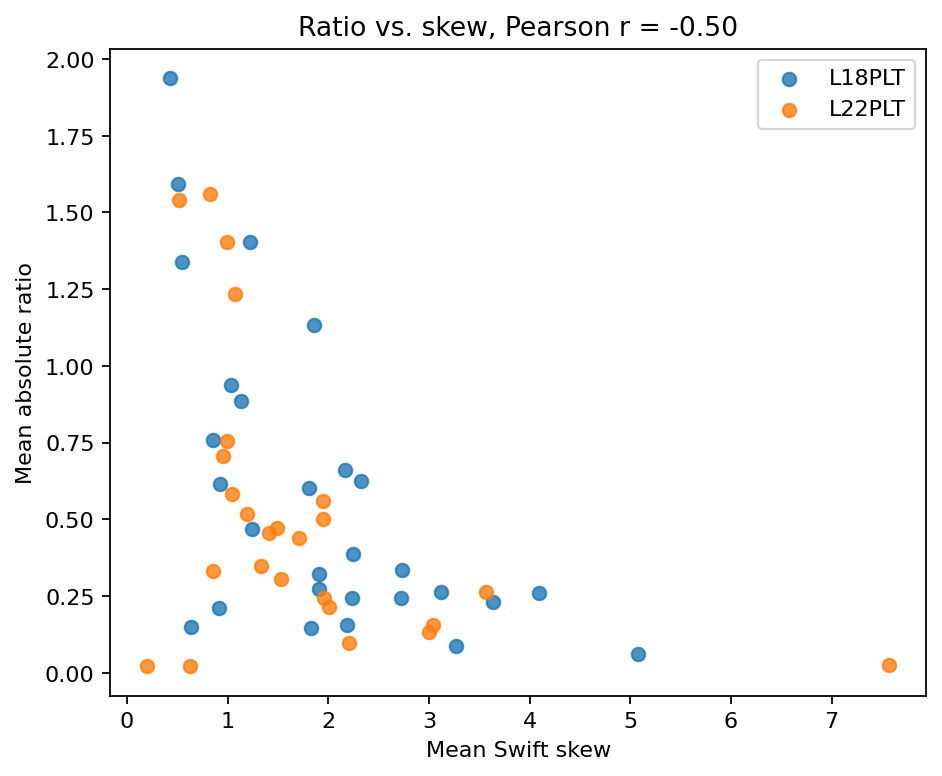
If the two metrics correlate strongly, they are telling a similar story. If they do not, inspect both views. A station can have a strong \(\rho_{xy}/\rho_{yx}\) contrast with modest skew, or large skew with a modest mean ratio.
11.11.11. Reading The Results#
Use the following interpretation pattern:
Start with
ratio_log10. Look for broad positive or negative zones that persist over multiple stations and periods.Check
swift_skew. Treat broad skew highs as important, but be cautious with single-pixel extremes.Check
phase_diff_degif the apparent resistivity ratio is strong; phase disagreement can help separate stable tensor behavior from amplitude-only effects.Use
strike_degas a directional clue, not as a unique structural solution. Strike estimates have ambiguity and can be unstable where the tensor is noisy.Compare neighboring lines before making a geological statement from one profile.
11.11.12. Common Failure Modes#
- Empty output
No valid impedance tensor was found. Check that the input path points to EDI files and that the files contain usable
Zdata.- All stations flagged
This can happen in real field data. Raise the thresholds only if you have a survey-specific reason. More often, keep the defaults and use rankings plus pseudo-sections for interpretation.
- Huge isolated Swift skew
Swift skew divides by
abs(Zxy + Zyx). If that denominator passes near zero at one frequency, a very large value can appear without a corresponding geological anomaly. Look for neighboring-period support.- Unstable strike
Strike is derived from tensor rotation. It is sensitive to noisy diagonal terms and carries the usual EM strike ambiguity. Interpret stable bands, not isolated values.
- Sparse long-period data
The method is most useful with dense CSAMT/AMT frequency sweeps. With sparse natural-source MT, use the output as a rough diagnostic only.
11.11.13. Saving A Reproducible Diagnostic Bundle#
For reports, save both tables and the key figure. That gives reviewers the station-level ranking and the raw station-frequency values behind the plot.
>>> survey = Path("data/AMT/WILLY_DATA/L18PLT")
>>> out = Path("outputs/anisotropy_l18plt")
>>> out.mkdir(parents=True, exist_ok=True)
>>> detail = analyze_anisotropy(survey)
>>> table = anisotropy_table(survey)
>>> detail.to_csv(out / "anisotropy_detail.csv", index=False)
>>> table.to_csv(out / "anisotropy_table.csv", index=False)
>>> fig, ax = plt.subplots(figsize=(10, 5))
>>> _ = plot_anisotropy(survey, metric="ratio_log10", ax=ax)
>>> fig.tight_layout()
>>> fig.savefig(out / "ratio_log10_pseudosection.png", dpi=200)
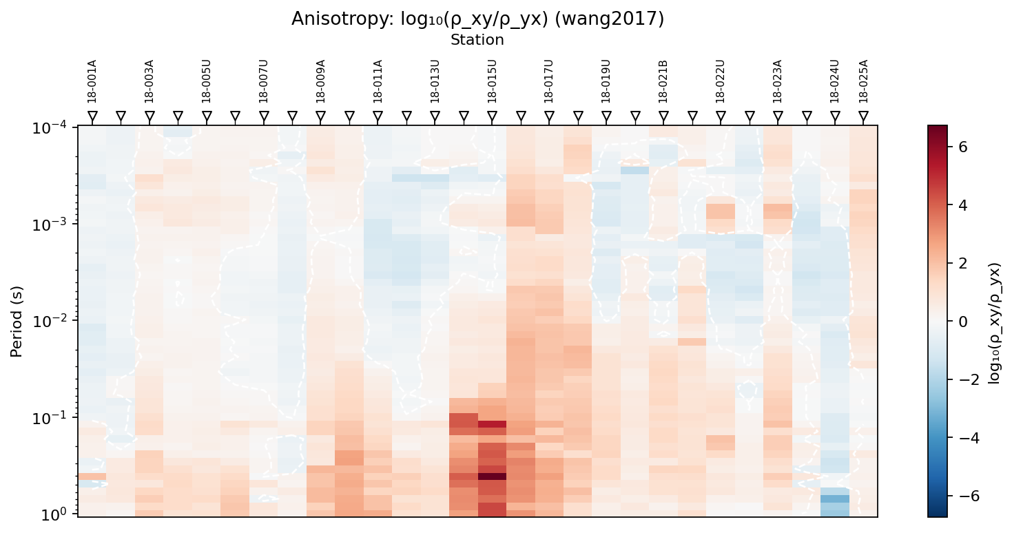
detail.to_csv preserves the full station-frequency data behind the
plot, table.to_csv preserves the per-station summary, and the saved
figure is the same ratio_log10 pseudo-section used throughout this
page’s interpretation – together they let a reviewer retrace any claim
back to the row that produced it.
11.11.14. Worked Example#
The gallery example uses L18PLT and L22PLT, two real AMT/CSAMT
survey lines bundled in data/AMT/WILLY_DATA/. It moves from a single
station curve, to station rankings, to pseudo-sections, and finally to a
two-line comparison showing that ratio and skew can carry different
information.
Open the rendered example here: CSAMT axial-anisotropy diagnostics (pycsamt.emtools.anisotropy).