
4.2. Station Maps#
Station maps show station positions, line traces, labels, and scalar overlay values. Use them for survey QC, coverage inspection, and quick comparison of per-station quantities.
The station-map API is intentionally code-first. It accepts the same
sources described in Loading Map Data: EDI folders, EDI files, file
lists, EDI-like objects, Sites containers, or an already-normalized
pycsamt.map.MapData / MapData object.
4.2.1. What A Station Map Shows#
A station map combines three kinds of information:
station locations or station order;
optional profile-line traces and station labels;
one scalar value per station, called the
overlay.
If the normalized table contains finite latitude and longitude values, the Plotly backend builds a geographic map; rows with incomplete pairs appear as gaps. If neither coordinate axis is usable, it falls back to a profile-style station-index plot rather than failing. In normalized form, station \(s_i\) contributes a coordinate pair \((\lambda_i,\phi_i)\) when longitude and latitude are finite, and an overlay value \(v_i\). Geographic maps draw \((\lambda_i,\phi_i,v_i)\); fallback maps draw \((i,v_i)\), where \(i\) is the zero-based station index. This keeps the diagnostic reproducible even before coordinate cleanup is complete.
4.2.2. Function API#
Use pycsamt.map.plot_station_map() for one-shot scripts and
notebooks. Rendering options are passed with
pycsamt.map.StationMapOptions.
>>> from pycsamt.map import (
...     StationMapOptions,
...     ensure_map_data,
...     plot_station_map,
...     value_at_frequency_details,
... )

>>> source = "data/AMT/WILLY_DATA/L18PLT"
>>> data = ensure_map_data(source)
>>> options = StationMapOptions(
...     overlay="rho",
...     frequency=10.0,
...     frequency_tolerance=2.0,
...     component="xy",
...     show_profiles=True,
...     show_labels=True,
... )
>>> fig = plot_station_map(data, options=options)
>>> print(len(fig.data), tuple(trace.type for trace in fig.data))
2 ('scattermap', 'scattermap')

>>> selected = value_at_frequency_details(
...     data,
...     frequency=10.0,
...     quantity="rho",
...     component="xy",
...     tolerance=2.0,
... )
>>> print(len(selected))
28
>>> sorted({item.selection.actual for item in selected.values()})
[10.16]
The function returns a Plotly figure by default. You can display it in
a notebook with fig.show() or export it with the helpers described
in Exporting Map Figures.
The two traces are the station markers and the profile line. The requested 10 Hz sample is taken from the nearest available frequency grid value, 10.16 Hz, for every station in this sample line.
4.2.3. Reusing Loaded Data#
For repeated maps, load once and reuse the same
pycsamt.map.MapData.
In v2.1, the normalizer delegates to the more robust
pycsamt.emtools._core.ensure_sites(). Its default "auto"
ordering uses coordinate-derived chainage only when the sites
form a credible profile; otherwise it preserves input order. The
decision is recorded on data.sites.ordering, so a plot can report
why its station sequence changed or remained unchanged.
>>> from pycsamt.map import (
...     StationMapOptions,
...     ensure_map_data,
...     plot_station_map,
...     value_at_frequency_details,
... )

>>> data = ensure_map_data("data/AMT/WILLY_DATA/L18PLT")
>>> report = data.sites.ordering
>>> print(report["requested"], report["applied"], report["n_sites"])
auto chainage 28
>>> print(round(report["span_m"], 1), round(report["linearity"], 4))
2403.0 0.9999

>>> rho_options = StationMapOptions(
...     overlay="rho", frequency=100.0, component="xy"
... )
>>> rho = plot_station_map(data, options=rho_options)

>>> phase_options = StationMapOptions(
...     overlay="phase",
...     frequency=100.0,
...     component="xy",
...     cmap="Cividis",
... )
>>> phase = plot_station_map(data, options=phase_options)
>>> print(len(rho.data), len(phase.data))
2 2

>>> rho_values = value_at_frequency_details(
...     data, frequency=100.0, quantity="rho", component="xy"
... )
>>> phase_values = value_at_frequency_details(
...     data, frequency=100.0, quantity="phase", component="xy"
... )
>>> print(round(min(v.value for v in rho_values.values()), 3),
...       round(max(v.value for v in rho_values.values()), 3))
22.899 2461.779
>>> print(round(min(v.value for v in phase_values.values()), 3),
...       round(max(v.value for v in phase_values.values()), 3))
3.313 59.84
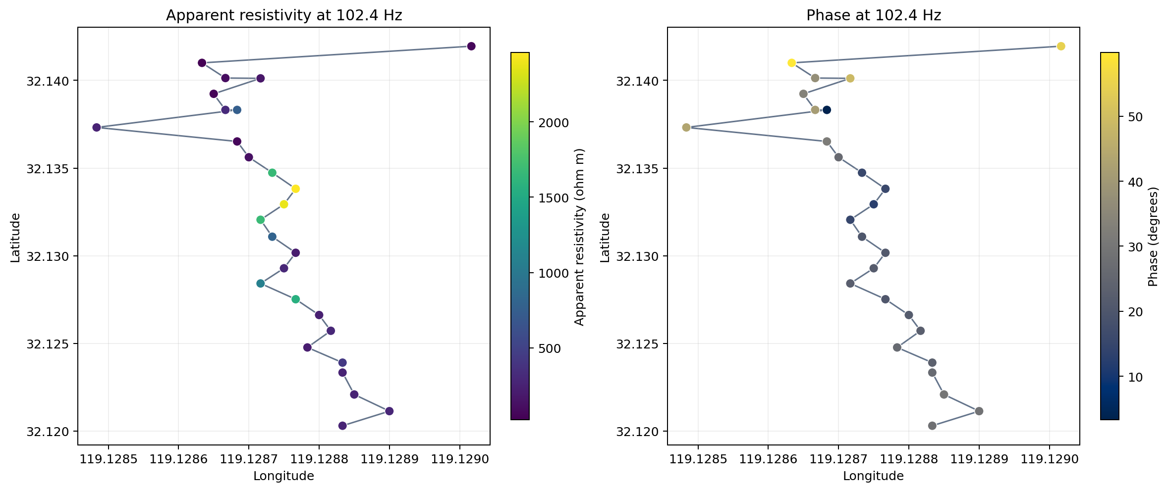
The same loaded MapData rendered twice: once as \(\rho_{a,xy}\) and once as \(\varphi_{xy}\) at the selected 102.4 Hz sample. The central part of the profile contains the strongest resistive values, whereas the largest phases occur mainly near the northern end. Their spatial patterns are therefore not interchangeable: a bright resistivity marker does not automatically imply a large phase at the same station.#
4.2.4. Builder API#
Use pycsamt.map.StationMap when you want an immutable builder
style. with_overlay and with_options return new builders that
reuse the same normalized data.
>>> from pycsamt.map import StationMap

>>> builder = StationMap("data/AMT/WILLY_DATA/L18PLT")
>>> depth_builder = builder.with_overlay("skin_depth", frequency=10.0)
>>> clean_builder = depth_builder.with_options(show_labels=False)
>>> fig = clean_builder.figure()
>>> print(len(fig.data), fig.data[0].mode)
2 markers
This pattern is convenient when a notebook or application lets a user switch overlays without re-reading the EDI files.
The original builder is unchanged: each method returns a new
builder with a copied options dataclass while all three builders point
to the same normalized MapData.
4.2.5. Overlays#
Supported overlay names include:
indexorstationStation index along the line.
elevationStation elevation, when present.
rhoorresistivityApparent resistivity at the nearest frequency.
phasePhase at the nearest frequency.
skin_depthordepthSkin-depth scale computed from apparent resistivity and the actual selected frequency.
- custom column name
If the overlay name matches a column in the station table, that column is used. Otherwise the station index is used as a safe fallback and the colorbar is labelled with the requested overlay name.
4.2.6. Frequency-Based Overlays#
rho, phase, and skin_depth need a frequency. The map uses
the nearest finite positive frequency for each station. Use
frequency_tolerance when the match must be strict.
>>> from pycsamt.map import (
...     StationMapOptions,
...     plot_station_map,
...     value_at_frequency_details,
... )

>>> options = StationMapOptions(
...     overlay="rho",
...     frequency=100.0,
...     frequency_tolerance=5.0,
...     component="xy",
...     log_color=True,
...     value_range=(10.0, 10000.0),
... )
>>> fig = plot_station_map(data, options=options)
>>> matched = value_at_frequency_details(
...     data,
...     frequency=100.0,
...     quantity="rho",
...     component="xy",
...     tolerance=5.0,
... )
>>> print(len(matched))
28
>>> sorted({item.selection.actual for item in matched.values()})
[102.4]
>>> sorted({round(item.selection.relative_delta, 3)
...         for item in matched.values()})
[0.024]
The component option accepts the same component names used by the
map core helpers:
"xy","yx","xx","yy"Individual impedance tensor components.
"avg"Average of
xyandyx."det"Determinant-style derived value for resistivity, or an average for phase.
When log_color=True, only positive values are transformed with
log10. Non-positive values become gaps in the color scale.
For a requested frequency \(f_r\), station \(i\) selects
\(f_i^\*\) by minimizing \(|f_{ik}-f_r|\) over its finite
positive grid. A finite tolerance \(\tau\) keeps the station only
when \(|f_i^\*-f_r|\le\tau\). Together, the index, selected
frequency, and acceptance rule are
After the selection in (1), the xy
apparent-resistivity overlay is
Equation (2) states the physical field-unit convention. During plotting, pyCSAMT reads the resistivity and phase arrays already computed by the EDI parser at index \(k_i\) rather than recomputing them from \(Z\). For phase, \(v_i=\arg Z_{xy}(f_i^\*)\) in degrees. For skin depth, the map uses
Equation (3) is a penetration-depth scale for
an equivalent uniform conductor, not a recovered interface depth. Keep
frequency, frequency_tolerance, component, and
log_color fixed when comparing exported maps.
4.2.7. Labels, Lines, And Selection#
Station maps can label stations, draw line traces, filter lines, and highlight one station.
>>> from pycsamt.map import StationMapOptions, load_lines, plot_station_map

>>> data = load_lines("data/AMT/WILLY_DATA", detect="folder")

>>> options = StationMapOptions(
...     overlay="elevation",
...     line_filter=("L18PLT", "L22PLT"),
...     selected_id="18-012A",
...     show_profiles=True,
...     show_labels=False,
...     marker_size=9,
... )
>>> fig = plot_station_map(data, options=options)
>>> print(data.lines)
('L18PLT', 'L22PLT', 'L26PLT', 'L30PLT', 'L34PLT')
>>> print(len(fig.data), tuple(trace.type for trace in fig.data))
4 ('scattermap', 'scattermap', 'scattermap', 'scattermap')
>>> tuple(len(trace.lat) for trace in fig.data)
(28, 28, 25, 25)
line_filter compares against normalized line names in
data.lines. selected_id increases the selected station marker
size; it does not remove other stations.
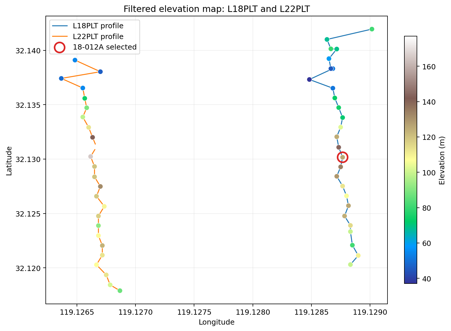
Filtering keeps only L18PLT and L22PLT for display, revealing
two roughly north–south profiles separated in longitude. The red
ring enlarges the real station 18-012A without creating a new
trace or removing any record. Elevation changes along both lines,
but the color pattern alone should not be read as a continuous
topographic surface between them.#
4.2.8. Basemaps#
Geographic station maps use public Plotly basemap styles by default. The theme controls the default:
theme="light"Uses
"open-street-map"unlessbasemapis set.theme="dark"Uses
"carto-darkmatter"unlessbasemapis set.
Pass basemap to choose a specific style.
>>> fig = plot_station_map(
...     data,
...     options=StationMapOptions(
...         overlay="index",
...         basemap="carto-positron",
...         bearing=15.0,
...     ),
... )
>>> print(fig.layout.map.style, fig.layout.map.bearing)
carto-positron 15.0
The map package also supports token-free ESRI raster basemaps through
the shared basemap helpers. Common style names include
"esri-satellite", "esri-topo", and "esri-natgeo".
4.2.9. Density And Contour Layers#
For quick spatial trends, enable a density layer:
>>> data = ensure_map_data("data/AMT/WILLY_DATA/L18PLT")
>>> fig = plot_station_map(
...     data,
...     options=StationMapOptions(
...         overlay="rho",
...         frequency=100.0,
...         show_contours=True,
...         contour_opacity=0.45,
...     ),
... )
>>> print(len(fig.data), tuple(trace.type for trace in fig.data))
3 ('densitymap', 'scattermap', 'scattermap')
show_contours adds a density-style Plotly map layer when at least
three finite coordinate/value triples are available.
For a filled image layer similar to a Surfer-style contour map, enable
contour_image:
>>> fig = plot_station_map(
...     data,
...     options=StationMapOptions(
...         overlay="rho",
...         frequency=100.0,
...         contour_image=True,
...         contour_mode="filled+lines",
...         contour_levels=16,
...         contour_opacity=0.55,
...     ),
... )
>>> len(fig.layout.map.layers)
1
contour_image rasterizes contours to a transparent PNG and inserts
it below station markers as a map image layer. It returns no layer
when there are fewer than three finite points or when log scaling would
leave fewer than three positive values.
For elevation maps, elevation_mode="contours" is the clearer shortcut.
It enables the contour layer for Plotly and draws native contourf and
contour lines for Matplotlib. The default elevation_mode="markers"
preserves the original behavior. Linear interpolation is the default
because it remains within the local values supported by the stations;
the Matplotlib result is additionally clipped to the observed elevation
range after optional smoothing.
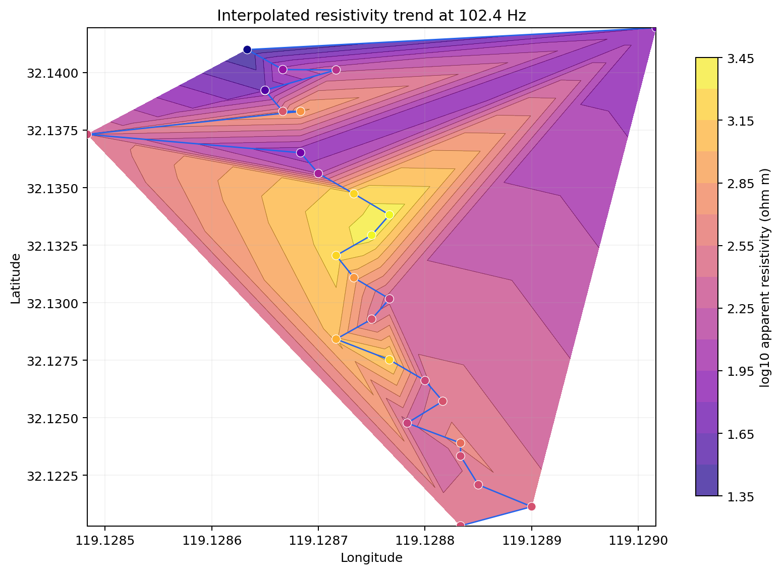
A static rendering of the contour idea: the station \(\log_{10}(\rho_a)\) values are interpolated before the measured markers are drawn over the result. The yellow zones in the central profile follow high measured values, but the broad triangular bands near the northern fold are controlled by sparse geometry. They are interpolation support, not evidence for a triangular subsurface body. Interpret the markers first and the filled surface only as a visual trend between them.#
4.2.10. Themes And Color Scales#
Station maps share the map theme and color utilities.
>>> options = StationMapOptions(
...     overlay="phase",
...     frequency=100.0,
...     theme="publication",
...     cmap="Turbo",
...     opacity=0.85,
...     title="L18 phase at 100 Hz",
... )
>>> fig = plot_station_map(data, options=options)
>>> print(fig.layout.title.text, fig.data[0].marker.opacity)
L18 phase at 100 Hz 0.85
Use value_range=(min, max) for stable comparisons across multiple
maps. This is especially important when exporting a sequence of maps
for a report.
If two maps use different automatic color limits, the same value can
appear as different colors. A fixed range makes the color transform a
single function \(c(v)\) across the full sequence, which is the
more reproducible choice for reports.
4.2.11. Backends#
plotly is the interactive default. matplotlib produces static
figures for reports and batch processing.
>>> from pycsamt.map import StationMapOptions, plot_station_map

>>> fig = plot_station_map(
...     "data/AMT/WILLY_DATA/L18PLT",
...     options=StationMapOptions(backend="matplotlib"),
... )
>>> type(fig).__name__
'Figure'
Backend behavior differs slightly:
plotlyProduces interactive geographic maps when coordinates exist, and station-index plots when they do not.
matplotlibProduces a static Matplotlib figure. It uses longitude/latitude when available and station index/value otherwise.
Unknown backends raise ValueError.
4.2.12. Coordinate Fallback#
Station maps do not require coordinates to produce a useful diagnostic view. When the latitude and longitude columns contain usable values, the Plotly backend attempts a geographic map and leaves incomplete rows as gaps. If the coordinate axes are unavailable, it creates a Cartesian station-index plot.
>>> from pycsamt.map import ensure_map_data

>>> data = ensure_map_data("data/AMT/WILLY_DATA/L18PLT")
>>> print("has geo", data.has_geo)
has geo True

>>> if not data.has_geo:
...     print("Using profile fallback because coordinates are incomplete.")
For production geographic maps, validate data.has_geo before
plotting when every station must appear at a real location, and fix
coordinates through your survey metadata or CRS preprocessing.
4.2.13. Exporting Station Maps#
Use the export helpers to save figures consistently:
>>> from pycsamt.map import (
...     StationMapOptions,
...     plot_station_map,
...     save_png,
...     write_html,
... )

>>> plotly_fig = plot_station_map(data)
>>> static_fig = plot_station_map(
...     data, options=StationMapOptions(backend="matplotlib")
... )
>>> print(write_html(plotly_fig, "outputs/stations.html").as_posix())
outputs/stations.html
>>> print(save_png(static_fig, "outputs/stations.png").as_posix())
outputs/stations.png
PNG export calls savefig directly for Matplotlib figures. Exporting
a Plotly figure to PNG instead requires a static image backend such as
Kaleido; HTML export does not.
4.2.14. Troubleshooting#
- Empty figure
No stations were loaded, or filtering removed every line. Inspect
data.station_idsanddata.lines.- Map appears as a station-index plot
No finite geographic coordinates were available. Check
data.has_geoand your station metadata.rhoorphasecolors are missingThe requested frequency may not exist within
frequency_tolerance, or the station may not have a validZobject. Try removing the tolerance to inspect nearest-frequency behavior.- Contours do not appear
The density and contour-image layers need at least three finite coordinate/value triples. They are skipped silently when there is not enough data.
- Colorbars differ between maps
Set the same
value_rangeandlog_coloroptions on each map.