
Note
Go to the end to download the full example code.
CSAMT axial-anisotropy diagnostics (pycsamt.emtools.anisotropy)#
pycsamt.emtools.anisotropy implements the axial-anisotropy metrics
from Wang & Tan (2017, J. Appl. Geophys. 146): the two independent
Cagniard apparent resistivities
their log-ratio \(\Lambda = \log_{10}(\rho_{xy}/\rho_{yx})\)
(zero for a perfectly isotropic 1-D earth), plus the classic Swift
(1967) skew and strike computed from the full impedance tensor. Three
functions cover this: analyze_anisotropy()
(per-frequency detail), anisotropy_table()
(per-station summary with an anisotropy_flag), and
plot_anisotropy() (station x period
pseudo-section, parameterised by metric).
This is a CSAMT-band method, so it needs a controlled-source-style
frequency sweep rather than long-period natural-source MT — this example
therefore uses L18PLT (and, for the comparison at the end, L22PLT)
from data/AMT/WILLY_DATA/ (see its README.md): a real AMT/CSAMT
field line spanning 1 Hz-10.4 kHz over 53 frequencies, with a full,
energetic Z tensor (unlike KAP03’s long-period natural-source band used
in the tf example).
Load the L18PLT line and compute both tables#
_datasets.py is the shared loader introduced in the tf example.
analyze_anisotropy() returns one row per (station, frequency);
anisotropy_table() collapses that to one row per station.
import matplotlib.pyplot as plt
from _datasets import load_survey

from pycsamt.emtools import (
    ANISO_RATIO_THRESH,
    SWIFT_SKEW_THRESH,
    analyze_anisotropy,
    anisotropy_table,
    plot_anisotropy,
)

survey = load_survey("amt_l18plt")
detail = analyze_anisotropy(survey)
table = anisotropy_table(survey)

print(f"{len(table)} stations, {len(detail)} station-frequency rows")
print(
    f"flagged at defaults (|ratio|>{ANISO_RATIO_THRESH} or skew>{SWIFT_SKEW_THRESH}): "
    f"{int(table['anisotropy_flag'].sum())}/{len(table)}"
)
28 stations, 1484 station-frequency rows
flagged at defaults (|ratio|>0.1 or skew>0.2): 28/28
1. One station’s raw metrics vs. period#
Before the multi-station views, it helps to see what
analyze_anisotropy() actually returns for a single station: the
log-ratio \(\Lambda\) and the Swift skew, both as plain functions
of period. 18-009A is used here because its profile is
well-behaved — some stations in this line have a handful of extreme
skew spikes (see step 3b) that would make a first introduction
confusing.
station = "18-009A"
d = detail[detail["station"] == station].sort_values("period_s")

fig, (ax1, ax2) = plt.subplots(2, 1, figsize=(7, 6), sharex=True)
ax1.semilogx(d["period_s"], d["ratio_log10"], "o-", ms=3, color="#1f77b4")
ax1.axhline(ANISO_RATIO_THRESH, color="0.4", ls="--", lw=1)
ax1.axhline(-ANISO_RATIO_THRESH, color="0.4", ls="--", lw=1)
ax1.set_ylabel(r"$\log_{10}(\rho_{xy}/\rho_{yx})$")
ax1.set_title(f"{station} — anisotropy ratio and Swift skew vs. period")
ax1.grid(alpha=0.3)

ax2.semilogx(d["period_s"], d["swift_skew"], "o-", ms=3, color="#d62728")
ax2.axhline(
    SWIFT_SKEW_THRESH, color="0.4", ls="--", lw=1, label="flag threshold"
)
ax2.set_ylabel("Swift skew S")
ax2.set_xlabel("Period (s)")
ax2.legend(fontsize=8, loc="upper left")
ax2.grid(alpha=0.3)
fig.tight_layout()
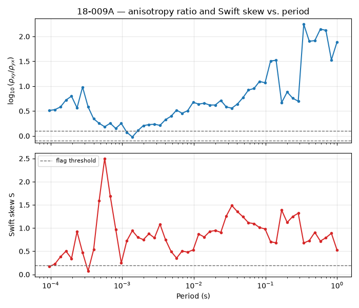
Reading this figure. The ratio (top) stays mostly positive and
grows toward longer periods, crossing the +0.1 flag line for most
of the band. The skew (bottom) sits above its 0.2 flag threshold
at essentially every period, reaching 1-2.5 — a genuinely 3-D-looking
response by both independent indicators, not a marginal, one-metric
call.
2. Per-station ranking#
anisotropy_table() collapses the whole band into one row per
station. With the module’s default thresholds, every one of this
line’s 28 stations gets anisotropy_flag=True — unsurprising for
real, non-ideal field data, and a reminder that the binary flag is
less useful here than the relative ranking between stations.
t = table.copy()
t["abs_ratio"] = t["mean_ratio_log10"].abs()
by_ratio = t.sort_values("abs_ratio")
by_skew = t.sort_values("mean_swift_skew")

fig, (axr, axs) = plt.subplots(1, 2, figsize=(10, 6), sharey=False)
axr.barh(by_ratio["station"], by_ratio["abs_ratio"], color="#1f77b4")
axr.axvline(ANISO_RATIO_THRESH, color="0.3", ls="--", lw=1)
axr.set_xlabel(r"$|\overline{\log_{10}(\rho_{xy}/\rho_{yx})}|$")
axr.set_title("Ranked by mean ratio")
axr.tick_params(axis="y", labelsize=6)

axs.barh(by_skew["station"], by_skew["mean_swift_skew"], color="#d62728")
axs.axvline(SWIFT_SKEW_THRESH, color="0.3", ls="--", lw=1)
axs.set_xlabel("mean Swift skew")
axs.set_title("Ranked by mean skew")
axs.tick_params(axis="y", labelsize=6)
fig.tight_layout()
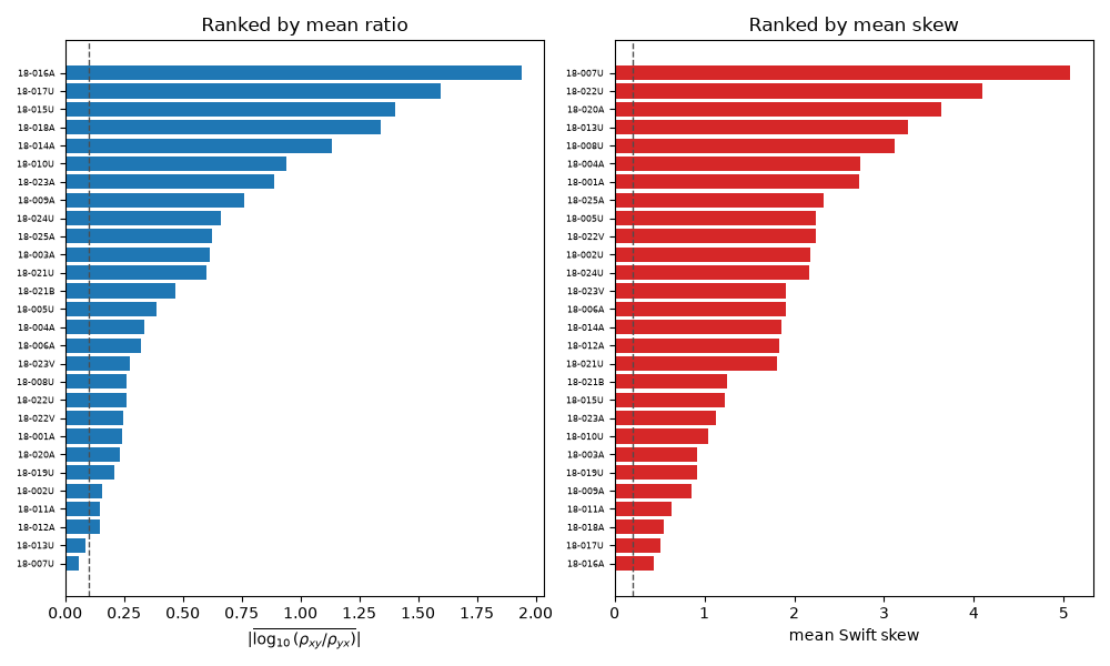
Reading this figure. The two rankings do not agree on a “most
anisotropic” station: 18-016A tops the ratio ranking (\(|\Lambda|\) ≈ 1.9)
but is unremarkable in skew, while 18-007U tops the skew ranking
(≈5.1) yet has one of the smallest mean ratios (≈0.06). Step 5 below
quantifies this across the whole survey — the two metrics are picking
up genuinely different aspects of non-1-D structure.
3. Ratio pseudo-section#
plot_anisotropy() grids a chosen metric onto a station x period
pseudo-section — the module’s core view, and the multi-station
counterpart to step 1’s single-station line plot.
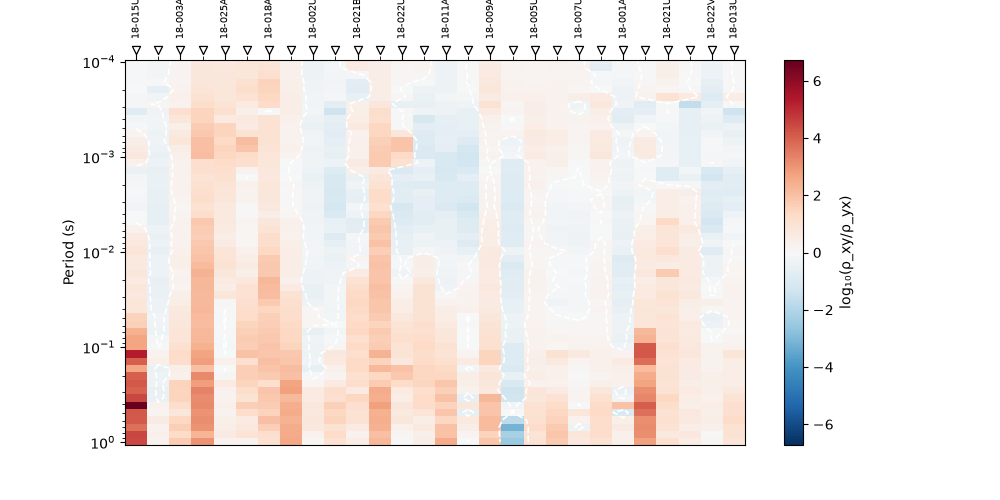
plot_anisotropy(survey, metric="ratio_log10")
<Axes: title={'center': 'Anisotropy: log₁₀(ρ_xy/ρ_yx) (wang2017)'}, xlabel='Station', ylabel='Period (s)'>
Reading this figure. Colour warms (ratio increases) toward the
bottom of the section for most stations — the same long-period growth
seen for 18-009A in step 1 turns out to be a profile-wide pattern,
not a one-station quirk. 18-016A-18-018A (the top of the
step-2 ratio ranking) stand out as a sustained warm block rather than
an isolated spike, which is a good sign it reflects real structure
rather than a processing artefact.
3b. Swift-skew pseudo-section — and a numerical caution#
The same function, metric="swift_skew".
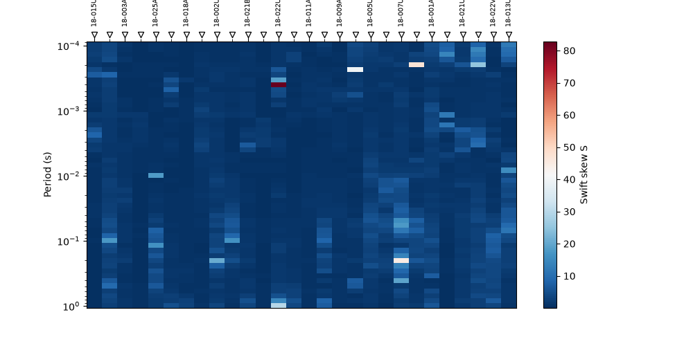
plot_anisotropy(survey, metric="swift_skew")
<Axes: title={'center': 'Anisotropy: Swift skew S (wang2017)'}, xlabel='Station', ylabel='Period (s)'>
Reading this figure. Unlike the ratio section, this one has sharp,
narrow, very intense pixels rather than broad warm regions — most
strikingly at 18-007U, whose per-frequency values include a single
spike above 44 (its neighbours in period sit around 1-2). Swift skew
is defined as \(|Z_{xx}-Z_{yy}| / |Z_{xy}+Z_{yx}|\): whenever the
denominator happens to pass near zero at one frequency, the ratio
blows up without any corresponding physical anomaly. Treat isolated
single-pixel extremes in a skew section with suspicion — the broad,
multi-frequency patterns (as for 18-016A-18-018A here too) are
the trustworthy signal.
3c. Strike pseudo-section#
metric="strike_deg" — the Swift-decomposition strike angle, with
the usual 90 degree ambiguity of any EM strike estimate.
plot_anisotropy(survey, metric="strike_deg")
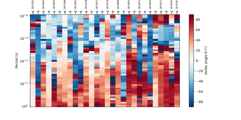
<Axes: title={'center': 'Anisotropy: Strike angle θ (°) (wang2017)'}, xlabel='Station', ylabel='Period (s)'>
Reading this figure. plot_anisotropy also accepts
metric="phase_diff_deg" (φ_xy − φ_yx) the same way, not shown here
to keep this gallery page from repeating the same figure type a
fourth time — its API reference entry covers it.
4. Advanced: comparing two lines of the same survey#
plot_anisotropy accepts an ax so two lines can be placed side
by side on one figure — here L18PLT against its neighbour L22PLT.
survey22 = load_survey("amt_l22plt")
table22 = anisotropy_table(survey22)

fig, (axa, axb) = plt.subplots(1, 2, figsize=(12, 5), sharey=True)
plot_anisotropy(survey, metric="ratio_log10", ax=axa)
axa.set_title("L18PLT")
plot_anisotropy(survey22, metric="ratio_log10", ax=axb)
axb.set_title("L22PLT")
fig.tight_layout()

print(
    f"L18PLT: mean|ratio|={table['mean_ratio_log10'].abs().mean():.2f}, "
    f"mean skew={table['mean_swift_skew'].mean():.2f}, "
    f"median strike={table['median_strike_deg'].median():.1f} deg"
)
print(
    f"L22PLT: mean|ratio|={table22['mean_ratio_log10'].abs().mean():.2f}, "
    f"mean skew={table22['mean_swift_skew'].mean():.2f}, "
    f"median strike={table22['median_strike_deg'].median():.1f} deg"
)
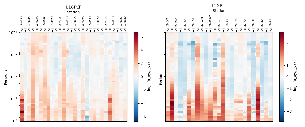
L18PLT: mean|ratio|=0.58, mean skew=1.95, median strike=24.4 deg
L22PLT: mean|ratio|=0.52, mean skew=1.76, median strike=17.7 deg
Reading this figure. Both lines show the same qualitative
long-period warming, and their summary numbers are close (mean
|ratio| 0.58 vs 0.52, mean skew 1.95 vs 1.76, median strike 24 deg vs
18 deg) — reasonable agreement for two neighbouring lines from the
same survey, and a useful sanity check: a line whose numbers were
wildly different from its neighbour would be worth re-inspecting for
a processing problem before trusting its anisotropy result.
5. Advanced: do the two metrics actually agree?#
Step 2 showed two rankings that disagreed at the extremes. Pooling
both lines’ per-station summaries makes it precise: is |ratio| and
skew correlated across the whole survey, or genuinely independent?
import pandas as pd  # noqa: E402

both = pd.concat([table.assign(line="L18PLT"), table22.assign(line="L22PLT")])
corr = both["mean_ratio_log10"].abs().corr(both["mean_swift_skew"])

fig, ax = plt.subplots(figsize=(6, 5))
for line, marker in [("L18PLT", "o"), ("L22PLT", "^")]:
    sub = both[both["line"] == line]
    ax.scatter(
        sub["mean_swift_skew"],
        sub["mean_ratio_log10"].abs(),
        label=line,
        marker=marker,
        alpha=0.8,
    )
ax.set_xlabel("mean Swift skew")
ax.set_ylabel(r"$|\overline{\log_{10}(\rho_{xy}/\rho_{yx})}|$")
ax.set_title(f"Ratio vs. skew across both lines  (Pearson r = {corr:.2f})")
ax.legend()
ax.grid(alpha=0.3)
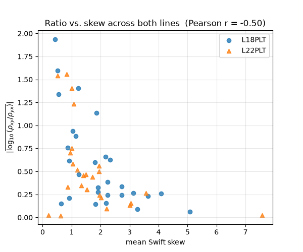
Reading this figure. Across all 53 stations from both lines, mean
|ratio| and mean skew are negatively correlated (Pearson r ≈ -0.5) —
stations with a strong ρ_xy/ρ_yx contrast tend to have comparatively
modest Swift skew, and vice versa, echoing 18-016A vs 18-007U
in step 2. That is the practical conclusion of this whole page: the
two indicators are not redundant. A site could pass as “isotropic” on
one and still be clearly non-1-D on the other, so a real assessment
should check both rather than either alone.
Total running time of the script: (0 minutes 1.884 seconds)