
Note
Go to the end to download the full example code.
Multi-station diagnostic panels (pycsamt.emtools.plot)#
pycsamt.emtools.plot is the “many stations, one figure” layer of
emtools: dense apparent-resistivity/phase panel grids, full-tensor
raw-data diagnostics, combined response/tipper quality-control figures,
side-by-side before/after comparisons, and measured-vs-predicted fit
grids with per-component RMS. This example works from the simplest call
(a handful of stations, two components) up to the richest single figure
the module produces, using L18PLT (data/AMT/WILLY_DATA/, no
tipper) for the tensor-only functions and KAP03
(data/MT/kap03lmt_edis, real tipper) for
plot_response_tipper(). As in the
inspect example, there is no real inversion output bundled with
these docs, so a smoothed version of the same real data
(smooth_mavg()) stands in honestly for
an “after processing” / “predicted” curve wherever one is needed.
1. Simple: a panel grid of several stations#
plot_sites_panels() is the module’s
simplest entry point: one rho/phase column per station, laid out in a
grid. A handful of stations keeps the figure readable, the same
legend-size lesson from the inspect example.
from _datasets import load_survey

from pycsamt.emtools import (
    plot_raw_sites_1d,
    plot_response_tipper,
    plot_sites_compare,
    plot_sites_fit_grid,
    plot_sites_panels,
    smooth_mavg,
)

survey = load_survey("amt_l18plt")
kap = load_survey("mt_kap03")

names4 = ["18-001A", "18-007U", "18-016A", "18-018A"]
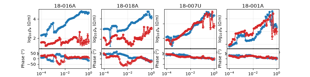
plot_sites_panels(survey, stations=names4, components=("xy", "yx"), ncols=4)
<Figure size 1040x260 with 8 Axes>
Reading this figure. These four stations are the same ones
threaded through the anisotropy, impedance, and lcurve
examples — 18-016A and 18-018A flagged for strong ratio
anisotropy, 18-007U for strong Swift skew. Even at a glance, the
XY/YX curves for 18-016A are visibly further apart than for the
other three, consistent with that anisotropy flag.
2. Full-tensor raw diagnostics#
plot_raw_sites_1d() is the module’s raw
quality-control view: every requested component gets its own
rho/phase column, and by default (raw=True) every curve is drawn
in the package’s plain black diagnostic style rather than per-component
colours, so nothing about the display implies interpretation yet.
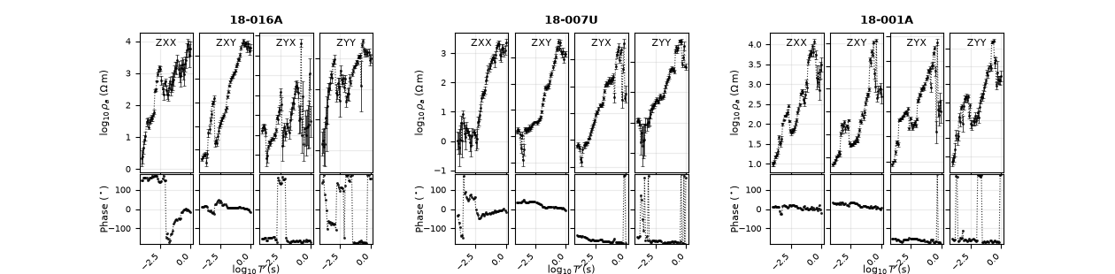
raw_stations = ["18-001A", "18-007U", "18-016A"]
plot_raw_sites_1d(
    survey,
    stations=raw_stations,
    components=("xx", "xy", "yx", "yy"),
)
<Figure size 1260x310 with 24 Axes>
Reading this figure. All four tensor components in one black,
undifferentiated diagnostic block — deliberately styleless. For
18-001A specifically, the diagonal terms (xx, yy) run at
a lower median \(\log_{10}\rho_a\) than the off-diagonal ones
(2.31/2.55 vs. 2.69/2.97), the expected pattern for a broadly
1-D/2-D setting rather than a data problem, even though the ranges
visibly overlap. Three stations fill the default three-column layout
exactly, and 18-016A’s much wider XY/YX split (from section 1) is
visible again here even in the plain, undifferentiated black style.
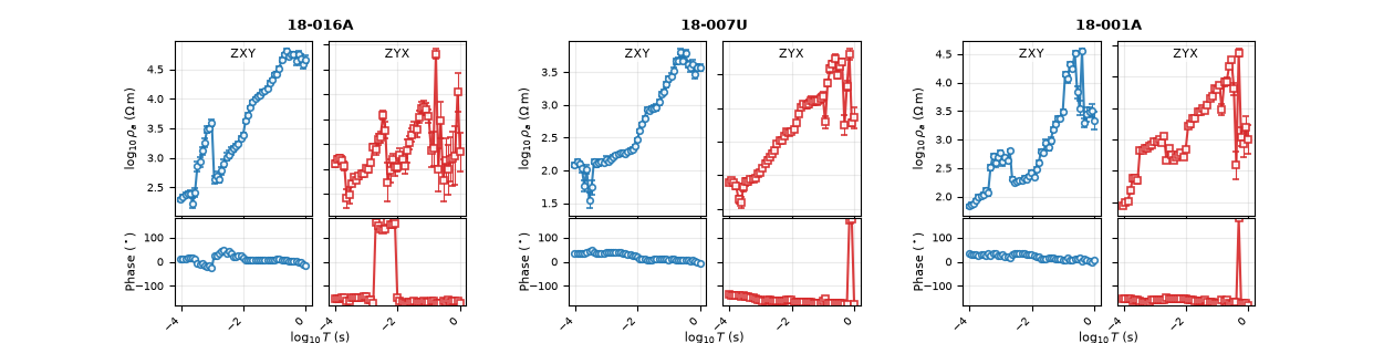
Passing force_style=True (with raw=True still set) switches
back on the usual per-component colours, which is often more useful
once the raw look-over above has already ruled out anything alarming.
plot_raw_sites_1d(
    survey,
    stations=raw_stations,
    components=("xy", "yx"),
    force_style=True,
)
<Figure size 1260x310 with 12 Axes>
Reading this figure. Same three stations and components, now colour-coded (the package’s usual XY/YX colours) — easier to read at a glance once the plain diagnostic pass is done.
3. Response + tipper quality control#
plot_response_tipper() is the richest
per-station figure for surveys that actually carry a vertical-field
response: resistivity and phase per component, with compact
\(T_x\)/\(T_y\) rows spanning the full group width. This needs
real tipper, so it switches to KAP03.
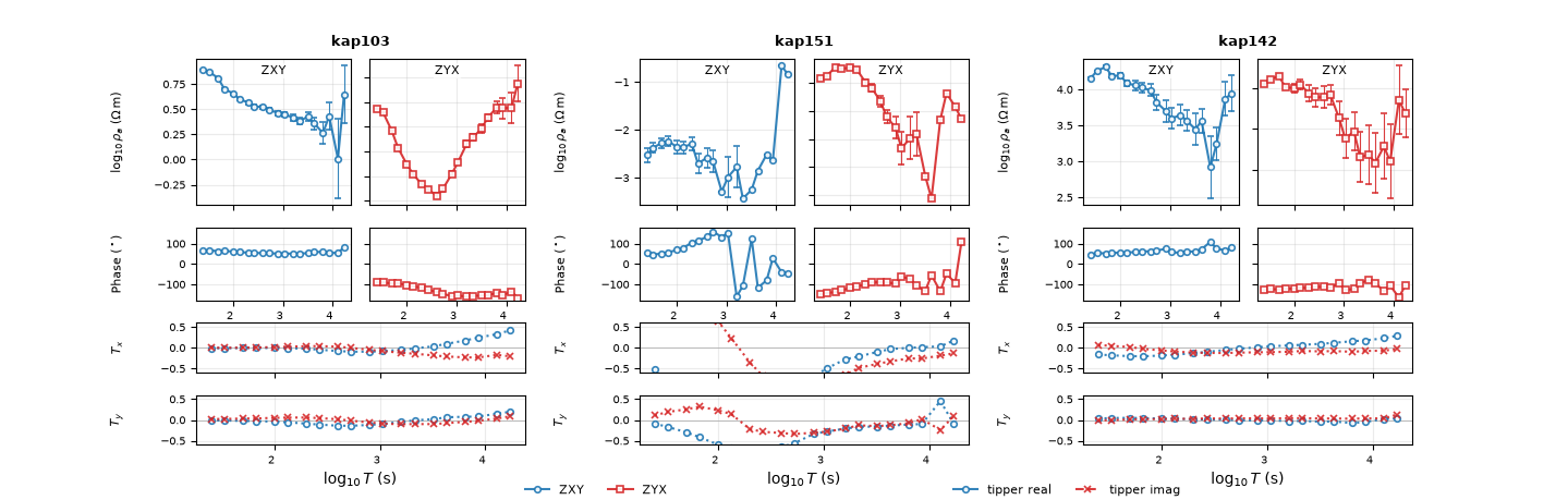
plot_response_tipper(
    kap,
    stations=["kap103", "kap142", "kap151"],
    components=("xy", "yx"),
    tipper_span_group=True,
)
<Figure size 1440x460 with 18 Axes>
Reading this figure. kap151 is the same station singled out in
the tf and inspect examples for its sharp, band-limited dip —
here visible directly in the \(T_x\)/\(T_y\) rows as a
localized wiggle rather than the smooth trend kap103 and
kap142 show over the same period range. Three stations fill the
default three-column group layout exactly, leaving no empty panels.
4. Before/after comparison#
plot_sites_compare() places two versions
of the same stations side by side. There is no real post-processing
run bundled with these docs, so — honestly, as in inspect — a
light frequency-domain moving average
(smooth_mavg()) stands in for
“after”: real numbers from a real (if simple) transform, not
fabricated to look clean.
smoothed = smooth_mavg(survey, k=5)
plot_sites_compare(
    survey,
    smoothed,
    stations=raw_stations,
    components=("xy", "yx"),
    labels=("raw", "smoothed (k=5)"),
)

<Figure size 1800x300 with 12 Axes>
Reading this figure. Each station’s “after” column keeps the same overall trend as “raw” but with the point-to-point scatter visibly reduced — exactly what a moving average should do to real, noisy data, and a reassuring sign that the underlying sounding shape survives the smoothing rather than being distorted by it. The same three stations as sections 1-2 again fill the default three-column layout exactly.
5. Measured vs. predicted, with per-component RMS#
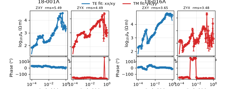
plot_sites_fit_grid() is built for
inversion QC: a “measured” and a “predicted” survey are paired by
station, plotted together per component, and each panel is annotated
with its own RMS misfit in log10(rho) space. The same smoothed survey
used above stands in for “predicted” here, which lets the RMS
calculation itself be demonstrated honestly.
plot_sites_fit_grid(
    survey,
    smoothed,
    stations=["18-001A", "18-016A"],
    components=("xy", "yx"),
)
<Figure size 800x300 with 8 Axes>
Reading this figure. The RMS reported in each panel header is an
error-normalized misfit (residual divided by the quoted per-point
uncertainty, in the spirit of a reduced-chi RMS), not the raw
log10(rho) difference — and the two tell different stories here.
The raw difference between “measured” and “smoothed” is genuinely
small (mean absolute \(\Delta\log_{10}\rho_a\approx 0.14\) for
18-001A/xy, comfortably under half a decade). But this
survey’s quoted per-point errors are even tighter (mean
\(\approx 0.047\)), so a five-point moving average — which was
never fit to those error bars in the first place — lands at RMS
\(\approx 5.5\): several times the data’s own noise floor. A
real inversion response, fit to those uncertainties, would be
expected to land close to RMS \(\approx 1\) instead; this
example’s large values are a property of using an unfit smoothing
stand-in, not a flaw in the RMS calculation itself.
6. Advanced: the same figures under a different display control#
Every function in this module reads its axis labels, phase wrapping,
and resistivity scale from pycsamt.api.control.PYCSAMT_CONTROL
rather than hard-coding them. Switching to a linear resistivity axis,
an unwrapped 0-360 degree phase range, and a frequency x-axis changes
every affected label and limit at once, with no other arguments touched.
from pycsamt.api.control import PYCSAMT_CONTROL  # noqa: E402

with PYCSAMT_CONTROL.context(
    rho__view="linear",
    phase__range=(0.0, 360.0),
    x__view="frequency",
):
    fig = plot_raw_sites_1d(
        survey,
        stations=raw_stations,
        components=("xy", "yx"),
        force_style=True,
    )

# shared group labels are drawn as figure-level text, not per-axis
# ylabels, so read them back from fig.texts rather than ax.get_ylabel()
shared_labels = [t.get_text() for t in fig.texts]
print("shared labels:", shared_labels)
print("phase axis ylim (index 2, first group XY):", fig.axes[2].get_ylim())
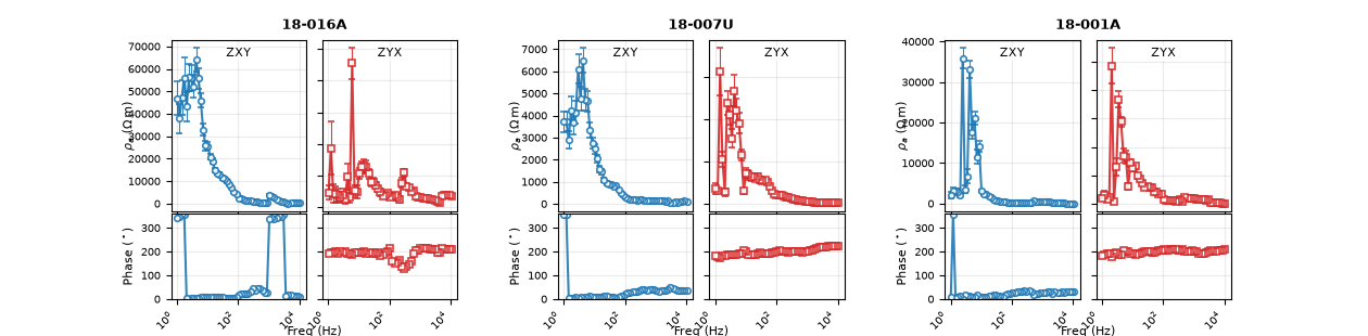
shared labels: ['18-001A', '$\\rho_a$ ($\\Omega\\,\\mathrm{m}$)', 'Phase ($^\\circ$)', 'Freq (Hz)', '18-007U', '$\\rho_a$ ($\\Omega\\,\\mathrm{m}$)', 'Phase ($^\\circ$)', 'Freq (Hz)', '18-016A', '$\\rho_a$ ($\\Omega\\,\\mathrm{m}$)', 'Phase ($^\\circ$)', 'Freq (Hz)']
phase axis ylim (index 2, first group XY): (np.float64(0.0), np.float64(360.0))
Reading this figure/output. Same three stations and components as
section 2, but the resistivity axis is now linear ohm-metres instead
of log10 (label $\rho_a$ ($\Omega\,\mathrm{m}$) rather than the
log10 version), phase is unwrapped into 0-360 degrees instead of
±180 (axis 2’s y-limits print exactly (0.0, 360.0) above), and
the x-axis label reads Freq (Hz) instead of log10 period — every
label matches the active control rather than a fixed default.
Total running time of the script: (0 minutes 2.647 seconds)