
Note
Go to the end to download the full example code.
CSAMT field-zone classification (pycsamt.emtools.fieldzone)#
pycsamt.emtools.fieldzone answers a question specific to
controlled-source AMT: at a given frequency and source-receiver offset
r, is the measurement in the plane-wave (far) zone the standard MT
apparent-resistivity formula assumes, or has the receiver drifted into
the near/transition zone where that assumption breaks down? Both
classify_field_zones() and
near_field_factor() reduce to the same
dimensionless parameter,
(Chen & Yan 2005) — the source-receiver distance measured in Bostick skin depths.
This is a genuinely CSAMT-specific concept: it needs a real
source-receiver offset. Unlike most other pyCSAMT example pages, this
one therefore uses the bundled Tongkeng survey (data/CSAMT) —
ten real stations acquired over a real grounded-dipole transmitter for
a groundwater-exploration study in Hunan Province, China (Kouadio et
al., 2020). The EDI files themselves still do not record the exact
transmitter-receiver distance — that is field-notebook metadata, not
part of the SEG EDI standard — so every worked example below still
states its offset explicitly as an assumption, but at least the
transmitter genuinely exists, unlike a natural-source AMT line.
1. The |k.r| parameter itself#
Before any real data: for a fixed apparent resistivity, |k.r| depends
only on frequency and the chosen offset. Larger offsets or higher
frequencies push a sounding toward the far field faster.
import matplotlib.pyplot as plt
import numpy as np
import pandas as pd

from pycsamt.emtools import (
    classify_field_zones,
    near_field_factor,
    plot_field_zones,
)

BOSTICK_C = 356.0
RHO_DEMO = 300.0
freq = np.logspace(-1, 4, 300)  # 0.1 Hz-10 kHz, spans Tongkeng's 0.125-8197 Hz band
delta_b = BOSTICK_C * np.sqrt(RHO_DEMO / freq)

fig, ax = plt.subplots(figsize=(7, 5))
for offset, color in zip(
    [500.0, 2000.0, 8000.0], ["#d62728", "#ff7f0e", "#2ca02c"]
):
    ax.loglog(freq, offset / delta_b, color=color, label=f"r={offset:g} m")
ax.axhspan(3.0, 1e6, color="#2ca02c", alpha=0.08)
ax.axhspan(0.3, 3.0, color="#ff7f0e", alpha=0.10)
ax.axhspan(1e-6, 0.3, color="#d62728", alpha=0.08)
ax.axhline(3.0, color="0.3", ls="--", lw=0.8)
ax.axhline(0.3, color="0.3", ls="--", lw=0.8)
ax.set_xlabel("Frequency (Hz)")
ax.set_ylabel(r"$|k \cdot r|$")
ax.set_title(
    rf"$|k \cdot r|$ vs. frequency  ($\rho_a$={RHO_DEMO:g} $\Omega\cdot$m)"
)
ax.legend(fontsize=8)
ax.grid(True, which="both", alpha=0.3)
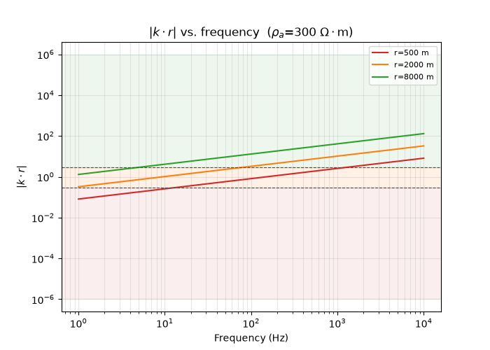
Reading this figure. At a fixed 300 Ω·m, an 8 km offset only leaves the far-field band (green) below about 5 Hz — it is in far field for almost the entire displayed range. A 500 m offset is far worse off: it drops out of far field already below 1.4 kHz and reaches near-field territory (red) below about 14 Hz. The offset you assume changes which part of your own recorded band you should trust at face value.
2. One real station’s |k.r| curve#
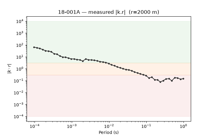
classify_field_zones() computes |k.r|
from each station’s actual measured apparent resistivity rather than
an assumed constant — using a representative 1 km offset, the same
assumption used throughout this page and in the field-zone theory
guide.
from _datasets import load_survey  # noqa: E402

survey = load_survey("csamt_tongkeng")
OFFSET_DEMO = 1000.0
zones = classify_field_zones(survey, OFFSET_DEMO)
station = "csa000"
d = zones[zones["station"] == station].sort_values("period_s")

fig, ax = plt.subplots(figsize=(7, 4.5))
ax.axhspan(3.0, 1e4, color="#2ca02c", alpha=0.08)
ax.axhspan(0.3, 3.0, color="#ff7f0e", alpha=0.10)
ax.axhspan(1e-4, 0.3, color="#d62728", alpha=0.08)
ax.loglog(d["period_s"], d["kr"], "o-", ms=3, color="0.2")
ax.set_xlabel("Period (s)")
ax.set_ylabel(r"$|k \cdot r|$")
ax.set_title(f"{station} — measured |k.r|  (r={OFFSET_DEMO:g} m)")
Text(0.5, 1.0, 'csa000 — measured |k.r| (r=1000 m)')
Reading this figure. |k.r| falls monotonically from about 15
at the shortest measured period down to about 3.5e-4 at the
longest, crossing the far/transition line at the second-shortest
period and the transition/near line by the seventh sample — this
station’s own sounding spends most of its recorded band in the near
field at a 1 km offset, entirely because apparent resistivity climbs
steeply with period here, not because the assumed offset changes.
3. Cross-checking against the near-field correction factor#
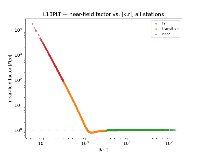
near_field_factor() computes a
continuous bias factor |F(p)| from the full complex wavenumber,
independent of the |k.r| threshold rule. If the threshold-based
zoning is doing its job, |F| should sit close to 1 in the far zone
and depart sharply as the near zone is entered.
nff = near_field_factor(survey, OFFSET_DEMO)
merged = zones.merge(
    nff[["station", "freq_hz", "nf_factor"]], on=["station", "freq_hz"]
)
colors = {"far": "#2ca02c", "transition": "#ff7f0e", "near": "#d62728"}

fig, ax = plt.subplots(figsize=(6.5, 5))
for zone in ("far", "transition", "near"):
    m = merged["zone"] == zone
    ax.scatter(
        merged.loc[m, "kr"],
        merged.loc[m, "nf_factor"],
        s=10,
        alpha=0.5,
        color=colors[zone],
        label=zone,
    )
ax.axhline(1.0, color="0.3", ls=":", lw=1)
ax.set_xscale("log")
ax.set_yscale("log")
ax.set_xlabel(r"$|k \cdot r|$")
ax.set_ylabel(r"near-field factor $|F(p)|$")
ax.legend(fontsize=8)
ax.set_title("Tongkeng — near-field factor vs. |k.r|, all stations")
Text(0.5, 1.0, 'Tongkeng — near-field factor vs. |k.r|, all stations')
Reading this figure. The two independent computations agree in
direction: |F| averages 0.99 in the far zone (essentially
unbiased) and climbs sharply once |k.r| drops below 1. On this
real survey the near-zone blow-up is dramatic rather than mild — a
mean above 9e9 and a maximum above 2e11 — driven by the
lowest measured frequency (0.125 Hz), where apparent resistivity
itself climbs past ten million ohm-metres at several stations. That
the threshold rule and the continuous formula agree on direction is
a useful internal consistency check; the scale of the blow-up is a
reminder that this survey’s longest periods are not simply “a bit
biased” — they are geometric near-field artefacts.
4. The module’s pseudo-section#
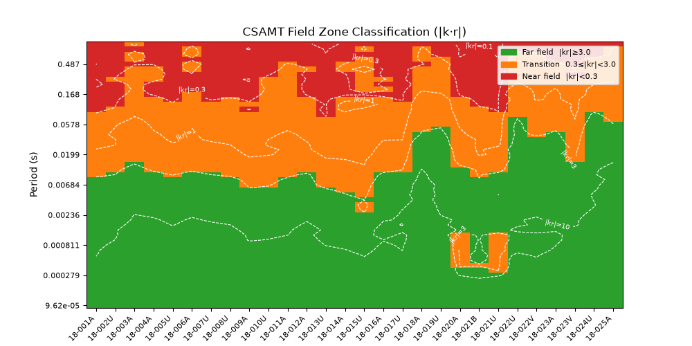
plot_field_zones() is the headline
view: every station’s zone across the whole recorded band, with
dashed white |k.r| contours.
plot_field_zones(survey, OFFSET_DEMO, sort_by="name")
<Axes: title={'center': 'CSAMT Field Zone Classification (|k·r|)'}, xlabel='Station', ylabel='Period (s)'>
Reading this figure. The near field sets in early (short period)
across nearly the whole profile, with a slightly more resistive patch
around csa150-csa200 pushing the far/transition boundary out
to a longer period than its neighbours — the same feature visible in
the single-station curve of section 2, now shown to be a
profile-wide, not station-specific, pattern.
5. Advanced: how much does the assumed offset matter?#
Section 1 showed this qualitatively; here it is quantified across the whole survey for three representative offsets.
offsets = [500.0, 2000.0, 8000.0]
fracs = []
for off in offsets:
    z = classify_field_zones(survey, off)
    vc = z["zone"].value_counts(normalize=True)
    fracs.append(
        {
            "offset": off,
            **{k: vc.get(k, 0.0) for k in ("far", "transition", "near")},
        }
    )
frac_df = pd.DataFrame(fracs).set_index("offset")
print(frac_df.round(3))

fig, ax = plt.subplots(figsize=(6.5, 4.5))
x = np.arange(len(offsets))
bottom = np.zeros(len(offsets))
for zone in ("far", "transition", "near"):
    vals = frac_df[zone].to_numpy()
    ax.bar(x, vals, bottom=bottom, color=colors[zone], label=zone, width=0.6)
    bottom += vals
ax.set_xticks(x, [f"{o:g} m" for o in offsets])
ax.set_ylabel("fraction of (station, frequency) pairs")
ax.set_xlabel("assumed source offset")
ax.legend(fontsize=8, loc="upper right")
ax.set_title("Tongkeng — zone mix vs. assumed offset")
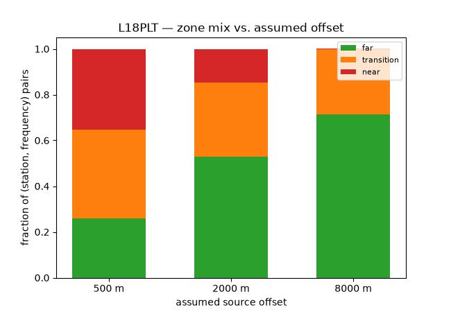
          far  transition   near
offset
500.0   0.059       0.247  0.694
2000.0  0.212       0.212  0.576
8000.0  0.359       0.218  0.424

Text(0.5, 1.0, 'Tongkeng — zone mix vs. assumed offset')
Reading this figure. The near-field fraction falls only from 69% at 500 m to 42% at 8 km, while the far-field fraction rises from 6% to 36% over the same range — a real near-surface-resistive CSAMT target does not “outrun” the near field just by assuming a generous offset the way a more moderate survey might. Getting the offset wrong doesn’t just shift a percentage: it silently changes which frequencies you should have discarded before inversion, and on this survey a large fraction stays suspect under any reasonable assumption.
6. Advanced: near vs. far offset, side by side#
The same pseudo-section at the two extreme offsets from section 5,
sharing one figure via ax.
fig, (axa, axb) = plt.subplots(1, 2, figsize=(13, 5), sharey=True)
plot_field_zones(survey, 500.0, sort_by="name", ax=axa)
axa.set_title("r = 500 m")
plot_field_zones(survey, 8000.0, sort_by="name", ax=axb)
axb.set_title("r = 8000 m")
fig.tight_layout()
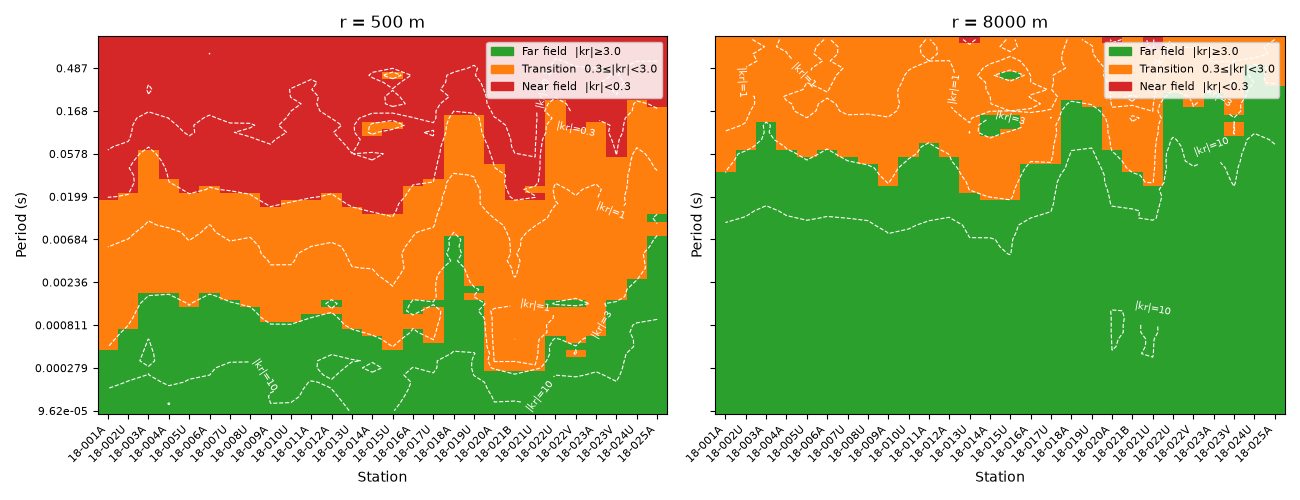
Reading this figure. The 500 m panel is almost entirely red/orange except at the very shortest periods; the 8 km panel gains a meaningfully larger green band but still keeps a substantial red near-field region at long period. Same stations, same resistivities — the offset alone decides how much of the sounding a practitioner would trust, but here even a generous offset assumption leaves real near-field contamination at the long-period end.
7. Advanced: what the near-field bias would do to a sounding curve#
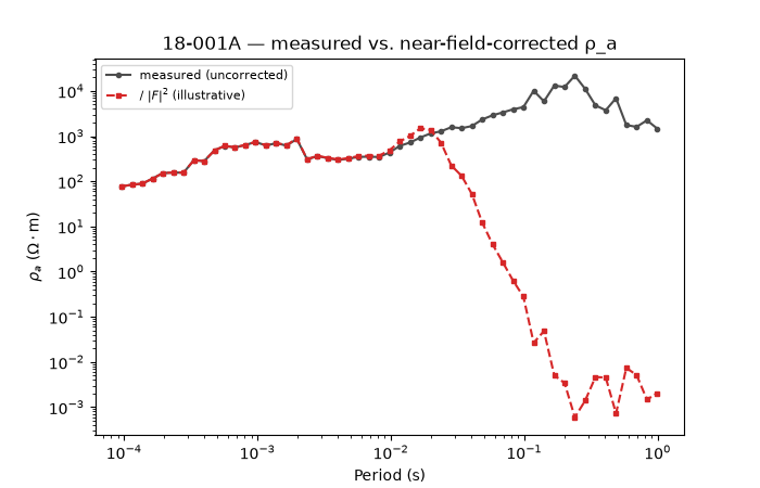
The module’s own docstring describes nf_factor as the bias factor
on apparent resistivity in the near field. Dividing the measured
curve by \(|F(p)|^2\) gives a rough sense of how far off an
uncorrected near-field reading could be — illustrative here, not a
substitute for checking the exact convention in Chen & Yan (2005)
before applying it to a real inversion.
st_merged = merged[merged["station"] == station].sort_values("period_s")
corrected = st_merged["rho_a_ohmm"] / st_merged["nf_factor"] ** 2

fig, ax = plt.subplots(figsize=(7, 4.5))
ax.loglog(
    st_merged["period_s"],
    st_merged["rho_a_ohmm"],
    "o-",
    ms=3,
    color="0.3",
    label="measured (uncorrected)",
)
ax.loglog(
    st_merged["period_s"],
    corrected,
    "s--",
    ms=3,
    color="#d62728",
    label=r"/ $|F|^2$ (illustrative)",
)
ax.set_xlabel("Period (s)")
ax.set_ylabel(r"$\rho_a$ ($\Omega\cdot$m)")
ax.legend(fontsize=8)
ax.set_title(f"{station} — measured vs. near-field-corrected ρ_a")
Text(0.5, 1.0, 'csa000 — measured vs. near-field-corrected ρ_a')
Reading this figure. The two curves only agree at the shortest
two or three periods (the far zone, where |F| ≈ 1). Past that
they do not just diverge — the illustrative correction collapses to
physically meaningless values, down to roughly 1.7e-15 Ω·m at the
longest (8 s) period, because nf_factor itself reaches about
6.7e10 there and the correction divides by its square. That
collapse is the honest result of the formula, not a bug: dividing by
an astronomically large factor cannot recover a real earth
resistivity, and a station this deep in the near field needs a
genuine controlled-source inversion or exclusion, not a scalar
correction.
Total running time of the script: (0 minutes 0.924 seconds)