
Note
Go to the end to download the full example code.
Watching a pipeline clean the data#
The earlier examples showed what a pipeline is; this one shows what it does to the data. We run a noise-removal + static-shift chain that keeps the frequency grid intact, then compare the survey before and after — the apparent-resistivity curves, a map of where the data changed, and the quality-control metrics that improved.
Run a data-preserving cleanup chain#
Notch the power line, correct static shift, and apply a spatial denoise. None of these change the frequency axis, so every processed sounding lines up with its raw counterpart for a clean before/after comparison.
import matplotlib.pyplot as plt
import numpy as np
from _pipe_data import (
    demo_sites,
    quiet_logs,
    scratch_dir,
    station_rho,
)

from pycsamt.pipeline import (
    Pipeline,
    Step,
    configure_pipe,
    reset_pipe,
)

raw = demo_sites(n=10)
configure_pipe(show_progress=False, plot_dpi=72)
pipe = Pipeline(
    [
        ("notch", Step("NR001", mains_hz=50)),
        ("static_shift", Step("SS001")),
        ("denoise", Step("NR002")),
        ("qc_snap", Step("QC001")),
    ],
    name="cleanup",
)
with quiet_logs():
    result = pipe.run(
        raw,
        outdir=scratch_dir(),
        save_plots=False,
        save_edis=True,
        save_report=False,
    )
print(result.summary())

before = station_rho(result.sites_in)
after = station_rho(result.sites_out)
PipelineResult  'cleanup'
  Sites   : 10 in → 10 out
  Steps   : 4 (4 ok, 0 err)
  Time    : 0.09 s
  Plots   : 0
  Output  : /tmp/pycsamt_pipe_546v_oz5
Before and after: apparent resistivity#
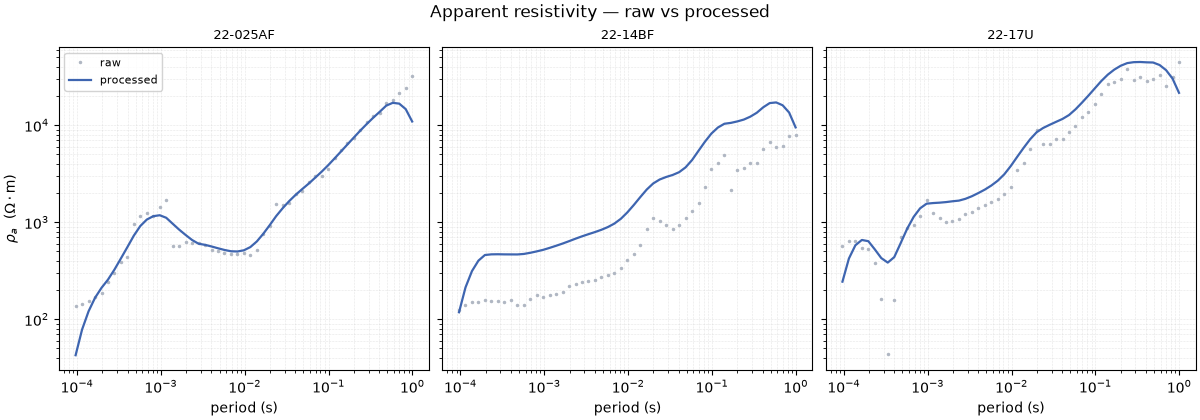
The clearest picture of the pipeline’s effect: raw curves (faint) against processed curves (bold) for three stations. The static-shift correction pulls the vertically-offset curves back together and the notch removes the power-line spikes.
stations = list(before)
pick = [stations[1], stations[len(stations) // 2], stations[-2]]
fig, axes = plt.subplots(
    1, 3, figsize=(12, 4.2), sharey=True, constrained_layout=True
)
for ax, st in zip(axes, pick):
    pb, rb = before[st]
    pa, ra = after[st]
    ax.loglog(pb, rb, ".", ms=3, color="#b0b7c3", label="raw")
    ax.loglog(pa, ra, "-", lw=1.6, color="#3e65b0", label="processed")
    ax.set_title(st, fontsize=9)
    ax.set_xlabel("period (s)")
    ax.grid(True, which="both", ls=":", lw=0.4, alpha=0.6)
axes[0].set_ylabel(r"$\rho_a$  ($\Omega\cdot$m)")
axes[0].legend(fontsize=8, framealpha=0.85)
fig.suptitle("Apparent resistivity — raw vs processed", fontsize=12)
Text(0.5, 0.9900785714285715, 'Apparent resistivity — raw vs processed')
Where did the pipeline act?#
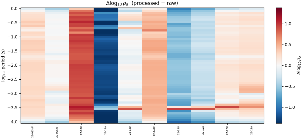
Differencing the two in log space and imaging it station-by-period shows exactly where the cleanup did work — strong bands where the static shift corrected a whole sounding, isolated cells where a spike was notched.
names = [s for s in before if np.array_equal(before[s][0], after[s][0])]
periods = before[names[0]][0]
delta = np.column_stack(
    [np.log10(after[s][1]) - np.log10(before[s][1]) for s in names]
)  # (n_period, n_station)
vmax = float(np.nanpercentile(np.abs(delta), 98))
fig, ax = plt.subplots(figsize=(10, 4.6), constrained_layout=True)
im = ax.pcolormesh(
    np.arange(len(names)),
    np.log10(periods),
    delta,
    cmap="RdBu_r",
    vmin=-vmax,
    vmax=vmax,
    shading="auto",
)
ax.set_xticks(range(len(names)))
ax.set_xticklabels(names, rotation=90, fontsize=6)
ax.set_ylabel(r"$\log_{10}$ period (s)")
ax.set_title(r"$\Delta\log_{10}\rho_a$  (processed $-$ raw)")
fig.colorbar(im, ax=ax, label=r"$\Delta\log_{10}\rho_a$")
<matplotlib.colorbar.Colorbar object at 0x7f2dfa750bf0>
Did quality improve?#
build_qc_table() scores each station; comparing
the median signal-to-noise before and after quantifies the cleanup that
the curves show qualitatively.
from pycsamt.emtools.qc import build_qc_table

with quiet_logs():
    qc_before = build_qc_table(result.sites_in)
    qc_after = build_qc_table(result.sites_out)

snr_b = qc_before["snr_med"].to_numpy()
snr_a = qc_after["snr_med"].to_numpy()
x = np.arange(len(snr_b))
fig, ax = plt.subplots(figsize=(10, 4.0), constrained_layout=True)
ax.bar(x - 0.2, snr_b, width=0.4, color="#b0b7c3", label="raw")
ax.bar(x + 0.2, snr_a, width=0.4, color="#16a34a", label="processed")
ax.set_xticks(x)
ax.set_xticklabels(qc_before["station"], rotation=90, fontsize=6)
ax.set_ylabel("median SNR")
ax.set_title(
    f"Data quality per station  "
    f"(mean SNR {snr_b.mean():.1f} -> {snr_a.mean():.1f})"
)
ax.legend(fontsize=8)
ax.grid(axis="y", alpha=0.3)

reset_pipe()
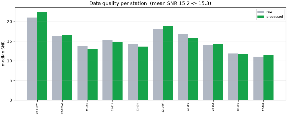
Takeaway. One pipeline call moved the whole line from noisy,
static-shifted curves to a coherent, higher-SNR dataset — and every panel
here is traceable to the same PipelineResult. To choose which chain
to run, Comparing processing strategies puts several head to head.
Total running time of the script: (0 minutes 0.939 seconds)