
Note
Go to the end to download the full example code.
Comparing processing strategies#
There is rarely one right pipeline — a light touch preserves the data, an aggressive chain removes more noise but risks over-smoothing. This example runs three strategies on the same line and compares them head to head: how each reshapes a sounding, how much it changes the data, how quickly it runs, and what it does to the signal-to-noise.
Three strategies#
From light to heavy: a single spatial denoise, the noise_reduction
preset, and a custom denoise-plus-static-shift chain. Each is just a
Pipeline.
import matplotlib.pyplot as plt
import numpy as np
from _pipe_data import (
    demo_sites,
    quiet_logs,
    scratch_dir,
    station_rho,
)

from pycsamt.emtools.qc import build_qc_table
from pycsamt.pipeline import (
    Pipeline,
    Step,
    configure_pipe,
    get_preset,
    reset_pipe,
)

raw = demo_sites(n=10)
configure_pipe(show_progress=False, plot_dpi=72)

strategies = {
    "light_denoise": Pipeline([("denoise", Step("NR002"))]),
    "noise_reduction": Pipeline(get_preset("noise_reduction").steps),
    "denoise+shift": Pipeline(
        [
            ("notch", Step("NR001", mains_hz=50)),
            ("denoise", Step("NR002")),
            ("static_shift", Step("SS001")),
        ]
    ),
}

raw_rho = station_rho(raw)
colors = {
    "light_denoise": "#3e65b0",
    "noise_reduction": "#fbb040",
    "denoise+shift": "#c44536",
}


def mean_change(proc_rho):
    """Mean |dlog10 rho| vs raw, per station (interp onto raw periods)."""
    per_station = {}
    for st, (p_raw, r_raw) in raw_rho.items():
        if st not in proc_rho:
            continue
        p_p, r_p = proc_rho[st]
        o = np.argsort(p_p)
        lr = np.interp(np.log10(p_raw), np.log10(p_p[o]), np.log10(r_p[o]))
        per_station[st] = np.nanmean(np.abs(lr - np.log10(r_raw)))
    return per_station


results, proc_rhos, changes = {}, {}, {}
with quiet_logs():
    for name, pipe in strategies.items():
        res = pipe.run(
            raw,
            outdir=scratch_dir(),
            save_plots=False,
            save_edis=False,
            save_report=False,
        )
        results[name] = res
        proc_rhos[name] = station_rho(res.sites_out)
        changes[name] = mean_change(proc_rhos[name])
        snr = build_qc_table(res.sites_out)["snr_med"].mean()
        print(
            f"{name:<16} steps={len(res.step_results)} "
            f"elapsed={res.elapsed_sec:5.2f}s  meanSNR={snr:5.1f}  "
            f"meanChange={np.mean(list(changes[name].values())):.3f}"
        )
light_denoise    steps=1 elapsed= 0.02s  meanSNR= 15.5  meanChange=0.074
noise_reduction  steps=6 elapsed= 0.27s  meanSNR= 26.3  meanChange=0.526
denoise+shift    steps=3 elapsed= 0.09s  meanSNR= 15.5  meanChange=0.287
One sounding, three ways#
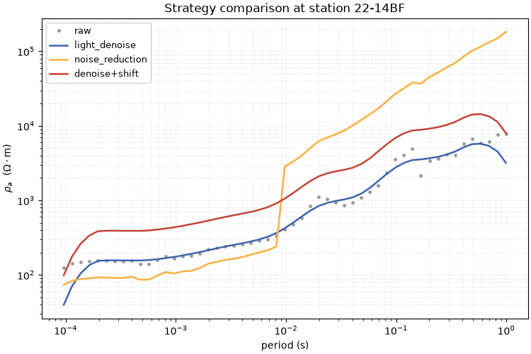
Overlaying a single station’s apparent resistivity under each strategy against the raw curve shows their character directly — how much each moves and smooths the data.
st = list(raw_rho)[len(raw_rho) // 2]
p_raw, r_raw = raw_rho[st]
fig, ax = plt.subplots(figsize=(7.5, 5.0), constrained_layout=True)
ax.loglog(p_raw, r_raw, ".", ms=5, color="0.6", label="raw")
for name in strategies:
    p, r = proc_rhos[name][st]
    ax.loglog(p, r, "-", lw=1.8, color=colors[name], label=name)
ax.set_xlabel("period (s)")
ax.set_ylabel(r"$\rho_a$  ($\Omega\cdot$m)")
ax.set_title(f"Strategy comparison at station {st}")
ax.legend(fontsize=9, framealpha=0.85)
ax.grid(True, which="both", ls=":", lw=0.4, alpha=0.6)
Strategy scorecard#
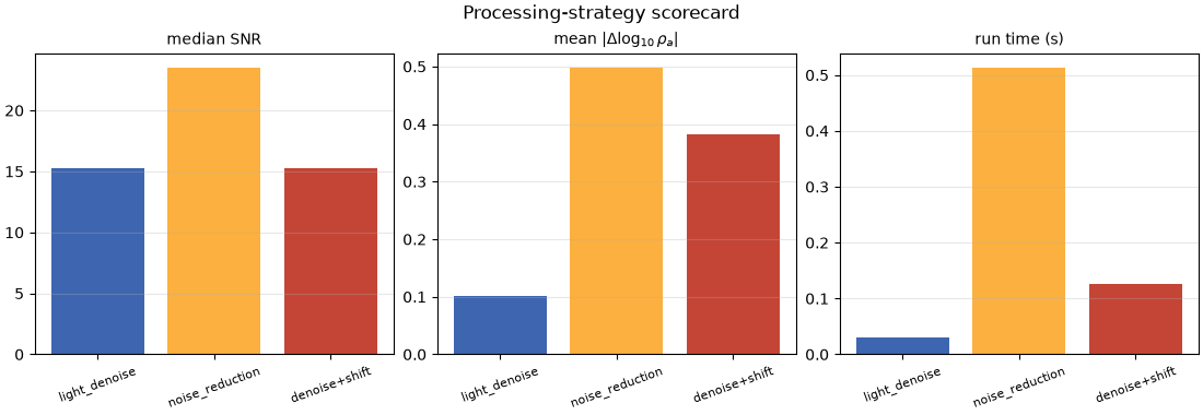
Three metrics side by side: median SNR (higher is cleaner), mean data change (how far the strategy moved the data from raw), and run time. The trade-off is explicit — more change and more compute buy more SNR, up to a point.
names = list(strategies)
snr = [build_qc_table(results[n].sites_out)["snr_med"].mean() for n in names]
chg = [float(np.mean(list(changes[n].values()))) for n in names]
secs = [results[n].elapsed_sec for n in names]

fig, axs = plt.subplots(1, 3, figsize=(11, 3.8), constrained_layout=True)
bar_colors = [colors[n] for n in names]
for ax, vals, title in [
    (axs[0], snr, "median SNR"),
    (axs[1], chg, r"mean $|\Delta\log_{10}\rho_a|$"),
    (axs[2], secs, "run time (s)"),
]:
    ax.bar(names, vals, color=bar_colors)
    ax.set_title(title, fontsize=10)
    ax.tick_params(axis="x", labelrotation=20, labelsize=8)
    ax.grid(axis="y", alpha=0.3)
fig.suptitle("Processing-strategy scorecard", fontsize=12)
Text(0.5, 0.9890342105263158, 'Processing-strategy scorecard')
Where each strategy changes the data#
The along-line profile of per-station change separates a uniform correction (a flat line — e.g. a global denoise) from a targeted one (a spiky line — e.g. static shift acting on a few offset stations).
fig, ax = plt.subplots(figsize=(10, 4.0), constrained_layout=True)
for name in strategies:
    sts = list(changes[name])
    ax.plot(
        range(len(sts)),
        [changes[name][s] for s in sts],
        "o-",
        ms=4,
        lw=1.5,
        color=colors[name],
        label=name,
    )
ax.set_xticks(range(len(sts)))
ax.set_xticklabels(sts, rotation=90, fontsize=6)
ax.set_ylabel(r"mean $|\Delta\log_{10}\rho_a|$ vs raw")
ax.set_title("Per-station data change by strategy")
ax.legend(fontsize=8)
ax.grid(axis="y", alpha=0.3)

reset_pipe()
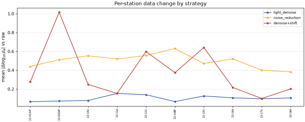
Takeaway. light_denoise makes a small, fairly uniform change,
noise_reduction lifts SNR the most, and denoise+shift makes the
most targeted correction (the static-shift stations stand out as spikes
in the profile). Run this scorecard on your own line to pick the lightest
pipeline that reaches the quality you need.
Total running time of the script: (0 minutes 1.068 seconds)