
Note
Go to the end to download the full example code.
Polar uncertainty diagnostics (pycsamt.emtools.diag)#
pycsamt.emtools.diag adapts the “k-diagram” polar-uncertainty
framework (Kouadio 2025, JOSS 10(116)) to CSAMT apparent resistivity:
given an observed sounding and a predicted quantile interval
[L, U] at each frequency, it checks empirical coverage
(\(c_j = 1(L_j \le \rho_{a,obs,j} \le U_j)\)), how interval width
drifts across the frequency band, and the rose of relative residuals
against a point prediction.
Unlike the other emtools modules covered so far, this one is not
about a property of the observed data alone — it needs a prediction to
evaluate against. There is no real forecasting model bundled with this
documentation, so this example builds one honestly: a smoothed
(rolling-median) version of each station’s own real observed resistivity
from L18PLT (data/AMT/WILLY_DATA/) stands in for a “model”, with
synthetic quantile bounds around it whose width is designed to grow with
period — a very ordinary uncertainty-modelling choice, not picked to
flatter the result. Three variants of that same construction are used
below: sensibly sized bounds, then bounds artificially narrowed
(“overconfident”) and widened (“underconfident”), to see whether the
module’s diagnostics actually catch bad calibration.
Note
While preparing this example, rho_obs in this module was found to
be off by a ~10^5-10^6 factor from the physically realistic values
pycsamt.emtools.csumt computes for the same data — a missing
practical-units conversion factor, now fixed. All values below use
the corrected formula.
1. The core concept, no data needed#
coverage_score() is pure arithmetic: what fraction of observed
values fall inside their predicted [lo, hi] interval. A tiny synthetic
example makes the definition concrete before applying it to real
soundings.
import matplotlib.pyplot as plt
import numpy as np
import pandas as pd

from pycsamt.emtools import coverage_score

rng = np.random.default_rng(0)
y_true = np.array([98.0, 105.0, 87.0, 130.0, 112.0, 76.0, 140.0])
y_lo = np.array([90.0, 95.0, 90.0, 100.0, 100.0, 70.0, 100.0])
y_hi = np.array([110.0, 115.0, 100.0, 120.0, 125.0, 90.0, 130.0])
covered = (y_true >= y_lo) & (y_true <= y_hi)

fig, ax = plt.subplots(figsize=(6, 4))
x = np.arange(len(y_true))
ax.vlines(x, y_lo, y_hi, color="0.7", lw=6, zorder=1)
ax.scatter(
    x[covered], y_true[covered], color="green", zorder=3, label="covered"
)
ax.scatter(
    x[~covered], y_true[~covered], color="red", zorder=3, label="not covered"
)
ax.set_xticks(x)
ax.set_ylabel("value")
ax.set_title(f"coverage_score = {coverage_score(y_true, y_lo, y_hi):.2f}")
ax.legend(fontsize=8)
<matplotlib.legend.Legend object at 0x7f2e2dbc2870>
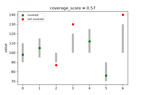
Reading this figure. Four of seven points fall inside their grey
interval bar; three sit outside it (indices 2, 3, and 6 — each either
just below its lower bound or above its upper one).
coverage_score() reports exactly 4/7 ≈ 0.57 — the same
fraction every other function in this module ultimately reduces to,
just computed per-frequency and per-station from real data instead of
by hand.
2. A synthetic “model” around a real sounding#
Real observed apparent resistivity comes straight out of
rho_coverage(): pass a bound of
[0, inf] and every observation is trivially “covered”, which is
just a convenient way to read off rho_obs without touching the
module’s private helpers. A rolling median in log-space then acts as a
plausible smooth “model” for what follows.
from _datasets import load_survey  # noqa: E402

from pycsamt.emtools import (  # noqa: E402
    coverage_table,
    plot_polar_coverage,
    plot_polar_errors,
    plot_width_drift,
    rho_coverage,
)

survey = load_survey("amt_l18plt")
raw = rho_coverage(survey, q_lo=0.0, q_hi=np.inf, rho_comp="xy")
print(
    f"rho_obs range: {raw['rho_obs'].min():.1f}-{raw['rho_obs'].max():.1f} "
    f"Ohm.m (median {raw['rho_obs'].median():.0f})"
)


def build_bounds(width_lo=0.15, width_hi=0.45, mult=1.0, window=5):
    """Smoothed centre + bounds whose relative half-width grows with
    period (``width_lo`` at the shortest period to ``width_hi`` at the
    longest); ``mult`` scales the whole band narrower/wider."""
    lp_all = np.log10(raw["period_s"])
    lp_min, lp_max = lp_all.min(), lp_all.max()
    q_lo, q_hi, model = {}, {}, {}
    for station, grp in raw.groupby("station", sort=False):
        grp = grp.reset_index(drop=True)
        smoothed = (
            np.log10(grp["rho_obs"])
            .rolling(window, center=True, min_periods=1)
            .median()
        )
        center = 10.0**smoothed.values
        t = (np.log10(grp["period_s"]) - lp_min) / (lp_max - lp_min + 1e-12)
        halfwidth = (width_lo + t * (width_hi - width_lo)) * mult
        q_lo[station] = center * (1 - halfwidth)
        q_hi[station] = center * (1 + halfwidth)
        model[station] = center
    return q_lo, q_hi, model


q_lo, q_hi, model = build_bounds()
rho_obs range: 4.0-70640.7 Ohm.m (median 436)
3. One station, up close#
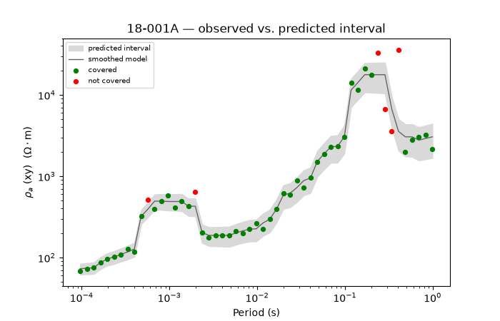
Before looking at the whole survey, plot one station’s observed curve against its bounds directly — the same “covered / not covered” idea from step 1, now over a real 53-frequency sounding.
station = "18-001A"
d = raw[raw["station"] == station].reset_index(drop=True)
lo, hi, ctr = q_lo[station], q_hi[station], model[station]
cov = (d["rho_obs"].values >= lo) & (d["rho_obs"].values <= hi)

fig, ax = plt.subplots(figsize=(7, 4.5))
ax.fill_between(
    d["period_s"], lo, hi, color="0.85", label="predicted interval"
)
ax.loglog(d["period_s"], ctr, "-", color="0.4", lw=1, label="smoothed model")
ax.scatter(
    d["period_s"][cov],
    d["rho_obs"][cov],
    color="green",
    s=18,
    zorder=3,
    label="covered",
)
ax.scatter(
    d["period_s"][~cov],
    d["rho_obs"][~cov],
    color="red",
    s=18,
    zorder=3,
    label="not covered",
)
ax.set_xscale("log")
ax.set_yscale("log")
ax.set_xlabel("Period (s)")
ax.set_ylabel(r"$\rho_a$ (xy)  ($\Omega \cdot$m)")
ax.set_title(f"{station} — observed vs. predicted interval")
ax.legend(fontsize=7)
<matplotlib.legend.Legend object at 0x7f2e2f7c8c20>
Reading this figure. Most points fall inside the shaded band; the
handful of red points are frequencies where this station’s own
resistivity jumps sharply away from its locally smoothed trend — the
same kind of point-to-point noise already seen in the csumt
example’s single-station depth curve.
4. Per-station coverage ranking#
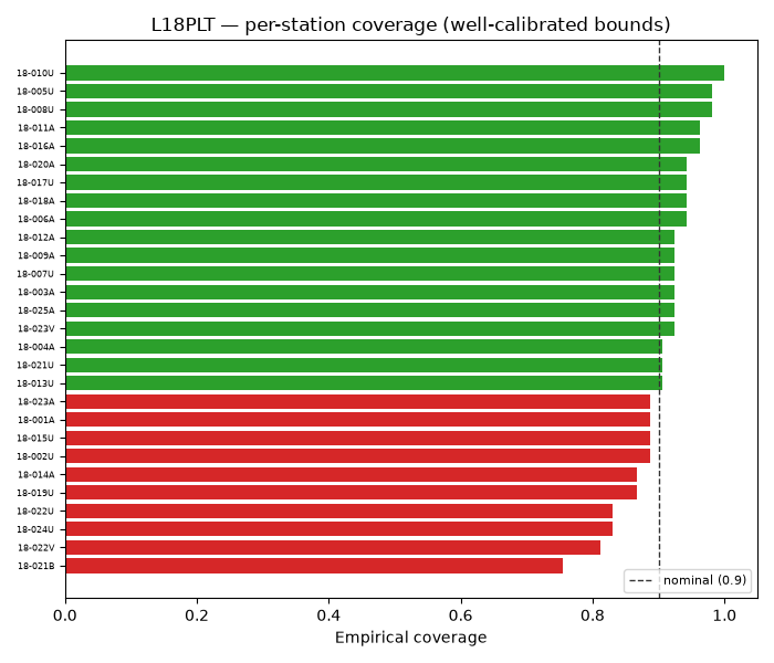
coverage_table() collapses each station’s whole band into one
empirical coverage fraction and mean interval width, and flags whether
coverage reaches the nominal target (default 90 %).
table = coverage_table(survey, q_lo, q_hi)
table_sorted = table.sort_values("empirical_cov")

fig, ax = plt.subplots(figsize=(7, 6))
colors = [
    "#d62728" if not f else "#2ca02c" for f in table_sorted["calibrated_flag"]
]
ax.barh(table_sorted["station"], table_sorted["empirical_cov"], color=colors)
ax.axvline(0.9, color="0.2", ls="--", lw=1, label="nominal (0.9)")
ax.set_xlabel("Empirical coverage")
ax.tick_params(axis="y", labelsize=6)
ax.legend(fontsize=8, loc="lower right")
ax.set_title("L18PLT — per-station coverage (well-calibrated bounds)")
fig.tight_layout()

print(
    f"mean empirical coverage: {table['empirical_cov'].mean():.3f}  "
    f"({int(table['calibrated_flag'].sum())}/{len(table)} stations >= nominal)"
)
mean empirical coverage: 0.908 (18/28 stations >= nominal)
Reading this figure. With bounds sized to be reasonable rather than tuned to pass, coverage lands close to but scattered around the 0.9 target — about 18 of 28 stations individually clear the threshold, the rest fall just short. That is a realistic outcome for “sensible” uncertainty bounds, not a failure: individual-station coverage is noisier than the survey-wide mean (here ≈0.91) because each station only has 53 frequencies to average over.
5. Polar coverage plot#
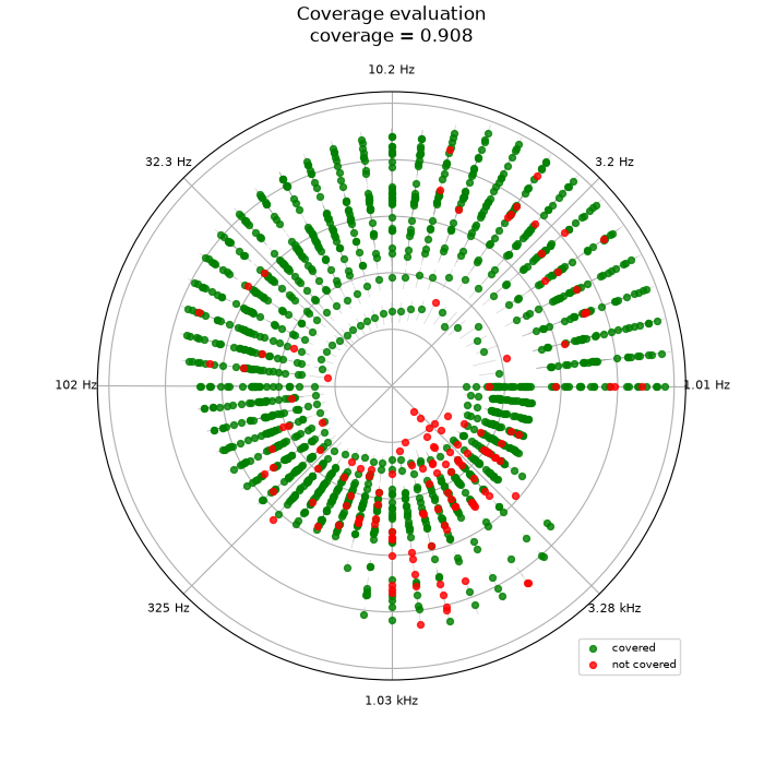
plot_polar_coverage() is the module’s headline view: angle
encodes log-frequency, radius encodes observed ρ_a, and colour marks
covered (green) vs. not (red), for every station and frequency at
once. Every station shares (almost) the same frequency grid, so each
angular position is really one frequency shared across all 28
stations — the ring is labelled with the actual frequency at each
position rather than plain, otherwise-uninterpretable degrees.
<PolarAxes: title={'center': 'Coverage evaluation\ncoverage = 0.908'}>
Reading this figure. Red points appear across most of the ring rather than in one narrow wedge — consistent with coverage failures coming mostly from point-to-point noise at scattered frequencies (as in step 3) rather than one dominant systematic problem. They are not perfectly uniform, though: the median miss sits at 1.13 kHz, with the middle 50% of misses spanning roughly 200 Hz-2.5 kHz — visible here as a denser smear of red between the “102 Hz” and “1.03 kHz” labels, now readable directly from the ring instead of an uninterpretable degree range.
6. Does interval width really grow with period?#
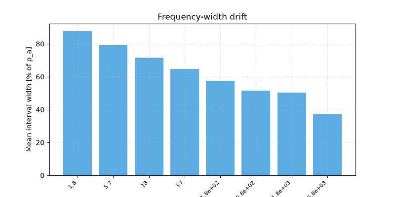
plot_width_drift() bins mean relative interval width by
frequency band — a direct check on whether the growing-uncertainty
design in build_bounds() shows up the way it was built to.
plot_width_drift(survey, q_lo, q_hi, n_bands=8)
<Axes: title={'center': 'Frequency-width drift'}, xlabel='Frequency band centre [Hz]', ylabel='Mean interval width [% of ρ_a]'>
Reading this figure. Width grows toward the lower-frequency (longer-period) bands, exactly as designed — a useful sanity check that this diagnostic recovers a known-by-construction trend before trusting it on a real model’s uncertainty output.
7. Relative-error rose against the smoothed model#
plot_polar_errors() needs a point prediction rather than
bounds — the same smoothed-model dict from step 2 works directly.
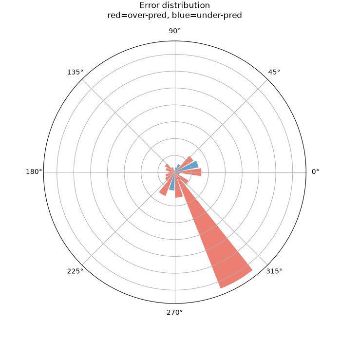
<PolarAxes: title={'center': 'Error distribution\nred=over-pred, blue=under-pred'}>
Reading this figure. Bar length is the mean absolute relative error within each frequency-decade sector; colour marks over- (red) vs under-prediction (blue). Most sectors are modest and mixed in colour, as expected when the “model” is just a smoothed version of the same real data — but one sector still spikes out sharply in red. That is not a modelling failure; it is the smoothed curve failing to track one real, sharp single-frequency jump in that station’s own sounding (the same kind of point seen as an outlier in step 3) — a reminder that even a “self-consistent” baseline model can look bad in exactly the bands where the raw data itself is noisiest.
8. Advanced: does the module actually catch bad calibration?#
Three variants of the same bounds — sensible, artificially narrowed (“overconfident”), and artificially widened (“underconfident”) — make the coverage/width trade-off explicit.
scenarios = {
    "well-calibrated": 1.0,
    "overconfident": 0.4,
    "underconfident": 3.0,
}
summary = []
for name, mult in scenarios.items():
    lo_s, hi_s, _ = build_bounds(mult=mult)
    t = coverage_table(survey, lo_s, hi_s)
    summary.append(
        {
            "scenario": name,
            "mean_coverage": t["empirical_cov"].mean(),
            "mean_width_pct": t["mean_width_pct"].mean(),
            "n_calibrated": int(t["calibrated_flag"].sum()),
        }
    )
summary_df = pd.DataFrame(summary)
print(summary_df.to_string(index=False))

fig, (axc, axw) = plt.subplots(1, 2, figsize=(10, 4.5))
axc.bar(summary_df["scenario"], summary_df["mean_coverage"], color="#1f77b4")
axc.axhline(0.9, color="0.2", ls="--", lw=1)
axc.set_ylabel("mean empirical coverage")
axc.tick_params(axis="x", labelsize=8)
axw.bar(summary_df["scenario"], summary_df["mean_width_pct"], color="#d62728")
axw.set_ylabel("mean interval width (% of rho_a)")
axw.tick_params(axis="x", labelsize=8)
fig.tight_layout()
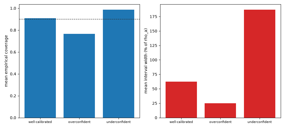
       scenario  mean_coverage  mean_width_pct  n_calibrated
well-calibrated       0.908356       62.287196            18
  overconfident       0.766846       24.914878             0
 underconfident       0.986523      186.861587            28
Reading this figure. Narrowing the bounds (“overconfident”) drops mean coverage from ≈0.91 to ≈0.77 — well below the 0.9 nominal target, and zero of 28 stations pass the flag, exactly the failure mode this diagnostic exists to catch. Widening them (“underconfident”) pushes coverage to ≈0.99, but at the cost of nearly tripling mean interval width (63 % to 187 % of ρ_a) — technically well-calibrated, but a much less useful, over-cautious prediction. Coverage alone cannot distinguish a good model from an overly humble one; that is exactly why this module reports width alongside coverage rather than coverage on its own.
Total running time of the script: (0 minutes 1.182 seconds)