
Note
Go to the end to download the full example code.
Phase-tensor ellipses#
The Caldwell et al. (2004) phase tensor is the distortion-free heart of
modern MT interpretation: its principal axes give strike, its skew
angle \(\beta\) flags 3-D structure, and its ellipticity measures
anisotropy. This example renders the full phase-tensor family from
pycsamt.emtools.tensor on the WILLY_DATA AMT survey — pseudo-
sections, a combined summary, rose diagrams, a geographic map, and
per-station ellipse strips — using line L22PLT for most panels,
L18PLT (28 stations) for the widest pseudo-section, and all five
lines together for the multi-profile strip grid.
1. Ellipse pseudo-section (L22PLT)#
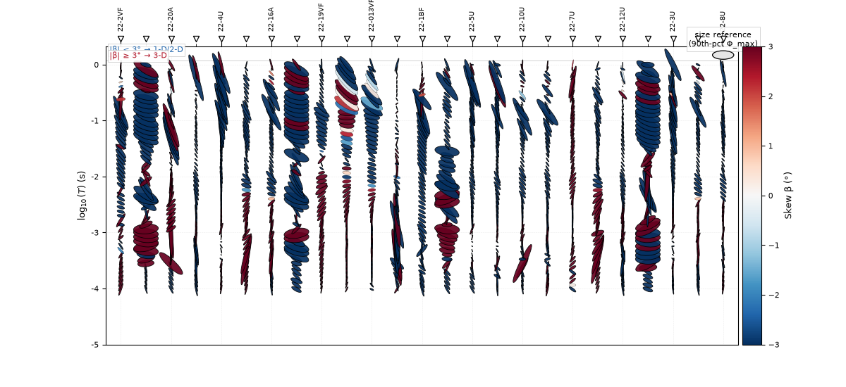
plot_phase_tensor_psection() draws the
full ellipse at every (station, period) cell: shape from
\(\phi_{max}\) / \(\phi_{min}\), rotation from strike, fill
colour from skew. This is the flagship phase-tensor view.
import numpy as np
from _datasets import line_groups, load_sites

from pycsamt.emtools.tensor import (
    plot_phase_tensor_map,
    plot_phase_tensor_psection,
    plot_phase_tensor_rose,
    plot_phase_tensor_strip,
    plot_phase_tensor_strip_grid,
    plot_phase_tensor_summary,
    plot_strike_director_field,
    plot_theta_vs_period,
)

L22 = load_sites("amt_l22plt")

plot_phase_tensor_psection(L22, figsize=(12, 5.5))
<Axes: xlabel='Station', ylabel='$\\log_{10}(T)$ (s)'>
2. Combined summary panel#
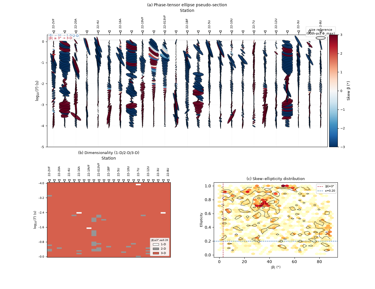
plot_phase_tensor_summary() stacks
\(\phi_{max}\), \(\phi_{min}\), and skew \(\beta\) into one
publication-ready figure — the quickest single image for judging
dimensionality across the line.
plot_phase_tensor_summary(L22, figsize=(13, 10))
<Figure size 1300x1000 with 4 Axes>
3. Strike rose (all periods)#
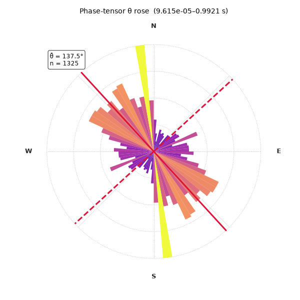
plot_phase_tensor_rose() folds every
(station, period) strike angle into one axial histogram. The styling
arguments below (gradient bars, compass labels, mean and secondary
spokes) are all optional polish on top of the default rose.
plot_phase_tensor_rose(
    L22,
    bins=36,
    bar_style="gradient",
    cmap="plasma",
    outer_ring_lw=2.5,
    outer_ring_color="0.12",
    n_rings=4,
    ring_label_angle=22.5,
    ring_label_fontsize=7.5,
    ring_label_fmt="{:.0f}",
    spoke_every=45.0,
    compass_labels="NESW",
    compass_fontsize=9.0,
    compass_fontweight="bold",
    show_mean=True,
    mean_color="crimson",
    mean_lw=2.2,
    show_secondary=True,
    secondary_ls="--",
    show_annotation=True,
    show_n=True,
    annotation_fontsize=8.5,
    figsize=(6, 6),
)
<PolarAxes: title={'center': 'Phase-tensor θ rose (9.615e-05–0.9921 s)'}>
4. Strike angle vs period#
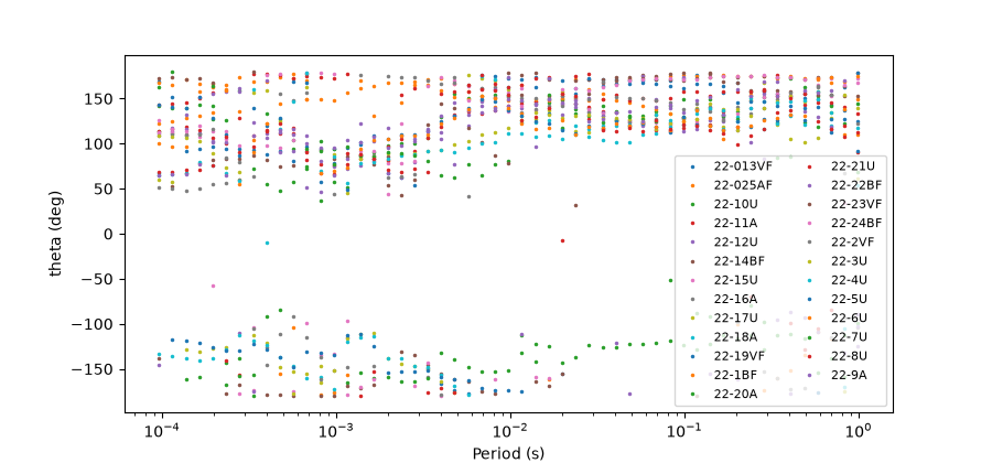
plot_theta_vs_period() scatters raw
strike per frequency for every station — the most direct way to see how
stable the phase-tensor strike is with depth.
plot_theta_vs_period(L22, figsize=(9, 4.2))
<Axes: xlabel='Period (s)', ylabel='theta (deg)'>
5. Strike director field — the axial-aware supplement#
theta is an axial angle (defined mod 180°), so the linear scatter
above fights its nature and collapses every station onto one axis.
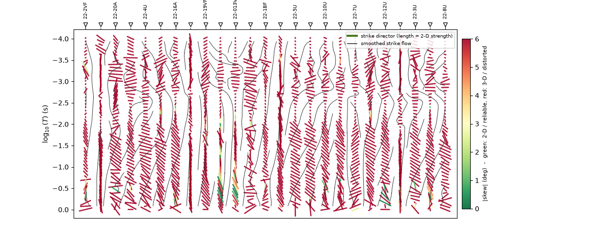
plot_strike_director_field() instead draws
one head-less bar per (station, period) cell oriented along the
strike, adding two more channels: bar length = 2-D strength
(ellipticity, so near-1-D cells shrink to a dot) and colour =
distortion (|skew|: green where strike is a reliable 2-D reading, red
where 3-D / galvanic distortion makes it untrustworthy). The smoothed
streamline overlay traces the coherent strike “flow”.
On L22PLT the field comes back mostly red — consistent with the strong 3-D / galvanic character already flagged by the skew panel in the summary above — yet the streamlines still trace a coherent dominant azimuth, and the occasional long green bar marks where a 2-D strike can be trusted. One picture says both “here is the strike” and “here is how much to believe it”.
plot_strike_director_field(L22, figsize=(12, 5.0))
<Axes: title={'center': 'Geoelectric strike director field'}, xlabel='Station', ylabel='$\\log_{10}(T)$ (s)'>
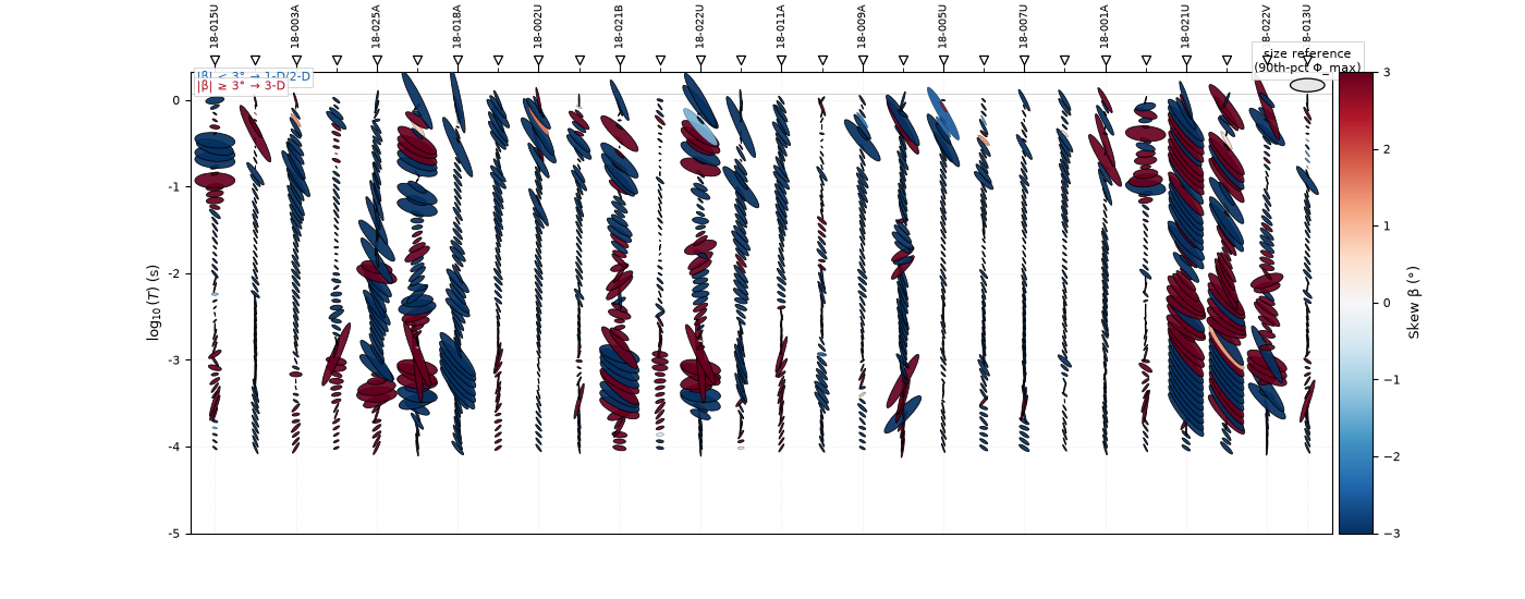
6. Widest pseudo-section (L18PLT, 28 stations)#
The same ellipse pseudo-section on the longest line in the survey. L18PLT’s real field data contains many near-degenerate \(\phi_{min}\) cells, which the ellipse renderer floors to a minimum aspect ratio so they stay visible rather than collapsing to invisible lines.
L18 = load_sites("amt_l18plt")
plot_phase_tensor_psection(L18, figsize=(14, 5.5))
<Axes: xlabel='Station', ylabel='$\\log_{10}(T)$ (s)'>
7. Geographic phase-tensor map#
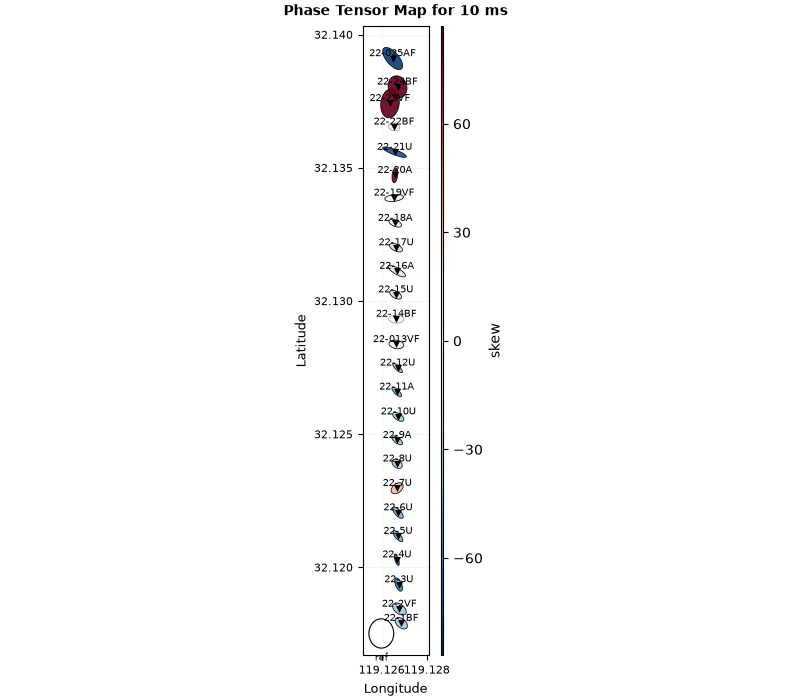
plot_phase_tensor_map() places one ellipse
per station at its true position, at the period nearest a requested
target (here 0.01 s) — the natural view for reading lateral structural
variation.
plot_phase_tensor_map(L22, period=0.01, figsize=(8, 7))
<Axes: title={'center': 'Phase Tensor Map for 10 ms'}, xlabel='Longitude', ylabel='Latitude'>
8. Single-station ellipse strip#
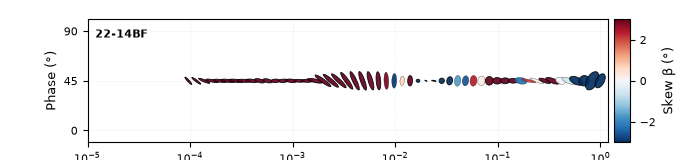
plot_phase_tensor_strip() draws the
classic single-station “ellipse timeseries” — one row of ellipses along
period for station 22-14BF.
plot_phase_tensor_strip(L22, station="22-14BF", figsize=(7, 1.6))
<Axes: xlabel='Period (s)', ylabel='Phase (°)'>
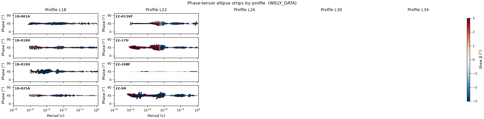
9. Multi-profile ellipse-strip grid#
plot_phase_tensor_strip_grid() tiles one
strip per profile under a shared colorbar. We load all five WILLY_DATA
lines at once and pick four evenly-spaced representative stations from
each, colouring the ellipses by skew.
S_all = load_sites("amt_willy", recursive=True)
groups = line_groups(S_all)


def _representative(names, k=4):
    names = sorted(names)
    if len(names) <= k:
        return names
    idx = sorted(set(np.linspace(0, len(names) - 1, k).round().astype(int)))
    return [names[i] for i in idx]


strip_profiles = {
    f"Profile {ln}": _representative(names) for ln, names in groups.items()
}
plot_phase_tensor_strip_grid(
    S_all,
    profiles=strip_profiles,
    c_by="skew",
    cmap="RdBu_r",
    panel_size=(3.4, 1.05),
    suptitle="Phase-tensor ellipse strips by profile  (WILLY_DATA)",
)
<Figure size 1700x420 with 21 Axes>
Total running time of the script: (0 minutes 6.813 seconds)