
Note
Go to the end to download the full example code.
Quality-control confidence scoring (pycsamt.emtools.qc)#
pycsamt.emtools.qc turns “does this transfer function look
trustworthy?” into numbers: per-station and per-frequency composite
confidence scores built from data coverage, tensor uncertainty,
off-diagonal consistency, diagonal leakage, phase smoothness, and
spatial coherence with neighboring stations, plus a family of plots
(a Kouadio et al. (2024)-style along-line profile, a period-vs-station
pseudo-section, single-station spectra/dashboards, a survey-wide
period-band summary, coverage/SNR quicklooks, an uncertainty-propagated
apparent-resistivity “fan chart”, and an XY/YX crossover map). This
example uses L18PLT (data/AMT/WILLY_DATA/) throughout, since
every station there carries real error tensors (z_err) needed for
the uncertainty-aware scores and the fan chart.
1. Station-level summary tables#
build_qc_table() is the simplest starting
point: one row per station with frequency coverage, tipper presence,
median row SNR, and (when available) phase-tensor skew.
qc_flags() layers pass/fail flags on top.
import matplotlib.pyplot as plt
import numpy as np
from _datasets import load_survey

from pycsamt.emtools import (
    build_qc_table,
    frequency_confidence_table,
    overlay_noise_cone,
    overlay_spectral_holes,
    plot_confidence_band_summary,
    plot_confidence_profile,
    plot_consistency_fan,
    plot_frequency_confidence_psection,
    plot_qc_quicklook,
    plot_station_confidence_dashboard,
    plot_station_confidence_spectrum,
    plot_xyyx_crossover_map,
    qc_flags,
    station_confidence_table,
)

survey = load_survey("amt_l18plt")

qt = build_qc_table(survey)
print(qt[["station", "n_freq", "frac_ok", "snr_med", "skew_med"]].head())

flagged = qc_flags(survey)
print(f"stations flagged: {(flagged['flags'] != '').sum()}/{len(flagged)}")
print("unique flags:", sorted(set(flagged["flags"])))
   station  n_freq  frac_ok    snr_med   skew_med
0  18-001A      53      1.0  17.658396   4.809977
1  18-002U      53      1.0  16.687366   6.596544
2  18-003A      53      1.0  12.031672  11.018588
3  18-004A      53      1.0  10.430580  14.509282
4  18-005U      53      1.0  14.360341   9.171151
stations flagged: 27/28
unique flags: ['', 'high_skew']
Reading this output. Every one of the 28 stations comes back
frac_ok=1.0 (fully finite data), and all but one – 18-001A,
at skew_med=4.81 – are flagged high_skew under the default
max_skew_med=6.0 threshold. Median phase-tensor skew across the
line is about 13.6 degrees, more than double that threshold, and
individual stations run as high as 54.5 degrees. That is not a data
defect: it is the same strongly 2-D/3-D structural signal this survey
shows throughout the gallery, just expressed through a QC threshold
tuned for near-1-D settings. A perfectly complete dataset can still
fail a structural-simplicity check.
2. Station confidence: presence vs. composite#
station_confidence_table() supports two
scoring methods. "presence" only checks whether each row is
finite; "composite" additionally weighs tensor uncertainty,
off-diagonal consistency, diagonal leakage, phase smoothness, and
spatial coherence.
sc_presence = station_confidence_table(survey, method="presence")
sc_composite = station_confidence_table(survey, method="composite")
print(
    "presence range:",
    sc_presence["confidence"].min(),
    "-",
    sc_presence["confidence"].max(),
)
print(
    "composite range:",
    round(sc_composite["confidence"].min(), 3),
    "-",
    round(sc_composite["confidence"].max(), 3),
)
worst = sc_composite.sort_values("confidence").iloc[0]
best = sc_composite.sort_values("confidence").iloc[-1]
print(f"worst: {worst['station']} ({worst['confidence']:.3f})")
print(f"best:  {best['station']} ({best['confidence']:.3f})")
presence range: 1.0 - 1.0
composite range: 0.544 - 0.812
worst: 18-022U (0.544)
best:  18-007U (0.812)
Reading this output. presence is 1.0 for all 28 stations here
(every row is finite, so this method has literally nothing left to
say about this particular survey). composite spreads from
\(\approx 0.54\) to \(\approx 0.81\) — the coverage-only view
was hiding real, measurable quality variation. Interestingly, the
best composite-confidence station is 18-007U, the same station
the anisotropy/impedance examples single out for having the
strongest Swift skew — a reminder that “structurally complex” and
“low data quality” are different axes entirely, even though both can
look like “anomalous” at a glance.
3. The along-line confidence profile#
plot_confidence_profile() reproduces the
Kouadio et al. (2024) Fig. 3 style: one coloured dot per station
(green/pink/red for safe/recoverable/reject), against the two CI
thresholds.
plot_confidence_profile(survey, method="composite")
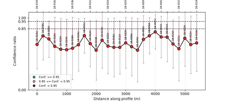
<Axes: title={'center': 'Station confidence (composite)'}, xlabel='Distance along profile (m)', ylabel='Confidence ratio'>
Reading this figure. Every station lands in the pink
“recoverable” band (\(0.50 \le \text{CI} < 0.95\)) — consistent
with the 0.54-0.81 range just printed, none rejected, none fully
safe. The x-axis is index-based 200 m spacing (this survey’s EDI
objects expose .coords as lat/lon/elevation, not the
east/north-style attributes this function looks for), so read it as
station order along the line rather than a surveyed distance.
4. Frequency-level confidence as a pseudo-section#
plot_frequency_confidence_psection() scores
every (station, frequency) cell rather than collapsing each station
to one number.
plot_frequency_confidence_psection(survey, method="composite")
ft = frequency_confidence_table(survey, method="composite")
corr = ft[["log10_period", "confidence"]].corr().iloc[0, 1]
print(f"corr(log10 period, confidence) = {corr:.2f}")
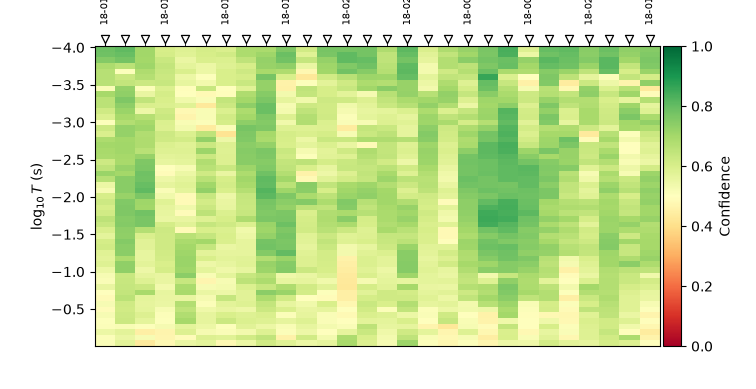
corr(log10 period, confidence) = -0.33
Reading this figure/output. Confidence trends downward with period (correlation \(\approx -0.33\) above): short periods near the top run a median \(\approx 0.75\), the longest periods at the bottom fall to \(\approx 0.55\) — visible here as a loose top-to-bottom green-to-yellow gradient rather than a uniform colour, consistent with signal strength dropping off toward the low-frequency end of a CSAMT-band line.
5. One station in depth: spectrum and dashboard#
plot_station_confidence_spectrum() overlays
the components behind one station’s confidence curve;
plot_station_confidence_dashboard() breaks
the same components into separate panels to avoid overlap. Comparing
the worst and best stations from section 2 side by side shows what
actually drives the difference.
plot_station_confidence_spectrum(survey, station="18-022U")
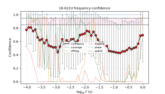
<Axes: title={'center': '18-022U frequency confidence'}, xlabel='$\\log_{10}T$ (s)', ylabel='Confidence'>
Reading this figure. 18-022U (the lowest overall confidence)
spends much of its spectrum with the red “diagonal” (diagonal-leakage
score) and “offdiag” traces pinned near zero — the composite penalty
is concentrated in tensor-shape diagnostics, not missing data
(coverage, the blue trace, sits at 1.0 throughout).
plot_station_confidence_dashboard(survey, station="18-022U")
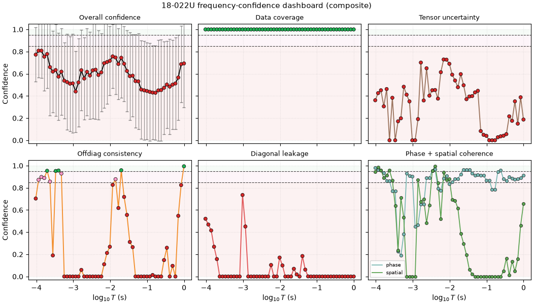
<Figure size 1050x600 with 6 Axes>
Reading this figure. Split into six panels, the same story reads
more clearly: “Diagonal leakage” collapses to (or near) zero across
almost the entire spectrum, and “Tensor uncertainty” is weak through
the middle and long periods — together these two components pull the
overall confidence (top-left) down into the 0.45-0.65 band, while
“Data coverage” (top-middle) stays a flat, uninformative 1.0
throughout, exactly as presence alone would report for every
station in this survey.
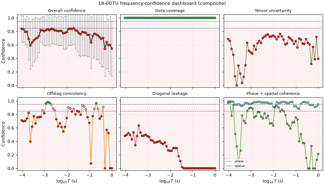
plot_station_confidence_dashboard(survey, station="18-007U")
<Figure size 1050x600 with 6 Axes>
Reading this figure. The gap to 18-022U is not “diagonal
leakage fixed” — that panel is weak for both stations (median score
0.30 here vs. 0.00 there, better but still far from clean). The real
differentiators are “Offdiag consistency” (median 0.77 vs. 0.10) and,
most of all, “Phase + spatial coherence” (spatial median 0.93 vs.
0.05): 18-007U’s \(Z_{xy}\)/\(Z_{yx}\) amplitudes agree
far better with each other and with its immediate neighbors along
the line. So the best-confidence station is not clean on every axis
— it simply avoids the specific failure (poor spatial/off-diagonal
agreement) that dominates 18-022U’s penalty, even though (per
section 2) it is also the station with the strongest Swift skew
elsewhere in the gallery.
6. Survey-wide period-band summary#
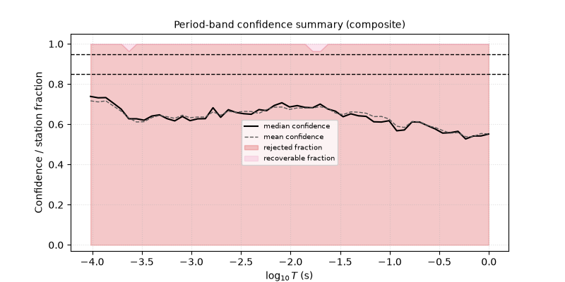
plot_confidence_band_summary() collapses
every station into one median/mean confidence curve per period,
shaded by the fraction of stations rejected/recoverable at each
period.
plot_confidence_band_summary(survey, method="composite")
<Axes: title={'center': 'Period-band confidence summary (composite)'}, xlabel='$\\log_{10}T$ (s)', ylabel='Confidence / station fraction'>
Reading this figure. The median confidence curve traces the same downward period trend from section 4, and the thin red “rejected fraction” band — while never dominant — is not exactly zero even though no single station’s overall composite score fell below 0.50 in section 2: a station’s aggregate score can stay safely above the reject threshold while a handful of its individual frequencies still dip under it.
7. Coverage and SNR quicklook#
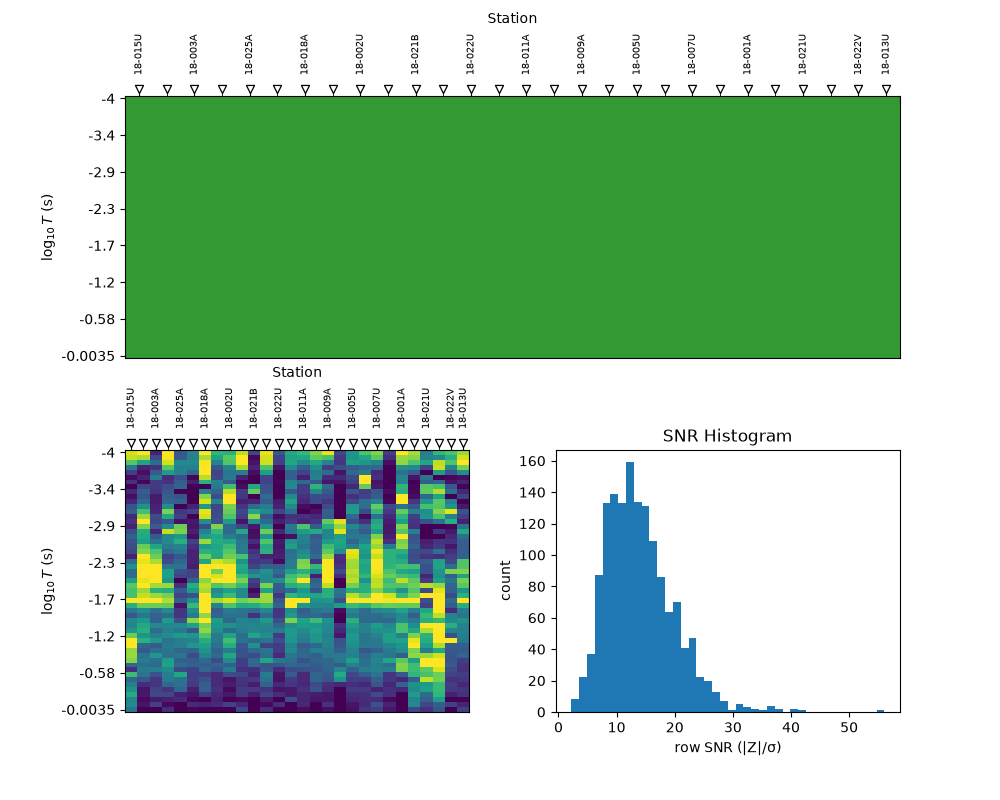
plot_qc_quicklook() combines a presence
pseudo-section, an SNR-coloured pseudo-section, and a row-SNR
histogram in one figure — a fast first pass before the more detailed
confidence views above.
<Figure size 1000x800 with 3 Axes>
Reading this figure. The top panel is solid green: 100% row
presence everywhere, the same frac_ok=1.0 finding from section 1.
The bottom-left SNR pseudo-section is where the real texture is —
brighter (higher row SNR, \(|Z|/\sigma\)) around the shorter
periods and near a few stations, fading elsewhere — and the histogram
on the right shows the underlying distribution: median row SNR
\(\approx 13\), with a long tail out to \(\approx 56\).
8. Advanced: error propagation and crossover/hole detection#
plot_consistency_fan() propagates the real
z_err tensor through \(\rho_a\) via a Monte Carlo draw rather
than a linearized formula, shading the 10th-90th percentile band
around the median curve.
ax_fan = plot_consistency_fan(survey, station="18-016A")
ax_fan.set_yscale("log")
overlay_noise_cone(
    ax_fan,
    np.logspace(-4, 0, 20),
    np.full(20, 10.0),
    np.full(20, 100.0),
    color="0.4",
    alpha=0.25,
)
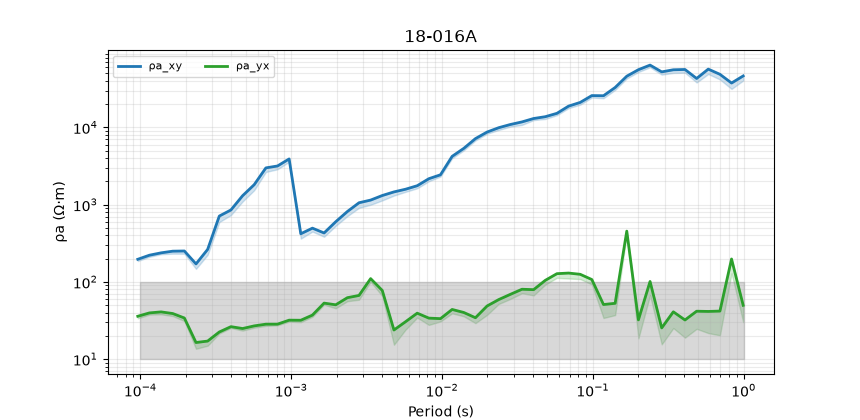
Reading this figure. 18-016A is the same station flagged
elsewhere for extreme ratio anisotropy: on this now-log resistivity
axis, \(\rho_{a,xy}\) (blue) climbs into the tens of thousands of
\(\Omega\,\mathrm{m}\) while \(\rho_{a,yx}\) (green) stays two
to three decades lower throughout — the same anisotropy that was
invisible on a linear axis (section 8’s default) is now clearly two
separate curves rather than one pinned at zero. The Monte Carlo band
is genuinely propagated from the EDI’s own error tensor, and is easy
to see once the axis is log-scaled; the grey band from
overlay_noise_cone() is not derived from
any real instrument spec (none is bundled) — a fixed, illustrative
10-100 \(\Omega\,\mathrm{m}\) reference range, which happens to
bracket most of this station’s real \(\rho_{a,yx}\) values while
sitting far below \(\rho_{a,xy}\).
plot_xyyx_crossover_map() finds every
period where \(\rho_{a,xy}\) and \(\rho_{a,yx}\) swap which
one is larger — a cheap, purely data-driven anisotropy-location
diagnostic with no tensor decomposition involved.
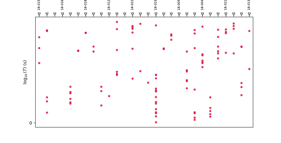
<Axes: xlabel='Station', ylabel='$\\log_{10}(T)$ (s)'>
Reading this figure. Per-station crossover counts range from 0
up to 15 (18-023V, the densest vertical run visible near the end
of the line). 18-016A — the strongly anisotropic station from the
previous figure — is one of only four stations (with 18-003A,
18-005U, 18-017U) with zero crossovers: its XY/YX curves sit
so far apart, as just seen, that they never come close enough to
cross at all.
overlay_spectral_holes() shades genuine
frequency-sampling gaps on top of a pseudo-section-style axis.
L18PLT’s real frequency grid is dense (worst gap
\(\approx 0.08\) decades), well under the default 0.30-decade
threshold, so the default call finds nothing to shade — an honest
negative result rather than a broken overlay. Lowering the threshold
well below any real gap here demonstrates the mechanism instead.
fig, ax = plt.subplots(figsize=(9.0, 4.6))
plot_xyyx_crossover_map(survey, ax=ax)
overlay_spectral_holes(ax, survey, thresh_dec=0.05)
ax.set_title("Crossover map with (artificially sensitive) hole shading")
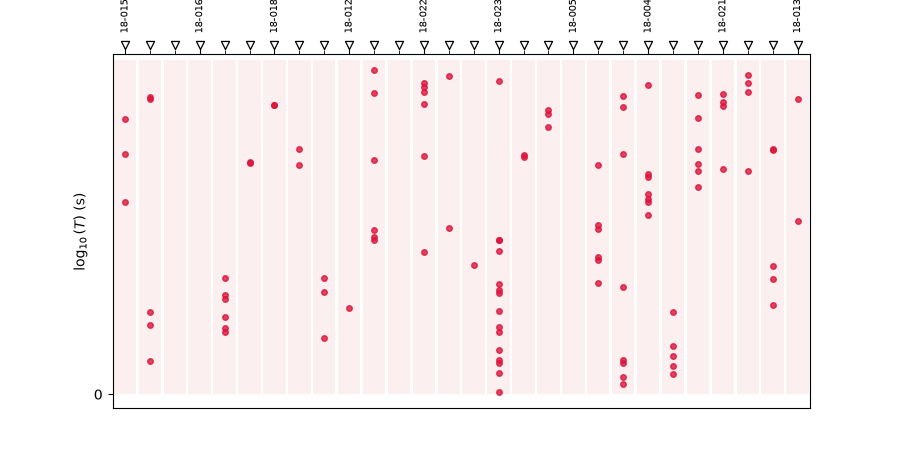
Text(0.5, 1.2369973022146936, 'Crossover map with (artificially sensitive) hole shading')
Reading this figure. With the threshold dropped to 0.05 decades — below this line’s real ~0.045-0.077 decade point spacing — nearly every station’s column now shows faint pink shading: exactly the behaviour a genuinely gappy survey (missing or manually dropped frequencies) would produce at the sensible default threshold, shown here on a densely-sampled line only to make the mechanism visible.
Total running time of the script: (0 minutes 5.627 seconds)