
Note
Go to the end to download the full example code.
Frequency coverage and data-quality confidence#
The first questions to ask of any freshly loaded EM survey are which
frequencies do I actually have at each station? and how much should I
trust them? This example walks line L22PLT of the bundled
WILLY_DATA AMT survey (25 stations) through the pycsamt.emtools
coverage and confidence diagnostics, from a plain per-station frequency
census to a full single-station confidence dashboard.
All figures come straight from pycsamt.emtools.inspect,
pycsamt.emtools.frequency, and pycsamt.emtools.qc; see the
EM tools guide for the per-module reference.
Load the survey line#
_datasets.py (a small shared helper, not itself an example)
resolves pyCSAMT’s bundled data by name and returns a ready-to-plot
Sites object, so every figure below re-uses the same parsed data.
from _datasets import load_sites

from pycsamt.emtools.frequency import (
    plot_apparent_depth_psection,
    plot_coverage_quality_heatmap,
)
from pycsamt.emtools.inspect import plot_coverage
from pycsamt.emtools.qc import (
    plot_confidence_band_summary,
    plot_confidence_profile,
    plot_frequency_confidence_psection,
    plot_station_confidence_dashboard,
)

L22 = load_sites("amt_l22plt")
1. Frequency coverage census#
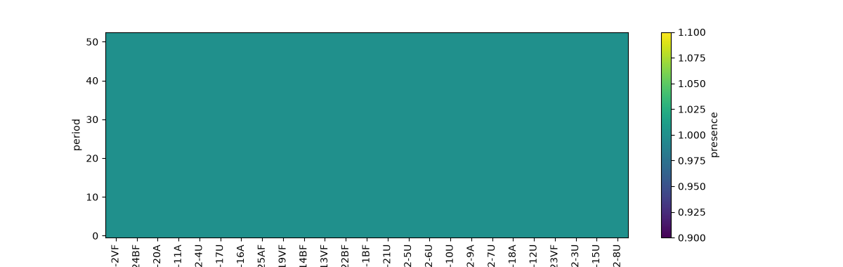
plot_coverage() marks, for every
station, which frequencies carry usable impedance data — the quickest
way to spot dropped bands or short-recording stations before any
processing.
plot_coverage(L22, figsize=(12, 3.8))
<Axes: xlabel='site', ylabel='period'>
2. Coverage-quality heatmap#
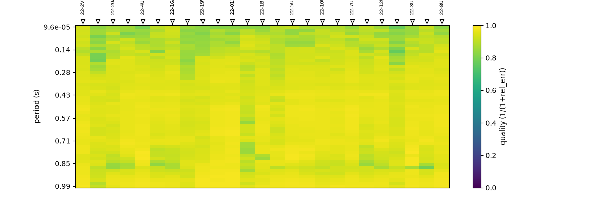
plot_coverage_quality_heatmap() turns
the same census into a station-by-frequency image shaded by a
per-cell data-quality score, so weak corners of the acquisition band
stand out at a glance.
plot_coverage_quality_heatmap(L22, figsize=(12, 4.2))
<Axes: xlabel='Station', ylabel='period (s)'>
3. Apparent-depth pseudo-section#
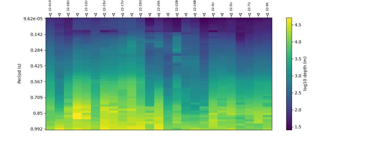
plot_apparent_depth_psection() remaps
frequency to an approximate skin depth, giving an early, distortion-free
sense of the depth range each station illuminates.
plot_apparent_depth_psection(L22, figsize=(12, 4.8))
<Axes: xlabel='Station', ylabel='Period (s)'>
4. Station-confidence profile#
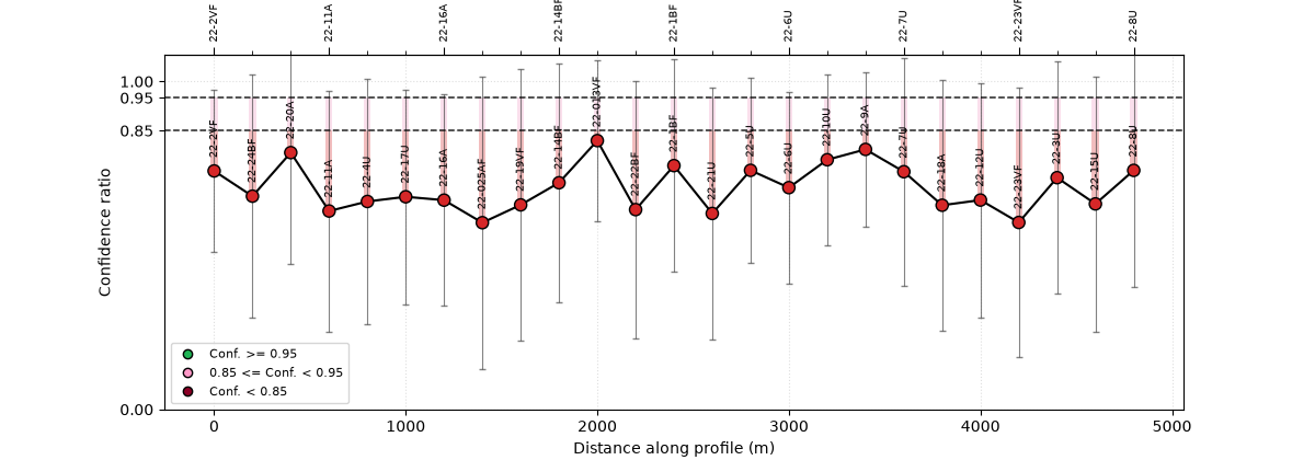
plot_confidence_profile() collapses the
per-frequency quality scores into one composite confidence value per
station and draws it along the profile with a credible band
(here the 50–90 % interval), flagging stations that need attention.
plot_confidence_profile(
    L22,
    method="composite",
    figsize=(12, 4.2),
    ci_hi=0.95,
    ci_lo=0.85,
)
<Axes: title={'center': 'Station confidence (composite)'}, xlabel='Distance along profile (m)', ylabel='Confidence ratio'>
5. Frequency-confidence pseudo-section#
plot_frequency_confidence_psection() keeps
both axes — station and period — so you can see where in the band
confidence drops, not just which stations are weak overall.
plot_frequency_confidence_psection(
    L22,
    method="composite",
    figsize=(12, 4.8),
    ci_hi=0.95,
    ci_lo=0.85,
)
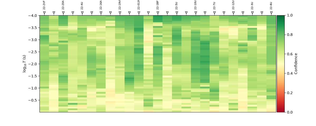
<Axes: title={'center': 'Frequency confidence (composite)'}, xlabel='Station', ylabel='$\\log_{10}T$ (s)'>
6. Period-band confidence summary#
plot_confidence_band_summary() aggregates the
same scores into log-period bands, summarising how trust varies with
depth across the whole line.
plot_confidence_band_summary(
    L22,
    method="composite",
    figsize=(8.5, 4.0),
    ci_hi=0.95,
    ci_lo=0.85,
)
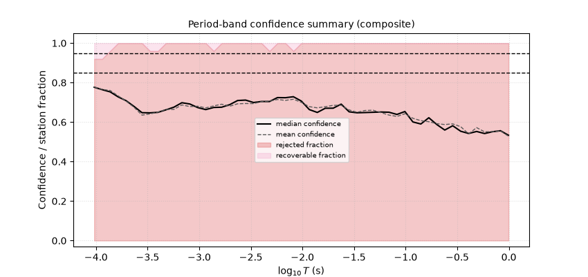
<Axes: title={'center': 'Period-band confidence summary (composite)'}, xlabel='$\\log_{10}T$ (s)', ylabel='Confidence / station fraction'>
7. Single-station confidence dashboard#
Finally, plot_station_confidence_dashboard()
zooms into one station (22-14BF) and lays out every contributing
quality metric together — the view to reach for when deciding whether
to keep, edit, or drop a specific site.
plot_station_confidence_dashboard(
    L22,
    station="22-14BF",
    method="composite",
    figsize=(10.5, 6.0),
    ci_hi=0.95,
    ci_lo=0.85,
)
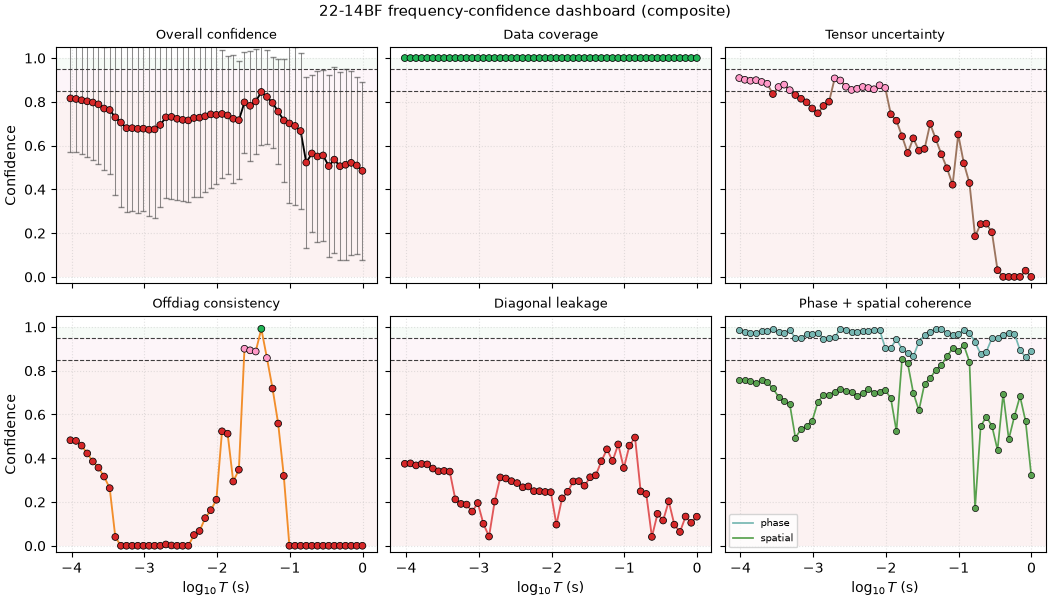
<Figure size 1050x600 with 6 Axes>
Total running time of the script: (0 minutes 2.324 seconds)