
Note
Go to the end to download the full example code.
Tipper-bearing site workflow on KAP03#
The first three site examples used the bundled WILLY AMT survey because it is large, convenient, and good for loading, selection, and export. For a tipper workflow, however, WILLY is the wrong teaching dataset: those EDI files do not carry a vertical magnetic transfer function.
This example switches to the bundled KAP03 MT line:
data/MT/kap03lmt_edis
The objective is:
select a tipper-bearing site collection, rank stations by tipper strength, then call a few transfer-function diagnostics from :mod:`pycsamt.emtools`.
In practice, this is the kind of pre-flight check to run before making induction-arrow maps or interpreting lateral conductivity contrasts. The workflow is deliberately more robust than a one-line plot call:
prove that the chosen dataset has tipper data;
summarize station coverage and tipper availability;
compute tipper magnitude statistics;
choose representative stations from the actual data;
make both site-level and survey-level diagnostic plots;
explain what each output is meant to answer.
The example stays in the site gallery because the main lesson is how to
prepare and reason about a site collection before handing it to plotting tools.
1. Imports and path setup#
Keep imports visible. Gallery pages are examples first, modules second.
The path bootstrap lets the downloaded script run directly from a checkout;
during documentation builds, docs/source/conf.py already inserts the
repository root.
import os
import sys
from pathlib import Path

import matplotlib.pyplot as plt


def repo_root():
    root = os.environ.get("PYCSAMT_DOCS_REPO_ROOT")
    return Path(root) if root else Path(__file__).resolve().parents[3]


ROOT = repo_root()
if str(ROOT) not in sys.path:
    sys.path.insert(0, str(ROOT))

from pycsamt.emtools import (
    ensure_sites,
    plot_induction_arrows,
    plot_induction_map,
    plot_induction_section,
    plot_tipper_hodograms,
    plot_tipper_polar,
)
from pycsamt.site import (
    SitesReport,
    by_index,
    drop_empty,
    keep_finite_z,
    tipper_magnitude,
)


def has_real_tipper(edi):
    """Return True when an EDI-like object exposes a non-empty tipper array."""

    tip_obj = getattr(edi, "Tip", None)
    tip = getattr(tip_obj, "tipper", None)
    return tip is not None and getattr(tip, "size", 0) > 0


kap_dir = ROOT / "data" / "MT" / "kap03lmt_edis"
willy_dir = ROOT / "data" / "AMT" / "WILLY_DATA" / "L18PLT"
2. Start with the data question, not the plot#
A common mistake is to ask for induction arrows before checking whether the survey has tipper data. Here we load KAP03 and WILLY side by side only to make that distinction concrete.
kap_sites = ensure_sites(kap_dir, recursive=False, verbose=0)
willy_sites = ensure_sites(willy_dir, recursive=False, verbose=0)

print("Dataset comparison:")
print(
    {
        "KAP03 stations": len(kap_sites),
        "KAP03 stations with real tipper": sum(
            has_real_tipper(edi) for edi in kap_sites.as_list()
        ),
        "WILLY L18 stations": len(willy_sites),
        "WILLY L18 stations with real tipper": sum(
            has_real_tipper(edi) for edi in willy_sites.as_list()
        ),
    }
)
Dataset comparison:
{'KAP03 stations': 26, 'KAP03 stations with real tipper': 26, 'WILLY L18 stations': 28, 'WILLY L18 stations with real tipper': 0}
If this were a production script, the following check would be a good early failure. It prevents a long plotting workflow from producing empty or misleading figures.
if not any(has_real_tipper(edi) for edi in kap_sites.as_list()):
    raise RuntimeError(
        "KAP03 was expected to contain tipper data, but none was found."
    )
3. Clean the site collection before analysis#
keep_finite_z checks impedance usability. drop_empty removes
structurally empty stations. KAP03 already behaves well, but the explicit
chain documents the contract for future datasets.
kap_clean = keep_finite_z(kap_sites)
kap_clean = drop_empty(kap_clean)
kap_clean_report = SitesReport(kap_clean).to_dataframe()

print(f"KAP03 stations loaded: {len(kap_sites)}")
print(f"KAP03 stations after structural checks: {len(kap_clean)}")
print(
    kap_clean_report[
        ["station", "nfreq", "freq_min", "freq_max", "has_tipper"]
    ]
    .head(10)
    .to_string(index=False)
)
KAP03 stations loaded: 26
KAP03 stations after structural checks: 26
station  nfreq  freq_min  freq_max  has_tipper
 kap103     20  0.000059      0.04        True
 kap106     20  0.000059      0.04        True
 kap109     18  0.000293    999.00        True
 kap112     20  0.000059      0.04        True
 kap115     20  0.000059      0.04        True
 kap118     20  0.000059      0.04        True
 kap121     20  0.000059      0.04        True
 kap123     20  0.000059      0.04        True
 kap125     20  0.000059      0.04        True
 kap127     20  0.000059      0.04        True
KAP03 is a long-period MT line. The frequency span is easier to interpret as period, so we add period limits to the report table.
coverage = kap_clean_report[
    ["station", "nfreq", "freq_min", "freq_max"]
].copy()
coverage["period_min_s"] = 1.0 / coverage["freq_max"]
coverage["period_max_s"] = 1.0 / coverage["freq_min"]

print("KAP03 period coverage preview:")
print(
    coverage[["station", "nfreq", "period_min_s", "period_max_s"]]
    .head(8)
    .to_string(index=False)
)
KAP03 period coverage preview:
station  nfreq  period_min_s  period_max_s
 kap103     20     25.000000  17066.669579
 kap106     20     25.000000  17066.669579
 kap109     18      0.001001   3413.332751
 kap112     20     25.000000  17066.669579
 kap115     20     25.000000  17066.669579
 kap118     20     25.000000  17066.669579
 kap121     20     25.000000  17066.669579
 kap123     20     25.000000  17066.669579
4. Rank stations by tipper magnitude#
pycsamt.site.tipper_magnitude() computes
for each station. Summary mode returns one row per station with mean, median, and maximum tipper magnitude.
tip_summary = tipper_magnitude(kap_clean, per_freq=False)
tip_summary = tip_summary.sort_values("mean", ascending=False)

print("Stations ranked by mean tipper magnitude:")
print(tip_summary.head(10).to_string(index=False))

strongest_station = tip_summary.iloc[0]["station"]
quiet_station = tip_summary.iloc[-1]["station"]

print(f"Strongest mean tipper station: {strongest_station}")
print(f"Quietest mean tipper station:  {quiet_station}")
Stations ranked by mean tipper magnitude:
station     mean   median      max
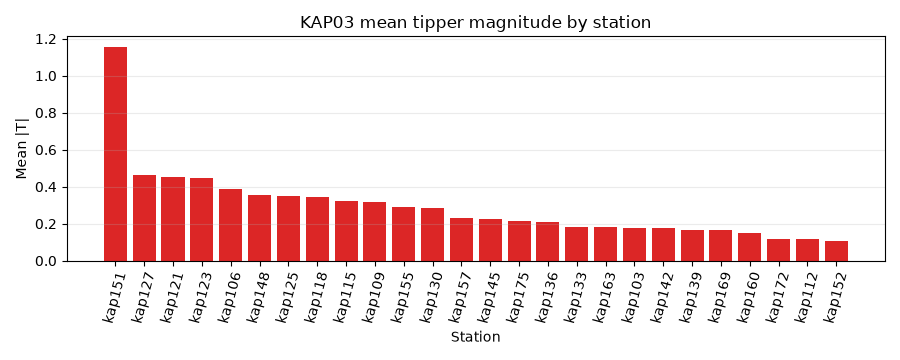
 kap151 1.154990 1.050360 2.272991
 kap127 0.460631 0.284776 1.355597
 kap121 0.455089 0.383687 0.756880
 kap123 0.445747 0.358580 0.802316
 kap106 0.385494 0.446527 0.671204
 kap148 0.355671 0.286409 0.639550
 kap125 0.347250 0.289868 0.696088
 kap118 0.344734 0.319840 0.522663
 kap109 0.337876 0.322160 0.489376
 kap115 0.325024 0.340367 0.521999
Strongest mean tipper station: kap151
Quietest mean tipper station:  kap152
A ranking plot gives a quick sense of whether the anomaly is broad or concentrated in a few stations.
fig, ax = plt.subplots(figsize=(9, 3.6))
ax.bar(tip_summary["station"], tip_summary["mean"], color="#dc2626")
ax.set_title("KAP03 mean tipper magnitude by station")
ax.set_xlabel("Station")
ax.set_ylabel("Mean |T|")
ax.tick_params(axis="x", rotation=75)
ax.grid(axis="y", alpha=0.25)
fig.tight_layout()
5. Inspect one station across frequency#
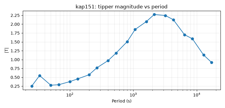
Summary statistics are useful, but tipper is frequency dependent. In
per-frequency mode, tipper_magnitude returns a long table with columns
station, freq, and mag.
tip_by_freq = tipper_magnitude(kap_clean, per_freq=True)
strong_curve = tip_by_freq[tip_by_freq["station"] == strongest_station].copy()
strong_curve["period_s"] = 1.0 / strong_curve["freq"]
strong_curve = strong_curve.sort_values("period_s")

print(f"Tipper-magnitude curve for {strongest_station}:")
print(strong_curve.head(8).to_string(index=False))

fig, ax = plt.subplots(figsize=(7.5, 3.6))
ax.semilogx(strong_curve["period_s"], strong_curve["mag"], marker="o", lw=1.5)
ax.set_title(f"{strongest_station}: tipper magnitude vs period")
ax.set_xlabel("Period (s)")
ax.set_ylabel("|T|")
ax.grid(True, which="both", alpha=0.25)
fig.tight_layout()
Tipper-magnitude curve for kap151:
station    freq      mag   period_s
 kap151 0.04000 0.249717  25.000000
 kap151 0.03000 0.548878  33.333333
 kap151 0.02000 0.276267  50.000000
 kap151 0.01500 0.289126  66.666667
 kap151 0.01000 0.377591 100.000000
 kap151 0.00750 0.456594 133.333298
 kap151 0.00500 0.569458 200.000000
 kap151 0.00375 0.768426 266.666667
6. Build a compact subset for expensive plots#
Some induction-vector plots are easier to read with fewer stations. Here we keep the first six stations plus the station with the strongest mean tipper, preserving a compact line context while guaranteeing that the strongest response is included.
station_order = kap_clean_report["station"].tolist()
strong_index = station_order.index(strongest_station)
subset_indices = sorted(set([0, 1, 2, 3, 4, 5, strong_index]))

kap_subset = by_index(kap_clean, subset_indices)
subset_report = SitesReport(kap_subset).to_dataframe()

print("Compact plotting subset:")
print(subset_report[["station", "nfreq", "has_tipper"]].to_string(index=False))
Compact plotting subset:
station  nfreq  has_tipper
 kap103     20        True
 kap106     20        True
 kap109     18        True
 kap112     20        True
 kap115     20        True
 kap118     20        True
 kap151     20        True
7. Raw tipper geometry: hodograms and polar view#
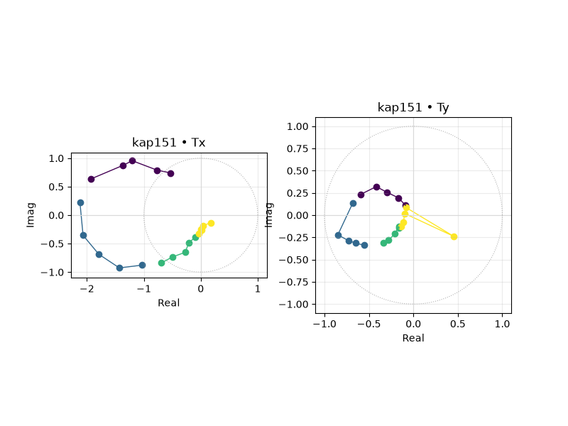
Before interpreting induction arrows, inspect the underlying tipper itself.
plot_tipper_hodograms shows the complex tipper trajectory. It answers:
“does the tipper rotate smoothly through the band, or does it jump around?”
plot_tipper_hodograms(
    kap_clean,
    station=strongest_station,
    n_bands=4,
    normalize=False,
    figsize=(8, 6),
)
<Figure size 800x600 with 2 Axes>
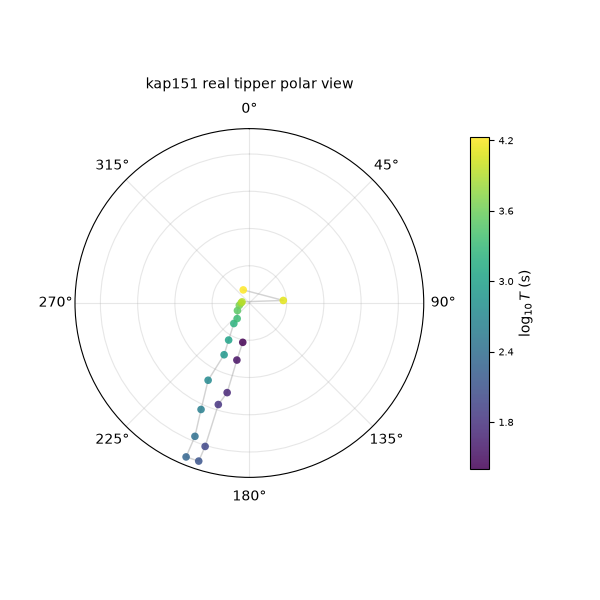
plot_tipper_polar folds magnitude and azimuth into a polar view. Here
we plot the real component for the same strongest station.
plot_tipper_polar(
    kap_clean,
    station=strongest_station,
    component="real",
    title=f"{strongest_station} real tipper polar view",
    figsize=(6, 6),
)
<PolarAxes: title={'center': 'kap151 real tipper polar view'}>
8. Survey-level induction-vector diagnostics#
Now that the site collection is proven to contain tipper, we can use
pycsamt.emtools induction-vector plots. These plots are not just
decorative; each one answers a different operational question.
plot_induction_arrows compares arrow direction and amplitude at selected
periods along the profile. We use the compact subset to keep labels legible.
plot_induction_arrows(
    kap_subset,
    periods=(100.0, 1_000.0, 5_000.0),
    convention="park",
    normalize=True,
    figsize=(9, 4.8),
)
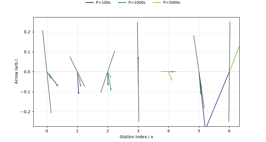
<Axes: xlabel='East / lon', ylabel='North / lat'>
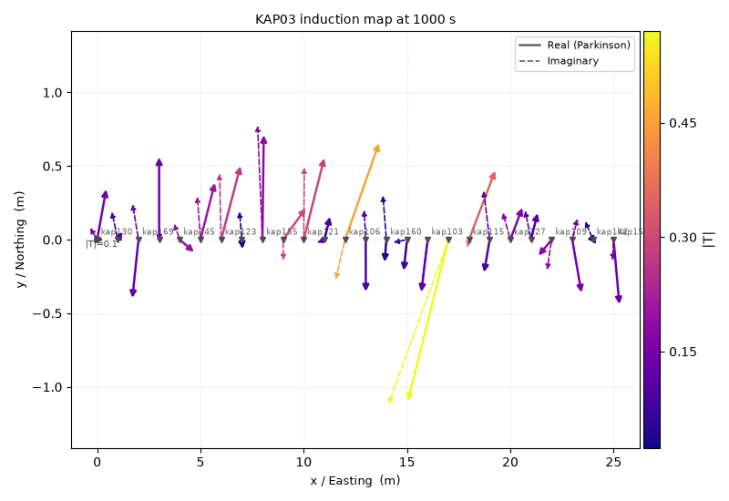
plot_induction_map places arrows in map/profile coordinates at one
representative period. The period should be chosen from the actual band,
not guessed blindly. Here, 1000 s sits comfortably inside KAP03’s coverage.
plot_induction_map(
    kap_clean,
    period=1_000.0,
    convention="park",
    station_labels=True,
    scale=4.0,
    title="KAP03 induction map at 1000 s",
    figsize=(8, 5.5),
)
<Axes: title={'center': 'KAP03 induction map at 1000 s'}, xlabel='Longitude', ylabel='Latitude'>
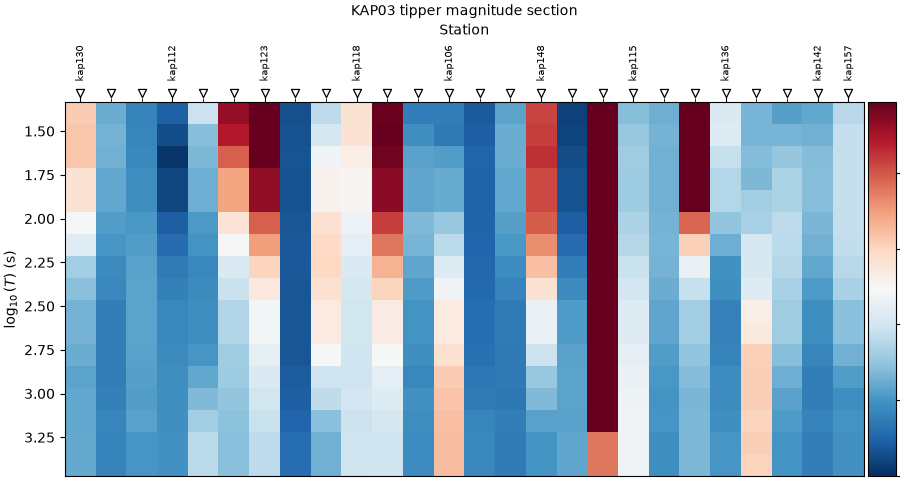
plot_induction_section summarizes tipper magnitude across station and
period. It is a good survey-wide overview after the station-level checks.
plot_induction_section(
    kap_clean,
    component="abs",
    n_periods=18,
    title="KAP03 tipper magnitude section",
    figsize=(9, 4.8),
)
<Axes: title={'center': 'KAP03 tipper magnitude section'}, xlabel='Station', ylabel='$\\log_{10}(T)$ (s)'>
9. Practical interpretation checklist#
This example is not claiming a geologic interpretation by itself. It is a preparation workflow. After running it, the user should know:
KAP03 is the appropriate bundled dataset for tipper examples;
every retained station has usable impedance and tipper data;
the strongest station is chosen from measured tipper magnitude, not from a hard-coded name;
induction-arrow plots are made only after the data contract is verified;
the compact subset is for readability, while survey-wide plots still use the full cleaned line.
For deeper transfer-function interpretation, compare this site-preparation
workflow with the dedicated pycsamt.emtools.tf gallery page.
Total running time of the script: (0 minutes 1.173 seconds)