
Note
Go to the end to download the full example code.
Induction arrows and tipper diagnostics (pycsamt.emtools.tf)#
pycsamt.emtools.tf turns the vertical-field (tipper) component of a
transfer function into induction-vector diagnostics: complex-plane
hodograms, polar plots, arrow maps at one or several periods, azimuth
roses, period pseudo-sections, and a publication-style multi-panel map.
All functions accept the same flexible input as the rest of emtools —
a path, an EDIFile/EDICollection, an APISurvey, or an
iterable of site-like objects.
This example works through the module from the simplest view (one
station, raw tipper) to the most composite one (a multi-period,
multi-panel map), using KAP03 — a real long-period MT profile from
SAMTEX bundled at data/MT/kap03lmt_edis (see data/MT/README.md
for origin and the required SAMTEX attribution). Unlike the AMT lines in
data/AMT/WILLY_DATA/, KAP03 was recorded with a real vertical-field
sensor, so every arrow below is genuine tipper, not synthetic.
The 26 stations run SW→NE (kap103 … kap175, profile index 0…25
below), covering periods from 25 s to about 17,067 s (~4.7 h). Their
horizontal positions are not stored as flat easting/northing in these
EDIs, so the station-position fallback in emtools is profile index —
that affects only the horizontal spacing drawn below, not the tipper
values themselves. The measurement axes (HX/HY at azimuth
0°/90°, ZROT) are geomagnetic-north-aligned at all but 3 of the 26
stations, so the tipper components themselves are in a consistent,
near-geographic frame — this example still avoids naming compass
directions for on-screen azimuths, since tf.py’s polar/rose plots
apply their own north-up, clockwise screen convention on top of that.
Throughout, azimuth comparisons below are expressed either as rotation amounts (degrees of change, which do not depend on that screen convention) or read directly off a chart’s own printed degree labels — both are safe regardless of the underlying convention.
Load the KAP03 survey#
_datasets.py is a small shared helper (not itself a gallery example)
that resolves pyCSAMT’s bundled sample datasets by name, so every
emtools example script can load real data in one line instead of
repeating path/read_edis boilerplate. Passing the resulting
APISurvey directly to each plotting call below re-uses the
already-parsed data — no re-reading from disk between figures.
import numpy as np
from _datasets import load_survey

from pycsamt.emtools import (
    plot_induction_arrows,
    plot_induction_convention,
    plot_induction_map,
    plot_induction_multiperiod_map,
    plot_induction_rose,
    plot_induction_section,
    plot_tipper_hodograms,
    plot_tipper_polar,
)

survey = load_survey("mt_kap03")
names = survey.stations  # already SW->NE, kap103...kap175
s0 = survey.get_site(names[0])
period = 1.0 / s0.Z.freq
p_min, p_med, p_max = (
    float(period.min()),
    float(np.median(period)),
    float(period.max()),
)

# Rank stations by mean tipper amplitude across the whole band — the
# first real diagnostic: which sites see the strongest response overall.
amplitude = {}
for name in names:
    site = survey.get_site(name)
    if site.has_tipper:
        amplitude[name] = float(np.abs(site.Tip.tipper).mean())
strongest = max(amplitude, key=amplitude.get)
ranked = sorted(amplitude, key=amplitude.get, reverse=True)
print(
    f"strongest station (whole-band mean): {strongest} ({amplitude[strongest]:.3f})"
)
print("next four:", [(n, round(amplitude[n], 3)) for n in ranked[1:5]])
strongest station (whole-band mean): kap151 (0.740)
next four: [('kap151', 0.74), ('kap121', 0.305), ('kap127', 0.305), ('kap123', 0.294)]
1. Tipper hodograms — the raw building block#
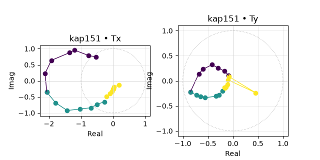
Before looking at arrows or roses, it helps to see the tipper itself:
for one station, plot_tipper_hodograms() plots
T_x and T_y as loci in the complex plane, one colour per period
band, so the period-dependent behaviour is visible with no
azimuth/magnitude conversion in the way.
kap151 has the largest whole-band-mean response of all 26
stations — nearly 2.5x the next-strongest sites (kap121,
kap127) — which makes it the natural single station to inspect in
detail before looking at the full profile.
plot_tipper_hodograms(
    survey,
    station=strongest,
    bands=[(p_min, 200.0), (200.0, 2000.0), (2000.0, p_max)],
    unit_circle=True,
)
<Figure size 640x320 with 2 Axes>
Reading this figure. The shortest-period band (dark) and,
especially, the 200-2000 s band both reach well outside the unit
circle — real tipper amplitudes routinely exceed 1 for a strong,
genuine anomaly, and kap151’s do, peaking with |T| ≈ 2.3 near
200 s. The longest-period band (light) contracts back down close to
the origin. So this is not a response that simply grows or shrinks
monotonically with period: it is concentrated in a broad but bounded
window roughly from 50 s to 1600 s, which the pseudo-section further
below confirms directly.
2. Polar tipper — magnitude and rotation vs. period#
plot_tipper_polar() folds the real tipper
component into (azimuth, magnitude) per frequency, coloured by
log10(period), for a single station.
plot_tipper_polar(survey, station=strongest, component="real")
![kap151 — tipper polar [real]](../../_images/sphx_glr_plot_tf_002.png)
<PolarAxes: title={'center': 'kap151 — tipper polar [real]'}>
Reading this figure. The radius (magnitude) is small at the shortest recorded period, swings out to its largest value around the middle of the band, then contracts back in toward the longest periods — the same peaked, band-limited behaviour seen in the hodogram above, now visible directly as a loop rather than as two separate complex-plane panels. The polar angle also sweeps through roughly 140-150° across the band; a smooth, one-directional sweep like this (rather than a scattered cloud) is a good sign that the tipper estimate is well-conditioned at this site.
3. Induction-arrow map at one period#
plot_induction_map() draws both the real
(solid) and imaginary (dashed) Parkinson arrows for every station at
one period, coloured by |T|, with a reference-length arrow and a
colorbar — the richer, single-period counterpart to the profile view
in the next section. scale is set explicitly here because the
stations’ 1-unit index spacing would otherwise make the default
auto-scaled arrows too small to see next to the full 26-station axis.
plot_induction_map(survey, period=2000.0, station_labels=True, scale=4.0)
![Induction arrows — T = 2000 s [park]](../../_images/sphx_glr_plot_tf_003.png)
<Axes: title={'center': 'Induction arrows — T = 2000 s [park]'}, xlabel='Longitude', ylabel='Latitude'>
Reading this figure. At T = 2000 s the largest arrows sit at the
SW end of the profile (around kap106-kap121, profile index
1-6), with a second, smaller cluster around kap142-kap152
(index 14-18). kap151 itself — the overall strongest station by
whole-band mean — shows only a modest arrow here: its exceptional
response is concentrated at shorter periods (see above), not at
2000 s. That is a useful caution about whole-band averages: they can
hide exactly when in the band a station’s anomaly actually occurs.
4. Induction arrows across three periods#
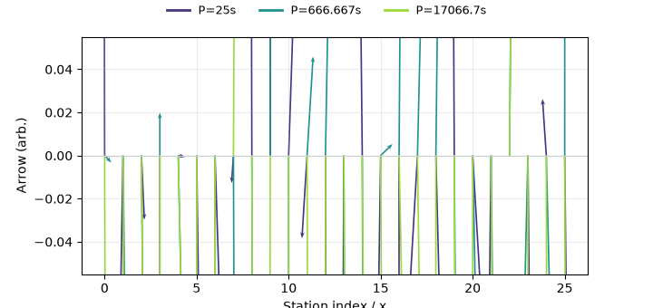
plot_induction_arrows() overlays arrows at
several periods on the same profile axis, one colour per period — the
fastest way to see how the response changes with period along a whole
line at once.
<Axes: xlabel='East / lon', ylabel='North / lat'>
Reading this figure. With 26 stations sharing the same
index-based y = 0 baseline, the arrows overlap enough that direction
is hard to compare station-to-station by eye here — the rose and
pseudo-section below are the better tools for that. Numerically,
though, this three-period choice is not arbitrary: kap127 has the
single largest response at the shortest period (25 s), kap151 at
the middle period, and the kap103-kap121 cluster at the
longest period — three different parts of the profile take turns
dominating as period changes, which is exactly what this figure is
built to show at a glance once you know where to look.
5. Sign-convention comparison#
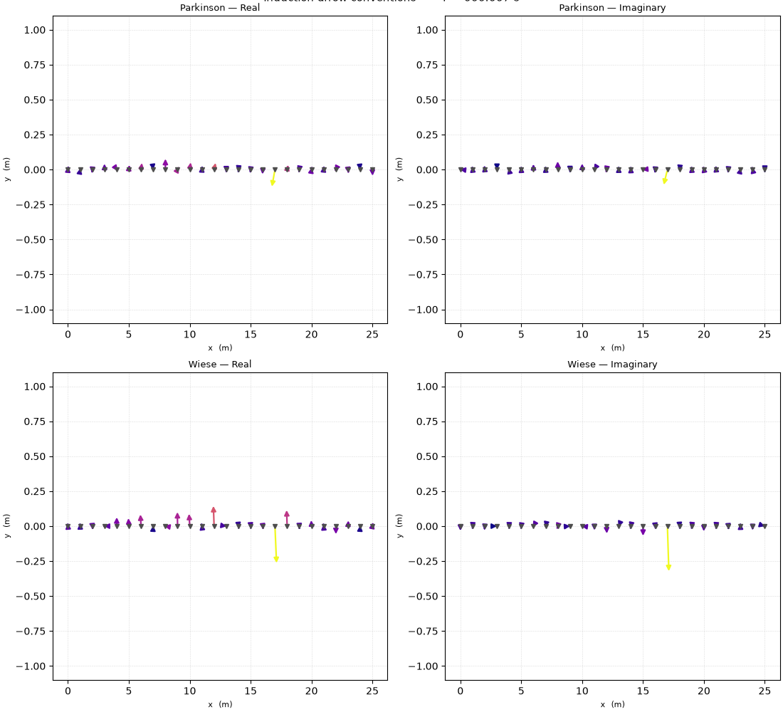
Induction vectors are drawn with two common sign conventions
(Parkinson and Wiese, 90° apart) and two components (real and
imaginary). plot_induction_convention()
lays out all four combinations side by side for one period so the
difference is visible directly, rather than memorised from a formula.
plot_induction_convention(survey, period=p_med, station_labels=False)
array([[<Axes: title={'center': 'Parkinson — Real'}, xlabel='Longitude', ylabel='Latitude'>,
        <Axes: title={'center': 'Parkinson — Imaginary'}, xlabel='Longitude', ylabel='Latitude'>],
       [<Axes: title={'center': 'Wiese — Real'}, xlabel='Longitude', ylabel='Latitude'>,
        <Axes: title={'center': 'Wiese — Imaginary'}, xlabel='Longitude', ylabel='Latitude'>]],
      dtype=object)
Reading this figure. The four panels contain the same underlying data rotated/selected differently: Wiese arrows are the Parkinson arrows rotated 90°, and the imaginary panels pick out the out-of-phase part of the response. When reading induction vectors from a paper, always check which convention the author used — a Parkinson arrow pointing at a conductor becomes a Wiese arrow pointing 90° away from it, a common source of misread MT figures.
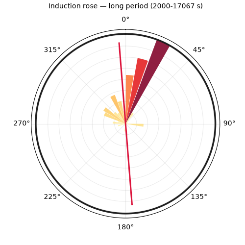
6. Azimuth rose — short vs. long period#
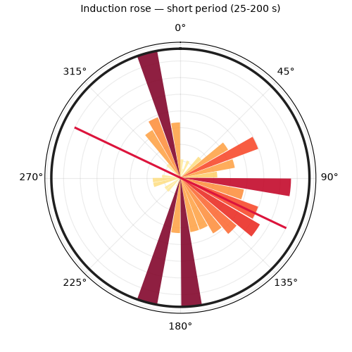
plot_induction_rose() histograms arrow
azimuths, across all stations, into a rose diagram. Restricting the
period band with pband lets you compare shallow vs. deep-sounding
behaviour for the whole profile at once, rather than one station at a
time.
plot_induction_rose(
    survey,
    component="real",
    pband=(p_min, 200.0),
    title="Induction rose — short period (25-200 s)",
)
<PolarAxes: title={'center': 'Induction rose — short period (25-200 s)'}>
plot_induction_rose(
    survey,
    component="real",
    pband=(2000.0, p_max),
    title="Induction rose — long period (2000-17067 s)",
)
<PolarAxes: title={'center': 'Induction rose — long period (2000-17067 s)'}>
Reading these figures. The short-period rose spreads bars across most of the circle, with no single dominant sector — a signature of scattered, near-surface heterogeneity. The long-period rose, by contrast, concentrates almost entirely within a narrow arc of the circle. That contrast is not just a rose-diagram artefact: computed directly from the data, the 6 strongest short-period stations scatter across more than 100° of azimuth from each other, while the 6 strongest long-period stations agree to within about 5°. A profile where the strongest responders point the same way only gets tighter as period grows is good evidence for one coherent, laterally continuous deep conductor, rather than several unrelated shallow ones.
7. Period pseudo-section#
plot_induction_section() grids |T| onto a
station × log10(period) pseudo-section — the most compact
single view of how the tipper anomaly is distributed both along the
profile and with period at once.
plot_induction_section(survey, component="abs")
![Tipper section [abs]](../../_images/sphx_glr_plot_tf_008.png)
<Axes: title={'center': 'Tipper section [abs]'}, xlabel='Station', ylabel='$\\log_{10}(T)$ (s)'>
Reading this figure. One column — kap151 — is saturated dark
across nearly the whole plotted period range, the same broad
50-1600 s window identified in the hodogram and polar plots. A
fainter, shorter-lived warm patch sits around kap121-kap130 at
short-to-mid period, matching the 25 s ranking above. The SW-end
columns (kap103-kap118) show a mild warming trend toward the
bottom (longer periods) of the section — the same long-period
dominance seen in the rose and arrow map, though here it only reads as
a faint tint because kap151’s much larger magnitude sets the
colour scale. That is a real limitation of any single colour-coded
section: always cross-check a dominant anomaly against the other views
before assuming it is the only thing there.
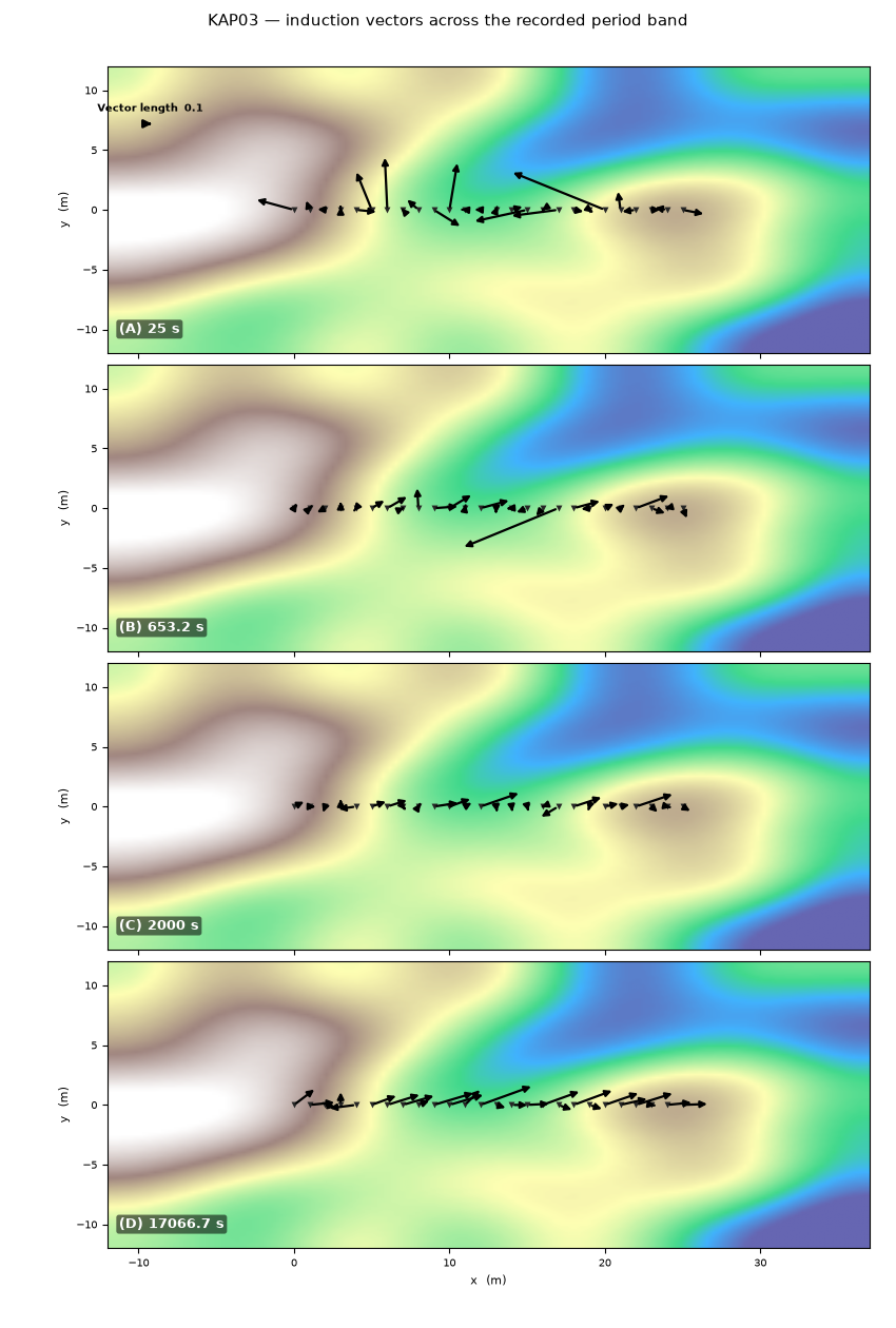
8. Multi-period map (publication style)#
plot_induction_multiperiod_map() stacks one
panel per period with real Parkinson arrows over a background raster,
in the style used in published induction-vector figures (e.g.
Boukhalfa et al., 2020). It is the most composite function in this
module — combining what sections 3, 4, and 7 showed separately into
one figure meant for a paper or report.
These EDIs carry no real topography, so the greyscale-to-green
background here is the function’s built-in synthetic terrain
placeholder, not real elevation — pass your own
background/background_extent arrays (e.g. from a DEM) to
replace it in a real report. Without an explicit tipper_data
override, this function’s default EDI read-back keeps only the
Tx component (arrows would be purely horizontal); the
tipper_data dict built below supplies the genuine 2-component
tipper instead, exactly as the function’s own docstring recommends
for real 2-D vectors.
periods = [p_min, 653.2, 2000.0, p_max]
tipper_data = {}
for p in periods:
    rows = []
    for name in names:
        site = survey.get_site(name)
        t = site.Tip.tipper[:, 0, :]
        per = 1.0 / site.Z.freq
        j = int(np.argmin(np.abs(per - p)))
        rows.append([t[j, 0], t[j, 1]])
    tipper_data[p] = np.array(rows, dtype=complex)

plot_induction_multiperiod_map(
    survey,
    periods=periods,
    tipper_data=tipper_data,
    arrow_scale=6.0,
    show_background_cbar=False,
    station_labels=False,
    title="KAP03 — induction vectors across the recorded period band",
)
(<Figure size 850x1260 with 4 Axes>, array([<Axes: ylabel='y  (m)'>, <Axes: ylabel='y  (m)'>,
       <Axes: ylabel='y  (m)'>, <Axes: xlabel='x  (m)', ylabel='y  (m)'>],
      dtype=object))
Reading this figure. Panel (A), 25 s, shows one clearly oversized
arrow near the SW-mid profile (kap127) and small arrows elsewhere.
Panel (B), 653 s, is dominated by a single much larger arrow
(kap151) pointing a visibly different way from its smaller,
mutually aligned neighbours — the same “strong but different
direction” signature found numerically above. Panel (C), 2000 s, has
no outlier at all; the modest response concentrates in the SW segment.
Panel (D), the longest period (~17,067 s), is the cleanest: the SW
segment’s arrows are both visibly larger and more consistently
aligned than the rest of the profile — the figure a report would show
to justify focusing a 2-D/3-D inversion on that part of the line.
Total running time of the script: (0 minutes 1.766 seconds)