
Note
Go to the end to download the full example code.
Impedance-tensor diagnostics (pycsamt.emtools.impedance)#
pycsamt.emtools.impedance works directly with the complex
impedance tensor rather than derived apparent resistivity: a polar
“phasor wheel” view of individual tensor components, a pseudo-section
of how far the off-diagonal terms depart from perfect antisymmetry
(\(Z_{xy} \approx -Z_{yx}\), the 1-D/2-D-friendly case), and a
determinant track with an error-propagated confidence band. This
example uses L18PLT (data/AMT/WILLY_DATA/), the same CSAMT-band
line as the anisotropy/csumt/diag/fieldzone/gradient_imaging
examples, which lets several findings below connect directly back to
those pages’ own station rankings.
1. The phasor wheel — one station, both off-diagonal components#
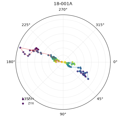
plot_phasor_wheel() plots each
requested tensor component as a point at (phase, |Z|) — a phasor —
with colour encoding log-period, for one station at a time.
import matplotlib.pyplot as plt
import numpy as np
import pandas as pd
from _datasets import load_survey

from pycsamt.emtools import (
    ensure_sites,
    plot_determinant_track,
    plot_offdiag_antisym_residual,
    plot_phasor_wheel,
)
from pycsamt.emtools._core import (
    _get_z_block,
    _iter_items,
    _name,
)

survey = load_survey("amt_l18plt")
STATION = "18-001A"

plot_phasor_wheel(survey, station=STATION)
<PolarAxes: title={'center': '18-001A'}>
Reading this figure. Zxy and Zyx trace out their own arcs
as period increases (colour running through the colormap); for a
perfectly antisymmetric tensor the two traces would sit exactly
opposite each other through the origin at every period. Section 5
below quantifies how close this particular station gets to that ideal
compared to the rest of the line.
2. Short vs. long period — does the phasor pattern change with depth?#
Restricting with pband isolates part of the recorded band.
fig, (axs, axl) = plt.subplots(
    1, 2, figsize=(9.5, 5), subplot_kw={"polar": True}
)
plot_phasor_wheel(survey, station=STATION, pband=(9e-5, 1e-3), ax=axs)
axs.set_title(f"{STATION} — short period (< 1 ms)")
plot_phasor_wheel(survey, station=STATION, pband=(1e-1, 1.0), ax=axl)
axl.set_title(f"{STATION} — long period (> 0.1 s)")
fig.tight_layout()
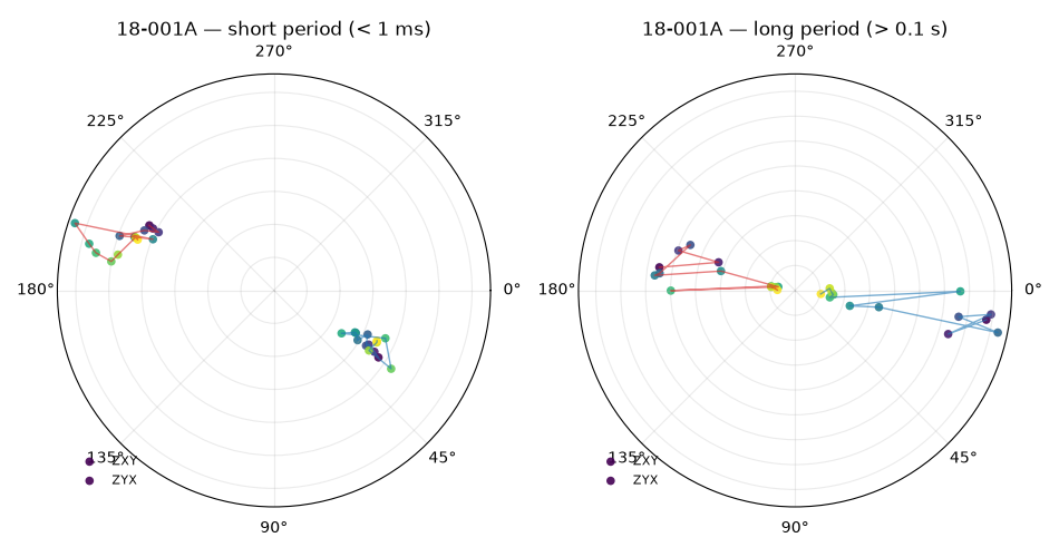
Reading this figure. The two bands occupy visibly different angular sectors rather than just scaling the same shape up or down — this station’s off-diagonal phase behaviour genuinely changes between its shallow and deep sounding, not only its magnitude.
3. All four tensor components, including the diagonal#
components accepts any of xy, yx, xx, yy. Adding
the diagonal shows how it compares to the off-diagonal that carries
the main 1-D/2-D signal.
plot_phasor_wheel(survey, station=STATION, components=("xy", "yx", "xx", "yy"))

d = ensure_sites(survey, recursive=False)
_, z0, fr0 = _get_z_block(next(_iter_items(d)))
print(
    f"{STATION}: mean|Zxy|={np.abs(z0[:, 0, 1]).mean():.1f}, "
    f"mean|Zyx|={np.abs(z0[:, 1, 0]).mean():.1f}, "
    f"mean|Zxx|={np.abs(z0[:, 0, 0]).mean():.1f}, "
    f"mean|Zyy|={np.abs(z0[:, 1, 1]).mean():.1f}"
)
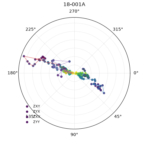
18-001A: mean|Zxy|=808.4, mean|Zyx|=1145.1, mean|Zxx|=446.9, mean|Zyy|=557.6
Reading this figure/output. The diagonal components (xx,
yy) trace smaller radii than the off-diagonal ones — about
55-65% of the mean off-diagonal magnitude here, not negligible but
consistently smaller — which leans toward a broadly 1-D/2-D-like
response without being an extreme case. A station where the diagonal
actually rivals or exceeds the off-diagonal in size would be a much
stronger visual flag for 3-D structure, independent of the
antisymmetry residual computed next.
4. The antisymmetry-residual pseudo-section#
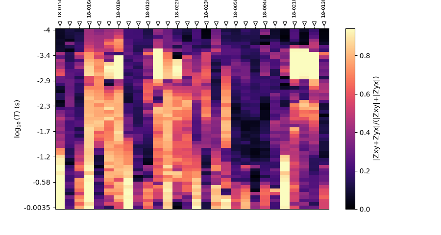
plot_offdiag_antisym_residual() maps
\(|Z_{xy}+Z_{yx}| / (|Z_{xy}|+|Z_{yx}|)\) — 0 for perfectly
antisymmetric off-diagonals, up to 1 when they add rather than cancel.
<Axes: xlabel='Station', ylabel='$\\log_{10}(T)$ (s)'>
Reading this figure. The residual is not uniform station to station — some columns run consistently warmer (closer to 1) than others across most of the band. Section 5 turns this into a per -station ranking to name which ones.
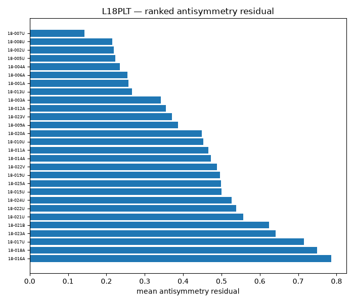
5. Per-station ranking, and a link back to the anisotropy example#
Ranking every station’s mean residual, then cross-checking against
the anisotropy example’s own per-station Swift skew and
\(\Lambda\) ratio, tests whether this is measuring something
related or something genuinely independent.
from pycsamt.emtools import anisotropy_table  # noqa: E402

rows = []
for i, ed in enumerate(_iter_items(d)):
    _, z, fr = _get_z_block(ed)
    if z is None:
        continue
    xy, yx = np.abs(z[:, 0, 1]), np.abs(z[:, 1, 0])
    r = np.clip(np.abs(z[:, 0, 1] + z[:, 1, 0]) / (xy + yx + 1e-24), 0.0, 1.0)
    rows.append({"station": _name(ed, i), "antisym_mean": r.mean()})
antisym_df = pd.DataFrame(rows).set_index("station")

aniso = anisotropy_table(survey).set_index("station")
merged = antisym_df.join(aniso[["mean_swift_skew", "mean_ratio_log10"]])
merged["abs_ratio"] = merged["mean_ratio_log10"].abs()

r_skew = merged["antisym_mean"].corr(merged["mean_swift_skew"])
r_ratio = merged["antisym_mean"].corr(merged["abs_ratio"])
print(f"corr(antisym_mean, mean_swift_skew) = {r_skew:.2f}")
print(f"corr(antisym_mean, |mean_ratio_log10|) = {r_ratio:.2f}")

top = merged.sort_values("antisym_mean", ascending=False)
fig, ax = plt.subplots(figsize=(7, 6))
ax.barh(top.index, top["antisym_mean"], color="#1f77b4")
ax.set_xlabel("mean antisymmetry residual")
ax.tick_params(axis="y", labelsize=6)
ax.set_title("L18PLT — ranked antisymmetry residual")
fig.tight_layout()
corr(antisym_mean, mean_swift_skew) = -0.59
corr(antisym_mean, |mean_ratio_log10|) = 0.72
Reading this output/figure. 18-016A, 18-018A, and
18-017U top this ranking — the exact same three stations that
topped the anisotropy example’s \(|\Lambda|\) ranking. That
shows up numerically too: antisymmetry residual correlates strongly
with \(|\Lambda|\) (r ≈ 0.72) and moderately negatively with
Swift skew (r ≈ -0.59) — consistent with that example’s own finding
that ratio and skew are themselves anti-correlated. 18-007U, which
topped the skew ranking there, sits at the bottom of this residual
ranking — its off-diagonal is comparatively close to antisymmetric
even though its diagonal-vs-off-diagonal skew is the highest in the
whole line. Three different tensor-based metrics, three different (if
related) opinions about which station is “most 3-D.”
6. The determinant track for two contrasting stations#
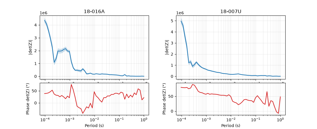
plot_determinant_track() shows
|det(Z)| and its phase vs. period, with an error-propagated confidence
band from z_err (Monte Carlo, n_draws complex Gaussian draws).
18-016A (top of the residual ranking) and 18-007U (bottom) are
a natural pair to compare.
fig = plt.figure(figsize=(11, 4.5))
gs = fig.add_gridspec(2, 2, height_ratios=(2, 1), hspace=0.08, wspace=0.25)
ax1, ax2 = fig.add_subplot(gs[0, 0]), fig.add_subplot(gs[1, 0], sharex=None)
ax3, ax4 = fig.add_subplot(gs[0, 1]), fig.add_subplot(gs[1, 1], sharex=None)
plot_determinant_track(survey, station="18-016A", axes=(ax1, ax2))
plot_determinant_track(survey, station="18-007U", axes=(ax3, ax4))
<Figure size 1100x450 with 4 Axes>
Reading this figure. Both stations’ |det(Z)| curves and shaded
bands look similar at a glance — the band itself is thin for both, so
the difference is not dramatic to the eye. Measured directly, though,
18-016A’s median relative band width (0.19) is about 35% wider
than 18-007U’s (0.14) — a modest but real indication that the
station further from antisymmetric also has a less tightly
constrained determinant, the kind of difference worth computing
rather than eyeballing.
7. Advanced: how much does the confidence level itself matter?#
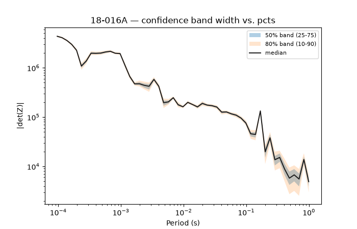
pcts sets which percentiles bound the shaded band (default
10th/90th); tightening or widening it changes how conservative the
band looks for the same underlying Monte Carlo draws.
from pycsamt.emtools.impedance import _det_ci  # noqa: E402

for i, ed in enumerate(_iter_items(ensure_sites(survey, recursive=False))):
    if _name(ed, i) == "18-016A":
        _, z, fr, ze = _get_z_block(ed, with_errors=True)
        break
per = 1.0 / fr

fig, ax = plt.subplots(figsize=(7, 4.5))
for pcts, label, alpha in [
    ((25.0, 50.0, 75.0), "50% band (25-75)", 0.35),
    ((10.0, 50.0, 90.0), "80% band (10-90)", 0.20),
]:
    mag, ph, band = _det_ci(z, fr, ze, pcts=pcts, n_draws=200, seed=0)
    ax.fill_between(per, band[:, 0], band[:, 1], alpha=alpha, label=label)
ax.plot(per, mag, "-", color="0.1", lw=1.4, label="median")
ax.set_xscale("log")
ax.set_yscale("log")
ax.set_xlabel("Period (s)")
ax.set_ylabel("|det(Z)|")
ax.legend(fontsize=8)
ax.set_title("18-016A — confidence band width vs. pcts")
Text(0.5, 1.0, '18-016A — confidence band width vs. pcts')
Reading this figure. Both bands shrink by roughly two orders of
magnitude from the shortest to the longest period, tracking |det(Z)|
itself — but the ratio of the 80% width to the 50% width stays
close to 2x at essentially every period (checked directly against the
underlying numbers, not just read off the plot). For this station,
widening the reported interval from 50% to 80% costs the same
relative amount of extra spread everywhere in the band; there is no
period range where the extra confidence comes cheap or expensive.
8. Advanced: comparing two lines of the same survey#
As in earlier examples, the same view on a neighbouring line is a useful same-survey sanity check.
survey22 = load_survey("amt_l22plt")

fig, (axa, axb) = plt.subplots(1, 2, figsize=(13, 5), sharey=True)
plot_offdiag_antisym_residual(survey, ax=axa)
axa.set_title("L18PLT")
plot_offdiag_antisym_residual(survey22, ax=axb)
axb.set_title("L22PLT")
fig.tight_layout()
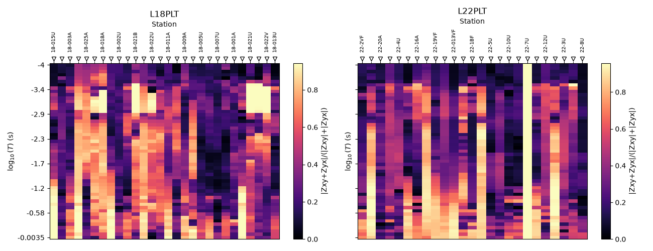
Reading this figure. Both lines show the same qualitative pattern — a handful of persistently “warm” (more symmetric, more 3-D-like) columns against a cooler background — rather than one line being uniformly cleaner than the other, a reasonable outcome for two lines from the same survey.
Total running time of the script: (0 minutes 1.523 seconds)