
Note
Go to the end to download the full example code.
First-look survey inspection (pycsamt.emtools.inspect)#
pycsamt.emtools.inspect is the module to reach for right after
loading a survey: per-site summaries, missing-section checks, frequency
coverage, resistivity/phase and tipper curves, pseudo-sections, and a
single-station “everything at once” response view with an optional
model overlay. This example uses all three bundled datasets — L18PLT
and L22PLT (data/AMT/WILLY_DATA/) and KAP03
(data/MT/kap03lmt_edis) — since a good first look is precisely
where their differences (tipper presence, frequency band, per-station
grid) matter most.
1. Per-site summary#
sites_summary() is the simplest
starting point: one row per station with frequency count, tipper
presence, period range, and coordinates.
import pandas as pd
from _datasets import load_survey

from pycsamt.emtools import (
    list_missing_sections,
    plot_coverage,
    plot_rhoa_phi,
    plot_station_response,
    plot_tipper_components,
    pseudosection,
    sites_summary,
)

surveys = {
    "L18PLT": load_survey("amt_l18plt"),
    "L22PLT": load_survey("amt_l22plt"),
    "KAP03": load_survey("mt_kap03"),
}

summaries = {name: sites_summary(s) for name, s in surveys.items()}
print(summaries["L18PLT"].head())

overview = pd.DataFrame(
    {
        name: {
            "n_sites": len(df),
            "has_tipper": df["has_tipper"].any(),
            "n_freq (unique)": sorted(df["n_freq"].unique()),
            "period_min": df["period_min"].min(),
            "period_max": df["period_max"].max(),
        }
        for name, df in summaries.items()
    }
).T
print(overview)
   station  n_freq  has_tipper  period_min  period_max        lat         lon
0  18-001A      53       False    0.000096    0.992063  32.120300  119.128833
1  18-002U      53       False    0.000096    0.992063  32.121133  119.128900
2  18-003A      53       False    0.000096    0.992063  32.122083  119.128850
3  18-004A      53       False    0.000096    0.992063  32.123333  119.128833
4  18-005U      53       False    0.000096    0.992063  32.123900  119.128833
       n_sites has_tipper n_freq (unique) period_min    period_max
L18PLT      28      False            [53]   0.000096      0.992063
L22PLT      25      False            [53]   0.000096      0.992063
KAP03       26       True        [18, 20]   0.001001  17066.669579
Reading this output. The two AMT lines share an identical
53-frequency, sub-second-to-1-second band and carry no tipper;
KAP03 has real tipper, a much longer period band (up to ~4.7 h), and
a per-station frequency count that is not perfectly uniform (18 or
20) — a detail worth knowing before assuming every station shares one
grid, the same heterogeneity seen in the frequency example’s
align_grid section.
2. Missing-section checks#
list_missing_sections() flags which
stations lack a requested section — here, real tipper.
miss_willy = list_missing_sections(surveys["L18PLT"], require=("tipper",))
miss_kap = list_missing_sections(surveys["KAP03"], require=("tipper",))
print(f"L18PLT: {len(miss_willy)}/28 stations missing tipper")
print(f"KAP03: {len(miss_kap)}/26 stations missing tipper")
L18PLT: 28/28 stations missing tipper
KAP03: 0/26 stations missing tipper
Reading this output. L18PLT is missing tipper at every one of its
28 stations (it is an AMT line with no vertical-field sensor); KAP03
is missing it at none — consistent with sites_summary above, now
checked station by station rather than just as a survey-wide flag.
3. Frequency coverage#
plot_coverage() shows which
(site, frequency) cells are actually present.
plot_coverage(surveys["KAP03"])
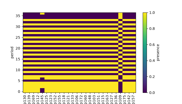
<Axes: xlabel='site', ylabel='period'>
Reading this figure. Most columns are fully covered, but the one station with only 18 (rather than 20) frequencies shows up as visible gaps rather than a uniform block — the same station flagged numerically in section 1.
4. Resistivity and phase curves#
plot_rhoa_phi() plots one or more
stations’ rho_a/phase at once for the requested components.
Passing all 28 stations at once works, but the resulting legend (56
entries) is unusable — a handful of representative stations makes a
far more readable survey-wide comparison.
l18_names = surveys["L18PLT"].stations[:4]
l18_subset = [surveys["L18PLT"].get_site(n) for n in l18_names]
plot_rhoa_phi(l18_subset, components=("xy", "yx"))
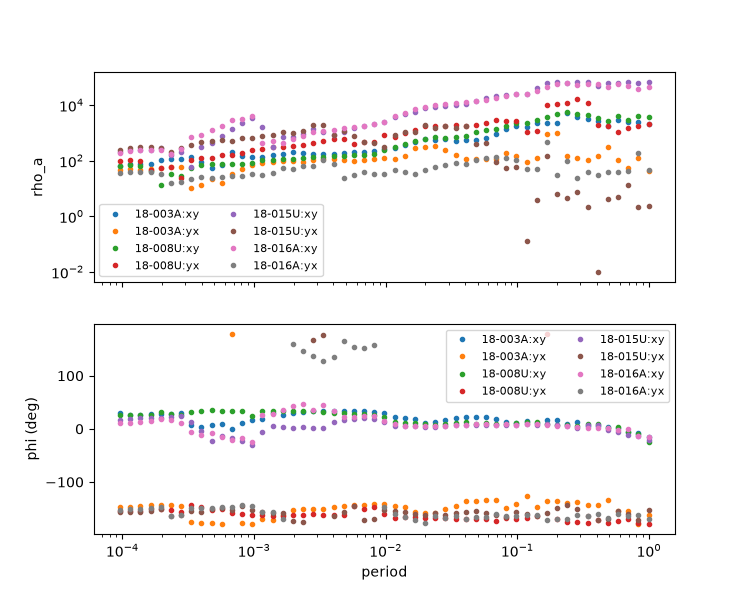
(<Axes: ylabel='rho_a'>, <Axes: xlabel='period', ylabel='phi (deg)'>)
Reading this figure. Even across just these four stations, the
curves already spread out visibly rather than overlapping tightly —
a first hint of the same station-to-station variability the
anisotropy/impedance examples quantify in detail. Follow up
on any one station of interest with plot_station_response
(section 7).
5. Pseudo-section#
pseudosection() is the module’s
station x period headline view for any resistivity/phase column.
pseudosection(surveys["L18PLT"], quantity="rho_xy")
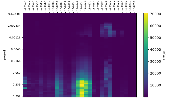
<Axes: xlabel='station', ylabel='period'>
Reading this figure. Station order follows the pivot table’s own column order (alphabetical here); values are the per-cell median in case of any duplicate frequency rows.
6. Tipper components#
plot_tipper_components() needs real
tipper, so this one uses KAP03 rather than the AMT lines — again with
a small subset (including kap151) rather than all 26 stations, for
the same legend-readability reason as section 4.
kap_names = ["kap103", "kap121", "kap142", "kap151"]
kap_subset = [surveys["KAP03"].get_site(n) for n in kap_names]
plot_tipper_components(kap_subset)
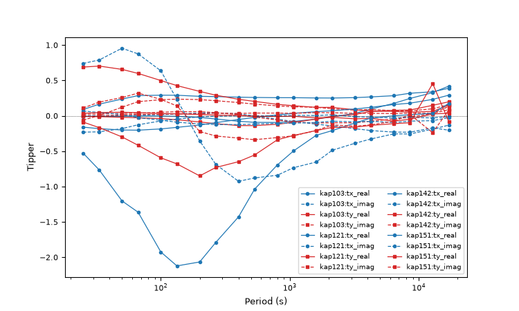
<Axes: xlabel='Period (s)', ylabel='Tipper'>
Reading this figure. kap151 (blue) stands out with a sharp dip
to about -2.1 around period ~200 s — the same station and the same
band-limited anomaly already identified from a different angle in the
tf example. Seeing it again here, in the plainest possible
real/imaginary-vs-period view, is a good reminder that a single
striking feature usually shows up across several different
diagnostics, not just one.
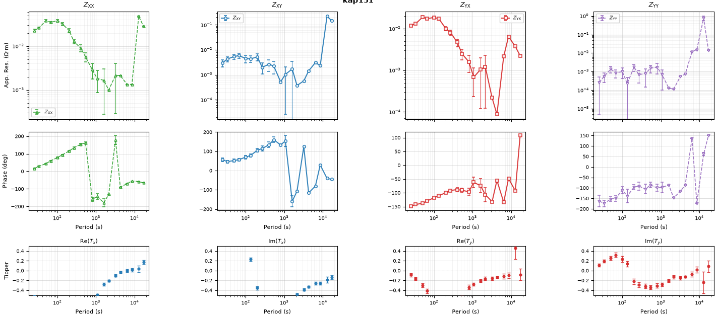
7. The full single-station response#
plot_station_response() is the richest
view in the module: apparent resistivity, phase, and (when present)
all four tipper sub-panels for one station at once.
plot_station_response(surveys["KAP03"], station="kap151")
<Figure size 1420x630 with 12 Axes>
Reading this figure. All four impedance components are shown
(xx, xy, yx, yy), matching the four fixed tipper
sub-panels below them so the grid fills out completely — the
impedance example’s diagonal-vs-off-diagonal comparison, this
station’s resistivity/phase, and its tipper (the same
kap151 singled out in the tf example for its unusually
strong, band-limited response) all in one figure.
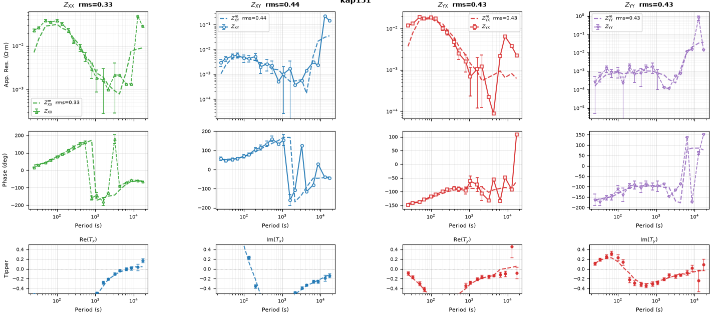
8. Advanced: overlaying a model and reading the RMS#
sites_model overlays a second dataset as dashed lines and reports
a per-component RMS misfit in log10(rho) space. There is no real
inversion output bundled with this documentation, so — as in the
diag example — a smoothed version of the same real station stands
in for a plausible “model,” which lets the RMS calculation itself be
demonstrated honestly without pretending it is a real forward model.
from pycsamt.emtools import smooth_mavg  # noqa: E402

smoothed = smooth_mavg(surveys["KAP03"], k=5)
plot_station_response(surveys["KAP03"], station="kap151", sites_model=smoothed)
<Figure size 1420x630 with 12 Axes>
Reading this figure. The dashed “model” line tracks the solid observed curve closely, as expected for a smoothed version of the same data, and each column’s title gains an RMS value quantifying exactly how closely — the same mechanism that would report a genuine forward-model or inversion-response misfit if one were supplied instead.
Total running time of the script: (0 minutes 4.220 seconds)