
Note
Go to the end to download the full example code.
Lithology: rock classification and logs#
The first interpretation step is turning resistivity numbers into named
rock units. pycsamt.geology.lithology provides a
RockDatabase that classifies a resistivity into a
lithology, and a StratigraphicLog that
stacks those classifications into a borehole-style column. This example
classifies the synthetic section and draws single-station and multi-station
(fence) logs.
The rock database#
RockDatabase.default ships a
ready table of rock types with resistivity ranges. classify maps a
value to its most likely rock.
from pycsamt.interp import RockDatabase

# Use the fence diagram (2nd figure) as the card thumbnail.

db = RockDatabase.default()
for rho in (8.0, 40.0, 200.0, 1500.0):
    print(f"{rho:7.0f} ohm-m  ->  {db.classify(rho).name}")
   8 ohm-m  ->  Alluvium (wet)
  40 ohm-m  ->  Silt (wet)
 200 ohm-m  ->  Granite (weathered)
1500 ohm-m  ->  Slate
From model to stratigraphic logs#
The quickest way to get per-station logs is the hydro interpreter, which
classifies every sounding and exposes the resulting
StratigraphicLog objects on .logs.
(The next example covers the hydrogeology it adds on top.)
from _interp_data import demo_model

from pycsamt.interp import HydroInterpreter

rm = demo_model()
hydro = HydroInterpreter(
    water_table_depth=20.0,
    aquifer_range=(30.0, 300.0),
    clay_max=20.0,
    min_zone_thickness=8.0,
).fit(rm)
logs = hydro.logs
_mid = logs[len(logs) // 2]
print(
    f"{len(logs)} logs, e.g. {_mid.station_name!r} with "
    f"{len(_mid.layers)} layers"
)
11 logs, e.g. 'S05' with 11 layers
A single stratigraphic log#
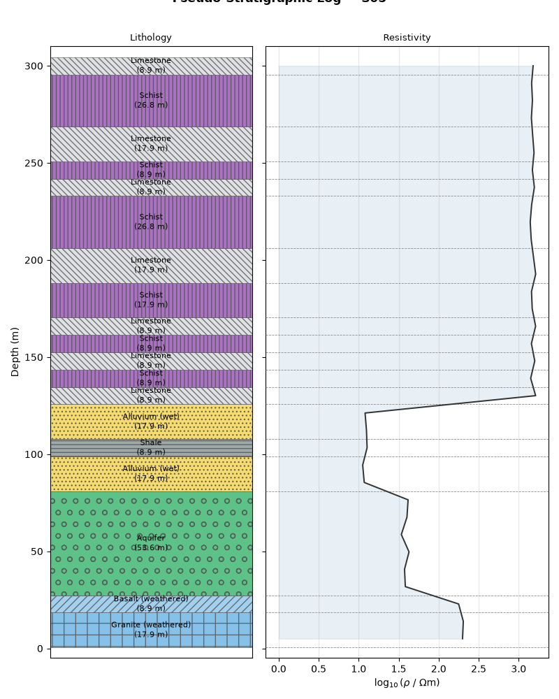
PlotStratigraphicLog draws the classic
two-track column: hatched lithology on the left, the resistivity curve on
the right. This is the figure you would hand a hydrogeologist.
<Figure size 800x1000 with 2 Axes>
A fence diagram across the line#
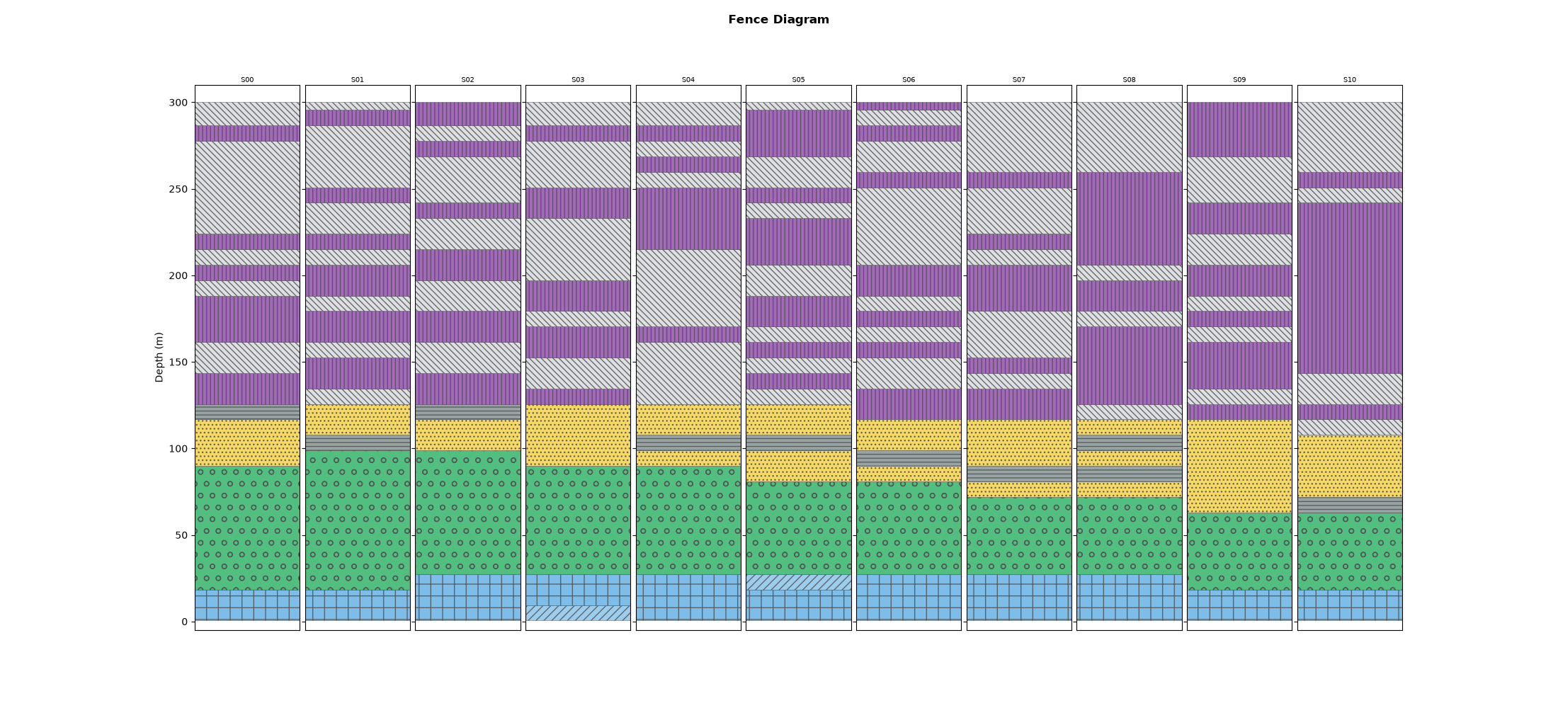
PlotFenceDiagram places every station’s log
side by side at its true distance, so laterally-continuous units (here the
aquifer and clay) line up into correlatable layers — the standard
cross-section deliverable.
PlotFenceDiagram(logs).plot()
/opt/build/repo/pycsamt/interp/plot.py:418: UserWarning: This figure includes Axes that are not compatible with tight_layout, so results might be incorrect.
  fig.tight_layout(rect=(0.0, bottom_margin, 1.0, 1.0))

<Figure size 2200x1000 with 11 Axes>
Reading it. The fence shows the four-unit sequence holding laterally with a gently undulating aquifer base, exactly the structure built into the model. Where a log’s colours break the trend, that station’s sounding is worth revisiting before trusting the correlation.
Total running time of the script: (0 minutes 0.541 seconds)