
Note
Go to the end to download the full example code.
Survey-line triage at a target frequency#
This example uses pycsamt.site for a task that is different from the
previous gallery pages:
rank and visualize survey lines before choosing where to do heavier processing.
When a project contains several lines, it is often useful to answer practical questions before running static-shift correction, phase tensor analysis, or inversion:
Which lines have complete station coverage?
Are the station coordinates usable for map/profile plots?
At a target frequency, which lines show stronger apparent-resistivity contrasts?
Do phase slopes look smooth enough for a first-pass interpretation?
Is a quick strike proxy consistent along the line, or does it flip?
This page uses the bundled WILLY survey because it contains five AMT lines
with consistent station-name prefixes: 18-*, 22-*, 26-*,
30-*, and 34-*.
1. Imports and data loading#
import os
import sys
from pathlib import Path

import matplotlib.pyplot as plt
import numpy as np


def repo_root():
    root = os.environ.get("PYCSAMT_DOCS_REPO_ROOT")
    return Path(root) if root else Path(__file__).resolve().parents[3]


ROOT = repo_root()
if str(ROOT) not in sys.path:
    sys.path.insert(0, str(ROOT))

from pycsamt.emtools import ensure_sites
from pycsamt.site import (
    SitesReport,
    keep_finite_z,
    phase_slope,
    res_at_freq,
    strike_estimate,
)

willy_dir = ROOT / "data" / "AMT" / "WILLY_DATA"
target_frequency_hz = 100.0
phase_band_hz = (10.0, 1_000.0)

all_sites = ensure_sites(willy_dir, recursive=True, verbose=0)
all_sites = keep_finite_z(all_sites)

print(f"Loaded WILLY survey stations: {len(all_sites)}")
Loaded WILLY survey stations: 53
2. Build one joined analysis table#
The site API gives us several small, composable tables:
pycsamt.site.SitesReportfor metadata and coverage;pycsamt.site.res_at_freq()for apparent resistivity at one frequency;pycsamt.site.phase_slope()for a compact smoothness/shape proxy;pycsamt.site.strike_estimate()for a quick orientation proxy.
Joining them by station name creates a lightweight triage table.
report = SitesReport(all_sites).to_dataframe(api=False)
rho100 = res_at_freq(all_sites, target_frequency_hz, how="nearest", api=False)
slopes = phase_slope(all_sites, phase_band_hz, api=False)
strike = strike_estimate(all_sites, method="phase_diff", api=False)

table = report.merge(rho100, on="station", how="left")
table = table.merge(slopes, on="station", how="left")
table = table.merge(strike[["station", "theta_deg"]], on="station", how="left")

table["line"] = table["station"].str.split("-", n=1).str[0]
table["station_number"] = (
    table["station"].str.extract(r"-(\d+)", expand=False).astype(float)
)
table["rho_gmean"] = np.sqrt(table["res_xy"] * table["res_yx"])
table["rho_anisotropy"] = np.log10(table["res_xy"] / table["res_yx"]).abs()
table["phase_slope_abs"] = table[["slope_xy", "slope_yx"]].abs().mean(axis=1)

print(
    table[
        [
            "station",
            "line",
            "nfreq",
            "f_used",
            "rho_gmean",
            "rho_anisotropy",
            "phase_slope_abs",
            "theta_deg",
        ]
    ]
    .head(10)
    .to_string(index=False)
)
station line  nfreq  f_used    rho_gmean  rho_anisotropy  phase_slope_abs  theta_deg
18-001A   18     53   102.4 2.748080e+08        0.423584         8.317403       90.0
18-002U   18     53   102.4 2.254786e+08        0.201830         5.010539       90.0
18-003A   18     53   102.4 1.142230e+08        0.318981         9.810269        0.0
18-004A   18     53   102.4 1.509632e+08        0.078099         6.985110        0.0
18-005U   18     53   102.4 2.405882e+08        0.111674         7.063466        0.0
18-006A   18     53   102.4 1.244852e+08        0.104816        12.157066       90.0
18-007U   18     53   102.4 2.265520e+08        0.178317        13.450438       90.0
18-008U   18     53   102.4 2.799875e+08        0.550992        10.798090       90.0
18-009A   18     53   102.4 4.543158e+08        0.676366         7.028785        0.0
18-010U   18     53   102.4 3.786673e+08        0.510280        17.161671        0.0
rho_gmean is the geometric mean of rho_xy and rho_yx at the
target frequency. rho_anisotropy is a simple log-ratio between the two
off-diagonal components. These are not final interpretation products; they
are compact screening variables.
3. Line-level triage scores#
A line summary helps decide where to look next. Here we rank lines by station count, median target-frequency resistivity, median anisotropy, and median phase-slope magnitude.
line_summary = (
    table.groupby("line")
    .agg(
        n_station=("station", "count"),
        median_rho=("rho_gmean", "median"),
        p90_rho=("rho_gmean", lambda x: np.nanpercentile(x, 90)),
        median_anisotropy=("rho_anisotropy", "median"),
        median_phase_slope=("phase_slope_abs", "median"),
        strike_0_fraction=("theta_deg", lambda x: float(np.mean(x == 0.0))),
    )
    .reset_index()
)

print("Line-level triage summary:")
print(line_summary.to_string(index=False))
Line-level triage summary:
line  n_station   median_rho      p90_rho  median_anisotropy  median_phase_slope  strike_0_fraction
  18         28 1.688095e+08 4.514963e+08           0.466932           18.696307           0.535714
  22         25 2.020950e+08 1.029680e+09           0.355853            8.505171           0.400000
4. Map view: all stations coloured by target-frequency resistivity#
The WILLY EDI headers contain coordinates, so a first map can be drawn from the site report alone. The colour is the target-frequency apparent resistivity proxy.
fig, ax = plt.subplots(figsize=(7.4, 5.6))
scatter = ax.scatter(
    table["lon"],
    table["lat"],
    c=np.log10(table["rho_gmean"]),
    s=48,
    cmap="viridis",
    edgecolor="black",
    linewidth=0.4,
)
for _, row in line_summary.iterrows():
    sub = table[table["line"] == row["line"]]
    ax.text(
        sub["lon"].mean(), sub["lat"].mean(), f"L{row['line']}", weight="bold"
    )

cb = fig.colorbar(scatter, ax=ax)
cb.set_label(f"log10 apparent resistivity at {target_frequency_hz:g} Hz")
ax.set_xlabel("Longitude")
ax.set_ylabel("Latitude")
ax.set_title("WILLY survey lines: target-frequency resistivity screen")
ax.grid(alpha=0.25)
fig.tight_layout()
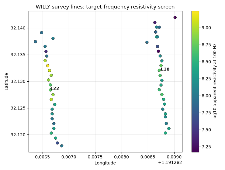
This map is intentionally a triage plot. It helps spot spatially coherent contrasts and coordinate problems before detailed geologic interpretation.
5. Line profiles: apparent resistivity along station order#
The station numbers embedded in WILLY names provide a stable along-line coordinate. Plotting all five lines together shows which lines are smooth and which have sharper station-to-station changes.
fig, ax = plt.subplots(figsize=(9.5, 4.5))
for line, sub in table.sort_values("station_number").groupby("line"):
    ax.semilogy(
        sub["station_number"],
        sub["rho_gmean"],
        marker="o",
        lw=1.4,
        label=f"L{line}",
    )

ax.set_xlabel("Station number within line")
ax.set_ylabel(
    f"Geometric mean apparent resistivity at {target_frequency_hz:g} Hz"
)
ax.set_title("Target-frequency line profiles")
ax.grid(True, which="both", alpha=0.25)
ax.legend(ncol=5, fontsize=8)
fig.tight_layout()
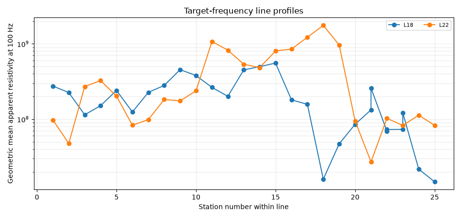
6. Anisotropy and phase-slope triage#
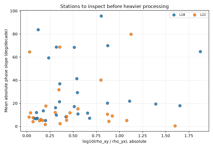
rho_anisotropy highlights disagreement between the two off-diagonal
apparent resistivities. phase_slope_abs is a compact proxy for how
rapidly phase changes through the selected frequency band.
Stations in the upper-right of this scatter deserve attention: they combine strong component disagreement with rapidly varying phase.
fig, ax = plt.subplots(figsize=(7.5, 5.2))
for line, sub in table.groupby("line"):
    ax.scatter(
        sub["rho_anisotropy"],
        sub["phase_slope_abs"],
        s=55,
        label=f"L{line}",
        alpha=0.85,
        edgecolor="black",
        linewidth=0.3,
    )

ax.set_xlabel("log10(rho_xy / rho_yx), absolute")
ax.set_ylabel("Mean absolute phase slope (deg/decade)")
ax.set_title("Stations to inspect before heavier processing")
ax.grid(alpha=0.25)
ax.legend(ncol=3, fontsize=8)
fig.tight_layout()
7. Heatmap-style matrix by line and station number#
A heatmap can be easier to scan than five overlapping curves. Missing station numbers remain blank, which makes line coverage obvious.
pivot = table.pivot_table(
    index="line",
    columns="station_number",
    values="rho_gmean",
    aggfunc="median",
)

fig, ax = plt.subplots(figsize=(10, 3.6))
im = ax.imshow(np.log10(pivot.to_numpy()), aspect="auto", cmap="magma")
ax.set_yticks(np.arange(len(pivot.index)))
ax.set_yticklabels([f"L{line}" for line in pivot.index])
ax.set_xticks(np.arange(len(pivot.columns))[::3])
ax.set_xticklabels([int(x) for x in pivot.columns[::3]], rotation=0)
ax.set_xlabel("Station number")
ax.set_title(f"Line/station matrix: log10 rho at {target_frequency_hz:g} Hz")
cb = fig.colorbar(im, ax=ax)
cb.set_label("log10 apparent resistivity")
fig.tight_layout()
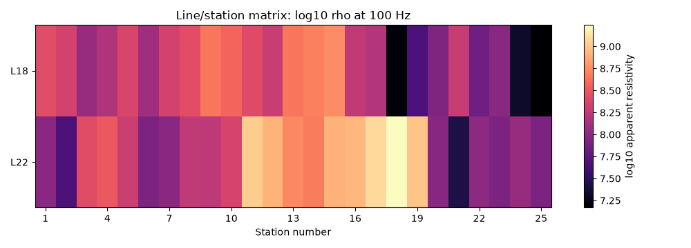
8. Pick a line for follow-up#
The most useful line is not always the most resistive. For demonstration, choose the line with the largest 90th-percentile target-frequency resistivity, then print its highest-contrast stations.
followup_line = line_summary.sort_values("p90_rho", ascending=False).iloc[0][
    "line"
]
followup = table[table["line"] == followup_line].copy()
followup = followup.sort_values("rho_gmean", ascending=False)

print(f"Suggested follow-up line by p90 rho: L{followup_line}")
print(
    followup[
        [
            "station",
            "rho_gmean",
            "rho_anisotropy",
            "phase_slope_abs",
            "theta_deg",
        ]
    ]
    .head(8)
    .to_string(index=False)
)
Suggested follow-up line by p90 rho: L22
 station    rho_gmean  rho_anisotropy  phase_slope_abs  theta_deg
  22-18A 1.753364e+09        0.171168         5.096616        0.0
  22-17U 1.221331e+09        0.148340         6.171060       90.0
  22-11A 1.072935e+09        0.923089         8.965401       90.0
 22-19VF 9.647970e+08        0.427565         8.505171        0.0
  22-16A 8.497952e+08        0.306616        11.950603       90.0
  22-12U 8.232311e+08        0.869214        10.510065       90.0
  22-15U 8.042945e+08        0.464120        11.870561       90.0
22-013VF 5.359454e+08        0.205618        17.784491       90.0
9. What this site workflow contributes#
This page is deliberately not a replacement for QC, static-shift analysis, or inversion. It is a pre-processing triage layer.
The value of using pycsamt.site here is that the workflow combines
metadata, station grouping, frequency-aware impedance summaries, phase
behavior, and quick orientation proxies without editing the survey. The
output tells the next developer which lines and stations deserve careful
follow-up, and why.
Total running time of the script: (0 minutes 0.723 seconds)