
Note
Go to the end to download the full example code.
Dimensionality, skew and anisotropy#
How many dimensions does the subsurface really have, and how distorted is the response? This example gathers the three closely-related diagnostics that answer that question on line L22PLT: a 1-D / 2-D / 3-D dimensionality classification, phase-tensor skew as a data-quality “traffic light”, and the resistivity anisotropy ratio. Together they tell you whether a 2-D inversion is defensible or whether galvanic distortion and 3-D effects dominate.
The functions come from pycsamt.emtools.dimensionality,
pycsamt.emtools.tensor, pycsamt.emtools.skew, and
pycsamt.emtools.anisotropy.
1. Dimensionality pseudo-section#
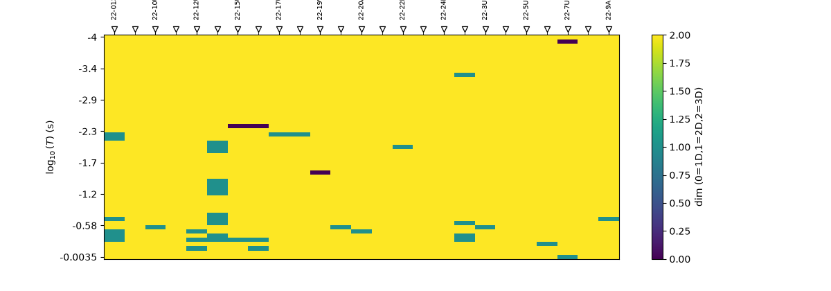
plot_dimensionality_psection() classifies
each (station, period) cell as 1-D, 2-D, or 3-D from phase-tensor
skew and ellipticity thresholds, giving an at-a-glance map of where the
2-D assumption holds.
from _datasets import load_sites

from pycsamt.emtools.anisotropy import plot_anisotropy
from pycsamt.emtools.dimensionality import (
    plot_dim_confidence_grid,
)
from pycsamt.emtools.skew import (
    plot_skew_percentile_ribbon,
    plot_skew_traffic_psection,
)
from pycsamt.emtools.tensor import (
    plot_dimensionality_psection,
    plot_skew_ellipt_density,
)

L22 = load_sites("amt_l22plt")

plot_dimensionality_psection(L22, figsize=(12, 4.2))
<Axes: xlabel='Station', ylabel='$\\log_{10}(T)$ (s)'>
2. Dimensionality confidence grid#
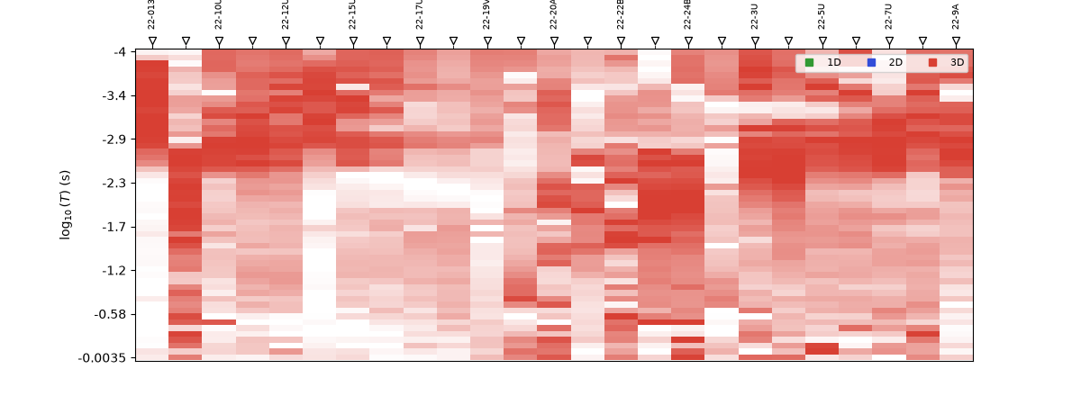
plot_dim_confidence_grid() adds a
confidence dimension to the same classification, shading how firmly each
cell can be assigned — so you can tell a confidently-3-D cell from a
borderline one.
plot_dim_confidence_grid(L22, figsize=(12, 4.5))
<Axes: xlabel='Station', ylabel='$\\log_{10}(T)$ (s)'>
3. Skew traffic-light pseudo-section#
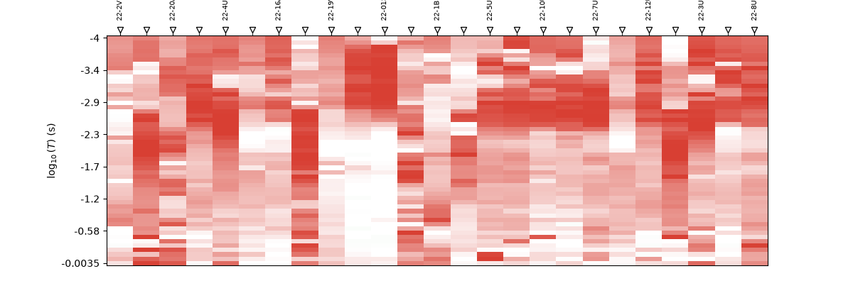
plot_skew_traffic_psection() renders
phase-tensor skew \(\beta\) as green / amber / red bands: small
skew (green) is 2-D-safe, large skew (red) warns of 3-D or distorted
response.
plot_skew_traffic_psection(L22, figsize=(12, 4.2))
<Axes: xlabel='Station', ylabel='$\\log_{10}(T)$ (s)'>
4. Skew percentile ribbon#
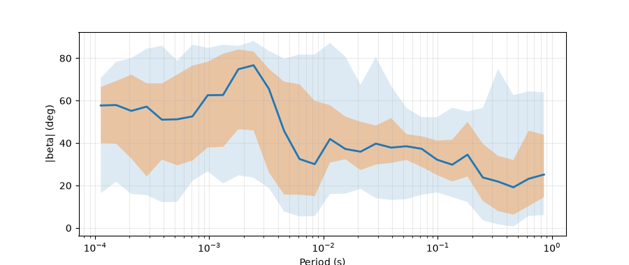
plot_skew_percentile_ribbon() summarises the
skew distribution along the profile as a median-plus-percentile ribbon,
condensing the pseudo-section above into one trend line with spread.
plot_skew_percentile_ribbon(L22, figsize=(9, 3.8))
<Axes: xlabel='Period (s)', ylabel='|beta| (deg)'>
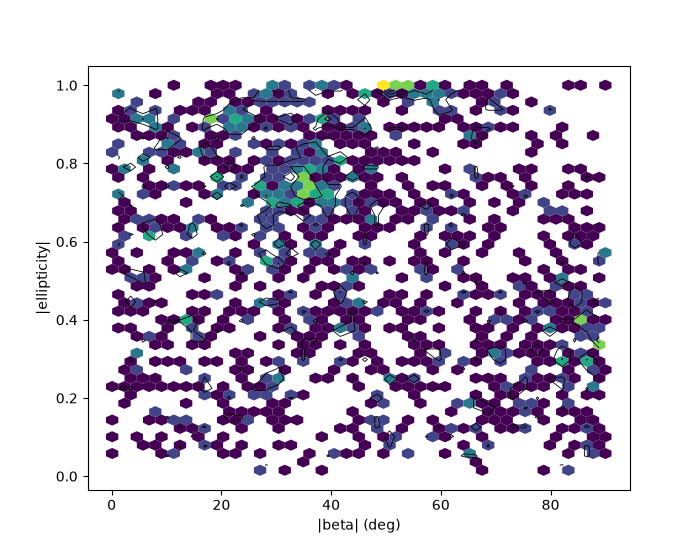
5. Skew–ellipticity density#
plot_skew_ellipt_density() is a hexbin of
\(|\beta|\) against \(|\) ellipticity \(|\) over every cell,
with the 1-D / 2-D / 3-D threshold lines overlaid — the joint
distribution behind the classification.
plot_skew_ellipt_density(L22, figsize=(7, 5.5))
<Axes: xlabel='|beta| (deg)', ylabel='|ellipticity|'>
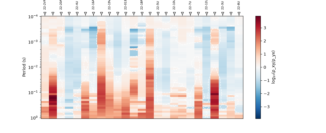
6. Anisotropy ratio pseudo-section#
plot_anisotropy() maps the ratio of
the two principal apparent resistivities across station and period.
Strong, coherent anisotropy is a structural signal; patchy anisotropy
usually points to distortion or noise.
plot_anisotropy(L22, figsize=(11, 4.5))
<Axes: title={'center': 'Anisotropy: log₁₀(ρ_xy/ρ_yx) (wang2017)'}, xlabel='Station', ylabel='Period (s)'>
Total running time of the script: (0 minutes 0.892 seconds)