
10.8. Field-to-Inversion Case Study#
The rest of this section builds pycsamt.stratagem up piece by
piece, verifying one behaviour at a time. This page runs the other
direction: start with a real field delivery sitting on disk
(data/stratagem/K2/), and walk it end to end to something ready to
hand to an inversion engine, checking the result visually at each
major step rather than only reading printed numbers. Nothing here is a
new class – every call is one already covered in Stratagem Concepts
through Export and Renaming – but the figures are new, built with
pycsamt.map and pycsamt.emtools on top of the corrected
data, and every one of them is reproducible directly from the code
shown below.
10.8.1. Starting Point#
Stratagem Concepts and Loading Hardware and EDI Data already characterised K2’s raw
hardware delivery in detail: 87 stations, a fixed 292-bin frequency
table, a low-frequency band that fails identically across every
station, and one component (Y) that is not usable at all for this
particular delivery. None of that is re-derived here – if a coverage
figure is the starting point you need, Stratagem Concepts has it. This
page picks up from the same 87-station WinGLink export and the same
reconciled GPS table built in Coordinate Injection
(data/stratagem/K2/k2-gps-aligned.csv), and goes forward from
there.
10.8.2. Coordinates and Corrections#
Before anything else, every station in a fresh WinGLink export sits at
the same placeholder position – LAT=0:00:00.00 parses to exactly
0.0, a finite number, not a missing value, so nothing downstream
fails or warns about it on its own:
>>> from pycsamt.stratagem import EDIBatch

>>> batch = EDIBatch("data/stratagem/K2/k2-edi").fit()
>>> edi_objects = [e for i, e in enumerate(batch.edi_objects_) if i != 0]
>>> uninjected_latlon = [
...     (e.get_section("head").Location.latitude, e.get_section("head").Location.longitude)
...     for e in edi_objects
... ]
>>> set(uninjected_latlon)
{(0.0, 0.0)}
All 86 surviving stations report the identical coordinate pair. Running
CoordinateInjector exactly as
Coordinate Injection did replaces it in place, on these same objects:
>>> import pandas as pd
>>> from pathlib import Path
>>> from tempfile import TemporaryDirectory
>>> from pycsamt.stratagem import CoordinateInjector

>>> aligned = pd.read_csv("data/stratagem/K2/k2-gps-aligned.csv")
>>> survey_coords = aligned[aligned["use_for_survey"]]
>>> with TemporaryDirectory() as tmp:
...     coord_csv = Path(tmp) / "coords.csv"
...     survey_coords.to_csv(coord_csv, index=False)
...     injector = CoordinateInjector(epsg=32649, order="forward").fit(
...         edi_objects, coord_csv,
...         easting_col="easting", northing_col="northing",
...         elev_col="elev", station_col="edi_file",
...     )

>>> injected_latlon = [
...     (e.get_section("head").Location.latitude, e.get_section("head").Location.longitude)
...     for e in injector.edi_objects_
... ]
>>> injected_latlon[0], injected_latlon[-1]
((25.769107, 109.629891), (25.764119, 109.645288))
Plotting both states side by side makes the difference impossible to miss:
>>> import matplotlib.pyplot as plt

>>> fig, (ax0, ax1) = plt.subplots(1, 2, figsize=(11, 4.4))
>>> lat0, lon0 = zip(*uninjected_latlon)
>>> _ = ax0.scatter(lon0, lat0, s=25, color="crimson")
>>> _ = ax0.set_xlim(-1, 1)
>>> _ = ax0.set_ylim(-1, 1)
>>> _ = ax0.axhline(0, color="0.8", lw=0.8, zorder=0)
>>> _ = ax0.axvline(0, color="0.8", lw=0.8, zorder=0)
>>> _ = ax0.set_title("Before injection: WinGLink placeholder")
>>> _ = ax0.set_xlabel("Longitude")
>>> _ = ax0.set_ylabel("Latitude")

>>> lat1, lon1 = zip(*injected_latlon)
>>> sc = ax1.scatter(lon1, lat1, s=25, c=range(len(lon1)), cmap="viridis")
>>> _ = ax1.set_title("After injection: real K2 geometry")
>>> _ = ax1.set_xlabel("Longitude")
>>> _ = fig.colorbar(sc, ax=ax1, label="Station order")
>>> _ = fig.suptitle("Station coordinates before vs after CoordinateInjector")
>>> fig.tight_layout()
>>> fig.savefig("tutorial_coord_injection_grid.png", dpi=170, bbox_inches="tight")
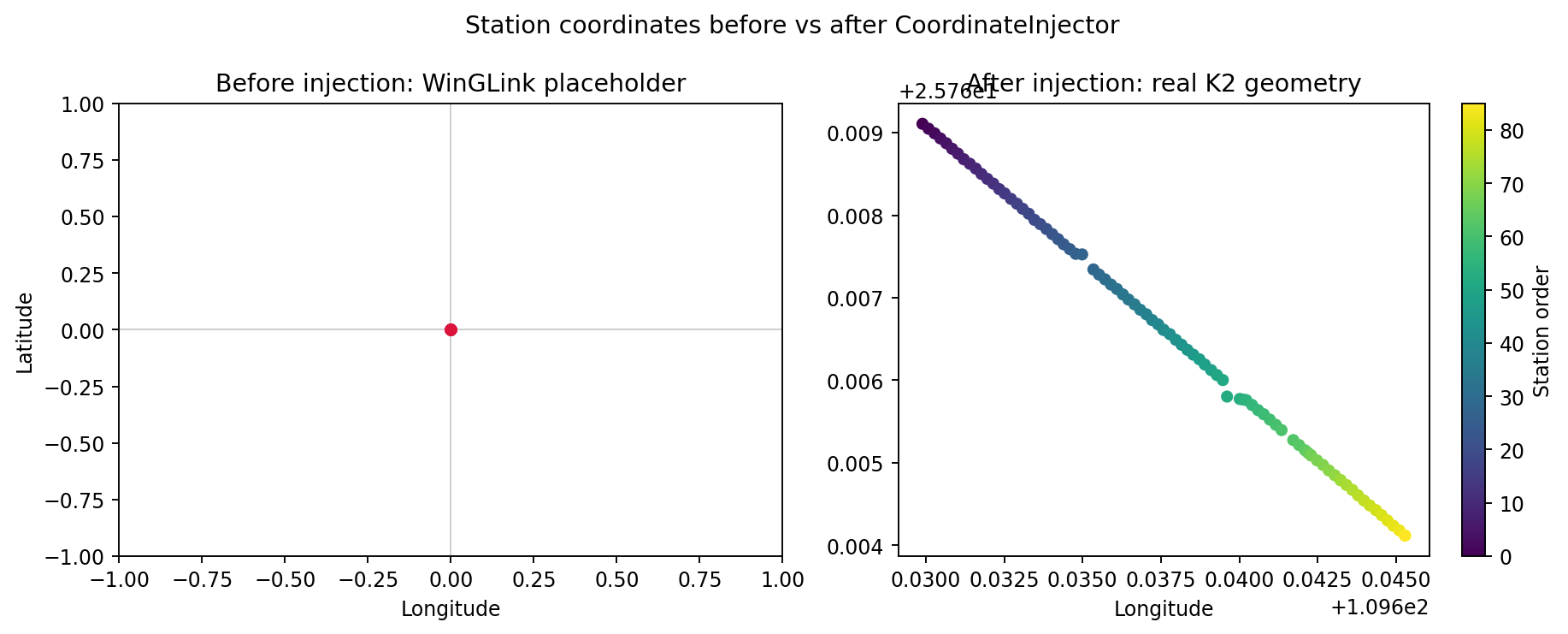
Left: every station collapsed onto one point at (0, 0) – literally
off the coast of West Africa, nowhere near Guangxi – because the
placeholder is a valid-looking finite coordinate, not an error a
plotting function can detect on its own. Right: the same 86 stations
after injection, spread along the real 1.6 km K2 line, coloured by
acquisition order to show the line runs in one consistent direction
rather than doubling back on itself. Nothing between these two panels
changed except calling CoordinateInjector.fit() – a concrete
answer to “what actually happens if this step is skipped.”#
injector.edi_objects_ – the corrected-coordinate objects, not the
placeholder ones – are what the rest of this page uses from here on:
the same deliberate difference from The StratagemSurvey Pipeline’s single
StratagemSurvey call keeps a deep
copy of this coordinate-injected, pre-correction state aside as
raw_edis, specifically so the figures below can show a real
before/after against the corrected baseline, not the placeholder one:
>>> from copy import deepcopy
>>> from pycsamt.stratagem import StratagemRawReader
>>> from pycsamt.stratagem.qc import FrequencyFilter
>>> from pycsamt.stratagem.process import StaticShiftCorrector, NoiseRemover

>>> raw_edis = [deepcopy(e) for e in injector.edi_objects_]

>>> rdr = StratagemRawReader("data/stratagem/K2/k2-HX", component="X").fit()
>>> sc = StaticShiftCorrector(sort_by="lon").fit(injector.edi_objects_)
>>> filt = FrequencyFilter(fmin=10.0, fmax=10000.0).fit(sc.edi_objects_, raw_reader=rdr)
>>> nr = NoiseRemover(mains_hz=50.0).fit(filt.edi_objects_)
>>> final_edis = nr.edi_objects_

>>> len(raw_edis), len(final_edis)
(86, 86)
raw_edis and final_edis now hold the same 86 stations at two
points in the same pipeline: coordinates injected but nothing else
touched, and fully corrected. Everything below compares the two.
10.8.3. Station Map#
pycsamt.map.plot_station_map() accepts the corrected EDI list
directly – no separate Sites wrapping needed, the same
ensure_sites() normalisation from Loading Hardware and EDI Data
runs internally:
>>> from pycsamt.map import StationMapOptions, plot_station_map

>>> fig = plot_station_map(
...     final_edis,
...     options=StationMapOptions(
...         overlay="rho", frequency=100.0, frequency_tolerance=20.0,
...         component="xy", backend="matplotlib", show_labels=False,
...         show_profiles=True, cmap="viridis",
...         title="K2 line: apparent resistivity at 100 Hz",
...     ),
... )
>>> fig.savefig("tutorial_station_map.png", dpi=170, bbox_inches="tight")
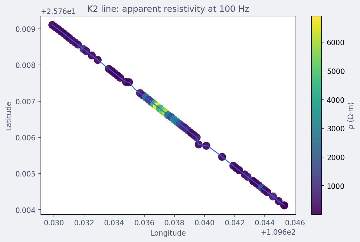
The K2 line runs almost perfectly straight for its full 1.6 km, with one resistive cluster (yellow-green, several thousand \(\Omega\cdot\)m) sitting roughly a third of the way along and everything else in the few-hundred-\(\Omega\cdot\)m range (dark purple). This is the same station geometry Coordinate Injection built by hand, now used as the base layer for a real scalar overlay.#
The requested 100 Hz is not available within tolerance at every station – frequency filtering removed some stations’ coverage near that value, and the map silently skips a station rather than guessing. Checking each station’s nearest frequency directly confirms it:
>>> import numpy as np

>>> n_within = 0
>>> for e in final_edis:
...     fr = np.asarray(e.Z.freq, dtype=float)
...     fr = fr[np.isfinite(fr) & (fr > 0)]
...     nearest = fr[np.argmin(np.abs(fr - 100.0))]
...     if abs(nearest - 100.0) <= 20.0:
...         n_within += 1
>>> n_within, len(final_edis)
(63, 86)
63 of 86 stations have a usable 100 Hz-ish value; the other 23 simply
do not appear as coloured points on the map above. This is the same
“frequency not always available” behaviour Station Maps
documents in general – widening frequency_tolerance recovers more
stations at the cost of matching a less exact frequency for each one.
10.8.4. Sounding Curve Comparison#
A map at one frequency is a single slice. The full effect of static
shift correction, frequency filtering, and noise removal is easier to
see per station, across the whole frequency range at once, with
pycsamt.emtools.plot_sites_compare(). Three stations make the
point: an ordinary station near the start of the line, one from the
middle, and station 61 – the one Static Shift and Noise Removal found taking a
\(\text{fac}_z=93\) correction from a single spatial neighbour:
>>> from pycsamt.emtools import plot_sites_compare

>>> fig = plot_sites_compare(
...     raw_edis, final_edis,
...     stations=["Z2HX005", "Z2HX040", "Z2HX061"],
...     components=("xy", "yx"),
...     labels=("raw", "corrected"),
...     quantity="rhoa", x_axis="period",
...     ncols_groups=3, show_legend=True,
... )
>>> fig.savefig("tutorial_soundings_compare.png", dpi=170, bbox_inches="tight")
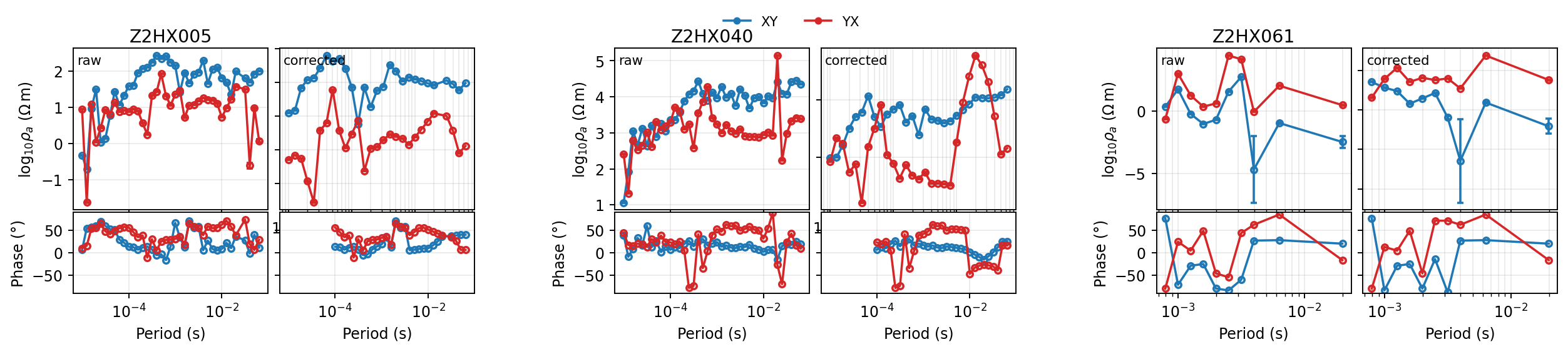
Station 5’s raw and corrected curves stay close in shape – a modest
correction, consistent with its fac_z sitting near 1 in
Static Shift and Noise Removal. Station 61, on the right, tells the opposite
story: the raw curve carries wide error bars and sits noticeably
lower, and the corrected curve is shifted upward across the whole
period range by roughly the same amount at every period – exactly
what a frequency-independent multiplicative correction should look
like, and a direct visual confirmation that the huge fac_z=93
number from Static Shift and Noise Removal is doing something coherent to the
actual curve rather than an isolated numerical artefact.#
10.8.5. Pseudosection Comparison#
Zooming back out to the whole line, pycsamt.map.plot_pseudosection()
renders every station’s apparent resistivity as one station-versus-period
image instead of 86 separate curves:
>>> from pycsamt.map import ProfileMapOptions, plot_pseudosection

>>> pseudo_opts = dict(
...     component="xy", components=("xy",), x_axis="station",
...     backend="matplotlib", log_rho=True,
... )
>>> fig_raw = plot_pseudosection(raw_edis, options=ProfileMapOptions(**pseudo_opts))
>>> fig_raw.axes[0].set_title("Raw (coordinates injected only)")
Text(0.5, 1.0, 'Raw (coordinates injected only)')
>>> fig_raw.savefig("tutorial_pseudosection_raw.png", dpi=170, bbox_inches="tight")

>>> fig_final = plot_pseudosection(final_edis, options=ProfileMapOptions(**pseudo_opts))
>>> fig_final.axes[0].set_title("After static shift, frequency filtering, and noise removal")
Text(0.5, 1.0, 'After static shift, frequency filtering, and noise removal')
>>> fig_final.savefig("tutorial_pseudosection_final.png", dpi=170, bbox_inches="tight")
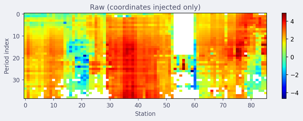
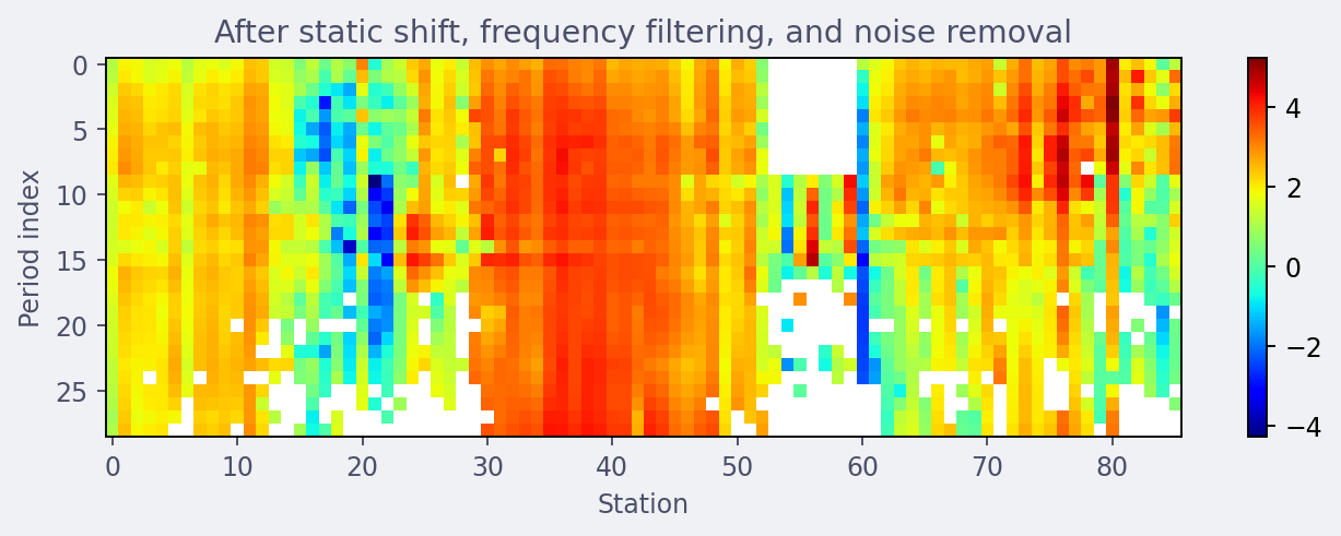
The vertical white gap around stations 52-60 in both panels is the same low-coverage run Stratagem Concepts first found in the raw hardware SNR mask – it survives every processing stage because the underlying frequencies were never usable to begin with, not because anything downstream discarded them. The resistive body visible in the station map (stations roughly 30-46) shows the same way here, as a warm red band running through the middle third of the section in both panels. The two colour scales are each fit to their own data range rather than forced to match, so this comparison is about pattern, not reading exact colours across panels – the corrected panel has visibly fewer of the isolated single-pixel speckles the raw panel shows scattered through the resistive zone, which is the Hampel outlier filter doing its job.#
10.8.6. Inversion Readiness#
A visually reasonable pseudosection is not the same as a dataset ready
to export. Two checks matter before treating final_edis as done:
whether any station is carrying unresolved gaps, and whether every
station has enough surviving frequencies to be worth inverting at all.
>>> import numpy as np

>>> total_nan = sum(int(np.isnan(e.Z.z).sum()) for e in final_edis)
>>> total_cells = sum(e.Z.z.size for e in final_edis)
>>> total_nan, total_cells
(0, 8832)

>>> n_freqs = [e.Z.z.shape[0] for e in final_edis]
>>> min(n_freqs), max(n_freqs), int(np.median(n_freqs))
(8, 29, 27)
Zero NaN cells remain anywhere in the 86-station batch – every
frequency the hardware mask or the incoherent-frequency stage marked
bad also happened to fall outside the retained 10-10 000 Hz band, so
band selection cleared them as a side effect rather than leaving gaps
behind. That is a property of this band choice, not a guarantee;
picking a wider band could easily leave real NaN gaps that a
downstream inversion tool would need to handle explicitly. The
frequency count is less uniformly good: most stations kept close to
the full 29-frequency band, but the weakest station has only 8:
>>> import matplotlib.pyplot as plt

>>> fig, ax = plt.subplots(figsize=(6.5, 3.6))
>>> _ = ax.hist(n_freqs, bins=range(min(n_freqs), max(n_freqs) + 2), color="#3b6fa0", edgecolor="white")
>>> _ = ax.set_xlabel("Usable frequencies per station (after filtering)")
>>> _ = ax.set_ylabel("Station count")
>>> _ = ax.set_title("K2 line -- final per-station frequency coverage")
>>> fig.tight_layout()
>>> fig.savefig("tutorial_freq_coverage_hist.png", dpi=170, bbox_inches="tight")
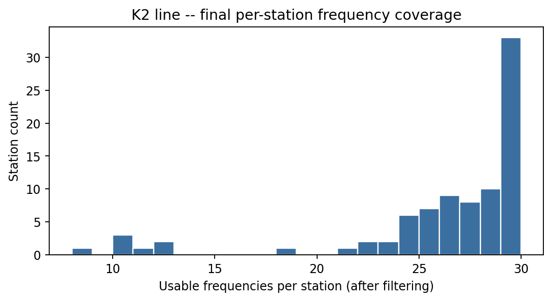
The distribution is heavily left-skewed toward full coverage – 33 of 86 stations kept essentially the whole band – with a small tail of thinner stations down to 8 frequencies. A handful of low-coverage stations is not a reason to drop them outright; it is a reason to weight them accordingly (or flag them for review) once they reach an inversion, the same distinction Quality Control drew between a QC flag and a verdict of “bad data”.#
10.8.7. Final Export#
With both checks done, writing the corrected batch out is the same call as Export and Renaming:
>>> from pycsamt.stratagem.rename import EDIWriter

>>> with TemporaryDirectory() as out:
...     wr = EDIWriter().fit(final_edis, out)
...     wr.n_written_
86
The K2 line is now a set of 86 EDI files carrying real WGS84
coordinates, static-shift-corrected impedances, a hardware- and
statistically-filtered frequency band, and powerline/outlier-cleaned
data – confirmed here not just by the summary numbers
The StratagemSurvey Pipeline already verified, but by looking directly at the
station map, the sounding curves, and the pseudosections a
reviewer would actually check before trusting the data. From here the
same final_edis (or the files just written) are ordinary EDI input
to EM Tools Guide diagnostics or to any of the inversion
backends this documentation covers separately.