
11.26. Polar Uncertainty Diagnostics#
pycsamt.emtools.diag evaluates predicted uncertainty intervals
against observed CSAMT/AMT apparent resistivity. It adapts the
k-diagram polar uncertainty ideas to electromagnetic soundings:
coverage, relative interval width, and relative prediction error.
This module is different from most emtools pages. It cannot work
from observed EDI data alone. You must provide a prediction to evaluate:
lower and upper apparent-resistivity bounds,
q_loandq_hi;optionally, a point prediction
model_rhofor relative-error plots.
Full callable signatures live in the API reference. This user-guide page focuses on the workflow, data shapes, returned tables, plots, and interpretation.
11.26.1. What The Diagnostics Measure#
For each station and frequency, the module computes observed apparent resistivity from one off-diagonal impedance tensor component:
where pq is xy by default and f is frequency in hertz. This
is the same practical-unit EDI convention used by the other
emtools resistivity diagnostics.
Given predicted bounds \([L_j, U_j]\), coverage is:
The empirical coverage of a station is the mean of those binary
values. For a nominal 90 percent interval, a station with empirical
coverage above 0.9 is flagged as calibrated by the default rule.
For station \(s\), with \(n_s\) evaluated frequencies, this is
Here \(p_{nom}\) is the requested nominal coverage probability, for example \(0.90\) for a 90 percent interval.
The module also reports relative interval width:
and relative point-prediction error:
Coverage tells you whether observations fall inside predicted intervals. Width tells you whether that coverage was useful or merely overly cautious. Error tells you where a point prediction systematically over- or under-predicts the observed sounding.
11.26.2. Inputs You Must Provide#
The observed data input is the usual emtools sites argument:
a directory containing EDI files,
one EDI-like object,
a
Sitescontainer,an iterable of site-like objects.
The prediction inputs can be shaped in three ways:
Input shape |
Meaning |
|---|---|
scalar |
Broadcast one value to every station and frequency. |
one array |
Reuse the same per-frequency array for each station. |
|
Use station-specific arrays keyed by station name. |
For real work, the dictionary form is usually best. Each array must be aligned with that station’s frequency array. When a station key is missing from the dictionary, that station is skipped.
That alignment is literal. For station \(s\), the vectors
must describe the same ordered samples. If \(L_{s,j}\) and \(U_{s,j}\) are shifted relative to \(f_{s,j}\), the coverage score becomes a number with no physical meaning.
11.26.3. Pure Coverage Score#
coverage_score is the pure arithmetic helper. It does not load EDI
files. Use it when you already have observed values and interval bounds.
>>> import numpy as np
>>> from pycsamt.emtools.diag import coverage_score
>>> rho_obs = np.array([98.0, 105.0, 87.0, 130.0, 112.0])
>>> q_lo = np.array([90.0, 95.0, 90.0, 100.0, 100.0])
>>> q_hi = np.array([110.0, 115.0, 100.0, 120.0, 125.0])
>>> score = coverage_score(rho_obs, q_lo, q_hi)
>>> print(f"empirical coverage = {score:.2f}")
empirical coverage = 0.60
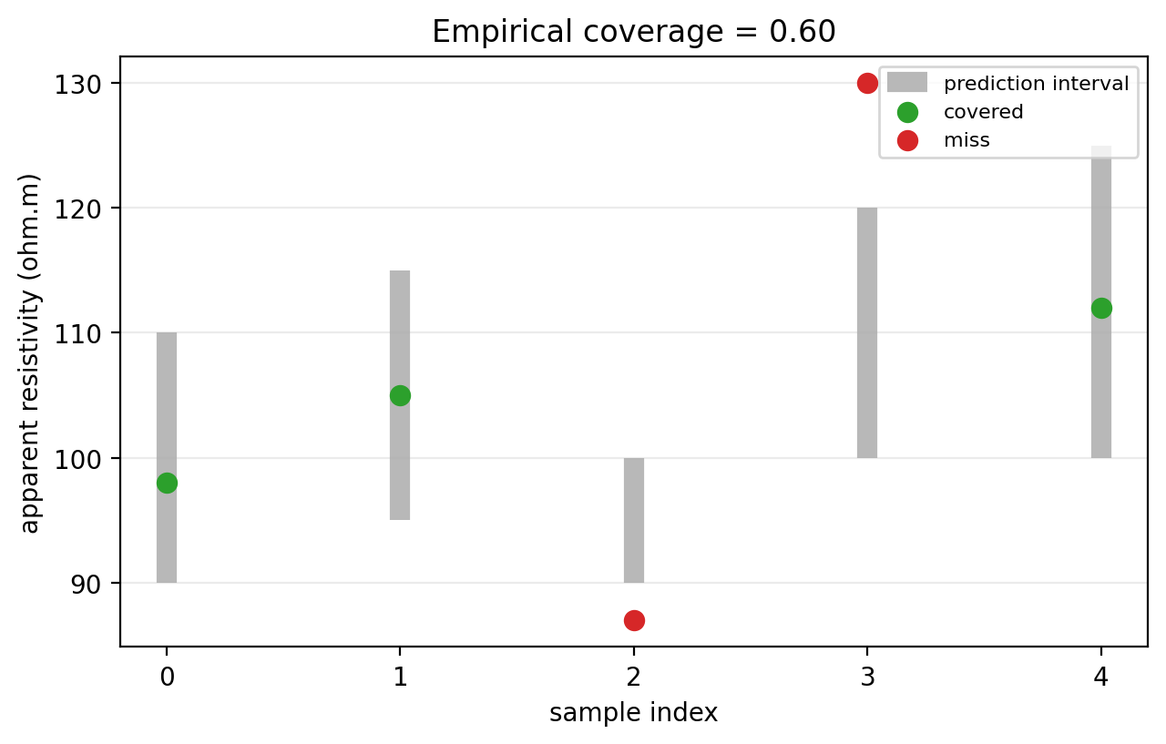
coverage_score is the fraction of observations that fall inside
their interval. In this toy example, values below q_lo or above
q_hi count as misses.
11.26.4. Building Example Bounds#
The rest of the workflow needs prediction intervals. The example below builds a simple baseline from real L18PLT observations: a rolling median in log-resistivity space becomes the center line, and the interval width grows toward longer periods.
This is not a forecasting model. It is a transparent way to demonstrate the diagnostics using real observed EDI data.
>>> import numpy as np
>>> from pycsamt.emtools.diag import rho_coverage
>>> survey = "data/AMT/WILLY_DATA/L18PLT"
>>> raw = rho_coverage(survey, q_lo=0.0, q_hi=np.inf, rho_comp="xy")
>>> q_lo = {}
>>> q_hi = {}
>>> model = {}
>>> log_period = np.log10(raw["period_s"])
>>> p_min = log_period.min()
>>> p_max = log_period.max()
>>> for station, group in raw.groupby("station", sort=False):
...     group = group.reset_index(drop=True)
...     smooth = (
...         np.log10(group["rho_obs"])
...         .rolling(5, center=True, min_periods=1)
...         .median()
...     )
...     center = 10.0 ** smooth.to_numpy()
...     t = (np.log10(group["period_s"]) - p_min) / (p_max - p_min + 1e-12)
...     half_width = 0.15 + 0.30 * t
...     q_lo[station] = center * (1.0 - half_width)
...     q_hi[station] = center * (1.0 + half_width)
...     model[station] = center
...
>>> len(q_lo), len(model)
(28, 28)
rho_coverage with infinite bounds is a convenient way to extract
observed apparent resistivity without evaluating any real interval –
every point trivially falls inside [0, inf]. The loop that follows
then builds station-specific lower bounds, upper bounds, and point
predictions from that same observed data.
In mathematical form, the center line is a rolling median in log-resistivity,
where \(W_j\) is the local smoothing window. The half-width is made larger at longer periods,
and the interval is then
This is deliberately transparent: the diagnostics are being tested against a smooth baseline, not hidden behind a separate inversion or machine-learning model.
11.26.5. Per-Frequency Coverage#
Use rho_coverage when you need one row per station and frequency.
>>> detail = rho_coverage(
...     "data/AMT/WILLY_DATA/L18PLT",
...     q_lo=q_lo,
...     q_hi=q_hi,
...     rho_comp="xy",
...     recursive=True,
...     on_dup="replace",
...     strict=False,
...     verbose=0,
... )
>>> detail.head()
   station  freq_hz  period_s  ...        q_hi  covered  width_pct
0  18-001A  10400.0  0.000096  ...   83.967382     True  32.193022
1  18-001A   8707.0  0.000115  ...   85.549285     True  31.582076
2  18-001A   7289.0  0.000137  ...   87.159020     True  32.307651
3  18-001A   6102.0  0.000164  ...  101.271129     True  33.461671
4  18-001A   5108.0  0.000196  ...  112.968367     True  34.616073
[5 rows x 8 columns]
>>> detail.to_csv("l18plt_coverage_detail.csv", index=False)
The output columns are:
station: station name.freq_hzandperiod_s: frequency and inverse frequency.rho_obs: observed apparent resistivity fromZxyorZyx.q_loandq_hi: prediction interval bounds.covered:Truewhenq_lo <= rho_obs <= q_hi.width_pct: interval width as a percentage ofrho_obs.
The most common mistake is misalignment. If your q_lo and q_hi
arrays are not ordered the same way as the station’s frequency array,
coverage will be meaningless even though the code can still run.
11.26.6. Single-Station Inspection#
Before trusting summary statistics, inspect one station’s observed curve against its bounds.
>>> import matplotlib.pyplot as plt
>>> station = "18-001A"
>>> one = detail.loc[detail["station"] == station].sort_values("period_s")
>>> fig, ax = plt.subplots(figsize=(7, 4.5))
>>> _ = ax.fill_between(
...     one["period_s"], one["q_lo"], one["q_hi"],
...     color="0.85", label="predicted interval",
... )
>>> _ = ax.loglog(one["period_s"], one["rho_obs"], "o-", label="observed")
>>> _ = ax.scatter(
...     one.loc[~one["covered"], "period_s"],
...     one.loc[~one["covered"], "rho_obs"],
...     color="red", zorder=4, label="miss",
... )
>>> _ = ax.set_xlabel("Period (s)")
>>> _ = ax.set_ylabel("Apparent resistivity (ohm.m)")
>>> _ = ax.set_title(f"{station} observed resistivity vs. prediction interval")
>>> _ = ax.legend()
>>> fig.tight_layout()
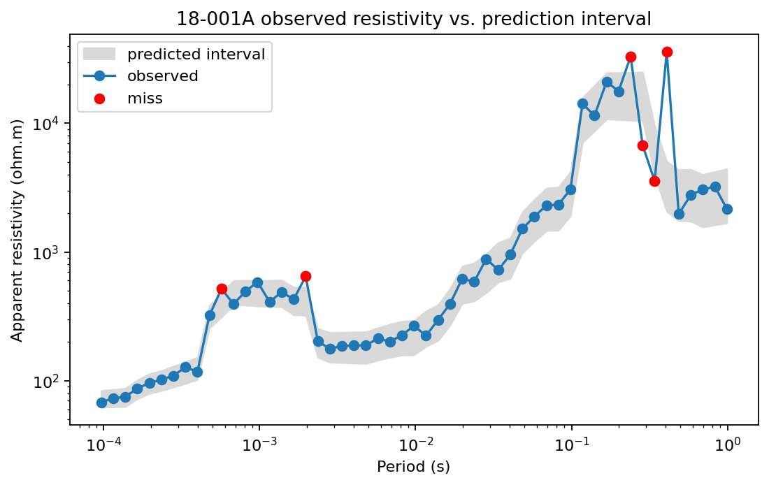
Red points are misses. A few isolated misses may be acceptable. A whole frequency band outside the interval usually means the model is biased or the interval width is too narrow in that part of the spectrum.
11.26.7. Per-Station Coverage Table#
Use coverage_table to summarize each station.
>>> from pycsamt.emtools.diag import coverage_table
>>> table = coverage_table(
...     "data/AMT/WILLY_DATA/L18PLT",
...     q_lo=q_lo,
...     q_hi=q_hi,
...     rho_comp="xy",
...     nominal=0.9,
... )
>>> ranked = table.sort_values("empirical_cov")
>>> ranked.head(10)
    station  n_freq  empirical_cov  mean_width_pct  calibrated_flag
21  18-021B      53       0.754717       61.136034            False
23  18-022V      53       0.811321       61.889193            False
22  18-022U      53       0.830189       61.305808            False
26  18-024U      53       0.830189       62.828105            False
13  18-014A      53       0.867925       66.977547            False
18  18-019U      53       0.867925       62.615552            False
24  18-023A      53       0.886792       61.066131            False
14  18-015U      53       0.886792       62.958395            False
0   18-001A      53       0.886792       63.019031            False
1   18-002U      53       0.886792       63.691545            False
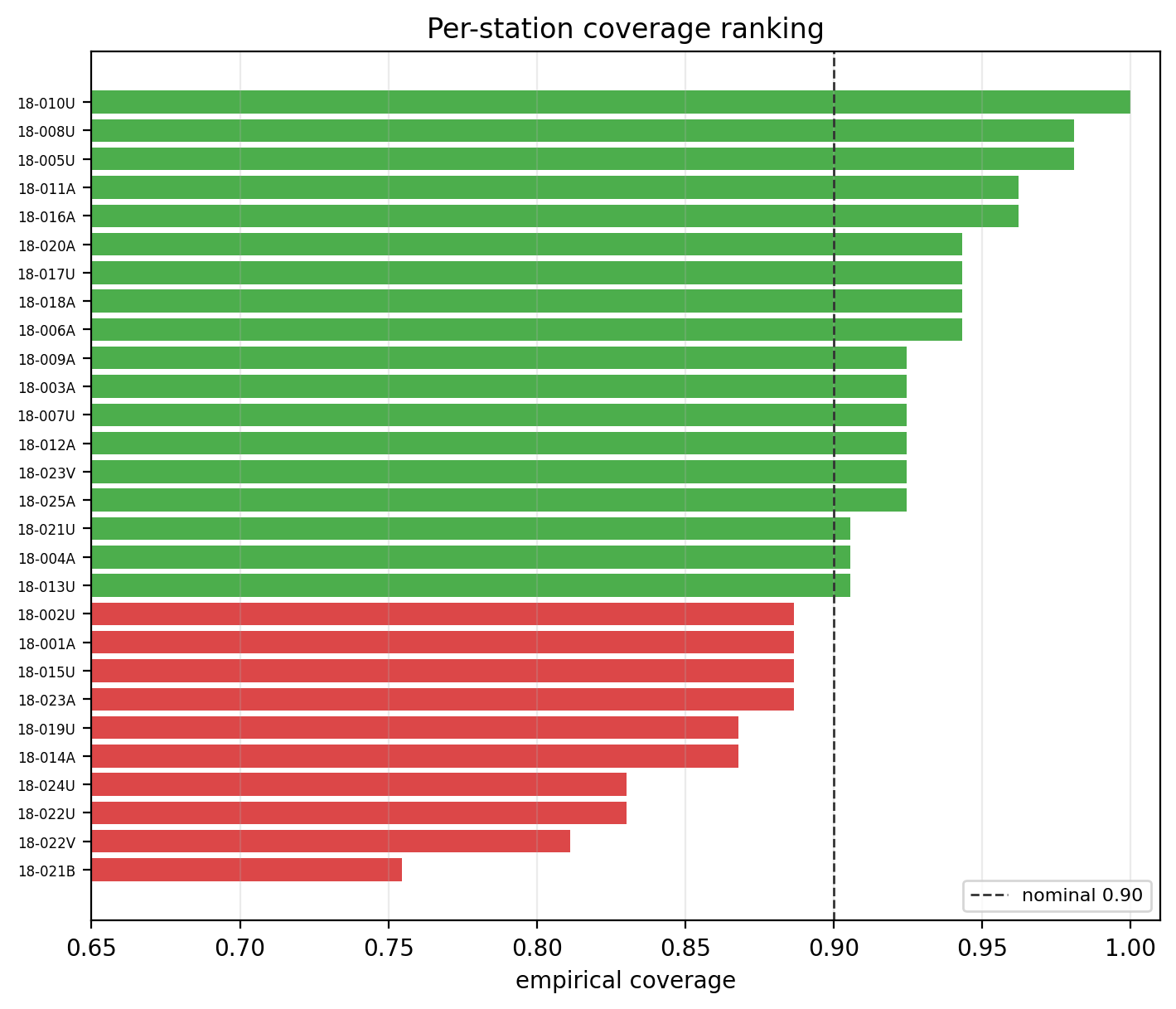
The output columns are:
station: station name.n_freq: number of evaluated frequencies.empirical_cov: fraction of covered frequencies.mean_width_pct: mean interval width as percent of observed resistivity.calibrated_flag:Truewhenempirical_cov >= nominal.
A station can be calibrated because the model is genuinely good, or
because the intervals are very wide. Always read empirical_cov with
mean_width_pct.
11.26.8. Coverage Visualization#
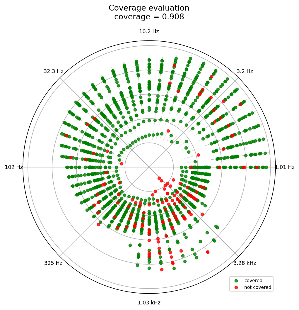
plot_polar_coverage maps frequency to polar angle and observed
resistivity to radius. Green points are covered. Red points are misses.
Thin radial segments show the prediction interval.
With logarithmic radius, the polar coordinates are
The radial segment spans \(\log_{10}L_j\) to \(\log_{10}U_j\), so equal resistivity ratios occupy comparable visual distance.
>>> from pycsamt.emtools.diag import plot_polar_coverage
>>> fig, ax = plt.subplots(subplot_kw={"projection": "polar"}, figsize=(7, 7))
>>> _ = plot_polar_coverage(
...     "data/AMT/WILLY_DATA/L18PLT",
...     q_lo=q_lo,
...     q_hi=q_hi,
...     rho_comp="xy",
...     n_freq_ticks=8,
...     ax=ax,
... )
>>> fig.tight_layout()
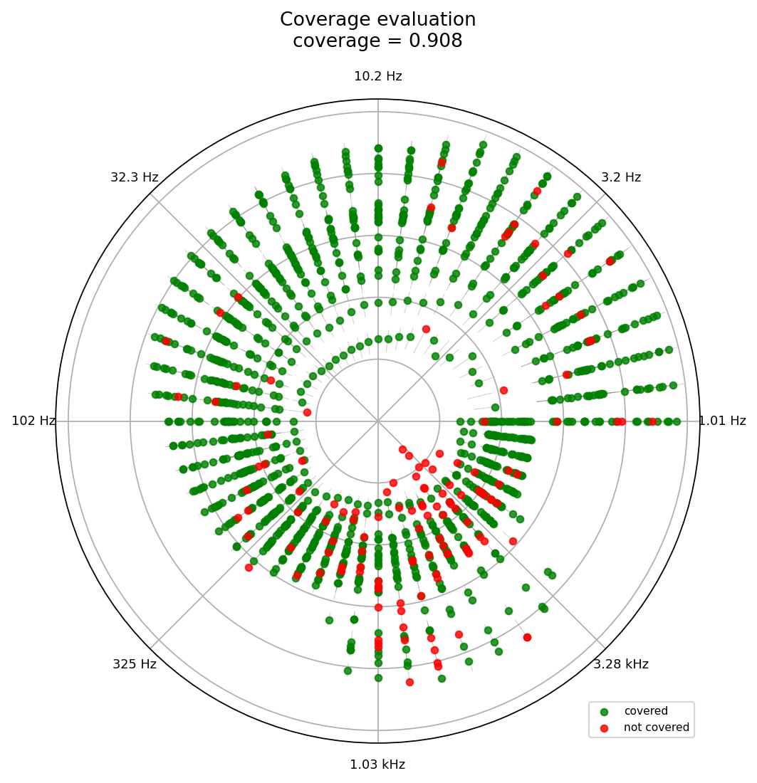
This plot is useful when you want to know whether misses cluster in a specific part of the frequency band. A red wedge suggests a systematic frequency-dependent calibration problem. Scattered red points suggest local noise or station-specific departures.
11.26.9. Width Drift#
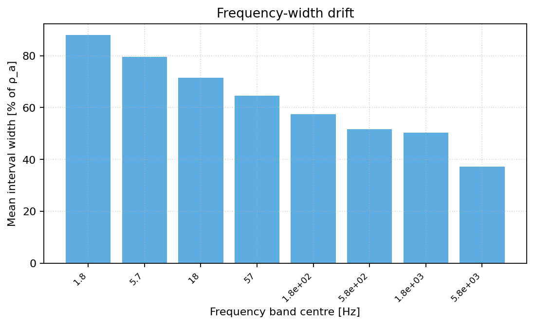
plot_width_drift bins relative interval width by frequency band.
It answers a different question from coverage: how expensive was the
coverage in interval width?
For a frequency bin \(B_b\), the plotted mean width is
>>> from pycsamt.emtools.diag import plot_width_drift
>>> fig, ax_cart = plt.subplots(figsize=(8, 4))
>>> _ = plot_width_drift(
...     "data/AMT/WILLY_DATA/L18PLT",
...     q_lo=q_lo,
...     q_hi=q_hi,
...     n_bands=8,
...     polar=False,
...     ax=ax_cart,
... )
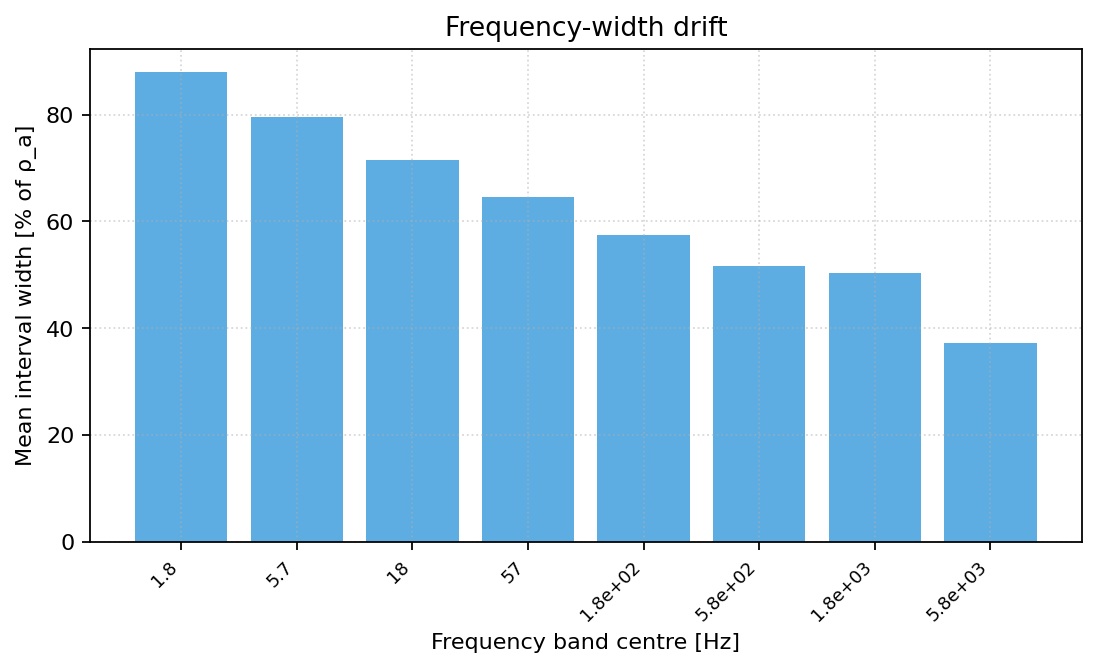
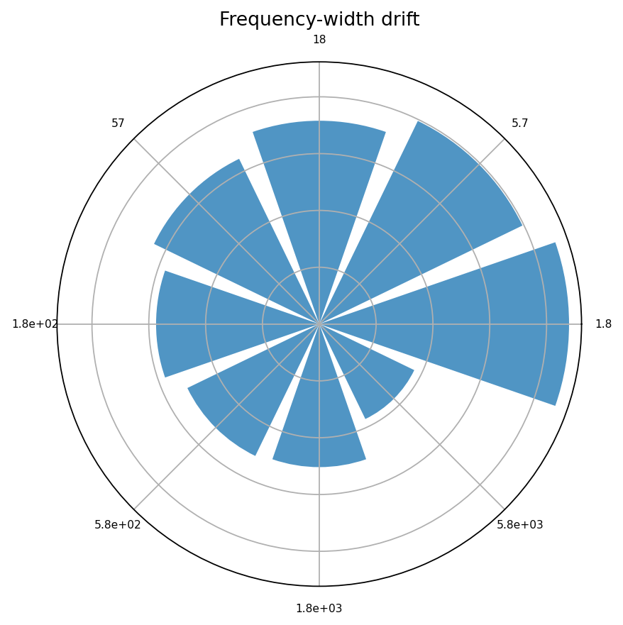
If widths grow toward lower frequencies, uncertainty is increasing with longer periods and, approximately, with greater investigation depth. If widths are huge everywhere, high coverage may not be very informative. The same bins also read well wrapped onto a polar axis, which keeps the frequency-band drift on the same angular convention as the coverage plot above:
>>> fig2, ax2 = plt.subplots(subplot_kw={"projection": "polar"}, figsize=(6, 6))
>>> _ = plot_width_drift(
...     "data/AMT/WILLY_DATA/L18PLT",
...     q_lo=q_lo,
...     q_hi=q_hi,
...     n_bands=8,
...     polar=True,
...     ax=ax2,
... )
11.26.10. Point-Prediction Error#
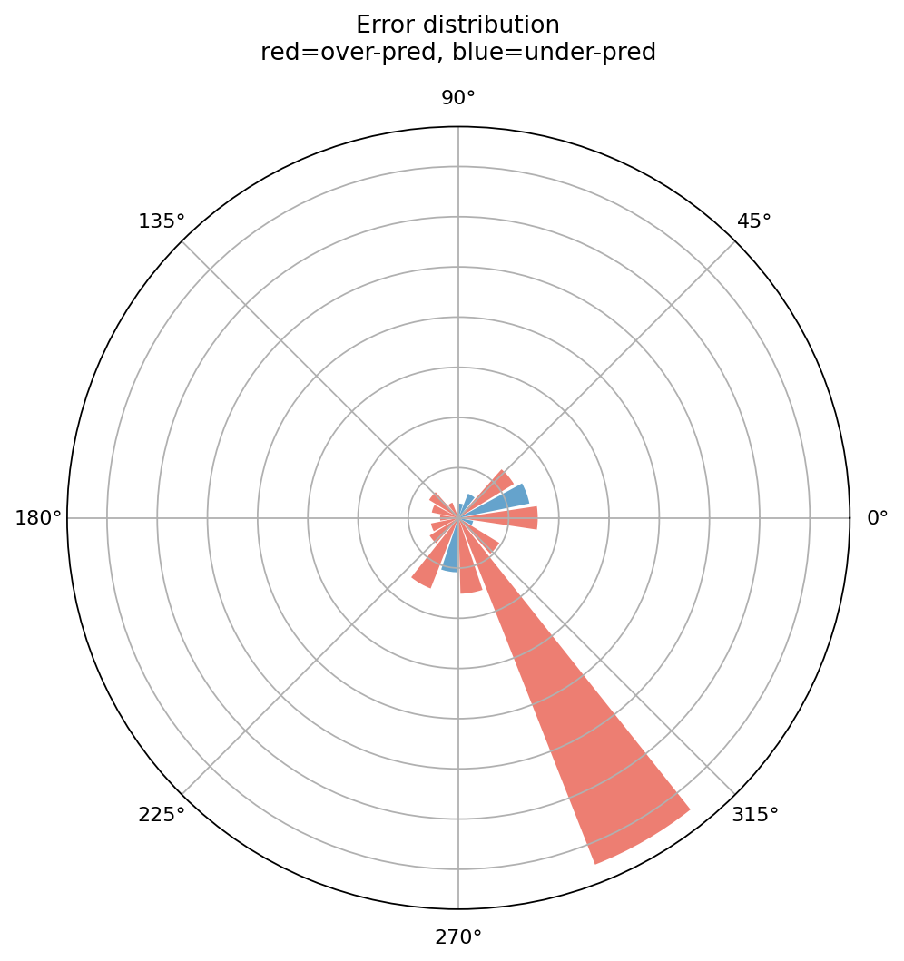
Use rho_error_stats and plot_polar_errors when you have a point
prediction, not only interval bounds.
The signed error keeps the bias direction:
In the polar summary, samples are grouped into frequency sectors \(B_b\). The bar height is
while the color follows the sign of
>>> from pycsamt.emtools.diag import rho_error_stats, plot_polar_errors
>>> errors = rho_error_stats(
...     "data/AMT/WILLY_DATA/L18PLT",
...     model_rho=model,
...     rho_comp="xy",
... )
>>> errors[["station", "freq_hz", "rel_err_pct", "abs_err_pct"]].head()
   station  freq_hz   rel_err_pct   abs_err_pct
0  18-001A  10400.0  7.310073e+00  7.310073e+00
1  18-001A   8707.0  1.375503e+00  1.375503e+00
2  18-001A   7289.0 -1.893832e-14  1.893832e-14
3  18-001A   6102.0  1.638024e-14  1.638024e-14
4  18-001A   5108.0  0.000000e+00  0.000000e+00
>>> ax = plot_polar_errors(
...     "data/AMT/WILLY_DATA/L18PLT",
...     model_rho=model,
...     rho_comp="xy",
...     n_bins=18,
... )
The output columns are:
rho_obs: observed apparent resistivity.rho_pred: predicted apparent resistivity.rel_err_pct: signed relative error.abs_err_pct: absolute relative error.
The polar error plot uses red bars for over-prediction and blue bars for under-prediction. Bar height is mean absolute relative error in each frequency sector.
11.26.11. Comparing Calibration Scenarios#
A useful diagnostic exercise is to compare sensible, overconfident, and underconfident intervals.
>>> import pandas as pd
>>> scenarios = {
...     "sensible": 1.0,
...     "overconfident": 0.4,
...     "underconfident": 3.0,
... }
>>> rows = []
>>> for name, multiplier in scenarios.items():
...     lo_s = {}
...     hi_s = {}
...     for station in q_lo:
...         center = model[station]
...         lo_s[station] = center - (center - q_lo[station]) * multiplier
...         hi_s[station] = center + (q_hi[station] - center) * multiplier
...     t = coverage_table("data/AMT/WILLY_DATA/L18PLT", q_lo=lo_s, q_hi=hi_s)
...     rows.append(
...         {
...             "scenario": name,
...             "mean_coverage": t["empirical_cov"].mean(),
...             "mean_width_pct": t["mean_width_pct"].mean(),
...             "n_calibrated": int(t["calibrated_flag"].sum()),
...         }
...     )
...
>>> comparison = pd.DataFrame(rows)
>>> comparison
         scenario  mean_coverage  mean_width_pct  n_calibrated
0        sensible       0.908356       62.287196            18
1   overconfident       0.766846       24.914878             0
2  underconfident       0.986523      186.861587            28
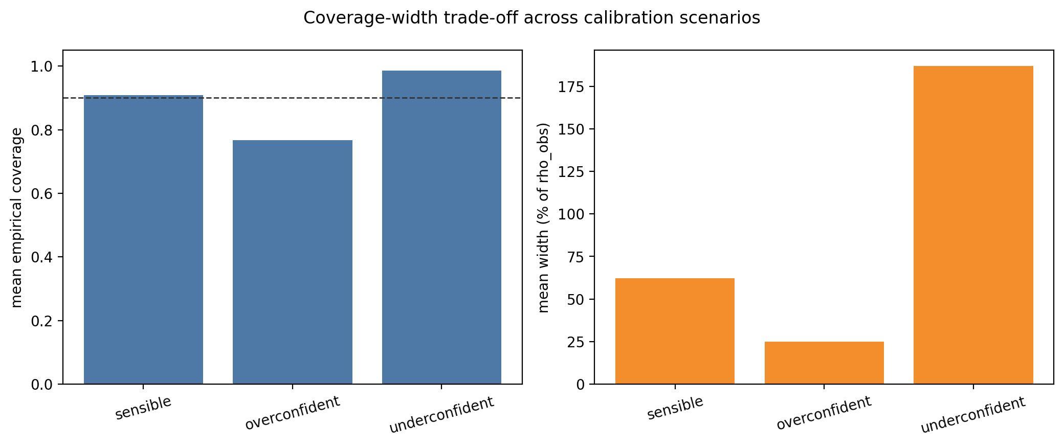
Read this table as a trade-off. Overconfident intervals should have low coverage and narrow width. Underconfident intervals should have high coverage and wide intervals. A useful model is the one that reaches the target coverage without making the intervals unnecessarily wide.
The loop scales the interval half-width around the same point
prediction model[station], rather than around the original
q_lo/q_hi midpoint directly. That keeps the comparison fair:
only the uncertainty width changes across scenarios, not the model
center. The scaled bounds are
where \(m_j\) is the point prediction and \(\alpha\) is the scenario multiplier. Values \(\alpha<1\) make the model more confident; values \(\alpha>1\) make it more conservative.
11.26.12. Reading The Results#
Use this interpretation order:
Check
coverage_tablefirst for station-level calibration.Read
mean_width_pctbesideempirical_cov.Use
plot_polar_coverageto locate frequency bands where misses cluster.Use
plot_width_driftto see whether the model becomes less certain at longer periods.Use
plot_polar_errorsto identify over- or under-prediction sectors when a point prediction is available.
11.26.13. Common Failure Modes#
- Missing prediction keys
If
q_loorq_hiis a dictionary and a station key is absent, that station is skipped. Check the station names in your prediction output.- Mismatched array length
Prediction arrays must align with the loaded station frequency array. Build bounds from the same station order and frequency order used by pyCSAMT.
- Intervals with high coverage but huge width
This is underconfidence. The model is technically calibrated but not very useful.
- Intervals with narrow width and low coverage
This is overconfidence. The model misses too many observations for the claimed interval.
- Scalar bounds
Scalars are accepted for quick tests, but they are rarely meaningful for real apparent-resistivity uncertainty because resistivity varies strongly across frequency and station.
11.26.14. Saving A Reproducible Diagnostic Bundle#
Save the detailed coverage table, station summary, error table, and figures together.
>>> from pathlib import Path
>>> from pycsamt.emtools.diag import (
...     coverage_table,
...     plot_polar_coverage,
...     plot_width_drift,
...     rho_coverage,
...     rho_error_stats,
... )
>>> survey = "data/AMT/WILLY_DATA/L18PLT"
>>> out = Path("outputs/diag_l18plt")
>>> out.mkdir(parents=True, exist_ok=True)
>>> detail = rho_coverage(survey, q_lo=q_lo, q_hi=q_hi)
>>> table = coverage_table(survey, q_lo=q_lo, q_hi=q_hi)
>>> errors = rho_error_stats(survey, model_rho=model)
>>> detail.to_csv(out / "coverage_detail.csv", index=False)
>>> table.to_csv(out / "coverage_table.csv", index=False)
>>> errors.to_csv(out / "relative_errors.csv", index=False)
>>> fig1, ax1 = plt.subplots(subplot_kw={"projection": "polar"}, figsize=(7, 7))
>>> _ = plot_polar_coverage(survey, q_lo=q_lo, q_hi=q_hi, ax=ax1)
>>> fig1.savefig(out / "polar_coverage.png", dpi=200)
>>> fig2, ax2 = plt.subplots(figsize=(8, 4))
>>> _ = plot_width_drift(survey, q_lo=q_lo, q_hi=q_hi, ax=ax2)
>>> fig2.savefig(out / "width_drift.png", dpi=200)
detail, table, and errors preserve the three tables behind
every figure on this page. The saved polar-coverage and width-drift
figures are the same diagnostics from the sections above, regenerated
here from q_lo/q_hi/model in one place for a report bundle:
11.26.15. Worked Example#
The gallery example uses L18PLT from data/AMT/WILLY_DATA/ and
builds synthetic prediction intervals around real observed apparent
resistivity. It demonstrates one-station inspection, per-station
coverage ranking, polar coverage, width drift, polar errors, and a
calibration scenario comparison.
Open the rendered example here: Polar uncertainty diagnostics (pycsamt.emtools.diag).